Esther C. Nolton attended one of my data visualization workshops in May 2019, and almost immediately followed up with examples of her own reports and slideshows that she had begun revamping based on what she learned in the session.
Friends, Esther’s data visualization edits are game-changing.
In one of her presentations, for example, Esther swapped her bullet points for engaging visuals. She added graphs, diagrams, screenshots, logos, and photographs. Every visual had a purpose. Every visual helped to better communicate her research project’s key takeaway findings.
Keep up the great work, Esther!!!
Taking Ann’s Introduction to Data Visualization course through The Evaluators’ Institute (TEI) was the most immediately applicable skills-building workshop I have ever taken. Not just at TEI, but ever. Within days of completing her course, I began going through every presentation or report that I was working on and began Emerizing them. My colleagues and friends took notice and started asking me, “Where did you learn that? Teach me that!”
I wish I could do her material justice. Ann has such a great way of delivering examples and tips for better data visualization. Each lesson makes you feel like you’ve always known it to be true, but just needed someone to show you how to make it so. She provides the perfect balance of theory and practice so that methodologists like myself appreciate the research behind data viz methods and then also know how to create the most appropriate visualization(s) for my data.
You can feel tension releasing in the room as she demonstrates before and after transformations of some of the most heinous visualizations that we have all done at one point in our lives—admit it, you’ve created a 3D pie chart. Hindsight is truly 20/20 because now there are things I just cannot unsee, like old reports or presentations that I am now too disgusted to ever look at again.
Now since I’m one class wiser, the only way I can give back is by continuing to spread the data viz gospel to others who are on this journey as well.
Here are the three most used lessons that I took away from Ann’s class.
1. Never Guess Colors Again
Ann taught us about the importance of using your company’s or client’s color palette to better visualize your work. Part of your/their branding should be that all outward-facing media align with the company’s theme. Again, this was not necessarily new information to me, but it was a healthy reminder because I was previously most concerned with the differentiation of categories. Ann taught us three things about colors that I now use with every data visualization.
Use a Color Identifier Tool
If you’ve ever been like me, you might have guessed at the closest shade to a color that you were trying to select. This might start with selecting a generic purple, for example, and then using the hue slider until you decided to accept the difference was negligible. She showed us a neat (FREE!) tool called the Instant Eyedropper (http://instant-eyedropper.com/), which will give you the color code for any color that you hover over on your computer screen.
Save Color Palettes
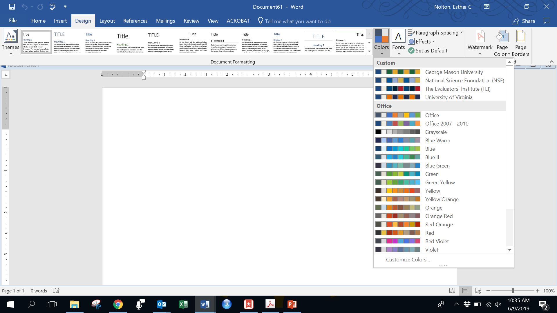
I was always reentering colors for new presentations and documents for the same company. This was exhausting and frustrating! I had enough sense to write down the RGB codes on a Post-It note for one company’s palette that I most frequently used and stuck it on the corner of my monitor. However, Ann taught us to save frequently used color themes in our Microsoft programs (see figure below) so that they could be easily selected and used across documents. Once saved in one program, it would be available across all Microsoft programs on that computer. Voila!

Use Colors to Tell a Story
Sometimes, we use colors to differentiate every category from one another. Ann really emphasized the use of colors for story telling because, maybe, you just want to highlight one category/statistic apart from all the rest. Accompanying this with a meaningful call out box or title are tricks that were game changers for me.
2. Less is More
You really don’t realize how much unnecessary stuff we include in data visualizations until Ann starts stripping them away in front of you one piece at a time and you realize…you don’t really miss it. Coming from academia, my traditional sense of formatting charts and tables were defined by some formal style guide. When given the freedom to break the mold, you begin to appreciate what is essential and what really is not. This minimalist approach helps to declutter your delivery and helps your audience appreciate the message you are trying to convey.
This lesson also came in the form of making your written work concise and palatable. Ann’s 30-3-1 approach is a hard but good lesson in focusing on the aspects that are absolutely necessary to be shared? If you’re not sure about your storyline or take-home message(s) to feature, this approach has helped me draw them out because you are forced to keep only what is pertinent for your audience to follow.
3. Work Smarter, Not Harder
Although Ann recommended fancy software options for data visualizations, she also took us back to the basics. For those of us who may not be able to or want to invest in expense software, Ann showed us how to take advantage of programs like Microsoft Office to produce useful visualizations. Many techniques are not very complex and can be duplicated or modified for future uses as well!
In short, I really enjoyed Ann’s class and continue to apply these skills regularly in my work. Although I still have much to learn, Ann continues to be a wonderful resource and cheerleader to support my growing skills in data visualization. Thanks, Ann!
Leave a Reply