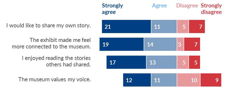
An invisible y-axis separates the good/bad, positive/negative, or agree/disagree categories.
Resources
Tutorials