Online Courses
Private Training
Full-Day Workshops
Conference Keynotes
Blog
Shop
Shirts & Hoodies
Ebooks
Chart Templates
About
Contact
Online Courses
Private Training
Full-Day Workshops
Conference Keynotes
Blog
Shop
Shirts & Hoodies
Ebooks
Chart Templates
About
Contact
Online Courses
Private Training
Full-Day Workshops
Conference Keynotes
Blog
Shop
Shirts & Hoodies
Ebooks
Chart Templates
About
Contact
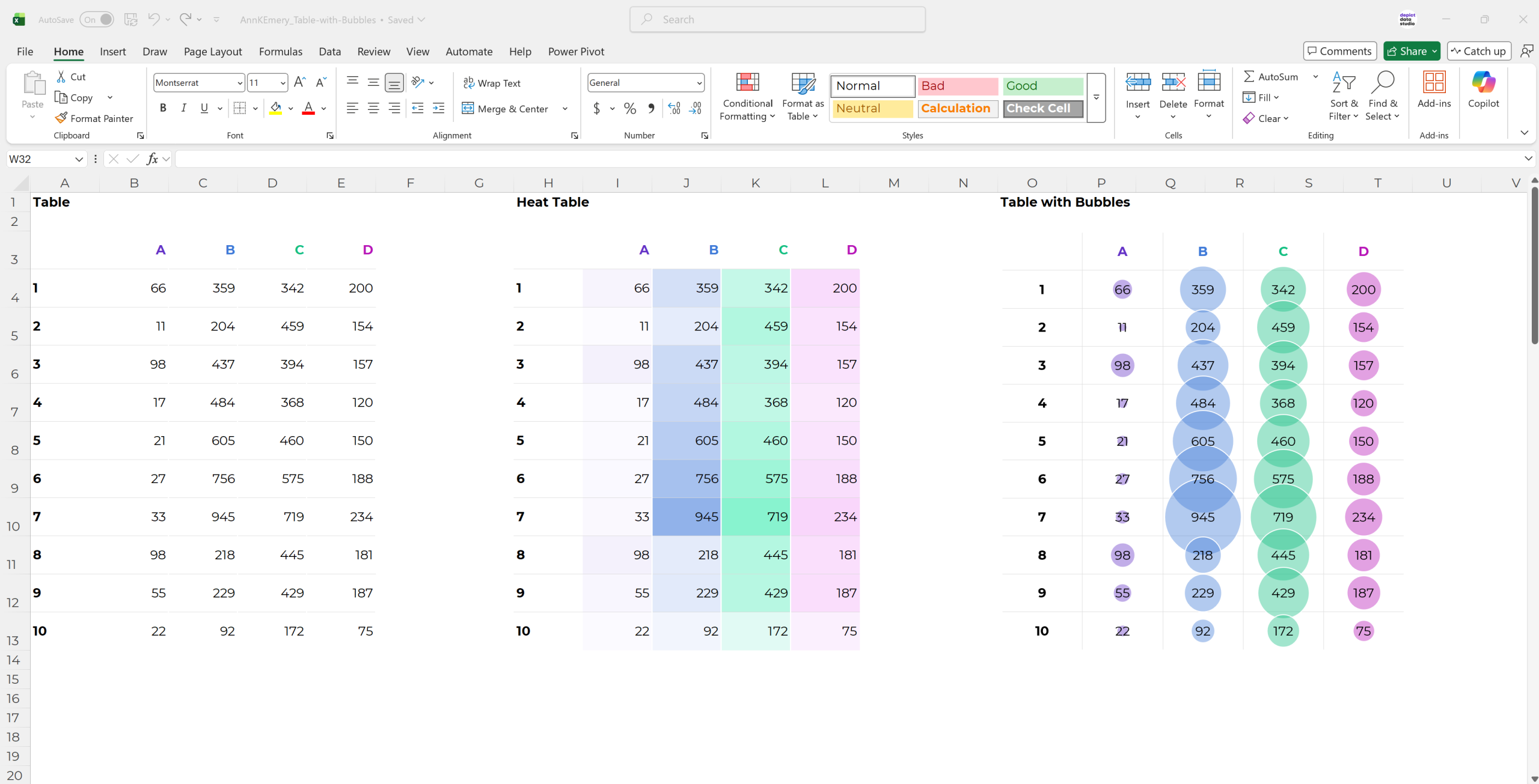
Heat Maps
Higher numbers are darker, lower numbers are lighter.
Description
Higher numbers are darker, lower numbers are lighter.
Tools
Presentation Magazine’s editable maps
Tableau
Carto
Functions
Examples
Non-vegetarianism in India in three maps
Poverty rates by US counties
Roads are becoming more deadly in developing countries
What are sanctuary cities?
How Trump’s refugee ban hurts health care in places that voted for him
Spring came early; scientists say climate change is a culprit
Change in percent of uninsured population
70 countries have had a female leader
Median ages of residents in African countries
Mapping every deficient bridge in the United States
Where America’s goats live
Where America’s cows live
Small multiples examples
Three ways you could draw Pennsylvania’s congressional districts
What music do Americans love the most? 50 detailed maps of music fandom
Gerrymandering
Republicans’ changes to Medicaid could have larger impact than their changes to Obamacare
White overrepresentation: 1980, 2016, 2016
176 drought maps reveal just how thirsty California has become
How the California drought has spread between 2011 and 2015
Wal-Mart’s urban spread between 2005 and 2020
Gerrymandering between the 83rd Congress and 115th Congress
Percentage of Catholics vs. Protestants in South America saying x is morally wrong
Example Chart
More Charts
Tables with Bubbles
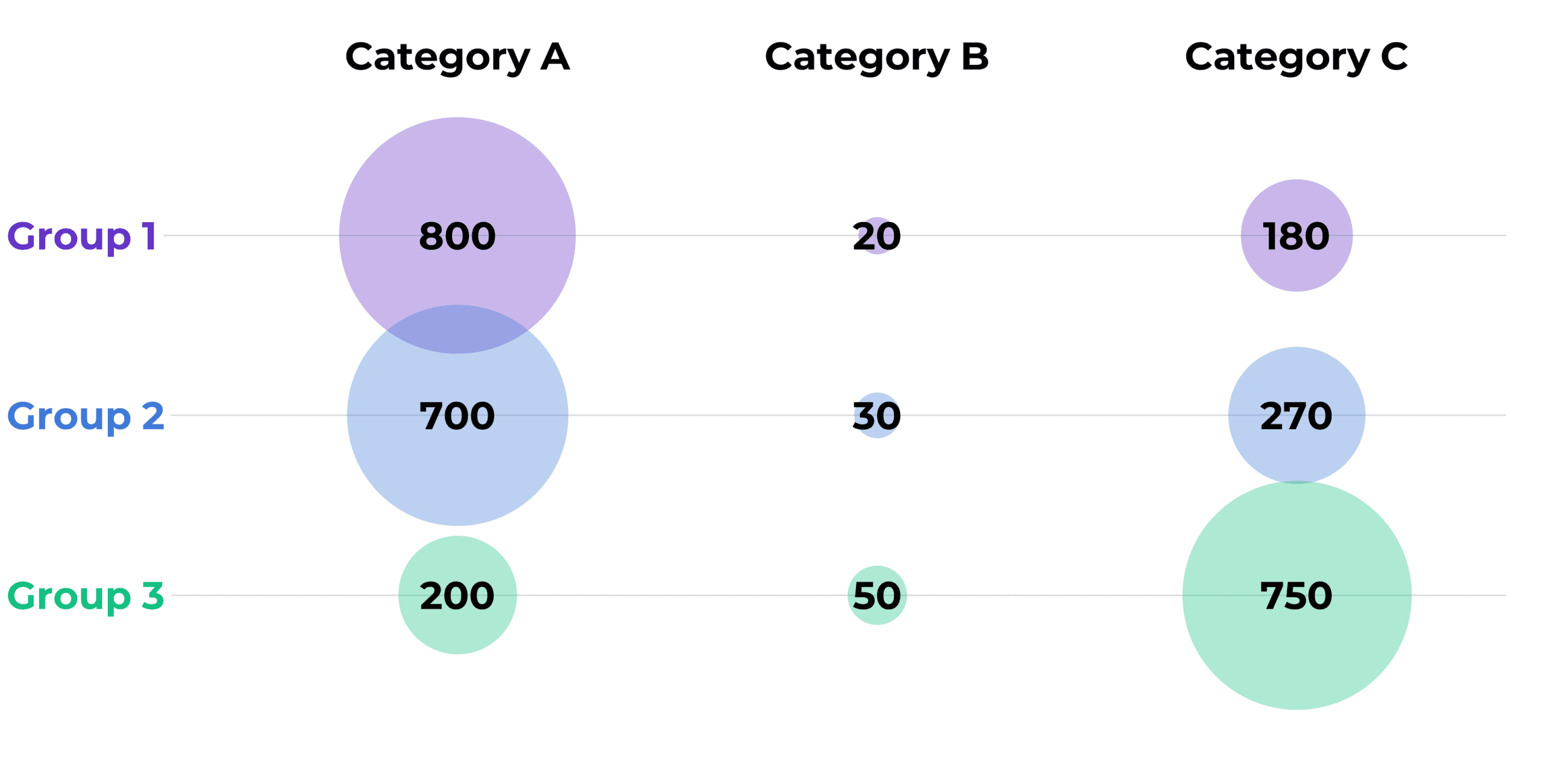
Bubble Charts (An Alternative to Bars)
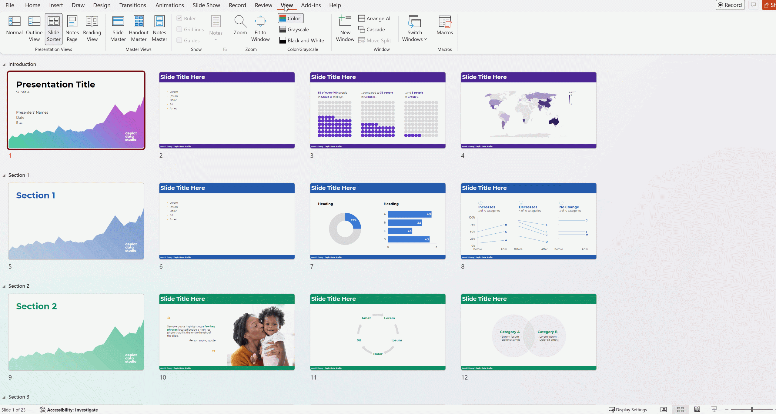
No more Frankensteined slides!
