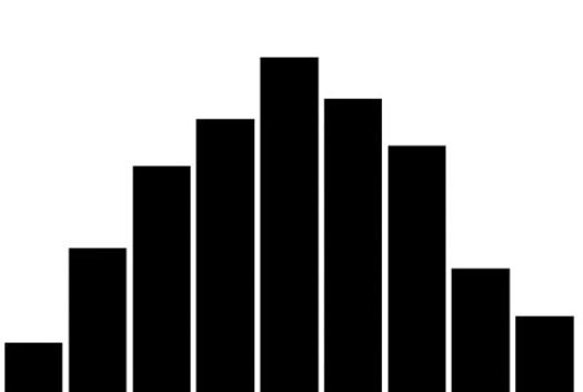
On the surface, histograms look similar to vertical column charts. A primary difference is that histograms group multiple columns into bins. For example, a column chart might show age 10, 11, 12, 13, and so on as separate bars. A histogram would group ages into age categories, like ages 10-19, ages 20-29, ages 30-39, and so on.
Histograms are designed to show a dataset’s distribution or spread. If you’ve taken a high school or college statistics course, then you recognize these graphs from your normal distribution and binomial distribution lessons.


