Online Courses
Private Training
Full-Day Workshops
Conference Keynotes
Blog
Shop
Shirts & Hoodies
Ebooks
Chart Templates
About
Contact
Online Courses
Private Training
Full-Day Workshops
Conference Keynotes
Blog
Shop
Shirts & Hoodies
Ebooks
Chart Templates
About
Contact
Online Courses
Private Training
Full-Day Workshops
Conference Keynotes
Blog
Shop
Shirts & Hoodies
Ebooks
Chart Templates
About
Contact
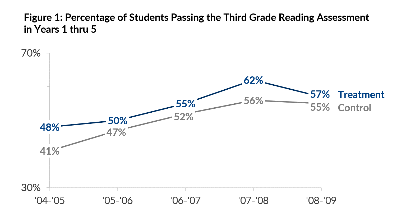
Line
Patterns over time.
Description
Patterns over time, folks.
Resources
Strategies for Avoiding the Spaghetti Graph
Line Graph
Functions
Examples
How this flu season compares with recent ones
When people around the world go to the movies most
Obama’s job rating higher than Bush’s, below Clinton’s, on par with Reagan’s
Number of measles cases over time
Mortgage rates have fallen sharply
Visits to doctors’ offices for flu-like symptoms
Example Chart
More Charts
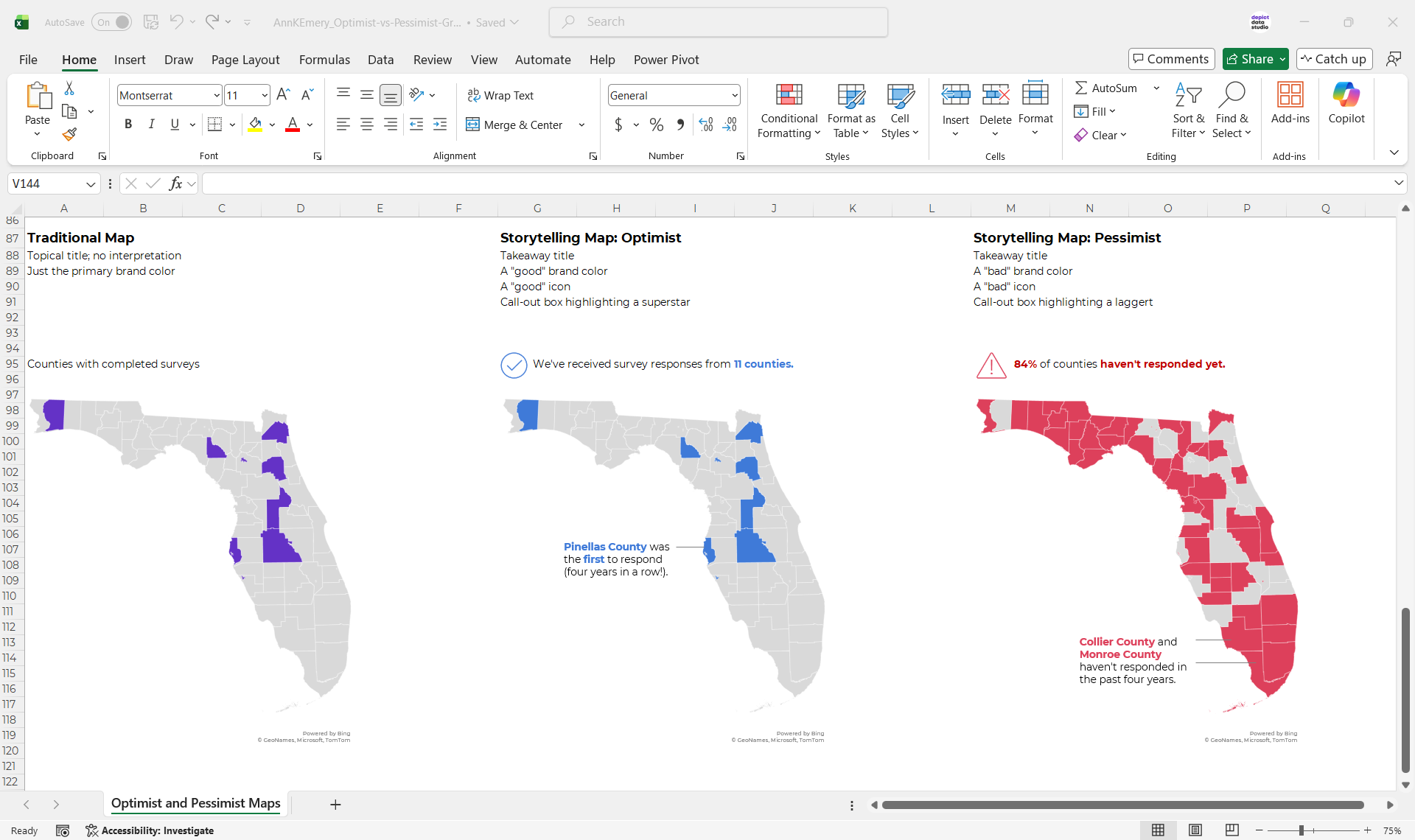
Optimist vs. Pessimist Maps
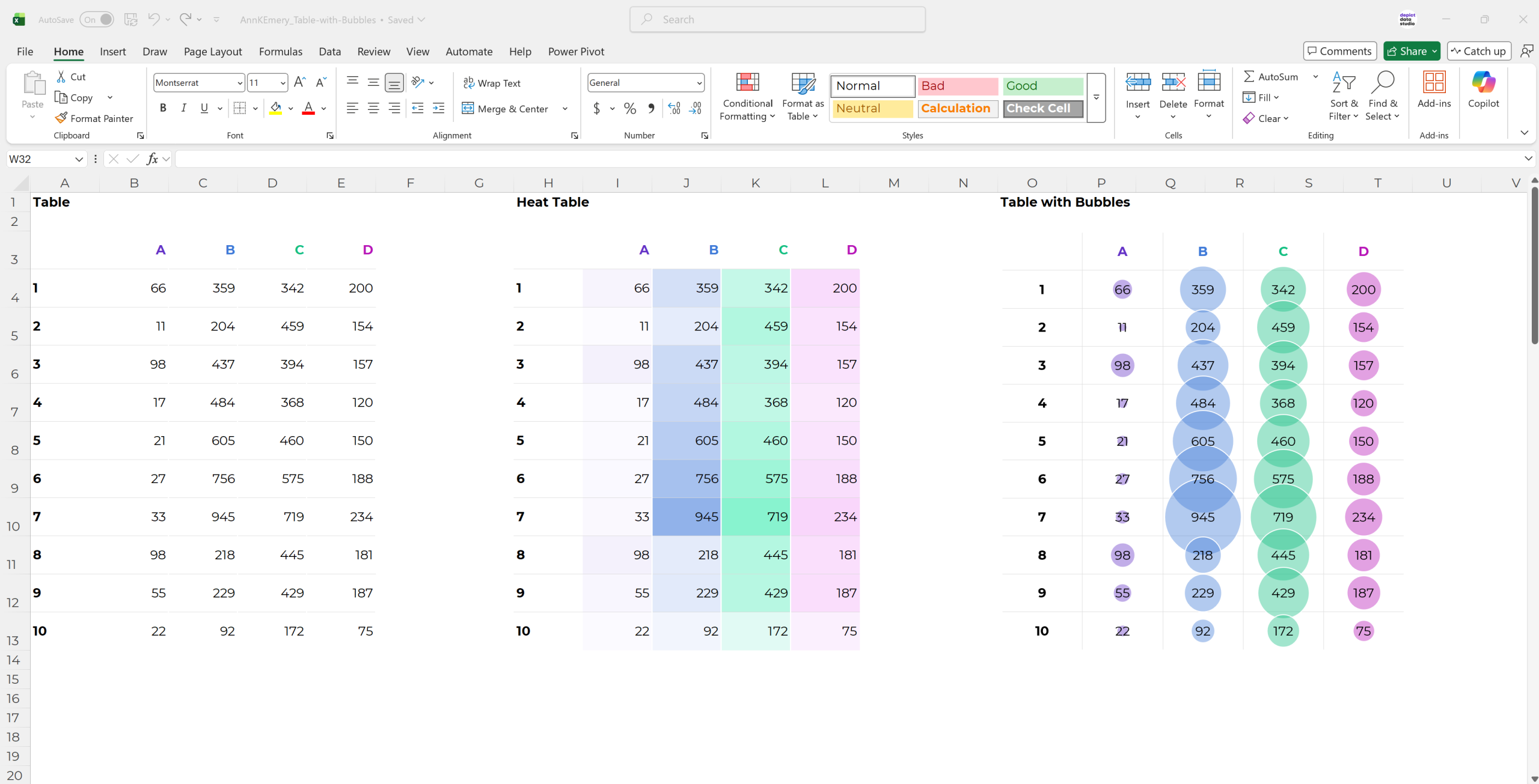
Tables with Bubbles
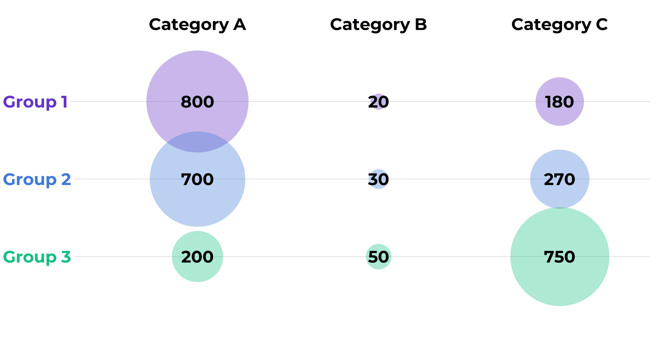
Bubble Charts (An Alternative to Bars)