Contrary to popular belief, I don’t lose sleep over pie charts. (Hundred-page “professional” reports filled with jargon are what keeps me up at night.) Here are my seven guidelines for using pies and donuts.
I can always tell when someone has attended a data visualization training in the past because they tell me, “Ann! I know everything there is to know about data visualization! I know that I can never use pie charts!” That advice about never using pie charts is only half-true.
Pie charts are okay when they:
- are well-formatted. No 3D, exploding slices, leader lines, or legends.
- display nominal variables. Ordinal variables don’t belong in a pie chart.
- add to 100%. I’ve seen pies that only add to 90% because the designer deleted the “other” category and forgot to recalculate the new percentages.
- they contain positive numbers. I’ve seen designers place a mix of positive and negative numbers inside the same pie chart, which doesn’t make any sense.
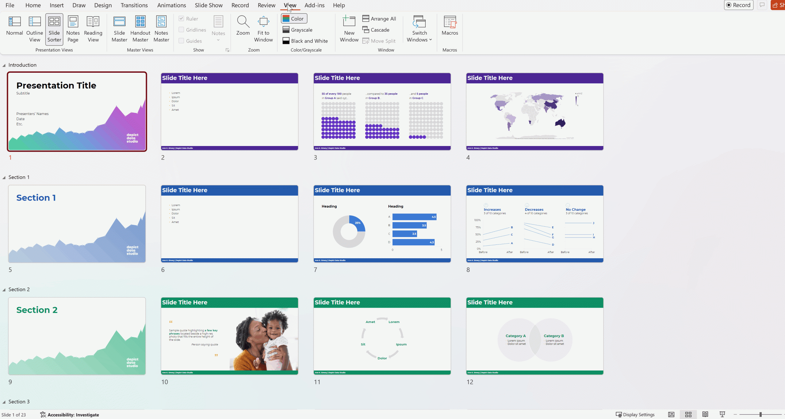
- display a single point in time. Patterns over time belong in a time series graph, like a slope chart, line chart, or dot plot.
- only have two or three slices. Four slices is pushing it.
- are displayed individually. Only show one pie chart at a time. No small multiples pies. Comparisons across multiple pies are time-consuming.
Finally, while I don’t consider this to be a strict guideline, pie charts tend to be easiest to read with common fractions, like a one-fourth vs. three-fourths pie or a one-third vs. two-thirds pie.
Resources


