• Online Courses
  • Private Training
    • Full-Day Workshops
    • Conference Keynotes
  • Blog
  • Shop
    • Shirts & Hoodies
    • Ebooks
    • Chart Templates
  • About
  • Contact
Depict Data Studio
Depict Data Studio
  • Online Courses
  • Private Training
    • Full-Day Workshops
    • Conference Keynotes
  • Blog
  • Shop
    • Shirts & Hoodies
    • Ebooks
    • Chart Templates
  • About
  • Contact
  • Online Courses
  • Private Training
    • Full-Day Workshops
    • Conference Keynotes
  • Blog
  • Shop
    • Shirts & Hoodies
    • Ebooks
    • Chart Templates
  • About
  • Contact

Span

When you’ve only got the min and max.

Description

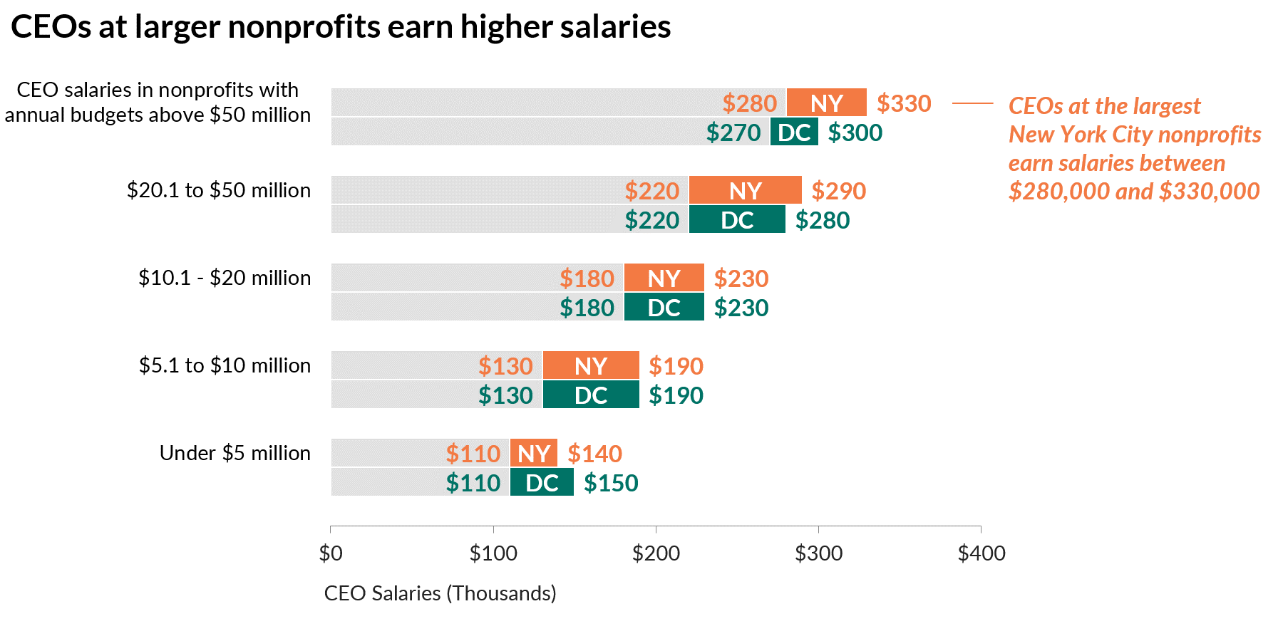
Use span charts when you’ve only got the min and max (not a median, mean, or frequency count).

Resources

  • Span charts: When you’ve only got the min and the max

Functions

Examples

  • Common “superbug” found to disguise resistance to potent antibiotic
  • Salary ranges for nonprofit executive directors 
  • The highs and lows of Presidential approval
  • Middle-income ranges over time; e.g., $30-92K in 1970 and $40-122K in 2013

Example Chart

More Charts

Ann K. Emery is an expert in data analysis, data visualization, and data storytelling.

Mini Data Bootcamp

Ann K. Emery of Depict Data Studio teaches you how to make interactive Gantt charts in Microsoft Excel with formulas and conditional formatting.

Sliceable Gantt Charts in Excel

Ann K. Emery of Depict Data Studio provides data visualization and data storytelling workshops, webinars, keynotes, and consulting.

Small Multiples Line Charts in Excel

Depict Data Studio
  • Dataviz Courses
  • Private Training
  • Blog
  • Swag
  • About
  • Contact
Copyright © 2025 Depict Data Studio | All Rights Reserved | Web Design by Kicks Digital Marketing