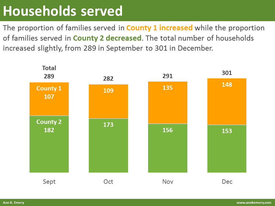
Stacked bar charts show how parts add up to a whole. I often use stacked bar charts for ordinal data, like the number of survey respondents who selected strongly agree, agree, disagree, or strongly disagree.
“Ann, should I show numbers or percentages?” I display numbers when there are less than 100 things (e.g., 58 people) and I display percentages when there are more than 100 things (e.g., 245 people).
“Ann, should I use vertical or horizontal stacked bars?” I use vertical columns for ordinal data and horizontal bars for nominal data.
Resources


