Are you giving a formal presentation with slides and a projector? Are you giving an informal presentation with a handout to accompany your talking points? Is your graph going into a report?
You’ll need to adjust your graph’s font sizes, layout, and amount and type of explanatory text to fit each of your dissemination formats.
In a previous post, I demonstrated how to remove double-y axes, in which we’ve got total grants awarded (dollars) on the left and the number of projects that were funded (a tally of projects) on the right.
Before: Dual Y Axes
Here’s the original, which I’ve always found onerous to interpret because two lines with two different units are overlaid on top of each other.
This layout doesn’t give the viewer any clues as to which section of the graph should be read first.
In my remake, I arranged the graphs in the order in which I want my viewers to read them: the total grant dollars given out, followed by the number of projects that were supported, with space for a third variable, the average grant size.
What would the final final version of this graph look like?
It depends on the dissemination format.
A Handout for a Meeting
The handout would probably look exactly like my remake above.
I tend to include lots of subtitles and explanatory text in handouts so that meeting attendees can use the handout as a reference later on, even when I’m not in the room to talk through it with them.
I usually design my handouts in PowerPoint so that I have a nice, large screen to use. Then, I print full-page “slides” to bring to the meeting, and might even save the slide as a PDF so it can be emailed to folks later on.
Slides for a Presentation
When I present slides on a projector screen, I use storyboarding to make my slides look like they’re animated. I plan how I’m going to explain the graphs, and then make each section appear to coincide with my speaking points.
For the first slide, I might say: “And next on the agenda, we’re going to talk about the grants we gave out between 2008 and 2016.”
For the second slide: “First, I looked at the amount of grant funding we gave out.”
For the third slide: “Look at the graph. There are little ups and downs, but we generally awarded the same ballpark figure each year.”
For the fourth slide: “The next item I looked at was the number of different projects that we supported. That number has actually been going down over the past eight years. This is on purpose–remember our plan to build stronger ties with a smaller number of grantees and a smaller number of projects?”
For the fifth slide: “And finally, I looked at the average project size. Since we’ve given out roughly the same amount of money, but for a smaller pool of projects, this means our average project size is going up.”
Storyboarding is easy. I design my final (fifth) slide first. Then, I copy and paste the fifth slide to create the fourth slide, and delete something (or cover up a portion of the slide with a big white rectangle). Then, I copy and paste the fourth slide to create the third slide, and delete something. And so on. It tends to be easier to work backwards than forwards.
A Page of a Report
Slides are short and fat, but reports are tall and skinny. (Or, landscape vs. portrait.)
Slides have large font size, but reports have small font size.
Slides have less text, but reports have more text.
(Are you getting the picture? You can’t use the exact same graph in both a slide and in a report. Well, sometimes. But rarely.)
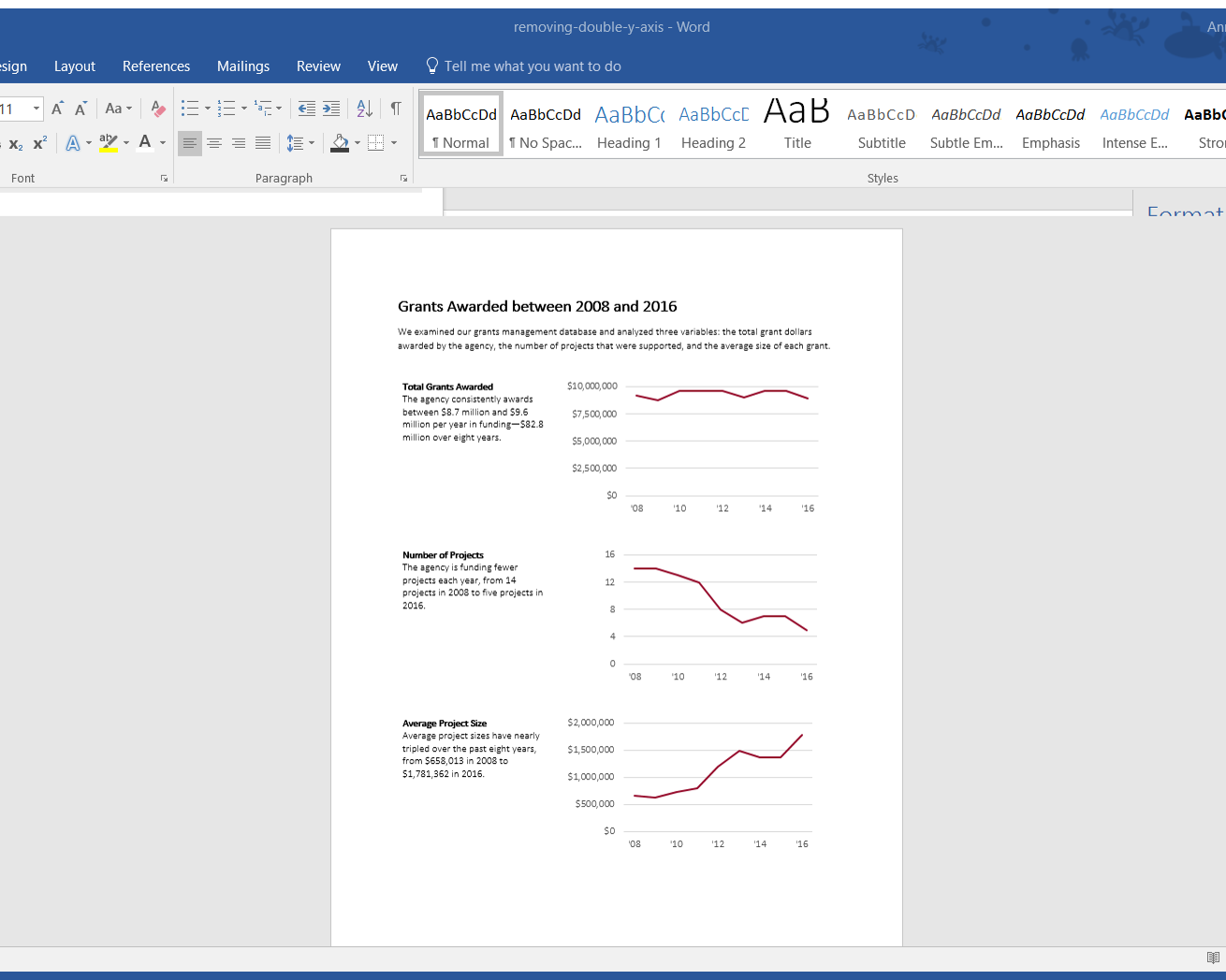
For a report, I would rearrange the graphs so that go from top-to-bottom rather than left-to-right. I take advantage of my tall, skinny document and use my real estate accordingly. I often place the titles and subtitles off to the left of each graph.

Have you noticed how it’s SO HARD to get text and images to align correctly in a document??
What a waste of time to spend hours dragging text boxes, paragraphs, and images around.
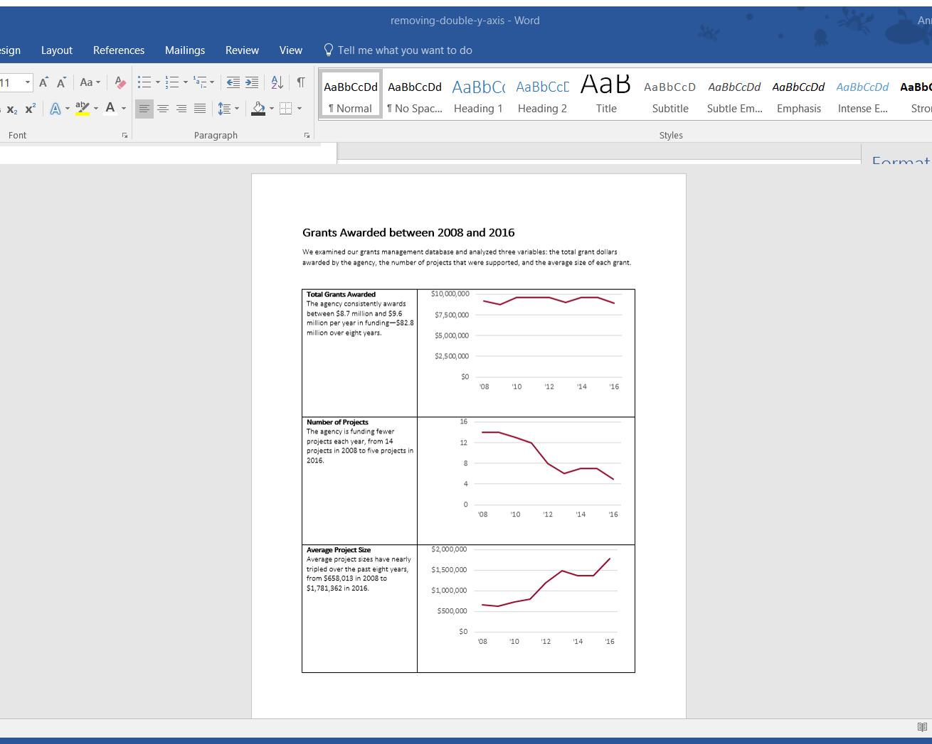
Here’s my secret: I paste my graphs into a table.
I type the titles and subtitles in the cells on the left, and then paste the accompanying graphs in the cells on the right.
When I’m finished, I swap the black table borders for white/transparent borders.
Your viewer gets a crisp, organized page layout and has no idea that your sentences and images are actually hiding within a table.


Leave a Reply