I took the Report Redesign class in October 2024, which was just under a year ago, but now seems like a different era.
If you work in global health as I do, that statement needs no explanation.
For anyone who is not sure what I mean by that: when I took the class, a key challenge was trying to synthesize and summarize abundant global health data into actionable information products. I fretted about how to convince colleagues to use our project’s branding and data visualization guidelines, how to get them to attach the label to the line on a line graph rather than in a legend somewhere else on the graph. I took for granted the global health resources like the Demographic Health Surveys.
A few months after taking the course, USAID was dismantled, and funding was slashed for many other federal government agencies. Dozens and dozens of my friends and former colleagues lost their jobs.
Meanwhile, much of the hyperbolic hype around AI makes it seem like all knowledge workers are going to be replaced soon.
In this climate, it might seem superfluous to talk about tips and tricks for making reports more appealing.
I’ll offer two examples of useful things I learned during the course, one simple and one more theoretical.
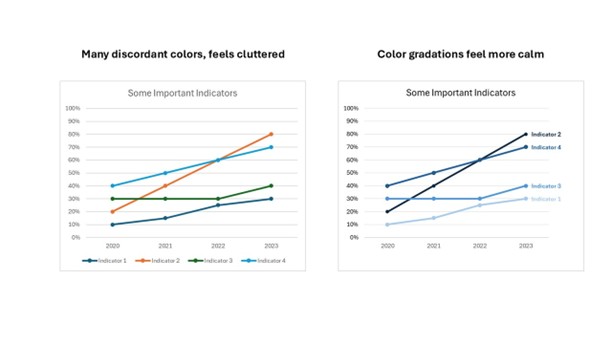
Fewer Colors
The first is simple but powerful.
I admired the clean design that I saw in Ann’s communications.
My designs, in comparison, seemed too cluttered.
During the class I realized that it was because Ann uses a limited color palette and largely uses colors gradations in graphs rather than using many different colors.
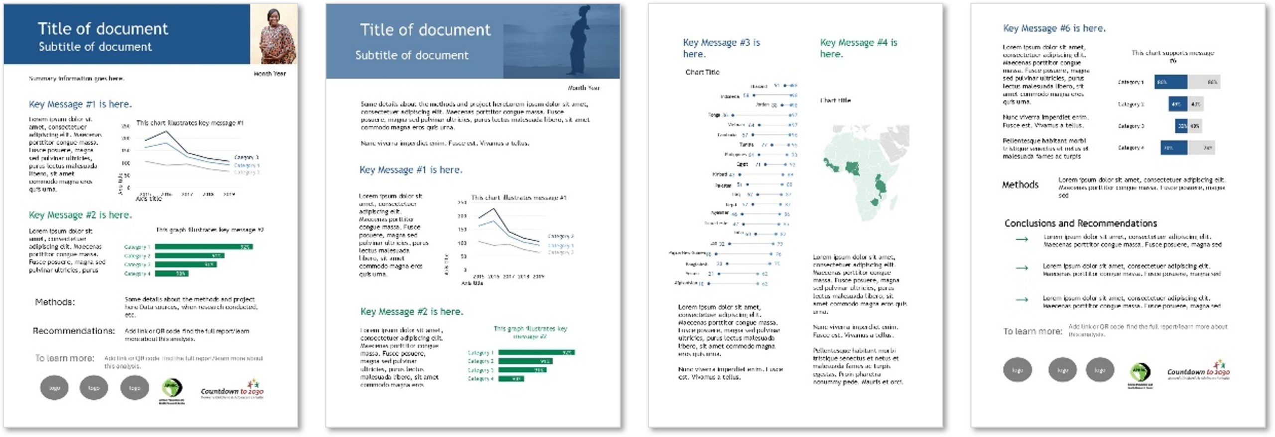
Templates to Create Structure
I decided to take Report Redesign because I was being asked to help write and design policy briefs, but I had never learned how to do that.
I thought the course would empower me to make suggestions– even though it wasn’t exactly the focus of the course – and it did!
The course materials included templates, and the tutorials explained how to create templates. It is a huge time-saver to start with template rather than developing each product from the blank page.
Using those as inspiration, I developed simple PowerPoint templates and an accompanying worksheet to help teams brainstorm their key messages and decide how to present them visually.
My team has shared these resources during several webinars, and colleagues have said that they appreciated the straightforward guidance.

I am glad I took the Report Redesign class, and I would encourage others to take it as well.
There will always be a need to communicate data clearly and accurately.
The class is a great balance of theory and practice.
The time allotted is enough to learn hands-on skills but still a reasonable time commitment for people with full-time jobs.
Connect with Emma Williams
On LinkedIn: https://www.linkedin.com/in/emma-williams-7144aa7/
Leave a Reply