Note from Ann:
In spring 2025, I livestreamed on YouTube as I created a 2-pager about NIH grant terminations.
Later, Michelle Grochocinski emailed me and wrote, “I applied your lessons to a two-page infographic fact sheet for the State Health Insurance Assistance Program (SHIP). The leaked HHS budget draft suggested cutting SHIP funding, and advocates mobilized quickly to highlight the importance of this program. (I could’ve kept tweaking the fact sheet forever, probably, but we wanted to get it out asap.) Thank you for the tools!”
Here’s what Michelle created:
I LOVED how she applied what she learned to her own project, and asked if she’d be willing to share it with you here.
Ann Emery: What did the “before” version look like?
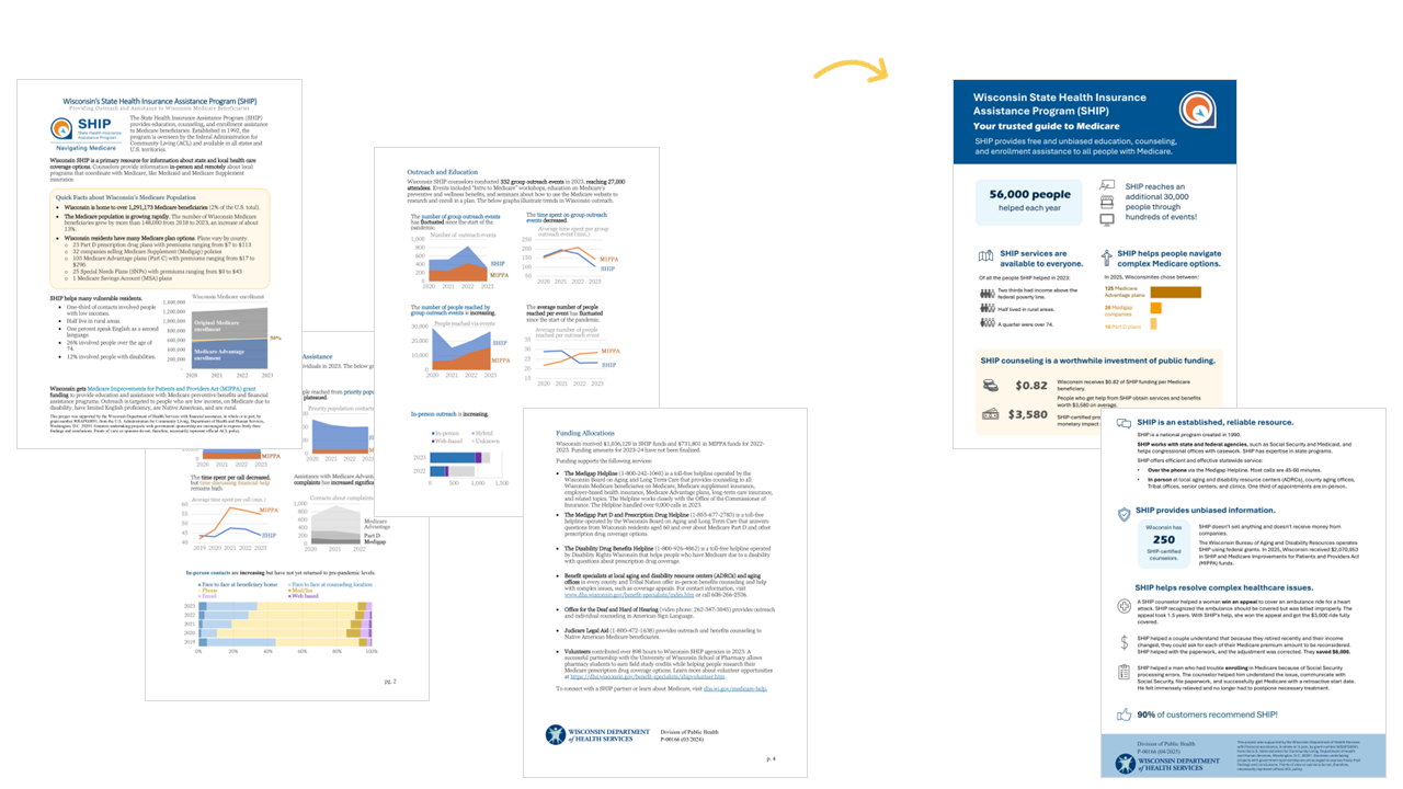
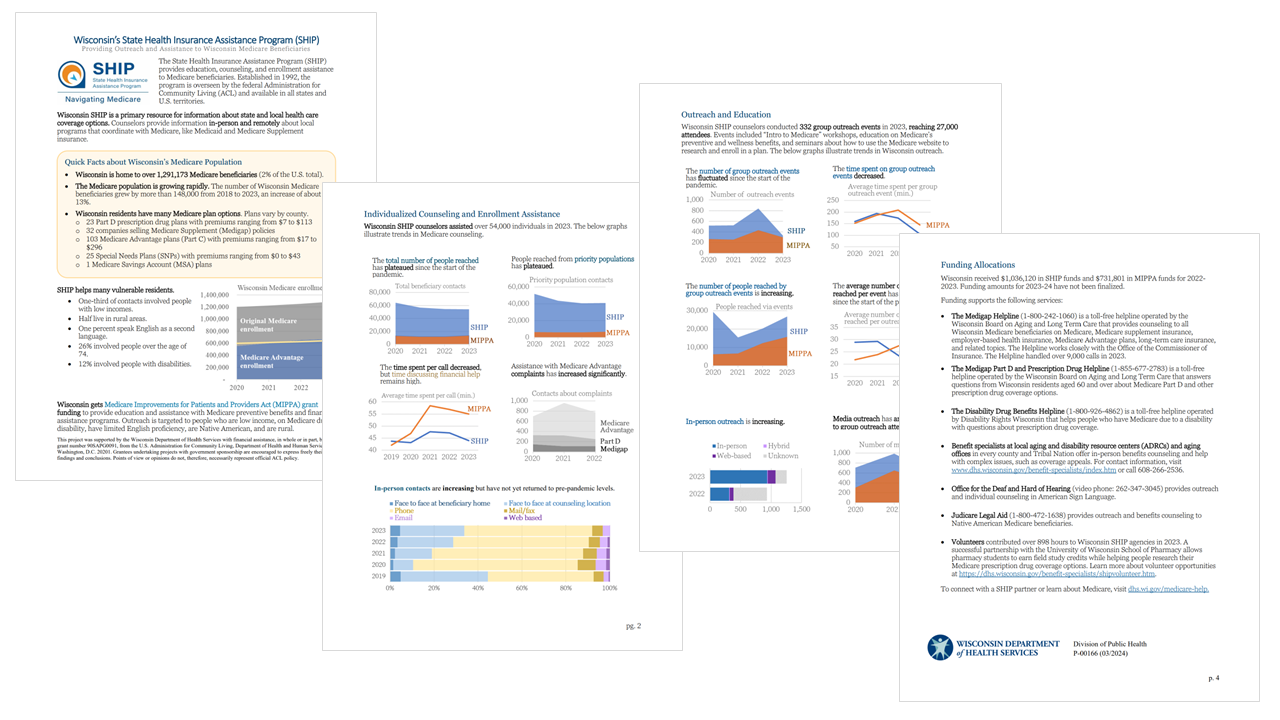
Michelle Grochocinski: The “before” version was four pages of neutral program trends and contextual information; there wasn’t a clear audience.
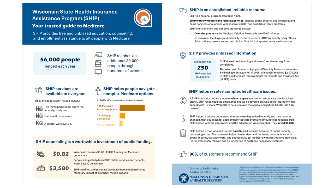
The revised fact sheet is two pages of infographics and information that explicitly highlight program impact.
How long did it take to create the Fact Sheet?
The better part of two days.
We went through several versions before landing on the data points, visualizations, and stories that we agreed best illustrate the importance of the program.
Which software program(s) did you use?
Excel for the data.
PowerPoint for the page design.
How did you decide which data points to include?
We considered many more data points than were ultimately selected.
We identified our audience as consumers / constituents, who may not realize this is a federally-funded service, and the legislature. We chose demographic data that would emphasize to lawmakers that constituents on both sides of the aisle rely on this program, such as numbers and stories about higher-income and rural customers.
I approached this with the hypothetical of “what would happen if SHIP weren’t available?” Immediately, the challenges of unsolved issues, trouble navigating coverage options, and lack of access to unbiased information came to mind. I worked backwards to select information that illustrates how SHIP meets these needs.
I consulted with colleagues in my program area and from my communications team to get fresh perspectives.
What do you like most about the Fact Sheet?
I feel we did a good job clearly and concisely communicating SHIP’s impact: empowering thousands of families and communities to understand and access their healthcare.
I believe the fact sheet shows how this is a popular, non-partisan program that helps all of us, including congressional offices and government partners.
We strove to use Reframe Aging principles in our verbiage and plain language.
It’s clean and succinct.
Did you run into any challenges?
I found myself wanting to insert my many graphs into the fact sheet. Pivoting to graphics and design that highlight the ultimate impact rather than trends over time took a mental shift, from program manager to consumer.
Selecting which data points to include amongst the vast amounts of data we collect was challenging.
Finding the right balance of context to provide without delving into complexities that require background knowledge and jargon was tricky.
Next steps??
I’ll keep tweaking the colors and formatting to polish it up.
I this it would be beneficial to have a national version of this state fact sheet, since SHIP is a national program, so I’m interested in working with my federal colleagues to make that happen.
Great work, Michelle! Here’s the before-after transformation. –Ann

Leave a Reply