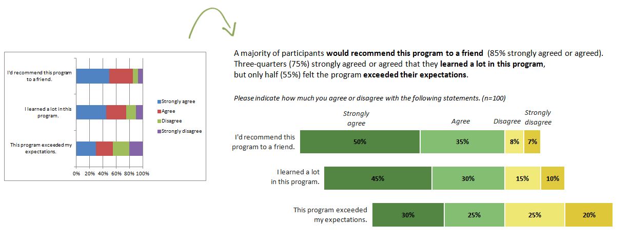
Last week I shared strategies for improving any chart’s colors. One of the examples was a diverging stacked bar chart:
 I love stacked bar charts because they’re pretty versatile, and because they’re a great chart for lots of evaluation and survey data. In my example, I looked at the percentage of survey respondents who selected strongly agree, agree, disagree, and strongly disagree on a satisfaction survey. But stacked bar charts can be used in dozens of different ways.
So when can you use a stacked bar chart?
- Stacked bar charts are for part-to-whole relationships. Use them when you want readers to see both a) one portion of the bar and b) compare that piece to the entire bar.
- Stacked bar charts can be used for tallies or percentages. A tally is the number of actual people, dollars, etc. For example, a nonprofit could display their funding sources in a stacked bar chart – $100K from a foundation, $200K from a government grant, and so on. The reader can see the size of each grant as well as how the grants stack up as a whole.
- Stacked bar charts can be used for nominal, ordinal, or diverging data. An example of nominal data is the racial/ethnic categories of your survey respondents. Ordinal data has a natural order – from best to worst, most to least, something to nothing – like my example. Diverging data is a subtype of ordinal data – when the categories are polar opposites and there’s a clear middle ground or neutral zone in between two ends.
And when can you use a diverging stacked bar chart? Diverging stacked bar charts are just for comparing several sets of ordinal data at once. They work best when you’ve got an even number of categories (like the 4 survey choices). Then, you can easily line up the midpoints along an invisible y-axis.
The dataviz challenge: Re-create the “after” version in Excel, R, or some other free software program. When you’re finished, email me or tweet a screenshot to @annkemery.
Bonus! 1) Adapt this chart for own data. Think outside the box! 2) There are at least two different ways to create diverging stacked bar charts in Excel. Can you find more than one solution? (And these charts are so awesome that you’ll even see one solution on Stephanie Evergreen’s blog next week!) 3) Don’t forget to use custom colors!
The prize for playing: Beer or coffee, my treat, the next time you’re in DC; a professional development opportunity; and bragging rights.
I’ll post the how-to guide in 3 weeks, on September 6, 2013. Happy charting!


3 Comments
Hi, my draft works (though it’s not totally ready yet) it can be senn: http://bl.ocks.org/CodeXmonk/6262477.
Happy Codings,
@CodeXmonk
[…] week my friend Ann Emery posted a dataviz challenge on something I’d been wanting to figure out for a long time: how to make a diverging stacked […]
[…] to share the chart secrets with all of you, so last month, I challenged readers to re-create a diverging stacked bar chart like this […]