This week’s dataviz tips come from Tyler Mason, who I met several years ago while leading a training in Indiana. Tyler and I have stayed in touch and he enrolled in additional virtual training with us. Check out how he’s created a two-pager for his program! Great work, Tyler. –Ann
Hi, I’m Tyler Mason, a Juvenile Justice Strategist with the Indiana Juvenile Detention Alternatives Initiative (JDAI).
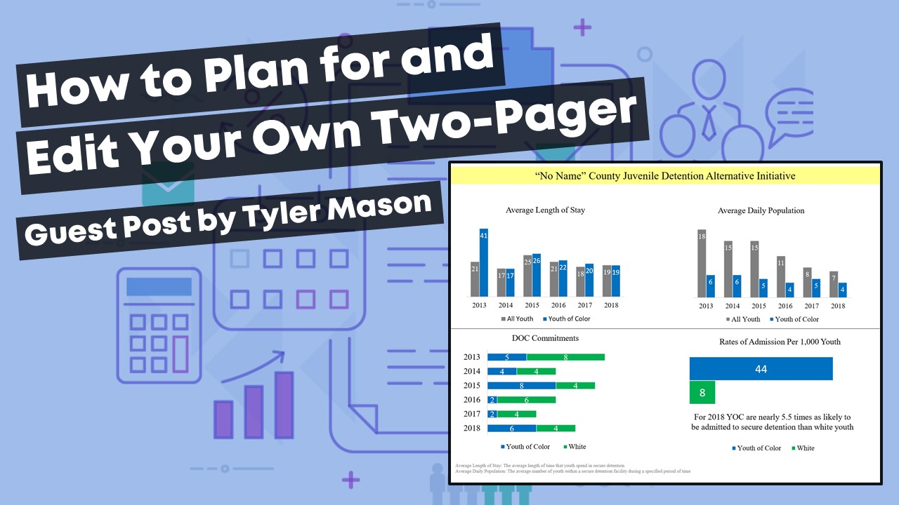
This two-pager that I have created was born out of Ann’s “chose the right format” training from her Great Graphs course:

Here’s how I developed this two-pager.
Know Who Your Audience Will Be
It is vital that you know who your audience will be when developing your charts.
If you don’t follow this critical piece, you may completely miss your audience, and at that point, you may have lost the story you were trying to convey to them.
You will notice with the two-pager I am attempting to communicate the essential data points that I can in a concise way given “one” sheet of paper.
Select the Right Type of Graph
By utilizing the “choose the right chart” lessons in Ann’s online course, I was able to use the chart that made the most sense with creating the data story.
You will notice that different charts were utilized to tell the data story. For example, we included line charts, bar charts, stacked bar charts, and clustered bar charts.

The first thing as Ann spells out is either draft what you envision on a piece of paper or start brainstorming in your mind.
Through the brainstorming and utilizing Excel, my graphs were born.
Create and Format the Charts on Your Computer
Entering the data and creating the charts is the hardest part, then comes the formatting, which can be the same.
The Less Noise, the Better
One thing as Ann mentions often is the less noise, the better. So, be sure to remove all the noise in the Excel graphs.
Using PowerPoint for Easy Layout Options
Once I had my charts created, I then utilized PowerPoint to lay them out and start telling the story from starting big picture to breaking out what was seen in 2018 for said county on the first page.
When you look at the other side of the page, I start to dig a little deeper into the data and what was seen with length of stay and average daily population.
The last two charts at the bottom are to tell a story about the work that still needs to be done.

How to Frame Your Two-Pager
As a recap, here’s what I considered in my project:
- What data are you planning to present?
- Who will be your audience, and what is their knowledge level of the data?
- Brainstorm ideas to develop your charts from this point forward
- Utilize whatever platform you like. I like to use Tableau or Excel. For this current project, I used Excel and PowerPoint.
- Start drafting your charts. I also find it valuable to bounce your ideas of your coworkers and what they think of the charts and the story you are trying to tell. I find asking a coworker what they think my data story is trying to tell. If they guess correctly, you’re on the right path.
- Do not forget the formatting of your charts. The less noise, the more people will be engaged. Simple is ideal. Also, another important thing to consider and not forget about is what will my charts look like in black and white and if I used color, are they legible for people with color vision deficiencies. I find that is something that is often overlooked that is also a very vital piece to this equation.
- You’re done! Good luck, and as always, be prepared for questions.
The Great Graphs course has been phenomenal and I highly recommend it for anyone needing guidance on how to create the best graphs for your audience.
I hope you find this information worthwhile. Good luck creating your data story.


Leave a Reply