2 Comments

  • […] K. Emery shows how to place chart labels directly on a line graph. Instead of doing this for all the data points, you could select one or two key points, and format […]

  • […] Add numeric labels through the center of each line–Edward Tufte’s graph table, my favorite chart type–as demonstrated in my tutorial. […]

  • Leave a Reply

    Your email address will not be published. Required fields are marked *

    How to Place Labels Directly Through Your Line Graph in Microsoft Excel

    Updated on: Jan 12th, 2016
    Data Visualization in Excel
    , , , , ,
    A collage of laptops, clocks, calendars, and charts in Depict Data Studio's purple, blue, green, and fuchsia color palette.

    I recently discussed four options for labeling line graphs. A personal favorite is to place the labels directly through the data points, like this:
    An example of how to label line graphs A personal favorite is to place the labels by going directly through the data points.
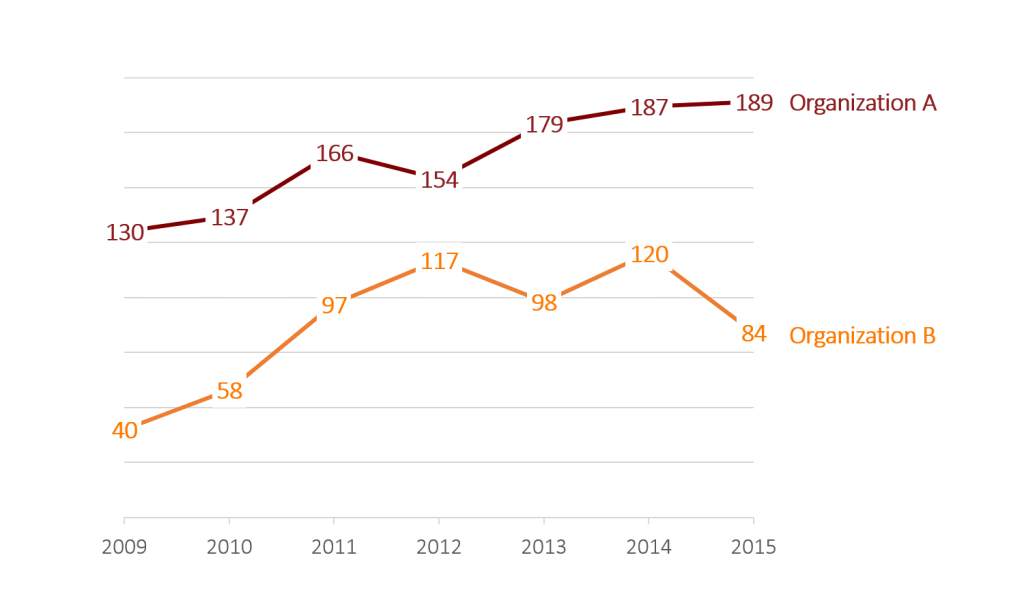
    There’s been a lot of interest in this labeling technique, so here’s your step-by-step tutorial!

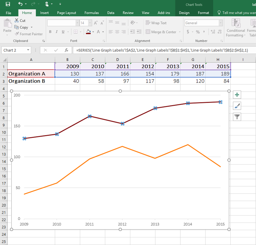
    First, set up your data table:
    Step 1 of how to label your line graph by going directly through the data points.

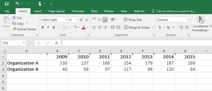
    Highlight the entire data table (A1 through H3), go to the Insert tab, and click on the line chart icon.

    You’ll get a 1990s-era default line chart:
    Step 2 of how to label your line graph by going directly through the data points.

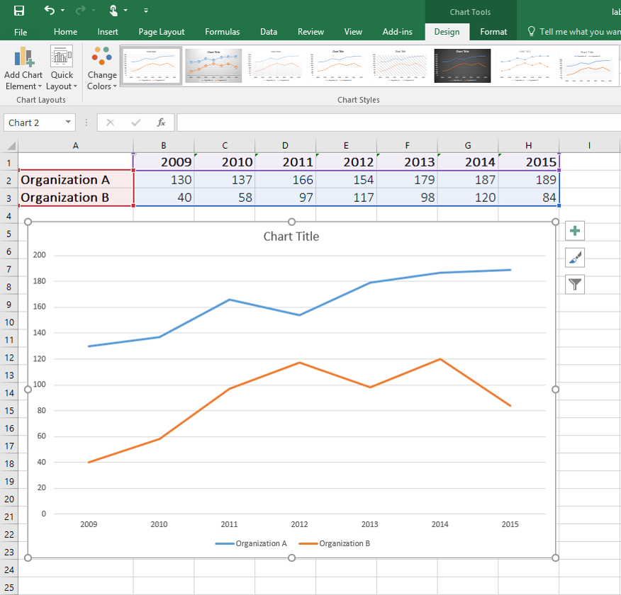
    Do some basic formatting.

    Adjust the y-axis so that the grid lines don’t appear quite so often (e.g., every 50 units rather than every 20 units).

    Apply a custom color palette (colors that match the organization’s look and feel rather than Excel’s blue and orange).

    You might even add light gray tick marks along the x-axis.

    Step 3 of how to label your line graph by going directly through the data points.

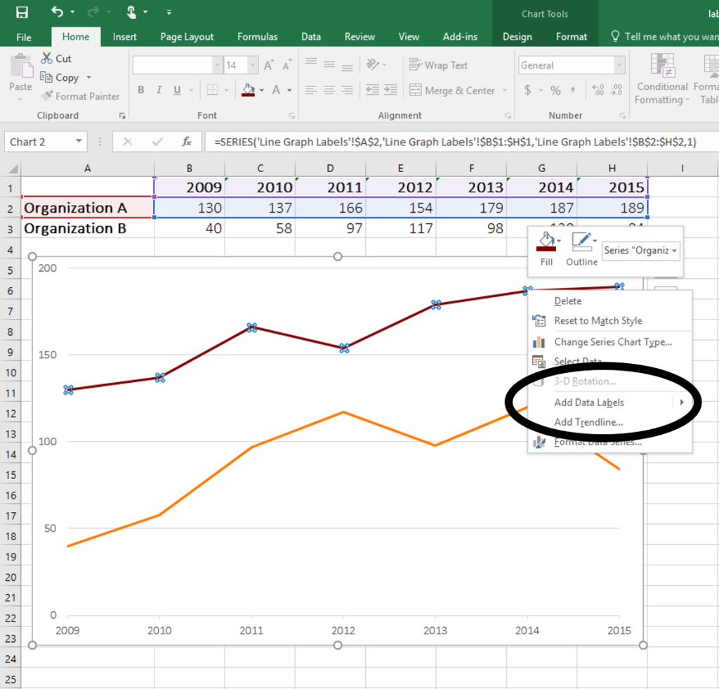
    Now let’s add labels.

    Click anywhere along the line, just once, and you’ll see little circles on top of each data point:

    Click anywhere along the line, just once, and you'll see little circles on top of each data point.

    Right-click on top of one of those circular data points.

    You’ll see a pop-up window.

    Click on Add Data Labels.

    Step 5 of how to label your line graph by going directly through the data points.

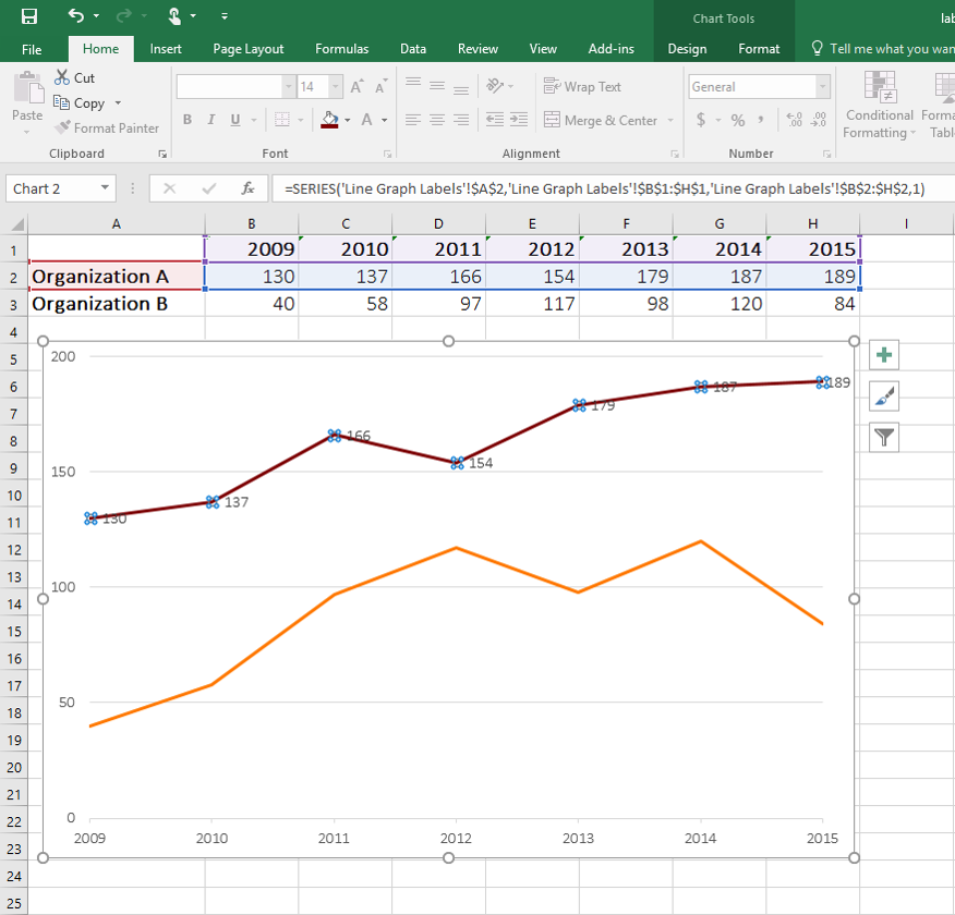
    Your unformatted labels will appear to the right of each data point:

    Step 6 of how to label your line graph by going directly through the data points.

    Click just once on any of those data labels. You’ll see little squares around each data point.

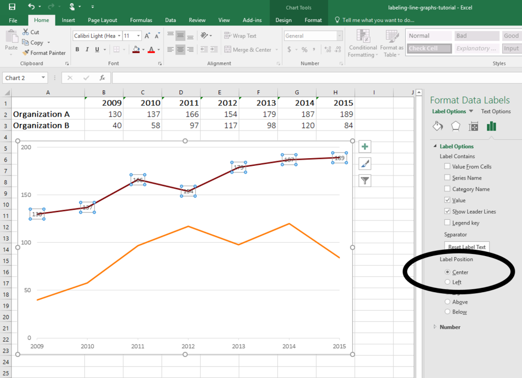
    Then, right-click on any of those data labels. You’ll see a pop-up menu. Select Format Data Labels.

    How to format data labels when labeling a line graph by going directly through the data points.

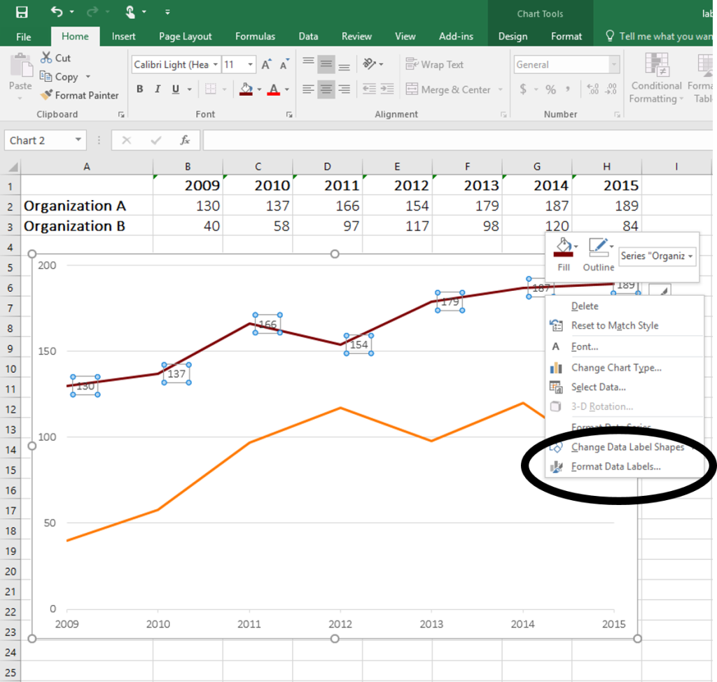
    In the Format Data Labels editing window, adjust the Label Position.

    By default the labels appear to the right of each data point.

    Click on Center so that the labels appear right on top of each point.

    How to center labels when labeling by going directly through the data points.

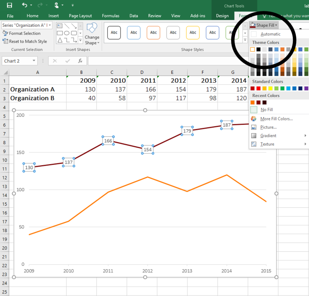
    Umm yeah. So the labels are totally unreadable because they’ve got a line running through them.

    Click on the labels again so that a square appears around the outside of the labels. Go to Shape Fill (the paint can icon) and fill each label with a white background.

    How to make data point labels legible by changing the shape fill.

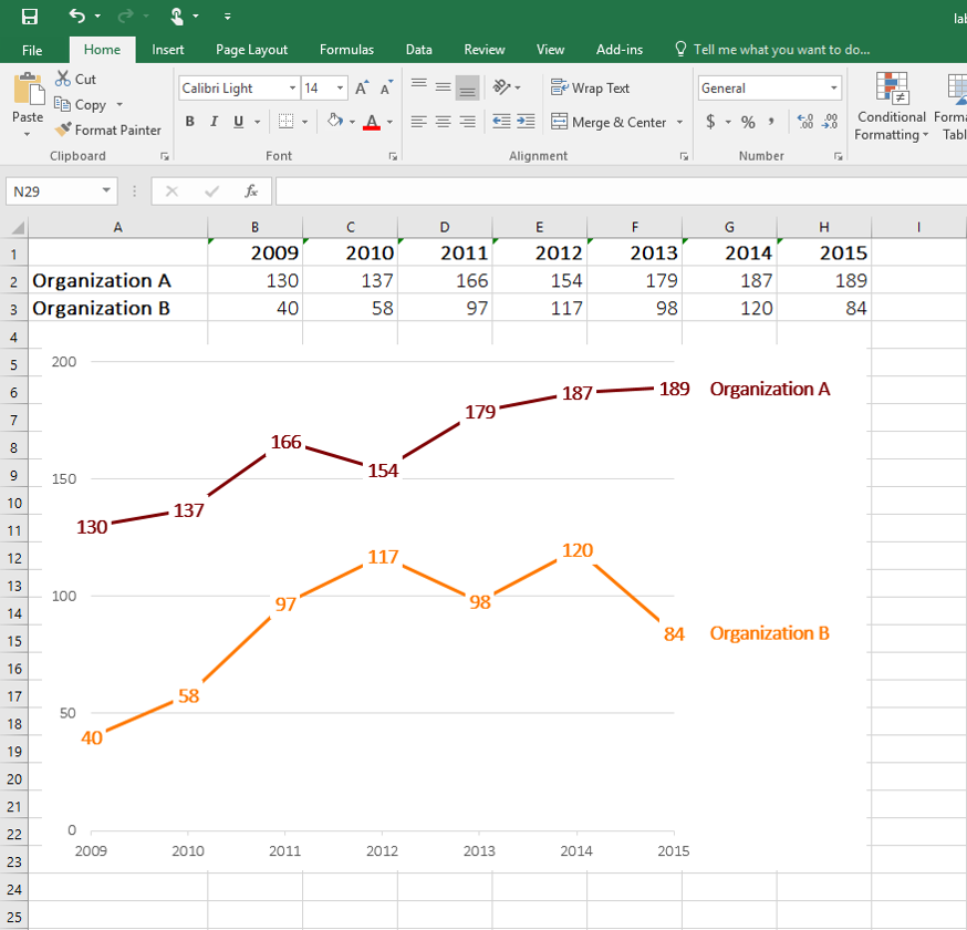
    Then, do the same thing to the orange line: Add data labels. Adjust the label position so that the labels are centered on top of each data point. Finally, fill the label with white so that the text is legible.

    Easy, right?!

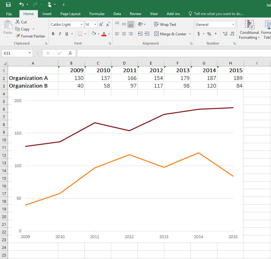
    Continue formatting a bit more. You might enlarge the label text and make that text bold so that it stands out against the gray axis labels. I often adjust the label colors so that the labels match the line (maroon numbers to match the maroon line, orange numbers to match the orange line).

    To add the Organization A and Organization B text, I would *usually* click Format Data Labels and check the box next to Series Name. In this example, that doesn’t quite work; you’ll need to manually add two text boxes.

    Final step of how to label your line graph by going directly through the data points.

    More about Ann K. Emery
    Ann K. Emery is a sought-after speaker who is determined to get your data out of spreadsheets and into stakeholders’ hands. Each year, she leads more than 100 workshops, webinars, and keynotes for thousands of people around the globe. Her design consultancy also overhauls graphs, publications, and slideshows with the goal of making technical information easier to understand for non-technical audiences.

    2 Comments

  • […] K. Emery shows how to place chart labels directly on a line graph. Instead of doing this for all the data points, you could select one or two key points, and format […]

  • […] Add numeric labels through the center of each line–Edward Tufte’s graph table, my favorite chart type–as demonstrated in my tutorial. […]

  • Leave a Reply

    Your email address will not be published. Required fields are marked *

    You Might Like

    Our complimentary mini course for beginners to dataviz. Takes 45 minutes to complete.

    Enroll

    Need practical how-to tips? In this course, you’ll learn how to make great graphs inside software you already have. Includes beginner, intermediate, and advanced tutorials for making charts from start to finish.

    Enroll

    Subscribe

    Not another fluffy newsletter. Get actionable tips, videos and strategies from Ann in your inbox.