Leave a Reply

Your email address will not be published. Required fields are marked *

No more Frankensteined slides!

Last updated

Mar 13th, 2026

Related resources:

,

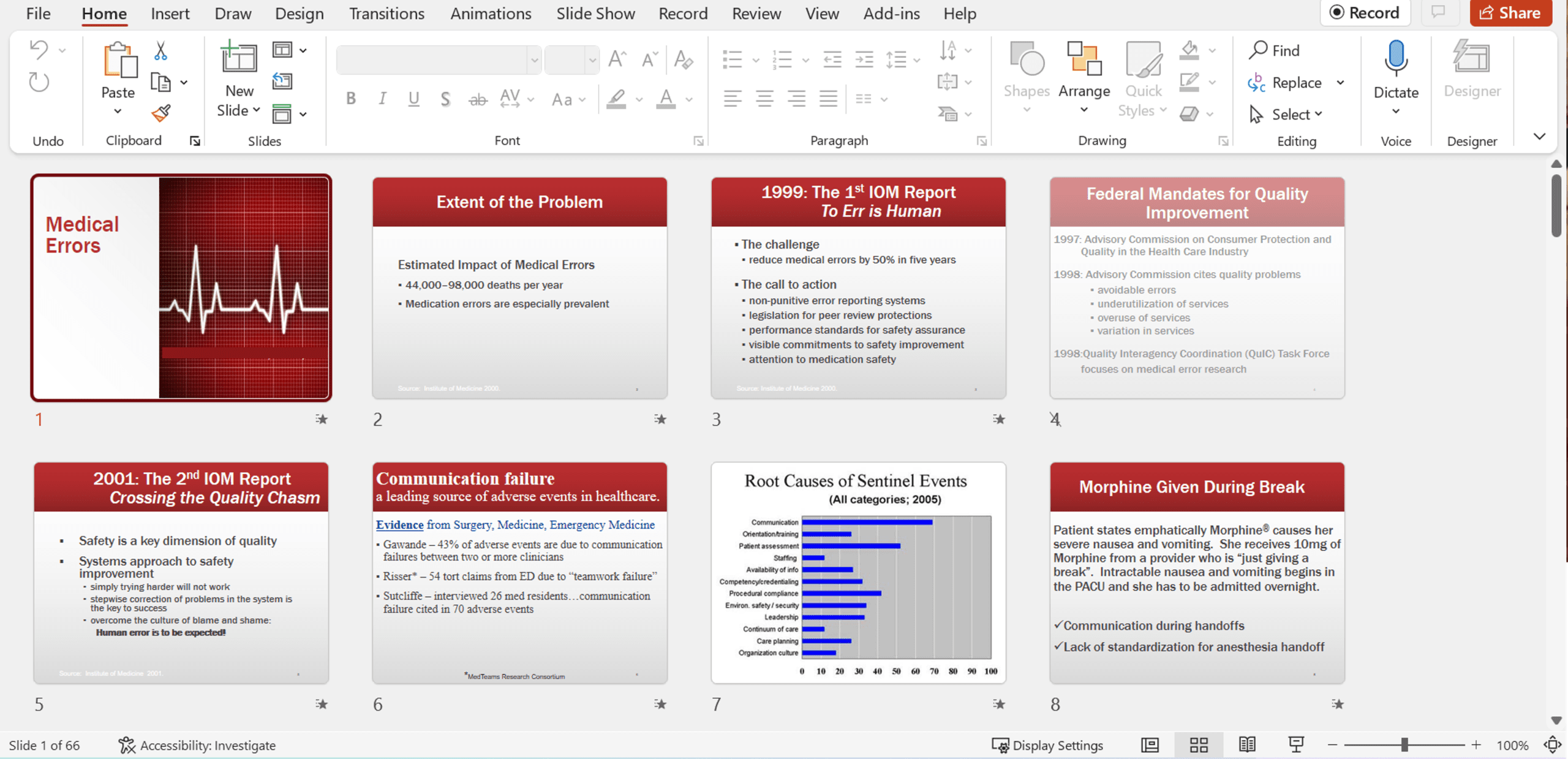
Unfortunately, you’ve seen Frankensteined slides.

(Not Jacob-Elordi-in-Frankenstein cute. But a monstrous mess.)

A mix of font sizes, colors, alignment, spacing, and graph styles.

Text heavy.

Boring graphs.

Barely alive.

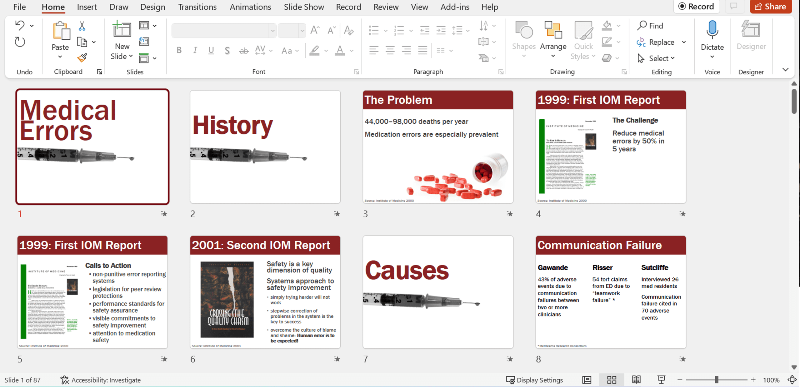
You deserve Jacob-Elordi-as-Heathcliff gorgeous slides!

Professional. Streamlined. Intentional. Visuals on every slide. Skimmable. Accessible.

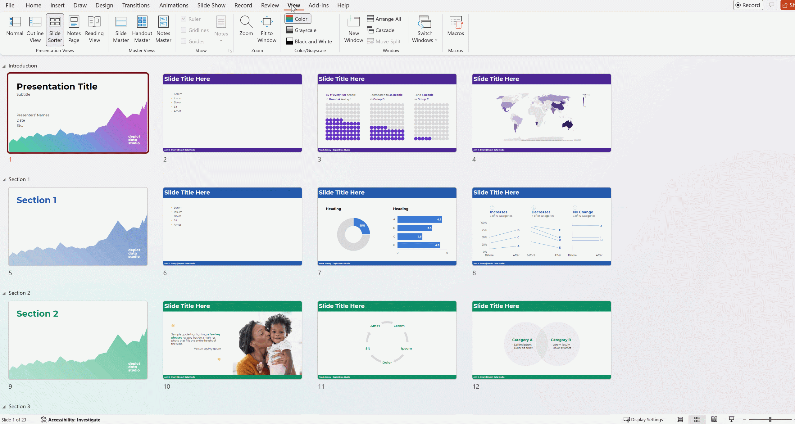
Slide Templates help you avoid Frankensteined Slides

Templates also eliminate the “stare at a blank slide” tax. You start with a ready-made structure that does the heavy lifting for you.

Templates save hours of formatting time. A good template bakes in hierarchy, spacing, and structure—so you can focus on your message, not nudging text boxes pixel by pixel.

Templates scale your best design practices across the whole org. Even non‑designers can produce clean, on‑brand slides because the template does the heavy lifting.

Do you really have slide templates…?

Most companies I work with think they have templates – but they don’t.

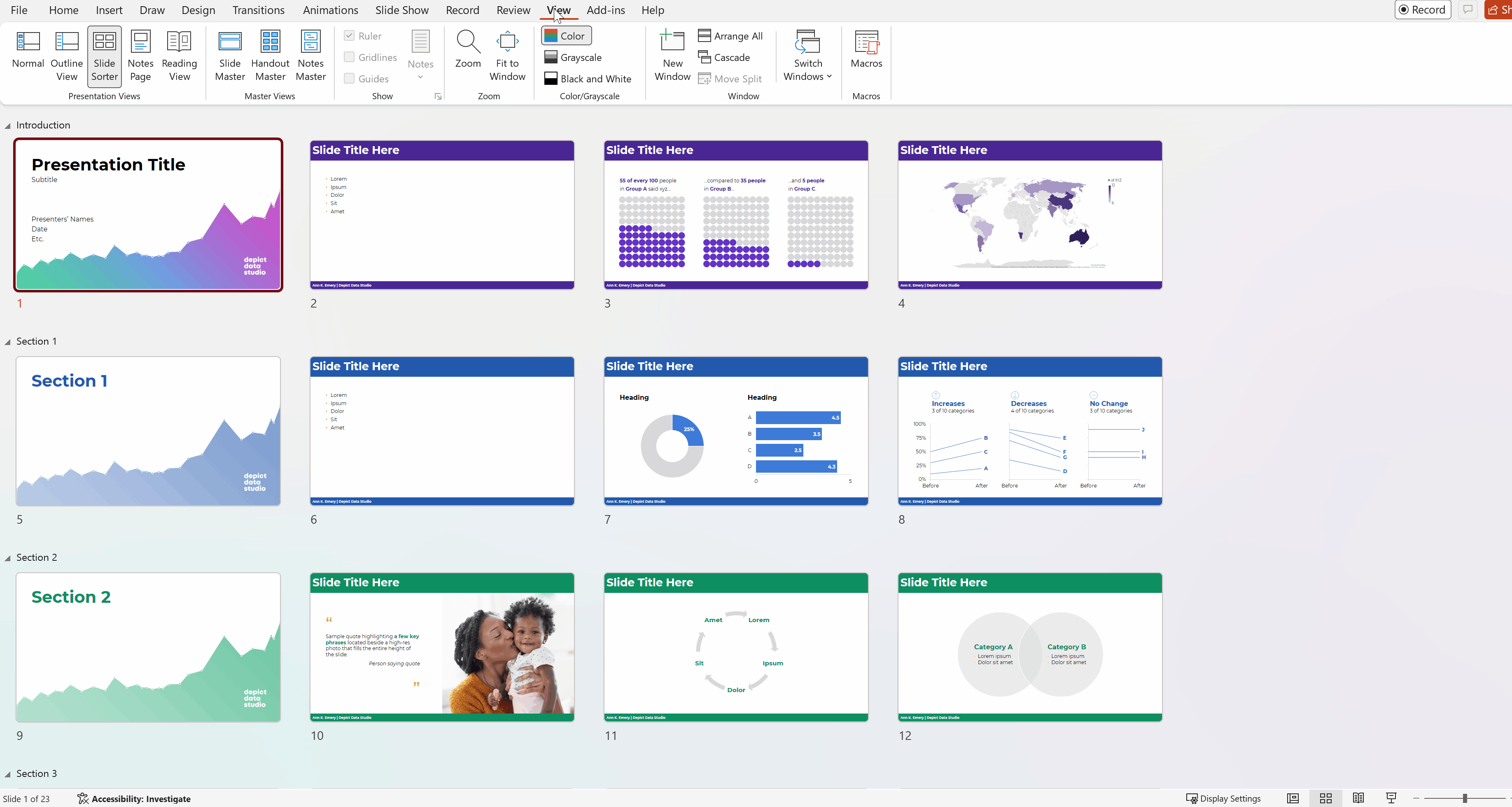
Here’s how to check: When you insert a new slide, do you see Microsoft’s defaults? Or your custom-designed slides?

Ann K. Emery

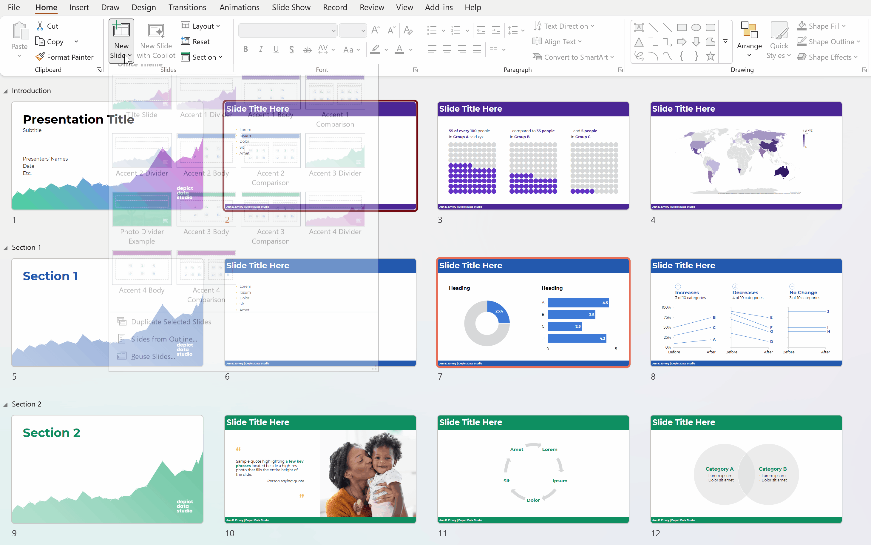
Setting Up the Slide Master

Templates live behind the scenes, in the Slide Master.

Go to View –> Slide Master and make sure you’ve got ’em there.

Heads up: The Slide Master is a massive pain. Counterintuitive. All sorts of quirks.

Ann K. Emery

Your Turn

What sorts of questions do you have about the Slide Master?

Comment here and let me know.

I might even make a new blog post or YouTube video for you.

More about Ann K. Emery
Ann K. Emery is a sought-after speaker who is determined to get your data out of spreadsheets and into stakeholders’ hands. Each year, she leads more than 100 workshops, webinars, and keynotes for thousands of people around the globe. Her design consultancy also overhauls graphs, publications, and slideshows with the goal of making technical information easier to understand for non-technical audiences.

Leave a Reply

Your email address will not be published. Required fields are marked *

You Might Like

Our complimentary mini course for beginners to dataviz. Takes 45 minutes to complete.

Enroll

Unlocking Creativity: Simple Steps for Non-Designers to Build Powerful Visual Frameworks

Want to make sure your presentation sticks with people? Visual frameworks are diagrams that help your audience see how everything fits together. In this post, you’ll go behind the scenes with Kate Hall to see how she developed a framework for a customer service training at her library.

More »

Want to design better slides? Terrified of public speaking? Learn how to avoid Death by PowerPoint by mastering the Message-Design-Delivery framework.

Enroll

Spreadsheets to Stories
Weekly Newsletter

You’ll receive:
  • how-to tutorials about data management, analysis, visualization, and storytelling;
  • spreadsheets to download so you can try it yourself; and
  • the latest info about our online courses.

    Our weekly newsletter is shared with a community of 8,000 professionals.