I love Echo Rivera’s enthusiasm and humor towards communicating scientific results. I’m often asked to talk about why visuals are so powerful, and I reached out to Echo to get her take. I know you’ll enjoy her article. She even has a free starter pack with worksheets and templates just for you. — Ann
Friends! #VisualsAreMagic for effective research communication.
I’m not exaggerating. A great visual with a teeny tiny bit of text (as in, like, up to 5 words) will make your point better than a slide full of bullet points ever will.
There is nothing else that maximizes efficiency & effectiveness that well when it comes to getting your audience to pay attention, understand, remember, and use the information you share with them. Plus, it’s part of being an effective research communicator, which is good for your career.
My passion for the last 10 years has been about engaging, visual presentations. I’ve tested many different strategies, constantly tweaked my process, and read research articles/books (with lessons from the fields of cognitive science, graphic design, information design, psychology, and others).
Let me save you the trouble of spending all that time and energy, and share the basics of what you need to know.

#1. Using Good Visuals Saves You Time
I know you’ve heard it before: A picture speaks 1,000 words.
Most of the time people say it to remind us that pictures help other people understand something quickly, at-a-glance. And, that’s true (and is the basis of reasons 2-4)
But let’s flip that around and think about what that means for the presentation creator (i.e., us).
Which sounds more time intensive: Dragging/dropping a picture -OR- typing out 1,000 words? Even compared to typing out 50 or 100 words, it’s easy to see that adding a picture saves you time compared to writing out a bunch of text.
And I can speak from experience. Once I created a good workflow and my own visual database, I’ve been able to take all the text/bullets from my presentation and turn it into to stunning visuals in minutes.
Seriously. MINUTES.
If you’re feeling like you already spend a lot of time on your presentations and you don’t believe that it could take less time, then it might be worth seeing if you’re spending time on ineffective strategies.

#2. Visuals Help You Catch and Hold Your Audience’s Attention
It is soooo hard to get people’s attention these days. Just about everyone has a computer in their pocket or a tablet/laptop in their bag. With this escape at their fingertips, the second they’re bored, they’re going to do something else.
And the quickest way to make your audience bored? Throw a wall of text/bullet points up on the screen.
Hard truth time: While you may be tempted to give up and shout that you’re fighting a losing battle, that’s just the easy way out. It’s easy to blame others for why we feel we made less of an impact than we wanted (deficit model, anyone?)
It’s ultimately our responsibility to keep our audience engaged. Or, at least, do everything you can to keep them engaged. *Yes, ok, in the case of a required course you may have some students who really just don’t want to be there and nothing will work. But you can’t control that, and should still try to make your lectures as engaging as possible for other students.
What are things you can do to keep them engaged? Yup, visuals.
Our human brains prefer visuals over text, so use that to your advantage, and get a head start! Your audience will be more likely to look at your slide if you have a good visual on it than if you have text. And that’s step 1. If you struggle to get people to look at your slides, you’ll have a hard time getting them to understand and remember what you said.
#3. Visuals Help Your Audience Quickly Understand Your Material
If you ever find yourself saying, “I’m not going to read the slides to you…” then chances are you’ve just set your audience up for failure.
We already know that our brains process visuals much quicker than text. But, there is still a lot going on in our brains that can bog down our working memory. Our working memory is that space where we’re processing, thinking, and trying to fit that new bit of info into its new “home” in our brains.
It’s really easy for us to get overwhelmed in this space. Especially if there are distractions, we’re tired, or get confused. The quickest way to make your audience overwhelmed and confused? Speaking while you have a lot of text on your slides.
This is especially confusing when people say things that are different than what’s on the slide. Think about what that means for your audience. I mean really think:
- There you are with a bunch of text on the slides…but
- You just told your audience that you aren’t going to read the text…so
- That means they now have to read the slides,
- AND try to pay attention to what you’re saying, which is different than what’s on the slides,
- AND try to take notes or process the material enough so it can transition into long-term memory.
Friends, that’s almost impossible to do.
Remember: It’s your job to help your audience process information, on the spot, easily and quickly. That’s why using visuals is probably the most helpful thing you can do for your audience, and for you. Using more visuals is a win-win, because it also sets YOU up for success as an effective communicator. The more you use (good) visuals, the less likely you’ll find yourself doing what I just described.
#4. Visuals Help Push New Information into Long-Term Memory
This one is closely tied to #3 (working memory), so I’m not really going to go into much detail.
Research shows that the combination of a great visual + a teeny tiny bit of text (around 5 words) increases the chances of information making it to long-term memory.
Text/bullet points are pretty bad at this task.
So, again, you increase the chance of your audience’s success by using great visuals and limited text.
#5. Visuals Are More Likely (than Bullet Points) to Resonate with and Inspire People to Act
I am most interested in research/evaluation/teaching that has a goal to increase social equity. I want my work to contribute to positive social change, and I like to work with people who share that same value.
For those of us who care about such things, we care deeply that our work has a positive impact and inspires people to act. Building on what we’ve already talked about, chances are you’re giving a presentation for a reason. Hopefully, that reason is you want your audience to use the information for some type of positive social change.
So, let me ask you this. How will your presentation inspire people to act if they:
- didn’t even pay attention?
- were confused by what you said?
- misunderstood what you said?
- forget the info a week later?
- didn’t enjoy the experience and were bored and uninspired?
- You already know the answer: It won’t.
But great visuals? Great visuals have the power not only to meet all the goals we’ve already talked about (getting people to pay attention, understand, and remember), but they have the power to move people.
Watch a few TED talks and you’ll see what I mean. Most TED talks are brief, superficial, and lack substance. BUT… the visuals and passion coming from the speakers will move and inspire in ways you probably didn’t expect. Hans Rosling has some great dataviz ones, so I’d recommend to watch his first.
#6. Using Good Visuals Makes You an Effective Communicator, Which is Good For Your Career
While right now the tenure system doesn’t specifically value effective research communication, there is a push to change that culture. If you’re paying attention, you’ll easily see the momentum forming in the natural, physical, and social sciences for researchers to do better at research communication.
Researchers, academics, scientists, and evaluators are on Twitter (including me: @echoechoR) and have blogs where they talk about their work. Our goal is to be better communicators and help make research more accessible to a broader audience.
That’s why I encourage everyone to jump on board and join this growing movement of effective science communicators (#scicomm).
But even before that cultural shift happens, if you communicate research effectively (which includes using good visuals), then any or all of these could happen:
- You will become a more effective speaker
- You will have more time to spend on your writing or research, while also increasing the quality of your presentations
- Your presentations will be more memorable
- Your students or audience will have a better understanding of your material
- You will spend less time answering basic questions, and more time having thoughtful discussions
- Your audience will have a positive experience with your presentation
- You will come across as more approachable/accessible to your audience
I’m not just guessing at these, either. I have personally experienced these benefits as a direct result of using high quality visuals in my presentations. That’s because using quality visuals does more for you than just “prettying up” your slides. But alas, that is perhaps a post for another day!
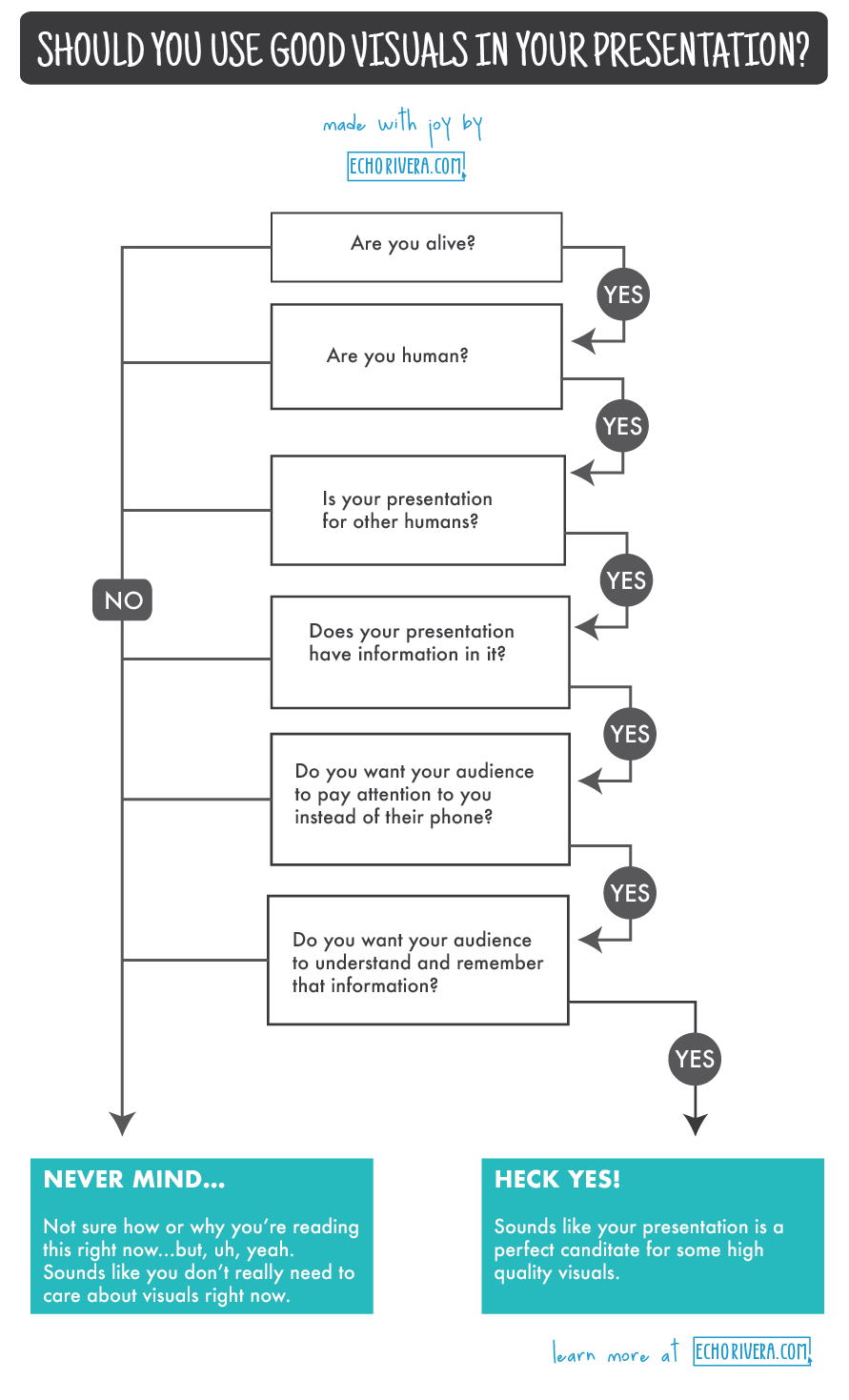
So… Should You Use Visuals?
The answer is Yes.
For more tips on how to create better presentations, check out my FREE starter kit. My starter kit comes with information design strategies, a workflow checklist, a ppt file to help you create your own slide design, and a storyboarding worksheet.
Learn More from Dr. Echo Rivera
Connect with Echo:
Twitter: @echoechoR
Website: echorivera.com
YouTube: Channel Link
To learn even more from Echo, check out her free starter kit:


Leave a Reply