I met Sara DeLong when I spoke at her organization last year. I previously invited her to write about the 30:3:1 approach to reporting. Sara’s work continues to impress me every time. Check out her latest tutorial, which is all about report redesign strategies that can be accomplished with everyday software you already have. –Ann
You know the document. It’s the one your agency references over and over again, but nobody has the time to redo or update such a long reference guide. This year, I had a 120-page HIV testing program protocol from 2009 that desperately needed a content and formatting overhaul. So I tried Ann’s tips on redesigning reports, and here is what I learned.
This project took several months because I was working on it alongside other projects. I completed this whole update in Microsoft Word. There were two phases of this project, content editing and redesigning the layout of the report.
[I use the term “protocol” in this blogpost to refer to document containing a set of requirements that need to be met for a funded agency to run a specific program or project.]
Redesign Tricks that Work
Here are four strategies for redesigning your report: 1) add color, 2) add more visuals, 3) add checklists and summary lists, and 4) create a 20-minute cover.
1. Add Color
I added color to each section of the protocol so the viewer can quickly tell which part of the guide they are reading.
Bold color helps break up the long document and makes it more engaging. I also included an overview at the beginning of each section, so the audience knew what information they would find in each part of the protocol.
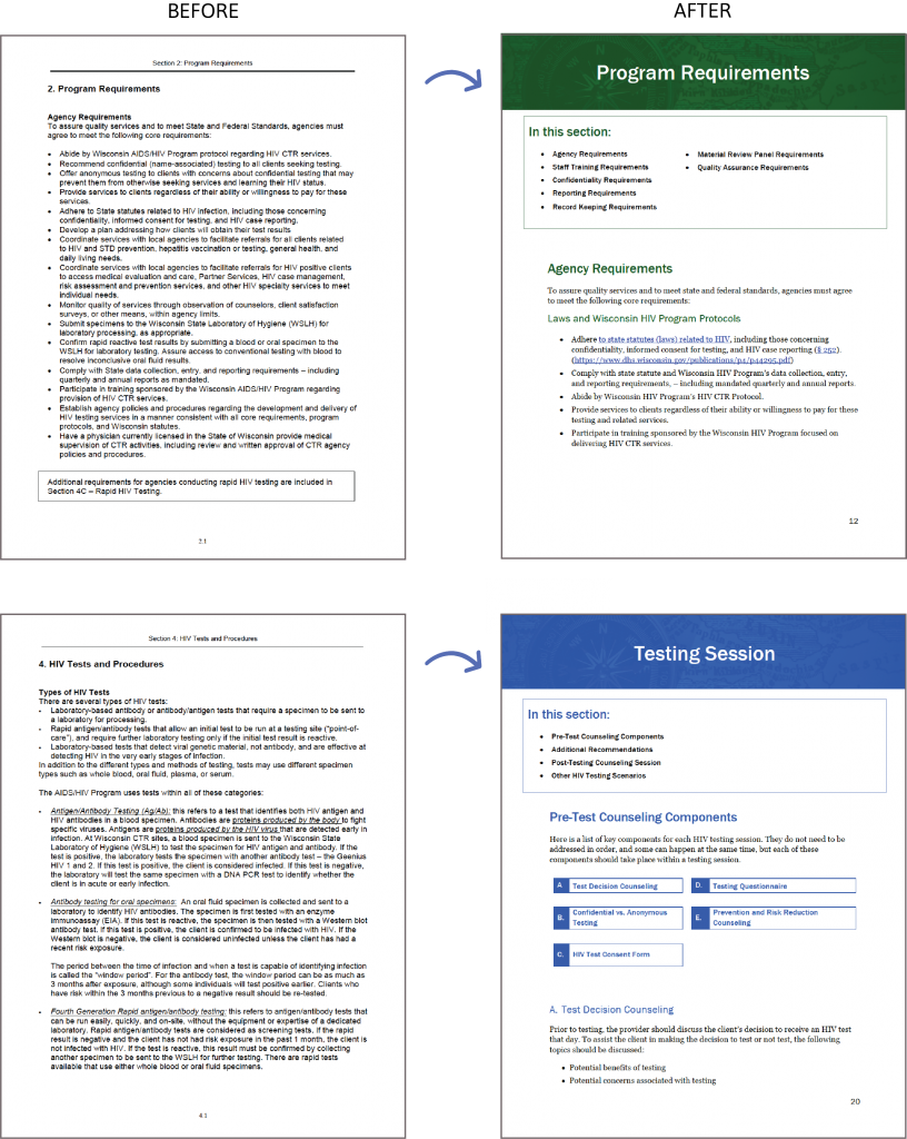
When selecting colors from your agency’s brand colors, try to choose colors that have high contrast against a white background. The American Disabilities Act includes a section on 508 compliance, which means that all content on a website must be accessible to people with disabilities. This definitely applies to text. I use this color contrast tool to determine if my colors meet the federal recommendation of WCAG 2.0 level AA standards. Your colors should at minimum be AA compliant if you are adding color to your text.
Tips for Adding Colored Blocks Behind Text
Here is a trick to create more accessible documents and save you time when you are adding color to your headers and sub headers:
- Format your heading exactly as you want, including font, font size, and color.
- Highlight the text you want to be the heading and right click on Heading 1 at the top of your page (see picture below).
- Select “Update Heading 1 to Match Selection.”
- Now anytime you want to format your text as Heading 1, just highlight the text you want to format and click Heading 1 at the top of the page. Boom. Done.
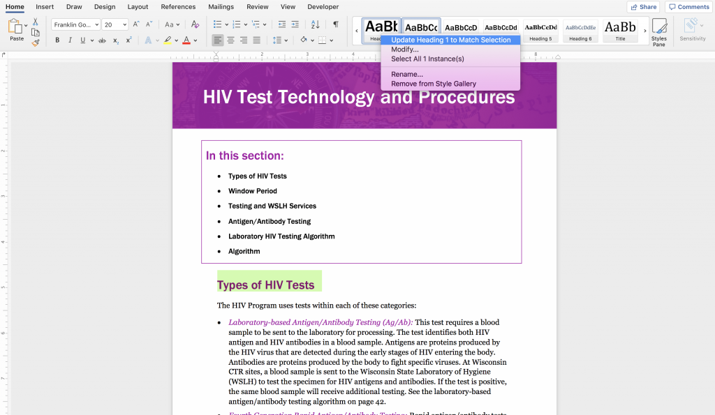
This shortcut works for multiple headings and sub headings and is a major time savor when reformatting documents. This strategy also helps make your document more accessible under 508 compliance guidelines because it helps software for people with disabilities better navigate your content.
2. Add More Visuals
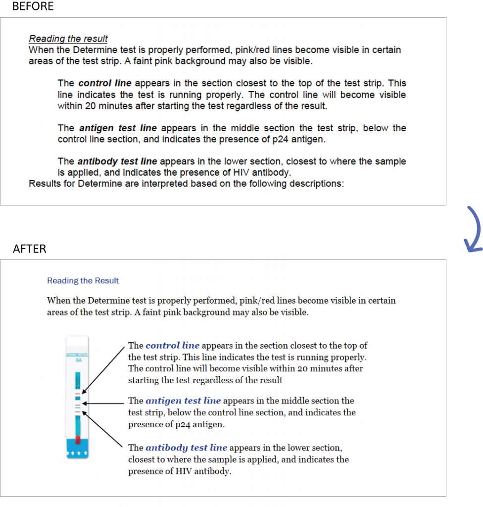
To make our agency’s document more reader friendly, I wanted to add as many visuals as possible. I looked for places where a visual might help the audience better remember the content. This could be icons, photos, diagrams, timelines, etc. All of these help break up the text for a reader.
3. Add Checklists and Summary Lists to Long Documents
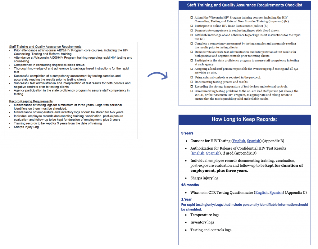
This is a lengthy document, so to make it easier for our partners to use, I added check lists and summary boxes with color for quick, easy reference.
These check boxes can be found under the bullet lists in Word.
I broke down the longer lists into more digestible groups that could be taken out of the protocol and used independently.
4. Create the 20-Minute Cover
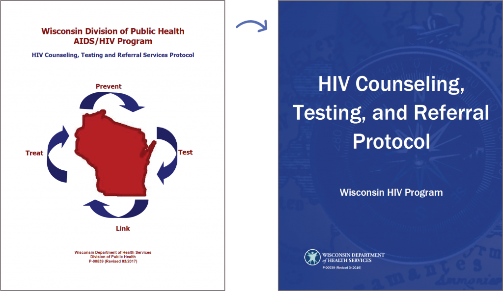
This cover really did take just twenty minutes to design.
I chose a compass for the background because these program guidelines provide guidance and direction for our grantee agencies who conduct HIV testing around the state.
I also used a photo of a compass as the background for each of my section headers to build continuity throughout the whole document.
Report Cover Tips
Try these additional tips when creating your cover:
- Consider the main points of your report or protocol when searching for photos. Use your main ideas to guide your photo searches. Think of what your protocol or report symbolizes and start by typing those words into the photo searches.
- Avoid images and clip art you see regularly. For example, try to stay away from pictures of puzzle pieces, big question marks, and light bulbs. A good rule of thumb is if you have seen it a lot then it might be overused.
- If you are going to use a picture of people in the background of your cover, consider what color you put over your photo. Some colors like green or red may unintentionally make the people in your image look sick, or it could just be unflattering.
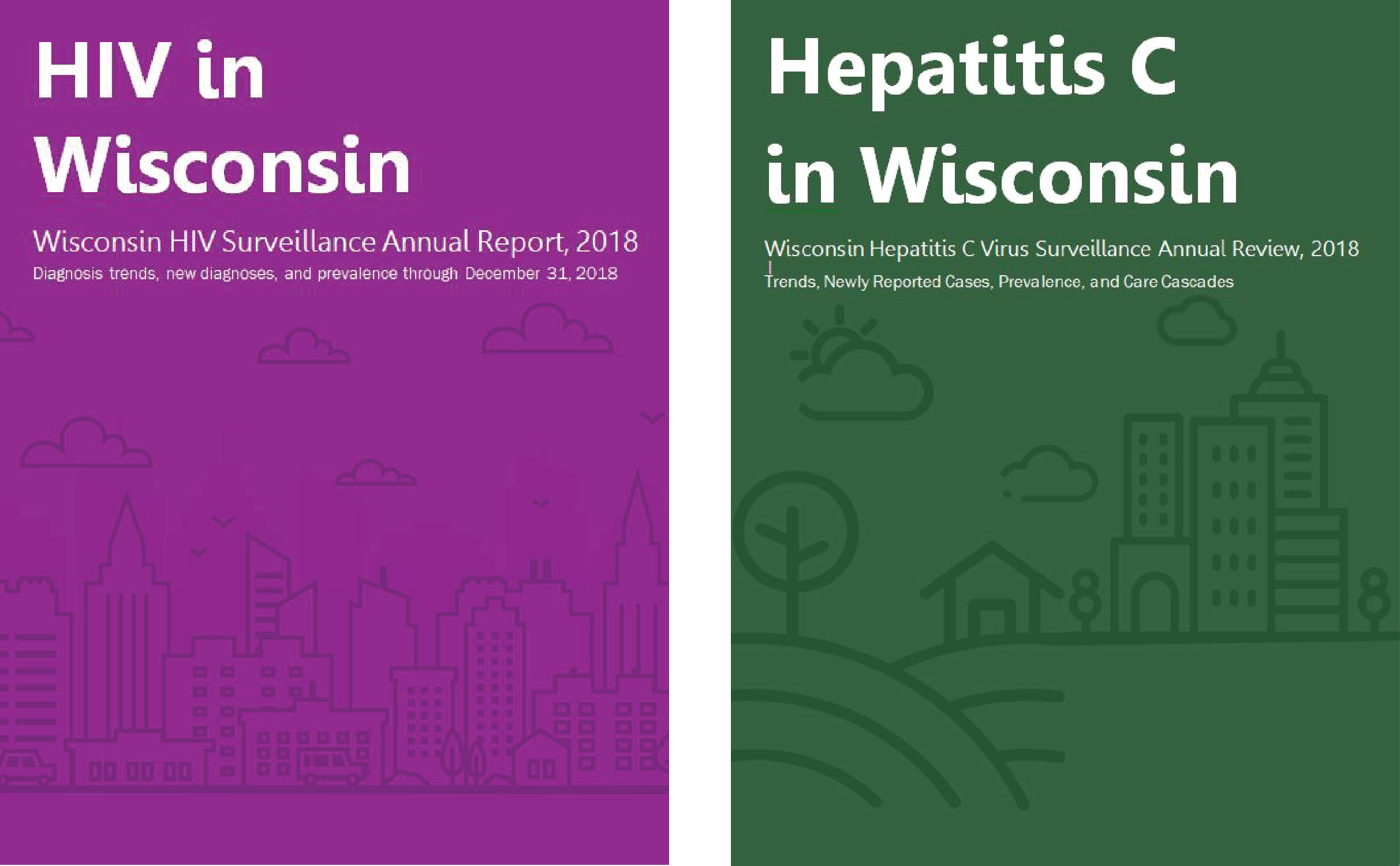
- Another option is to use a large icon or vector image to fill the background of your cover. Choose an icon that fills your whole page. Check out these other two reports where I used an icon instead of a photo:
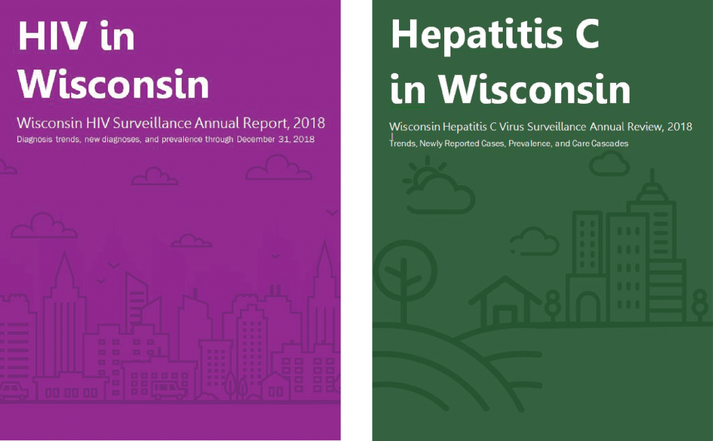
Result
To redesign this protocol, I added color to my section breaks and headers, included more diagrams and visuals, created easy to use checklists to make this long document more user friendly, and inserted a 20-minute cover. Ann’s blog post helped launch this redesign, and then I was able to build on her recommendations. I was surprised that her cover strategy works and really only took 20 minutes to find a photo and design the cover. Using a different photo with each report makes each cover unique and saves me from having to come up with a new cover design for each publication.
Deciding on colors and fonts upfront also saved me lots of time during the redesign phase. It minimized the number of decisions I had to make while reformatting the document. I have received positive feedback from our partners that this version of the protocol is more user friendly and accessible. It is easier to find and retain the key information they need to know about their program.
Going through this redesign process helps legitimize our department and show that our content and program requirements are up to date with the latest national guidelines. This helps build rapport with our grantee agencies and minimizes the number of repeat questions that are now readily answered in this easy to use protocol.
A Data Visualization Style Guide
Redesigning this protocol inspired me to create a data visualization style guide for my department, similar to a communications style guide. A data visualization style guide establishes color, font, line, and size guidelines for charts and maps, so anyone can make charts or reports in our department, and they will all look cohesive and align with our brand.
Here are some examples of data visualization style guides.
Branding continuity builds trust with your key stakeholders and makes you and your work look more professional.
Learn More from Sara DeLong
Subscribe to my blog, so you will be the first to know when I post about creating this data visualization style guide!

Leave a Reply