
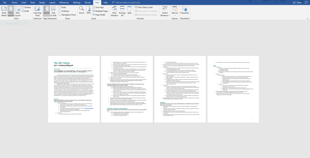
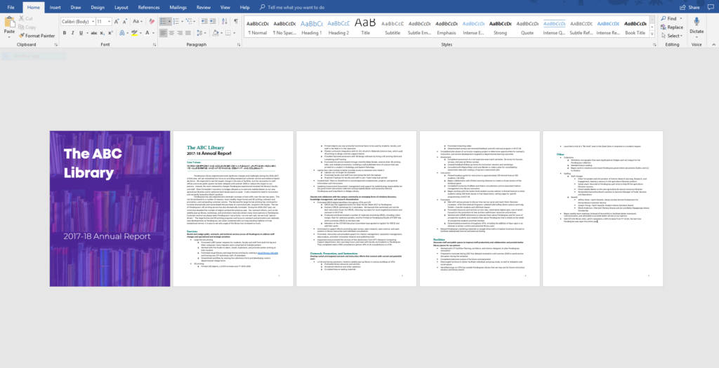
Most of my early reports looked exactly like this: a few pages of 11-point font and some bullet points here and there.
Except… Mine were way worse! I loved to write 100 pages of 11-point font and bullet points instead of these four summarized pages.
If you’re a full-time graphic designer, then you have 40 hours a week to get fancy with covers and other visuals.
But if you’re a full-time researcher, evaluator, scientist, or university faculty member (like this report’s author), your time to mess around with reports is limited.
I’m going to walk you through five easy steps that you can tackle in just two hours:
- Add a 20-Minute Cover
- Add a Text Hierarchy
- Color-Code by Section
- Add Intentional Page Breaks
- Add More Visuals
Step 1: Add a 20-Minute Cover
Covers for short reports are optional, but they sure add a lot of visual interest to a text-heavy report.
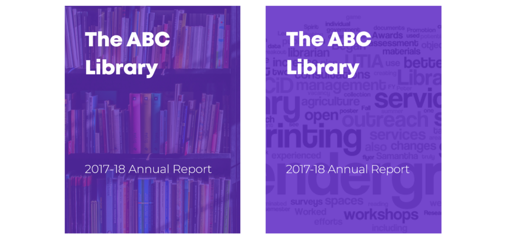
I experimented with two 20-Minute Covers. The first cover is a full-bleed photograph. The second cover is a word cloud made from the report’s key words.
Here’s how I added the 20-Minute Cover with the full-bleed photo:
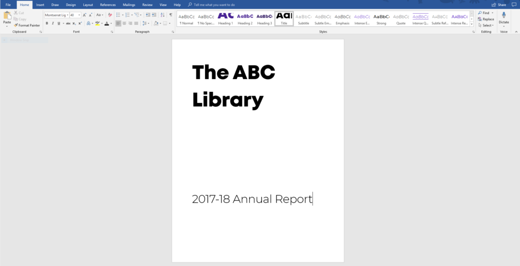
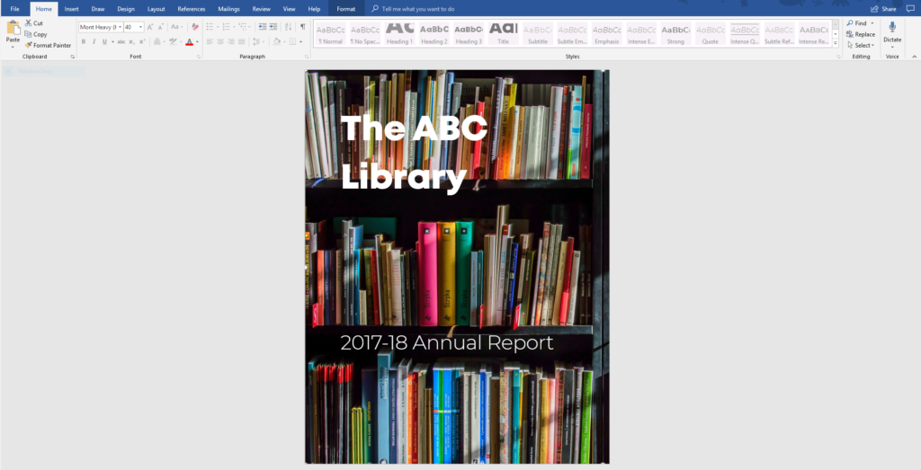
I added a new, blank page to the beginning of the document. I typed The ABC Library and 2017-18 Annual Report in large font.
You’ll use your institution’s fonts, not mine.
I went to www.Pexels.com and searched for library. I like Pexels because it has enough options without having too many options. You’ve got better things to do than spend your entire afternoon searching for stock photography. Plus, the photos on Pexels are free for both educational and commercial use.
If your organization already has its own repository of stock images—great! Use those.
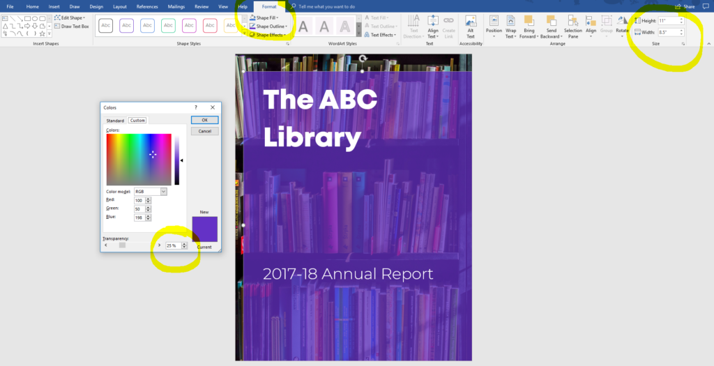
I downloaded this photograph of a bookshelf.

I inserted the image file into my Word document.
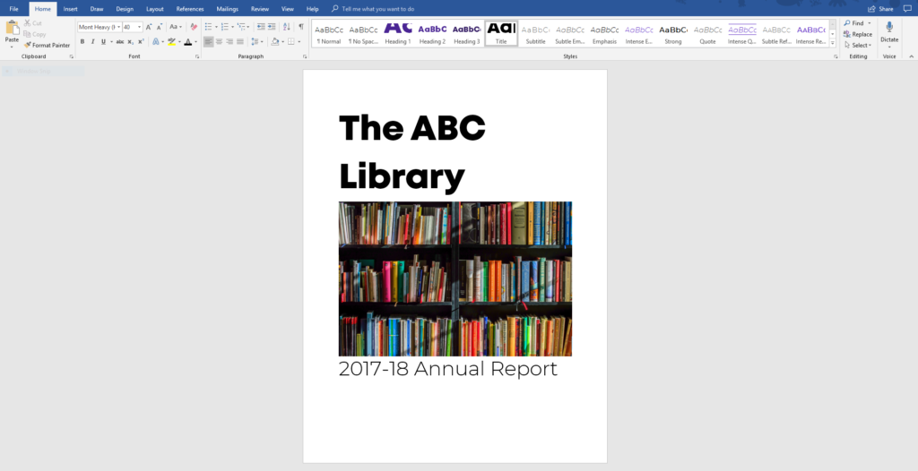
I moved the image behind the text. To do this, I clicked on the image, went to Picture Tools: Format, and selected Wrap Text: Behind Text.
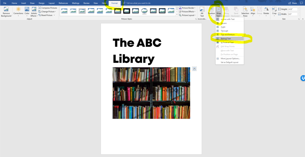
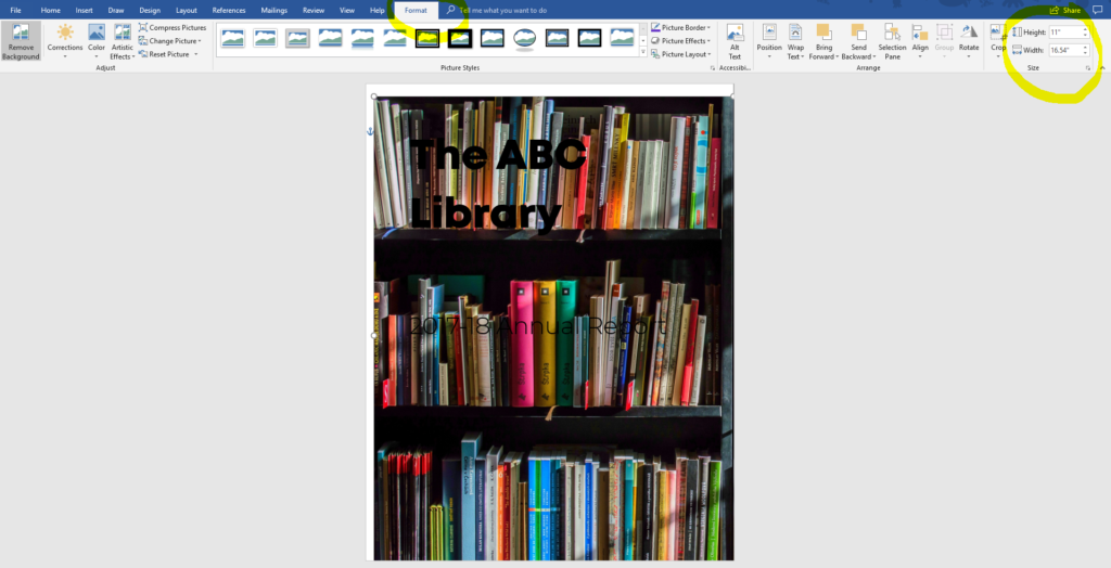
Tiny photos are so 1995. Nowdays, the bigger, the better. I wanted a full-bleed photograph; in other words, a photograph that filled the entire page with no margins whatsoever.
I enlarged the image until it filled the page (11 inches tall).
The photograph and the words were competing for attention, so I changed the font from black to white.
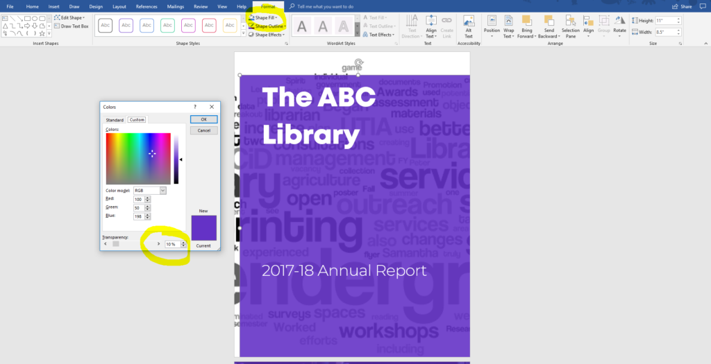
It was still too hard to read the text. I covered the image in a semi-transparent purple rectangle. You’ll use your institution’s color palette, not mine.
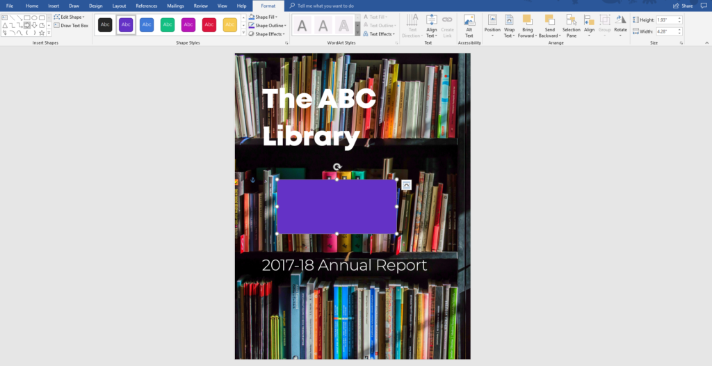
You’ll need to experiment with different transparencies (e.g., 10%, 20%, 30%, or higher).
Here’s how I added the 20-Minute Cover with the word cloud:
I added a new, blank page to the beginning of the document. I typed The ABC Library and 2017-18 Annual Report in large font.

I highlighted the entire report’s contents with a CTRL + A keyboard shortcut.
I went to www.wordle.net to make a word cloud. This site works best with Internet Explorer.
I spent 19 of my 20 minutes updating Java and giving permissions for the site to run on my computer.
I pasted the report’s contents into Wordle.
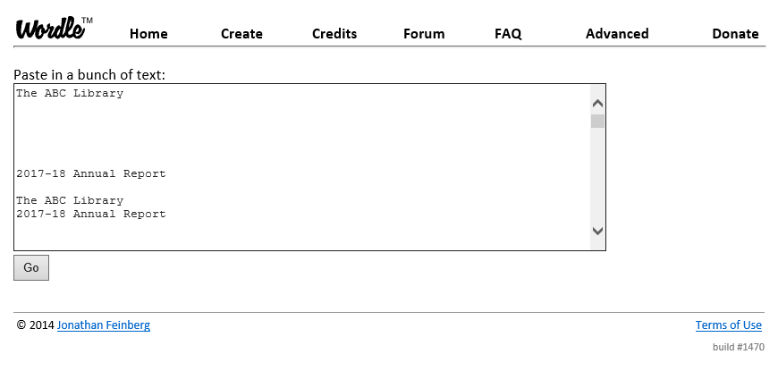
I adjusted the word cloud’s settings. I used horizontal text (I didn’t want distracting vertical text on my cover). I selected a Sans Serif font. I chose a grayscale color scheme.
I downloaded the word cloud.
I inserted the image file into my Word document.
I enlarged the image until it filled the page (11 inches tall and a million inches wide).
I moved the image behind the text. To do this, I clicked on the image, went to Picture Tools: Format, and selected Wrap Text: Behind Text.
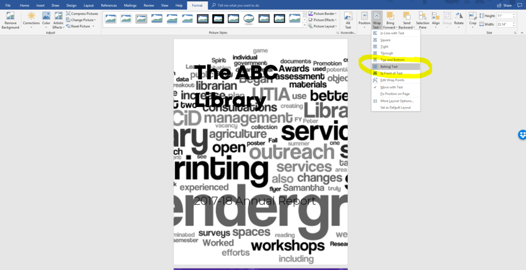
The word cloud and the words were competing for attention, so I changed the words from black to white and covered the word cloud in a semi-transparent purple rectangle.
Which 20-Minute Cover is your favorite?
I liked the photograph better than the word cloud.
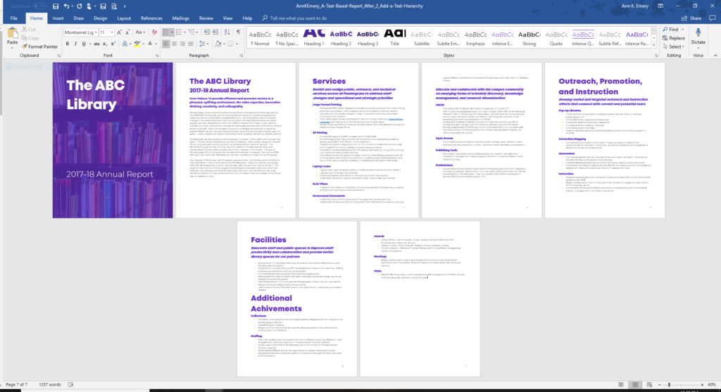
Step 2: Add a Text Hierarchy
When you zoom out and glance at the report, nothing stands out. It’s just a sea of text because everything is size 11.
I enlarged the Heading 1s from size 11 to size 38 bold. I often use even larger font for my headings (40s, 50s, or even 60s). But, some of the headings were long, and I didn’t want them to spill onto a third line. I kept all the headings to just one or two lines of text.
I also enlarged the Heading 2s from size 11 to size 13 bold.
Finally, I changed the black text into colored text to further differentiate the Heading 1s and Heading 2s from the regular ol’ body font.
Now, you can spot the sections of the report at a glance.
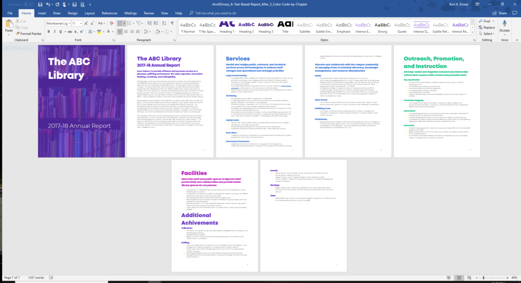
Step 3: Color-Code by Section
It’s a short report but it still feels dense. We need to break it up even more. Readers love skimming.
I color-coded the headings by section:
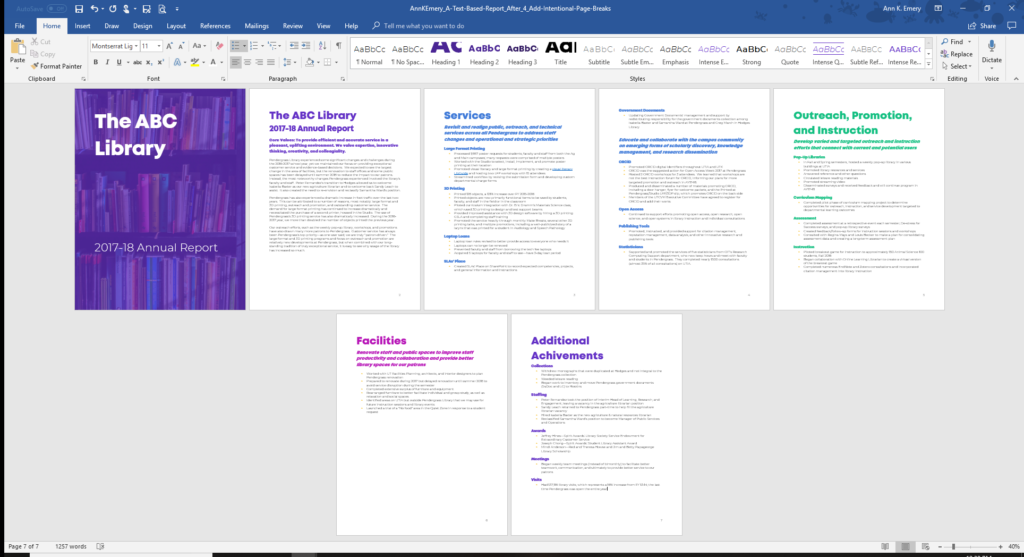
Step 4: Add Intentional Page Breaks
Make sure every section begins on a new page.
I use CTRL + Enter to add page breaks (rather than pressing the Enter key a dozen times).
Intentional page breaks are the easiest edit, yet researchers, evaluators, and scientists shy away from page breaks.
Why are we so afraid of white space? It’s not going to bite us.
Why are we so afraid of adding another page or two to our already-way-too-long reports? A well-designed report beats a non-designed report every time, regardless of the length.
Step 5: Add More Photos
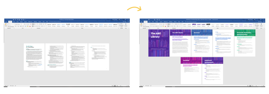
The zoomed-out, at-a-glance view was really coming together! Our readers can see that the report has a few different sections because each section begins on a new page, with large font, and in a new color.
I still needed to add visuals. I suggest aiming for one visual per page—a graph, photograph, table, diagram, logo, etc. It would be great to comb through the entire report and find ways to incorporate graphs, tables, or diagrams. But this report was largely a list of bullet points, and I didn’t have the time or the background knowledge to completely overhaul its contents. I wanted to focus on the low-hanging-fruit edits.
When you’re pressed for time, or if you’re new to data visualization, you can add icons and/or photographs.
The default Microsoft book icons looked cheesy when placed next to the nice stock photograph. Mixing icons and photos just didn’t look right.
I decided to repeat the cover photo behind each of the Heading 1s.
I inserted the photograph, placed it behind the text, expanded it to fit the full width of the page, cropped it to be just a few inches tall, and overlaid colorful semi-transparent rectangles.
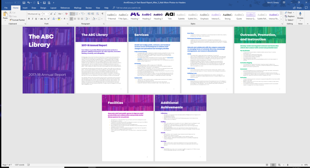
These small edits can transform a text-heavy report into a visual-lite report.
This transformation took me an hour. The vast majority of that time was spent banging my head against the wall thanks to the Wordle/Internet Explorer/Java trifecta of insanity. I’m calling it a Two-Hour Turnaround because everything takes longer when you’re doing it for the first time.
Don’t lose sleep over report formatting. You’ve got better things to do. Instead, just follow my easy steps and make drastic improvements to your document’s appearance within an hour or two.
4 Comments
Hi Ann,
I really like the revised report. It’s definitely an improvement with all the added colour. Unfortunately, sometimes my stakeholders will print my reports, and to save on colour ink they’ll print it in greyscale. This makes it really hard to make an impactful report without using colours. Do you have any tips?
Thanks!
Hi Danielle,
Here are some ideas for you:
1) Make sure your graphs are still legible in grayscale. You can print some drafts (one version in color, one version in grayscale). Or, to save ink, just take a screenshot of your draft and use any ol’ photo editing software program (even PowerPoint) to preview your draft in grayscale. There are two primary strategies that will ensure your graphs are still legible in grayscale: a) Directly label the data instead of using separate legends, and b) Outline touching segments of graphs (stacked bars, maps, donut slices, etc.) in which to ensure that the grays don’t blend together.
2) Add visuals. This report was full of bullet points and definitely could’ve benefited from tables, graphs, maps, photographs, icons, logos, diagrams, and other imagery. Even in grayscale, it’ll look better than the bullet points alone.
3) Write short, skimmable reports with larger font so that clients don’t have any need to print a dense report.
4) Add printing costs to the project budget and hand-deliver or mail the glossy masterpieces. All the consulting firms I’ve worked for over the years have done this, mine included.
Good luck! Let me know how it goes.
Ann
This is great. Love the level of detail! Makes it super easy to follow along and saves me time googling. Much obliged.
[…] was inspired by Ann K. Emery’s, A Two-Hour Turnaround: How to Transform a Text-Heavy Report into a Visual-Lite Report. Evaluation reports are a synthesis of technical information, which means care and attention […]