Leave a Reply

Your email address will not be published. Required fields are marked *

I spent a couple hours livestreaming, and created this masterpiece:

a sliceable Gantt chart that automatically updates and populates itself when you add more rows to your dataset (i.e., no tedious manual updates).

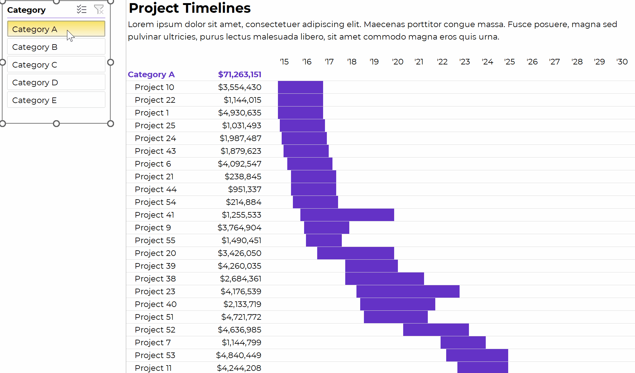
How to Make Sliceable Gantt Charts in Excel

You can watch the high-level tutorial here:

What’s Inside

  • 0:00 Intro
  • 1:08 The end product: Sliceable in Excel. or printed/PDFd
  • 1:52 Gantt chart options in Excel: 1) Stacked bar chart or 2) Inside cells, like this
  • 3:50 Dataset
  • 5:51 Pivot table
  • 6:29 Slicer
  • 6:40 List of projects and their amounts
  • 8:30 Helper cells to the left and above
  • 9:55 AND formula to fill in the body of the table
  • 11:18 Conditional formatting
  • 12:50 Theme Colors
  • 13:40 Your Homework List
  • 14:17 Want more details? Watch the 2.5-hr livestream
  • 14:37 Download this Gantt chart

Download the Excel File

It’s here.

Related Resources

More about Ann K. Emery
Ann K. Emery is a sought-after speaker who is determined to get your data out of spreadsheets and into stakeholders’ hands. Each year, she leads more than 100 workshops, webinars, and keynotes for thousands of people around the globe. Her design consultancy also overhauls graphs, publications, and slideshows with the goal of making technical information easier to understand for non-technical audiences.

Leave a Reply

Your email address will not be published. Required fields are marked *

You Might Like

Our complimentary mini course for beginners to dataviz. Takes 45 minutes to complete.

Enroll

Small Multiples Line Charts in Excel

In this 8-minute lesson, you’ll learn: (1) how small multiples layouts can help, and (2) how to make small multiples charts in Excel.

More »

Need practical how-to tips? In this course, you’ll learn how to make great graphs inside software you already have. Includes beginner, intermediate, and advanced tutorials for making charts from start to finish.

Enroll

Weekly Newsletter

Data visualization time-savers in everyday software, like Excel. 

Our weekly newsletter is shared with a community of 8,000 researchers, evaluators, and scientists.