
Death by PowerPoint makes our audience scroll through their phone or lose interest. Important information sits on the slide, gathering dust.
We’re all familiar with the obvious signs of Death by PowerPoint:
- Text-wall slides with bullet points for daaaays.
- Using filler words (um, like, so).
- Multiple graphs smushed on one slide with tiny text.
- Tiny, grainy images with cheesy stock photography models.
But are you familiar with the subtle signs of Death by PowerPoint?
10 Subtle Signs of Death by PowerPoint
Here are 10 subtle signs that our presentations might need some TLC:
Spending Too Much or Too Little Time Making Slides
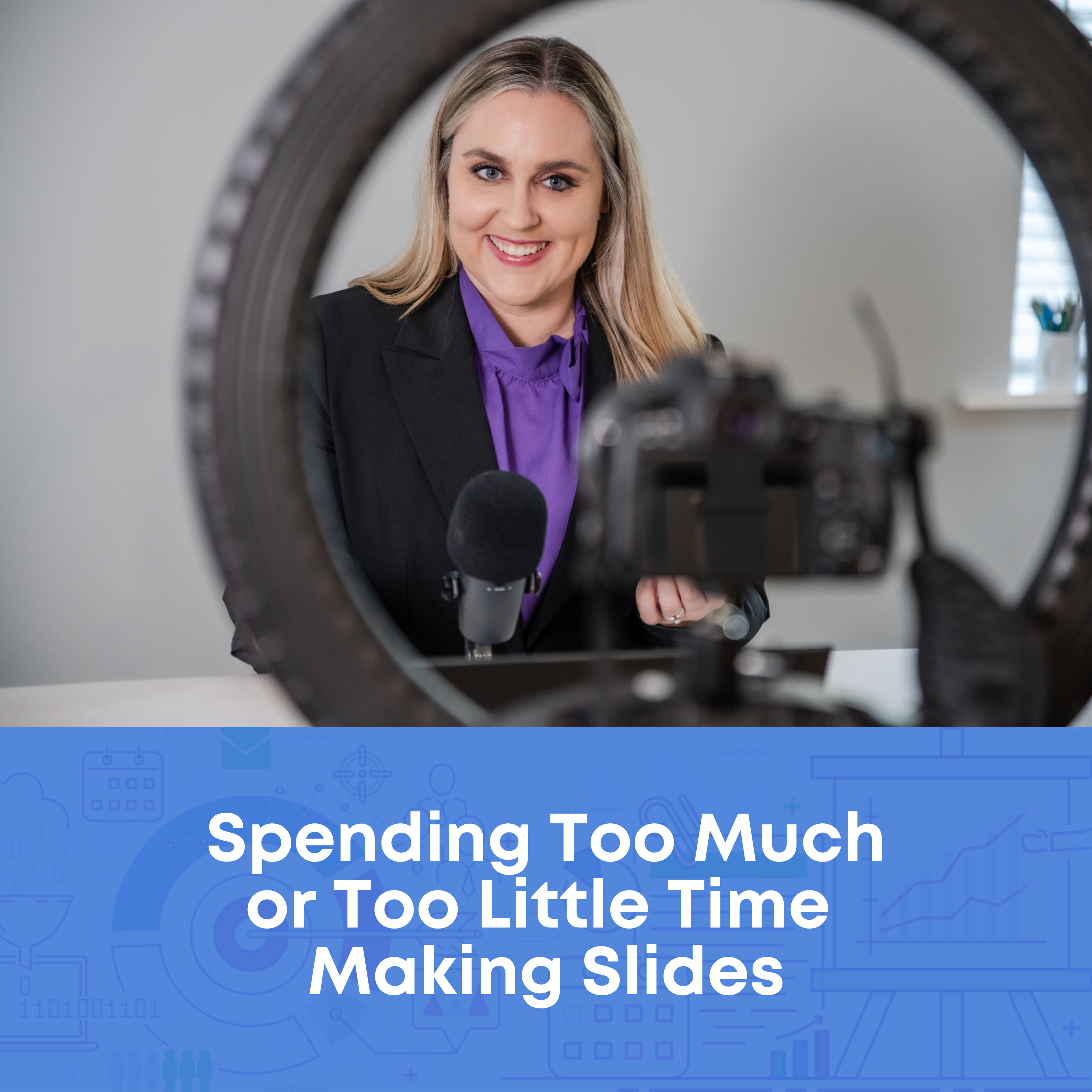
Are you making the slides the night before? That’s not enough time.
I’m guilty. I used to make slides on the plane on the way to the conference.
Or, maybe you’re running into the opposite challenge: Are you spending too much time making slides?
Again, I’m guilty. Sometimes I’d waste an entire weekend making slides for a big talk.
If your time management falls on either extreme—you’re spending too little time or too much time making the slides—then that’s a subtle sign of Death by PowerPoint.
Poor time management à poor presentation quality à adverse effects on our audience.
Running Out of Time to Make Handouts

In a perfect world, every presentation would be accompanied by a separate handout, one-pager, or even technical report.
In reality, I used to just share a PDF’d copy of my slides. I wasn’t sure what to include in the handout, how to format it, or whether it was really necessary (it is!!!).
As a result, my slides were in this weird limbo: I’d strive for great-looking presentation slides with lots of images and very little text. But sometimes I’d get nervous and add too much text so that the slides could do double-duty as a handout.
When our PowerPoint has to serve two purposes, as the presentation slides and as the handout, the presentation suffers.
Losing Time on Colors and Fonts
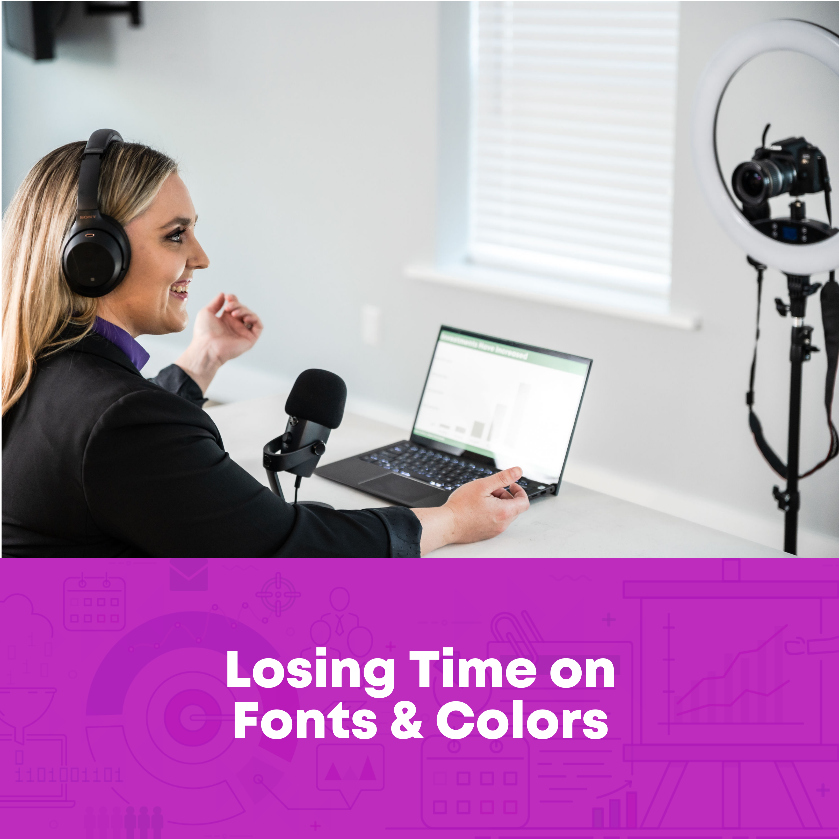
Have you ever used one of PowerPoint’s ugly and overused templates?
I have. A dozen times.
Have you lost time searching through folders and subfolders for your organization’s templates?
Have you lost time making your own templates?
Have you lost time thinking about colors?
Fonts?
Photos?
Sure, it takes time to create an initial corporate template with Theme Colors and Theme Fonts.
But these Word Hard Once techniques save a ton of time in the long run.
Losing time before each presentation on colors and fonts is a sure sign of Death by PowerPoint. When our minds are distracted by the minutiae of slide design, our audience feels the effects.
Including Lots of Graphs

I bet you’re already trying to avoid text-heavy slides.
But are you actively trying to avoid graph-heavy slides?
It sounds counterintuitive, I know. I teach dataviz for a living, after all. 😊
Our audience needs a variety of visuals. Not just graphs. They need graphs, tables, diagrams, photos, maps, logos, quotes, stories, and more.
Graph-heavy presentations are a subtle sign of Death by PowerPoint.
Having Trouble Editing Graphs
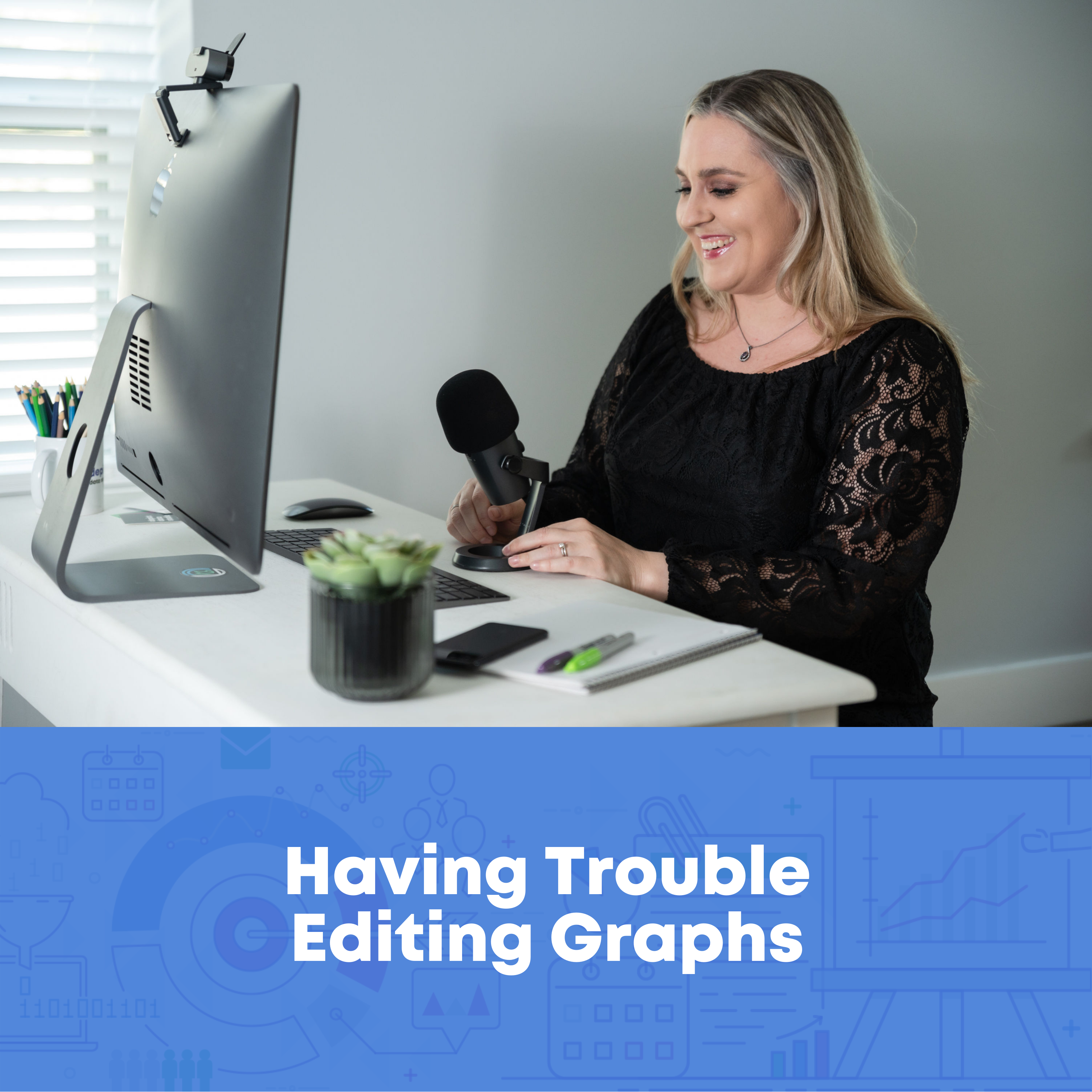
Is it tricky to update your graphs, tables, and diagrams once they’re inside PowerPoint?
Maybe you need to:
- Link your Excel spreadsheet to your PowerPoint slide (so that changes in Excel are reflected in PowerPoint);
- Make your fonts bigger or smaller in PowerPoint;
- Adjust the graph colors; or
- Change the chart type (e.g., from a vertical column chart to a horizontal bar chart).
There are plenty of behind-the-scenes techniques to make editing easier.
Editing the long, hard way is a sign of Death by PowerPoint.
Word-Vomiting Our Presentation’s “So What?”
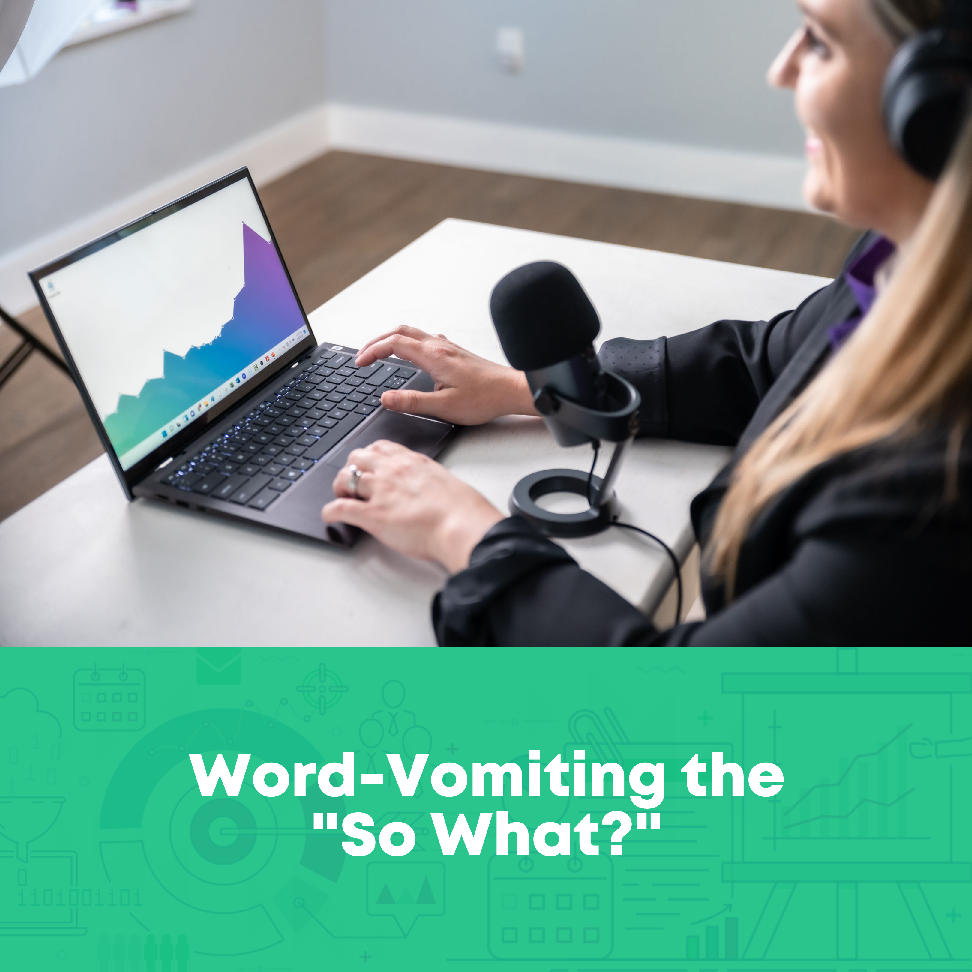
Can you step back and write a “takeaway tweet” for your presentation?
It doesn’t matter if you’re prepping for a 5-minute update in your staff meeting, or a multi-day workshop, or a keynote speech.
You know the quote: “If you can’t explain it simply, you don’t understand it well enough.”
If it takes us sentences and sentences and sentences to get to the point, then our presentation is probably causing Death by PowerPoint.
Feeling Weird on the Webcam

Pre-pandemic, were you comfortable speaking in-person?
Nowadays, in the world of daily Zooms, do you feel awkward on the webcam?
Maybe you’re:
- hesitating to turn on your webcam at all?
- wondering if you look okay?
- staring at your own face when you speak?
A lot of us feel weird on the webcam. It’s so different from being in-person.
But it doesn’t have to stay awkward.
There are plenty of rules of thumb: where to look, and for how long; which tech to use to give you a boost; and how to overcome your own self-consciousness about your appearance.
Including Lots of Details–Just in Case

Just in case someone wants to review the slides ahead of time.
Just in case someone asks a tough question.
Adding “just in case” information dilutes the power of our presentation, which is a sign of Death by PowerPoint.
Have you deleted your “just in case” graphs, tables, and diagrams?
If not, it’s Death by PowerPoint.
Guessing How to Use Our Hands
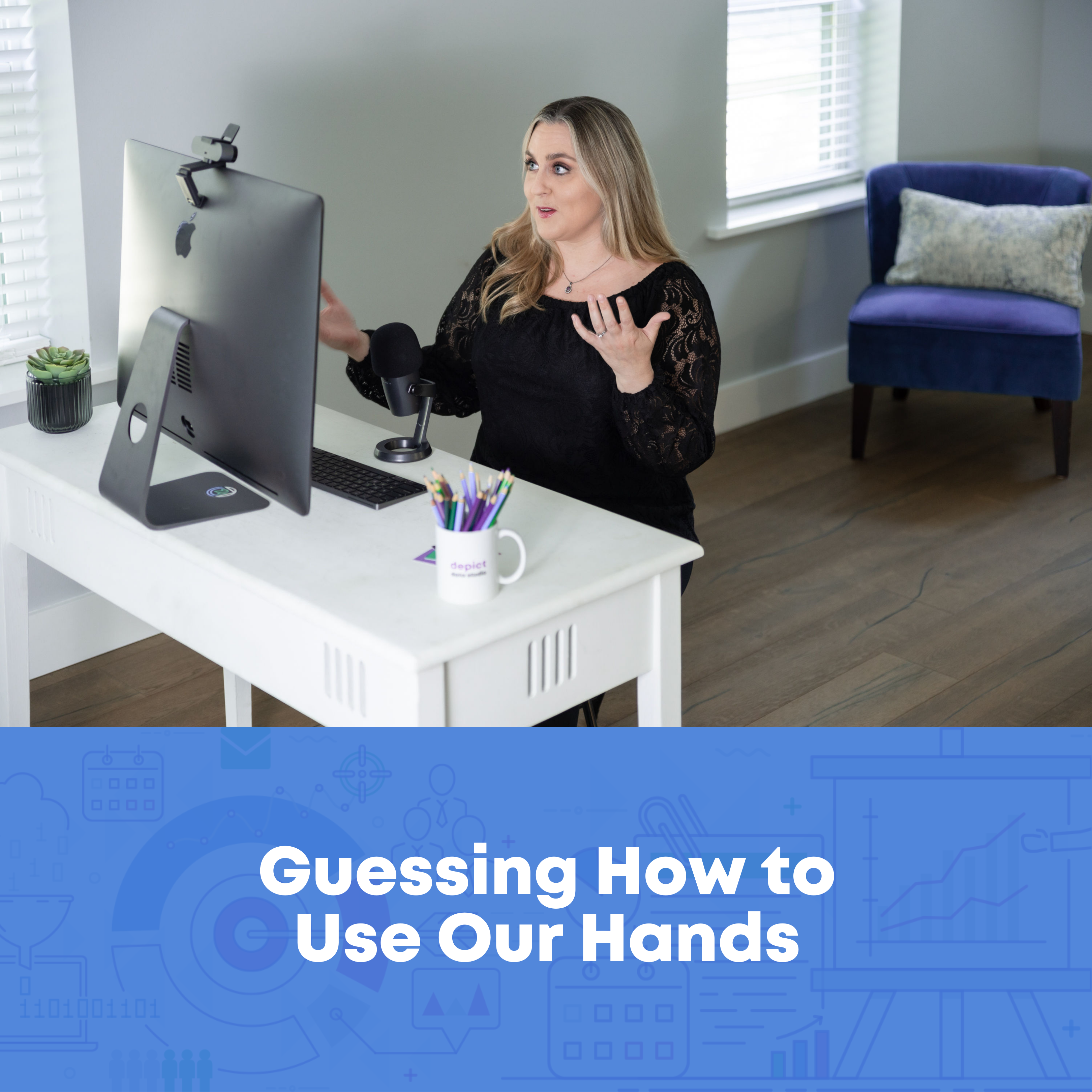
Years ago, when I first started studying public speaking, I read that I was supposed to “use my hands.”
The statistics were promising: We’re rated as being more trustworthy when the audience can see our hands.
Think of the biological roots from cavepeople days. When others can see our hands, they know we’re not holding a weapon. We’re approachable. We’re safe. We’re trustworthy.
At first, I wasn’t sure what to do:
- Hands placed firmly on the podium (for big conference talks)?
- Hands in front pockets (for smaller meetings)?
- Hands holding a notebook or tablet with notes?
- Hands holding a laser pointer?
I lost so much time guessing.
Can you explicitly name 5+ ways your hand motions can help your audience understand patterns in the data?
If not, it’s Death by PowerPoint.
Not Prioritizing Accessibility
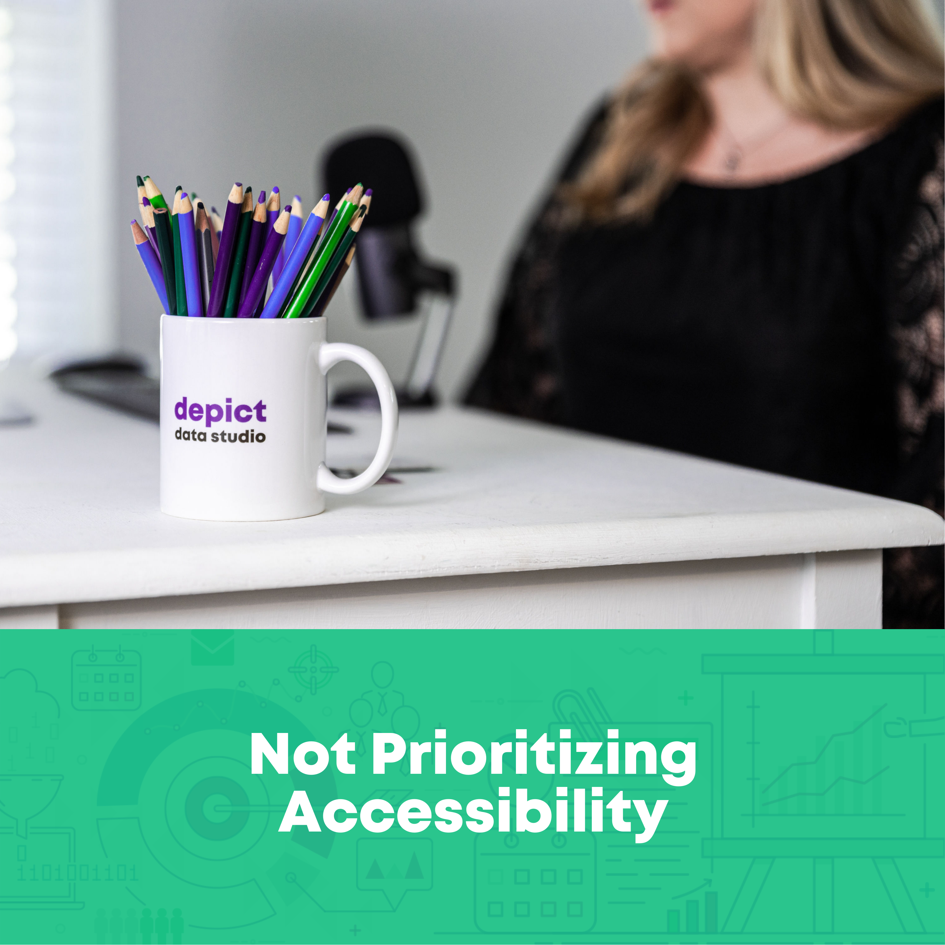
“Little a” accessibility is making sure our graphs are easy for others to understand.
“Big A” Accessibility is making sure our graphs follow specific Federal government standards so that the can be read, viewed, and understood by people with disabilities.
Both types should be priorities in every presentation.
Can you name 5+ specific edits you’ve made to increase your presentation’s accessibility and Accessibility?
If not, it’s Death by PowerPoint.
Your Turn
How many subtle signs are you guilty of? 1, 2, 5, 10?
What about the staff members that you supervise?

Leave a Reply