When I’m teaching Dashboard Design workshops, sometimes participants ask where they should place the filters.
Here are two common layouts that I’ve used over and over:
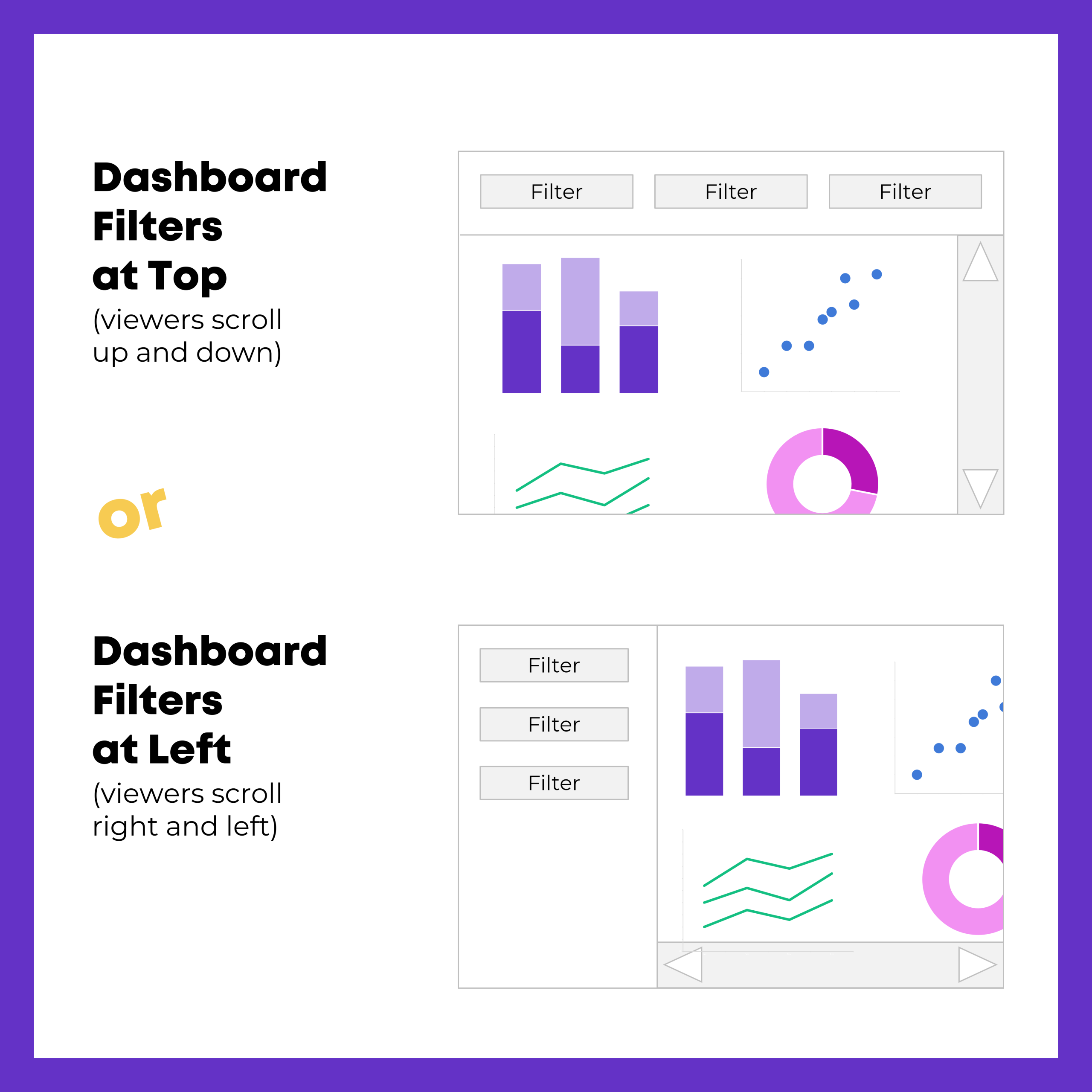
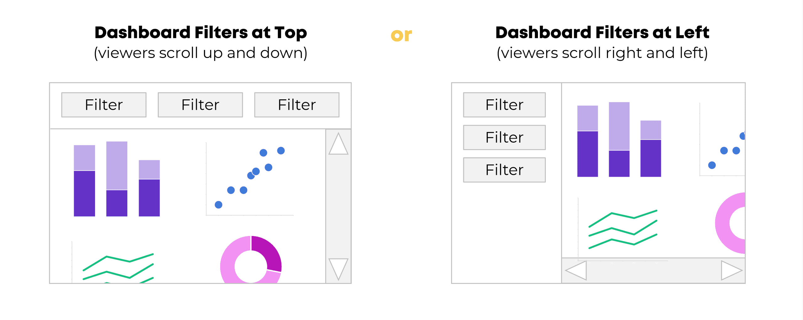
- The filters along the top
- The filters on the left side
Honestly, those are the only two layouts you should be using.
In other words, we’d never want to hide the filters along the bottom. And I don’t recommend placing the filters on the right side (because we read from left to right).
Here’s an example of each style.
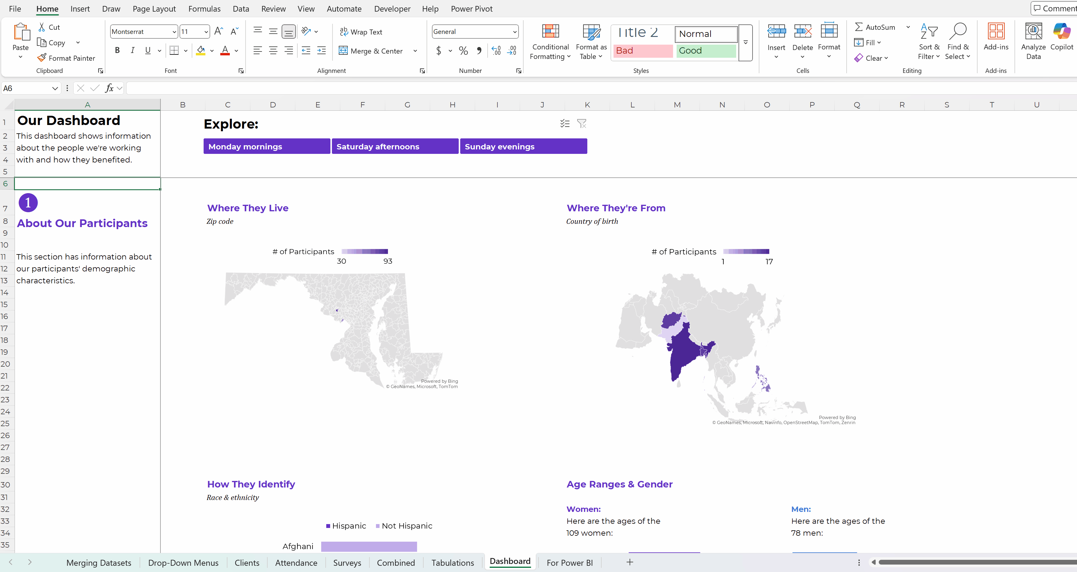
(1) Dashboard Filters at Top
Here’s an example of a dynamic dashboard with a filter along the top of the screen.
These are pretend numbers, but inspired by a real dashboard I created during a workshop with a nonprofit organization. They wanted to be able to drill-down and look at a single cohort of participants at a time (just the Monday morning group, just the Saturday afternoon group, or just the Sunday evening group).
There are a dozen different graphs and maps, so it was impossible to fit everything on a single screen. (We didn’t want to sacrifice the font size – it’s nice and legible now, and if we shrunk everything down, it would be unusable.) So, the filter stays stuck at the top of the screen, and then the viewers can scroll downwards to see all the graphs.
(In Excel, we froze the panes so that the top few rows wouldn’t move.)
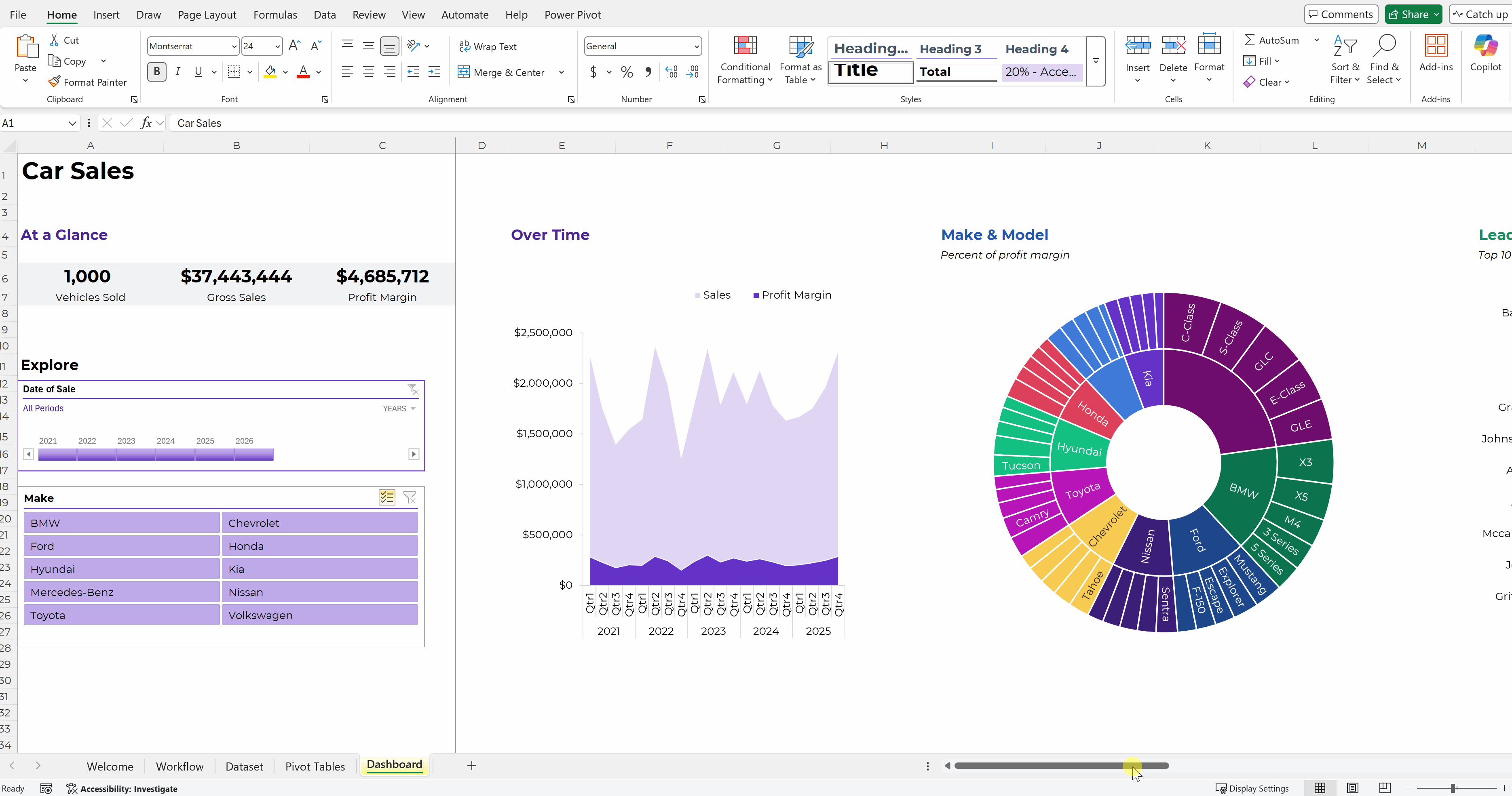
(2) Dashboard Filters Along the Left
Here’s a dashboard about fictional car sales.
There were several charts and maps, and I couldn’t fit everything on a single screen without sacrificing font size and readability.
So, the two filters are frozen on the left side, and viewers can scroll to the right to see all the graphs.
How to Make Dynamic Dashboards
Want to make something similar for your own workplace?
Here are all my dashboard blog posts and YouTube tutorials.
In particular, you might like these examples of dynamic dashboards made in Excel that you can use for inspiration.
Here’s a how-to video about making dynamic dashboards in Excel and another how-to video about making dynamic dashboards in PowerBI.
I also teach private workshops and online courses about dashboard design.
Do you have specific questions? Reach out anytime.
Leave a Reply