
Ever had that “aha!” moment in Excel that completely changes your data game?
For me, it was discovering pivot tables and their ability to run circles around painstaking formula execution.
What are Pivot Tables?
Simply put, pivot tables sort a contiguous array of quantitative data by multiple planes of information simultaneously.
This is an example of a contiguous dataset (with pretend data). All the cells are touching/sharing a border.

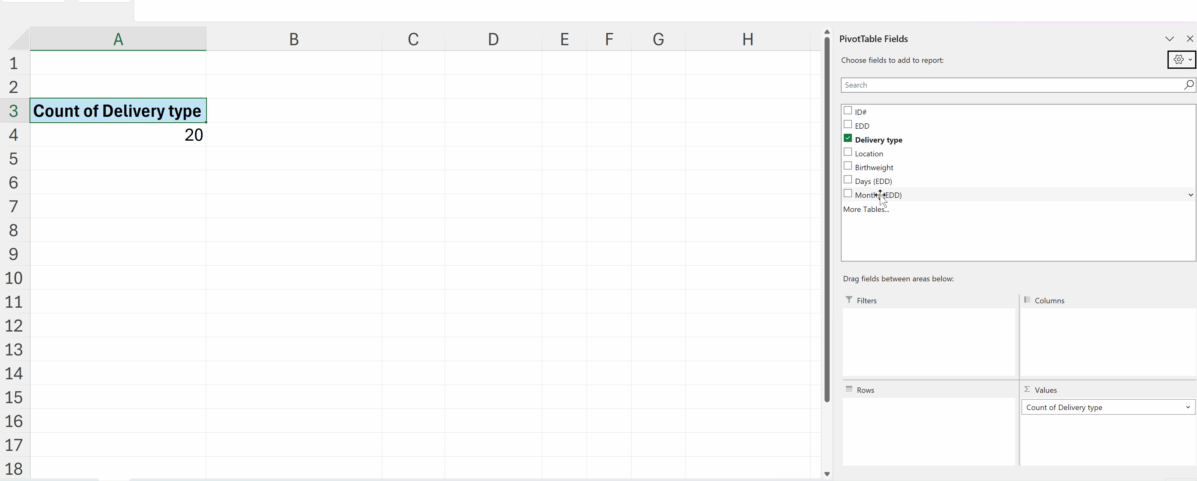
After you fiddle with the rows (x axis)/ columns (y axis)/ values (summary), filters (sorting)… Tah da! The magic happens.
Here’s how quickly you can summarize data with pivot tables:
Improving Your Interactive Dashboards
To build professional and reliable interactive dashboards, pivot tables are your best friend.
As a data designer who’s recently completed Ann K. Emery’s Dashboard Design course, I’m excited to share three techniques that have elevated my dashboard game.
(1) Helper Tables
First, I’ve learned the value of creating “helper tables.”
Think of these as your dashboard’s backbone.
While pivot tables are constantly shifting as users interact with filters and slicers, helper tables provide a stable foundation for your key metrics.
I create these on a dedicated ‘Ref’ sheet, where they quietly but efficiently pull data from the pivot tables using direct cell references (=).
(2) Consistent Cell References
Second, cell references need to be consistent.
By using absolute references (=$row$column), I ensure my helper tables always pull exactly what I need, regardless of how the underlying pivot table shifts and sorts.
(3) Naming Pivot Tables
Third, name your pivot tables intuitively!
Sure, Excel is happy to call them “PivotTable1,” “PivotTable2,” and so on, but meaningful names make maintenance so much easier. (Just remember: no spaces allowed!)
Organizing Your Dashboard Spreadsheets
My finished dashboards now follow a clean, organized structure with five key sheets:
- Overview (where users find instructions)
- Data (the raw information, typically hidden)
- Pivot (where the magic happens, also hidden)
- Dashboard (the beautiful final product)
- Ref (my helper tables’ home)
Dashboards Need Functionality and Performance
One of the most valuable lessons from Ann’s course was learning to balance functionality with performance.
Multiple pivot tables can strain Excel’s resources, but with these techniques, I can create sophisticated dashboards that remain lightning-fast and reliable.
What started as a simple appreciation for pivot table magic has grown into a comprehensive approach to creating dynamic, professional dashboards that my clients love.
Your Turn
What’s your favorite pivot table trick?
I’d love to hear how you’re using these powerful tools in your own work!
Connect with Anna Pfaff
Reach out to guest author Anna Pfaff on LinkedIn.
Leave a Reply