Are you working on a dashboard at your workplace?
Maybe you’re making a brand-new dashboard?
Maybe you’re revamping an existing dashboard to bring it up to speed?
Maybe you don’t have a dashboard yet, and you’re wondering if you need one?
In this article, you’ll see my 10 worst mistakes from past dashboards.
I’ve made all these mistakes (and more…) over the past 15 years. Let’s fast-forward your project and make sure you’re not doomed to run into the same issues I did.
Learn from my mistakes. Don’t let your dashboards suffer.
10 Worst Dashboard Mistakes
You can watch the video or read about the top 10 dashboard mistakes.
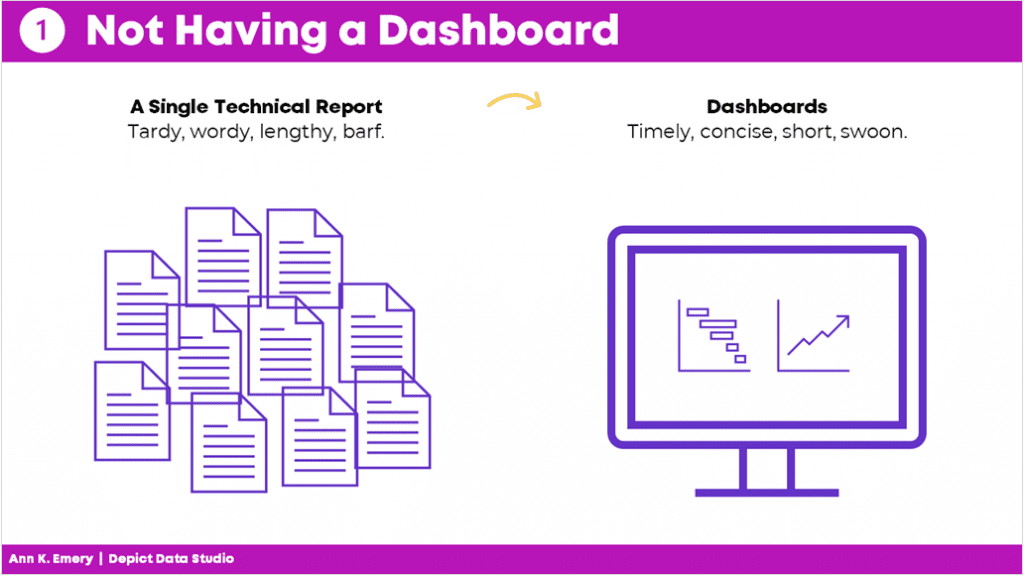
Mistake #1: Not Having a Dashboard
Fifteen years ago, I assumed that a single technical report was enough.
I started my career by working on university-based research centers. Peer-reviewed articles were the norm.
When I transitioned into contracting for Federal government agencies, 100-page technical reports were the norm.
Nowadays, I know better.
Dashboards used to seem like extras.
But they’re not extras. They’re essential.
Mistake #2: Not Having Multiple Dashboards
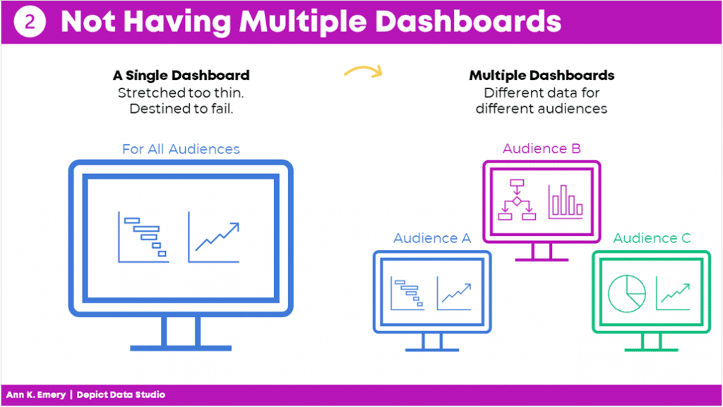
After I realized that every project could benefit from a dashboard, I realized that every project needs multiple dashboards.
In the past, I’d make a single dashboard. All the information was crammed in. I was trying to meet every audience’s needs.
It was destined to fail.
Now, I have multiple dashboards so that each audience gets their own individualized dashboard.
Audience A gets the information they need.
Audience B gets the information they need.
Audience C gets the information they need. And so on.
By providing each audience the exact information they need, the data is much more likely to be understood and used.
Mistake #3: Copying and Pasting from Excel into Word or PowerPoint
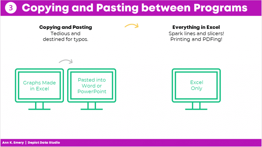
Here’s what I used to do.
I would make my graphs in Excel and then I would paste them into Word or PowerPoint.
I found workarounds to make sure the formatting was identical in both Excel and Word/PowerPoint (e.g., by setting up Themes and a standard text hierarchy in advance).
I found workarounds to avoid copying and pasting (e.g., by writing VBA code).
But the transfer process was still time-consuming and prone to errors.
Nowadays, I just keep everything in the same software program.
I’m a big fan of everyday software so I usually just use Excel for everything. You could use PowerBI or Tableau. Whatever software program you like.
Less copying and pasting between programs is a major time saver.
Mistake #4: Getting Distracted by Sparkly Interactivity
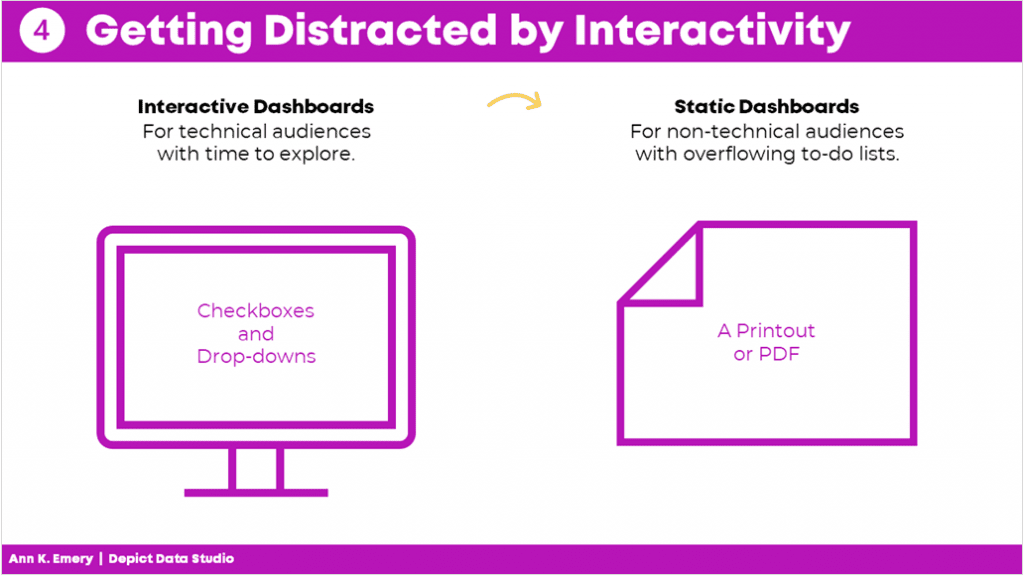
It’s easy to get caught up in all the cool things interactive dashboards can do, like adding drop-down menus or checkboxes. Interactivity lets the user explore the data further.
In hindsight, I wish that some of my interactive dashboards were actually static dashboards.
Yes, I admit it–I wish some of my interactive dashboards were static instead.
I wish I would have used static dashboards for the high-level executives who don’t have extra time to explore data.
Or, for the non-technical audiences who just want the key takeaways.
Sometimes your audience would really just prefer a PDF’d one-pager.
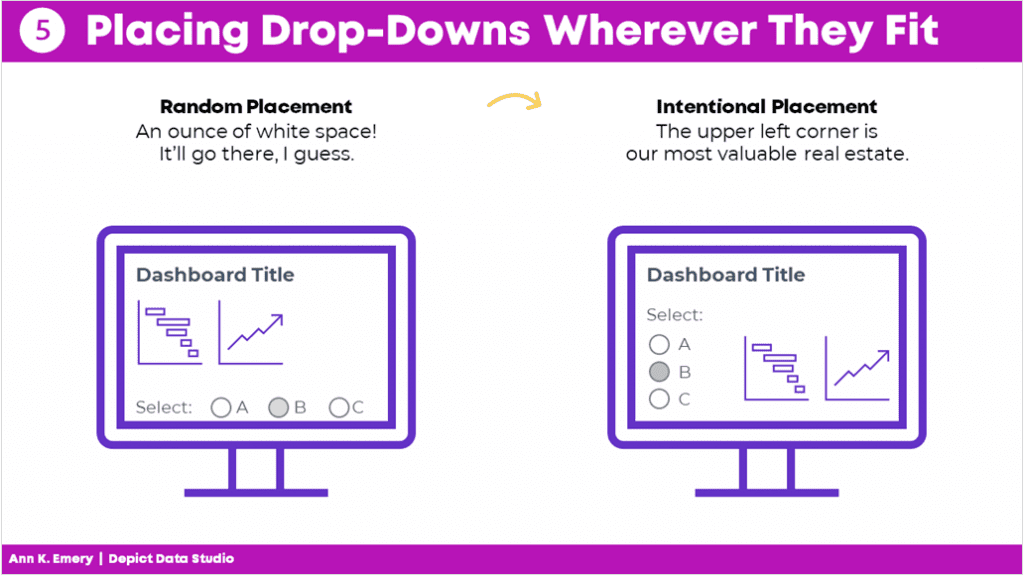
Mistake #5: Placing Drop-Drops or Checkboxes Wherever There Was Space
I used to just place drop-downs and checkboxes wherever there was space.
At the bottom of a page? Sure.
On the right-hand side of a page? Sure.
In this teeny tiny white space that’s leftover? Sure!
Now, I aim for consistency.
That means usually placing them in the upper left corner.
It’s the most valuable real estate on our screen because our eyes are naturally drawn there.
Intentional placement helps your audience know where to start.
Mistake #6: Shoving Everything onto a Single Screen
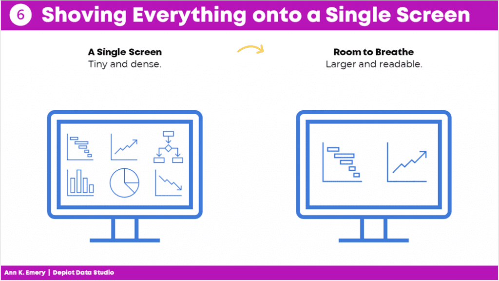
I used to think that a dashboard had to fit onto a single screen or page.
That’s false.
People can easily click to the next window or flip to the next page.
There’s no reason to cram all the information into one page. Especially if you have to resort to using size 6 font with no white space left.
A good rule of thumb is literally a thumb: Make sure you have about a half inch to an inch of white space between your graphs and text boxes.
Give the dashboard some room to breathe so your audience doesn’t feel overwhelmed by the sheer density of the data.
Mistake #7: Only Showing the Latest Data
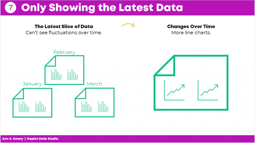
Here’s the most common mistake I see: Only showing the latest data.
Let’s pretend there’s a big meeting in March. I used to just show March’s numbers.
But what about February? Or January? Or earlier dates? My poor audience would have to hunt down the previous month’s dashboard, flip back and forth between screens, and try to make comparisons. Our audience should never have to flip between screens or flip between pages to make comparisons!
By only showing the most current data, we’re not allowing our viewers to see the bigger picture.
Nowadays, I use lots more line graphs so that my viewers can see whether there are fluctuations over time.
Mistake #8: Losing Time on Colors and Fonts
Wasting time looking for color palettes or fancy fonts is so common.
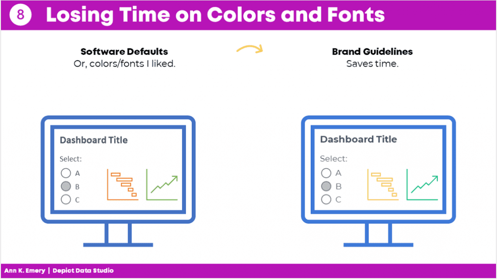
I used to just use whatever colors and fonts I felt like. Or, I used the software defaults…
I would think, “Ooh, I heard this font is really popular right now!” or “I love this shade of blue!”
Being guided by personal preferences means your work isn’t as professional as it could be. Especially if you’re working in a group.
If everyone picks their favorite colors or fonts, nothing is cohesive or branded.
Instead, save yourself some time and boost the professionalism by using the recipient’s brand fonts and colors.
You don’t even have to think about it. It’ll just be done. Save your precious mental space for something else.
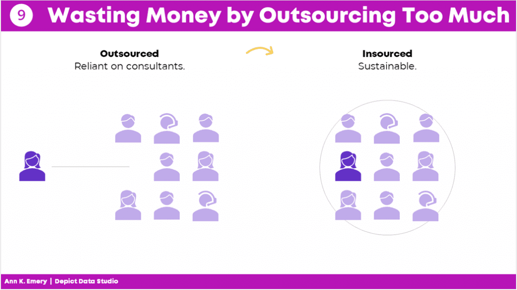
Mistake #9: Wasting Money by Outsourcing Too Much
There’s a time and place for outsourcing work.
But dashboard design is not one of them.
It shouldn’t cost tens of thousands of dollars to develop a dashboard.
Nor should it take weeks or months.
Don’t hire somebody else to make your dashboard.
Keep it in-house.
You’ll be able to maintain it more easily and will have full control whenever changes or updates need to be made.
Mistake #10: Assuming It Was Finished
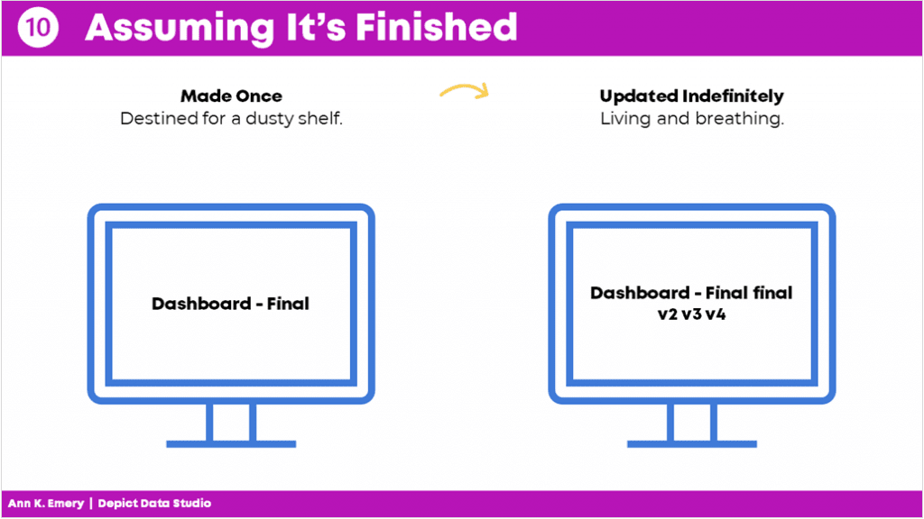
Dashboards are never finished.
Ever.
They’re not supposed to be.
Dashboards should be updated over time.
Dashboards should evolve as the information needs evolve.
And not just once a year.
You should be making ongoing edits, adjustments, and improvements all the time.
As needs change, the dashboard changes.
Which is another reason why keeping it in-house is so much better.
Your Turn
Those were my top 10 worst mistakes from my past projects.
Now, it’s your turn.
What are your worst mistakes from your past dashboard projects? Share so we can learn from one another and avoid some of the headaches before they start.

Leave a Reply