Hello. I am Barbara Klugman, strategy and evaluation practitioner based in Cape Town, South Africa.
Under the guidance of the inestimable Ann Emery’s “Report Redesign” course, I had a go at making the contents page of a previous evaluation report meaningful.
Here are the steps I followed.
For anonymity, I have renamed the evaluand as (gender org) and the funder as (funder).
The Original
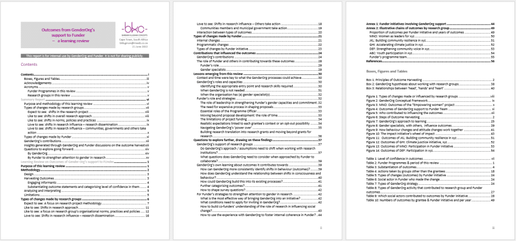
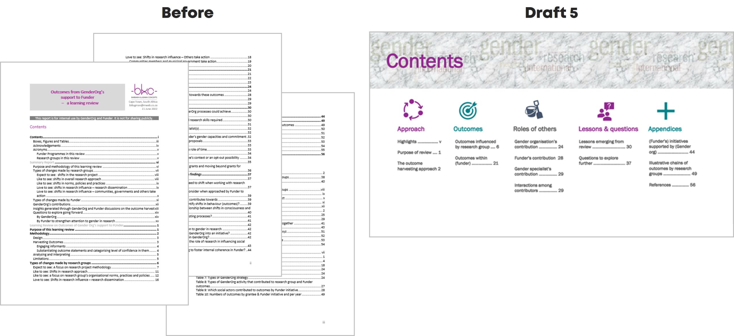
Here’s what the initial Table of Contents looked like:
Draft 1
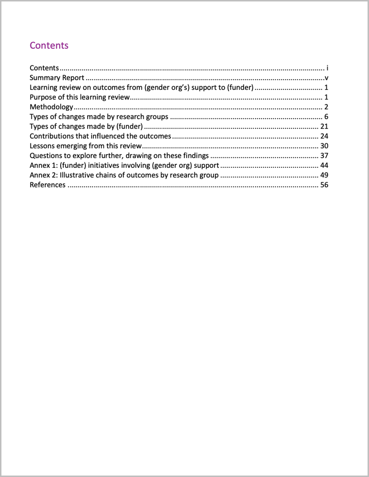
I cut my multi-page contents page from three heading levels to only Heading 1s.
Draft 2
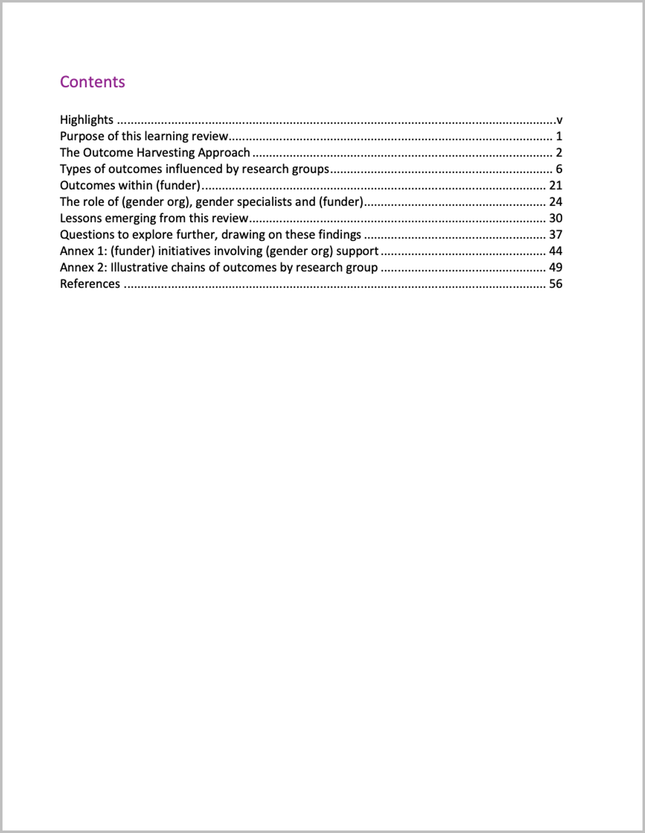
I changed some headings to be more meaningful.
For example,
- from ‘Summary Report’ to ‘Highlights’
- from ‘Methodology’ to ‘The Outcome Harvesting Approach’; and
- from ‘Contributions that influenced the outcomes’ to ‘The role of (gender org), gender specialists and (funder)’.
Draft 3
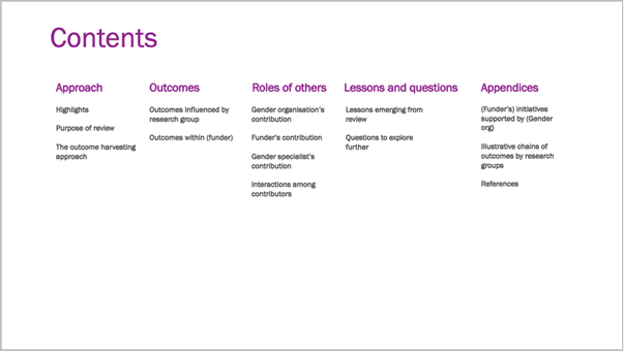
I grouped the headings, named the groups, and set it up in landscape.
I also enlarged ‘Contents,’ in response to one of Ann’s ongoing exhortations to “double the size of the headings from what you currently use.”
I moved from Word into PowerPoint.
Draft 4
I created a section divider in my brand colours and added icons.
Ann proposes use of such dividers for short reports, with a different colour for each section – in long reports you’d use a whole page for each section.
I used her ’20-minute page cover’ method by layering a cylinder shape in my brand colour, somewhat transparent, over a Word Cloud, and ‘Contents’ on top.
I added an icon to each section and recoloured the sections to colours I will use for the divider page and headings of each section, taken from my brand colours.
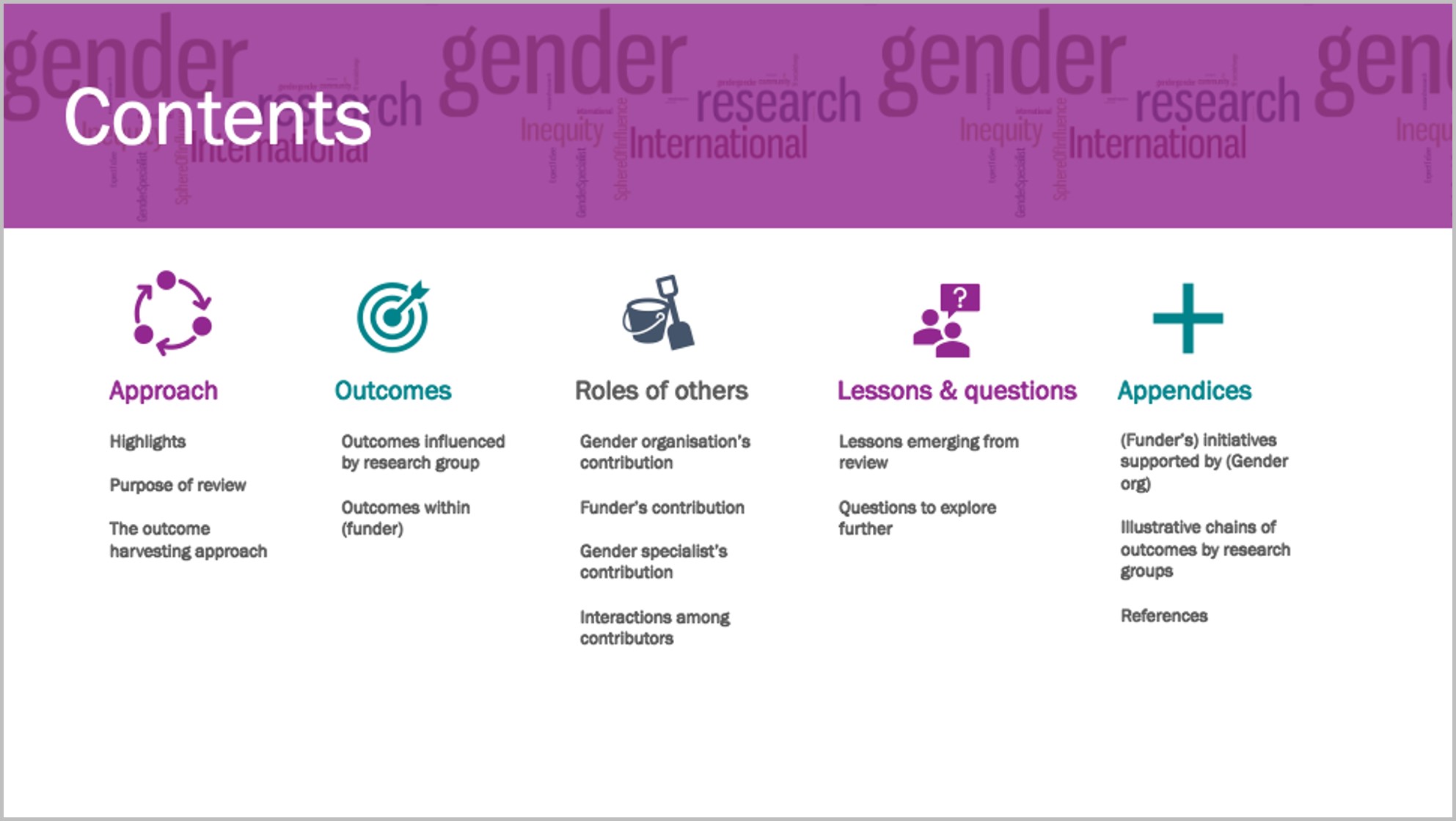
Draft 5
I re-coloured the section divider and put in page numbers.
As ‘gender’ in the Word Cloud overwhelmed the heading, I used the ‘textures’ option in ‘format colours’ to create a grey textured layer over the Word Cloud, and changed the colour of ‘Contents.’
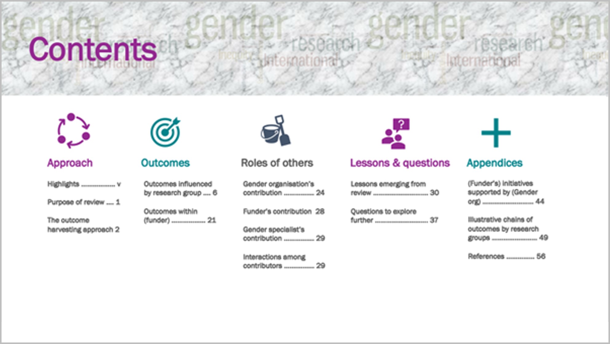
To me this shift from a pro-forma contents page to this version invites the reader to find what they’re looking for in the report.
Going forward, I would plan this out before writing the report, to help organise my own thinking about the contents and how to communicate it.
Thanks to Ann.


10 Comments
Nice!!! So much better!
Great revamping, Barbara. You’ve given me some ideas for the Coursebook revamp I am setting up a style guide for. Thanks!
Impressive work! I am curious, why did you decide to switch to landscape format?
Hi Gesine, thanks for your comment. I shifted to landscape when Ann pointed out how in most cases clients aren’t printing evaluation reports. They’re reading them on the computer, which is set up in landscape. I recently did a whole report on PowerPoint in landscape and found that the format itself pushed me to think more about presentation, and brevity! Barbara
great idea! thanks for sharing 🙏🙏
Beautiful work! Thanks for the inspiration.
This is really awesome! Thanks for the inspiration as we are looking to update our TOC as well!
Great interpretation and application of Ann’s recommendations. Thanks for sharing.
Very nice! Thanks for sharing!!
That looks amazing. I glazed over on the original and on Draft 5, I wanted to read the report.