10 Comments

  • Laura Baxter says:

    Nice!!! So much better!

  • Sue Griffey says:

    Great revamping, Barbara. You’ve given me some ideas for the Coursebook revamp I am setting up a style guide for. Thanks!

  • Gesine Ziebarth says:

    Impressive work! I am curious, why did you decide to switch to landscape format?

    • Barbara Klugman says:

      Hi Gesine, thanks for your comment. I shifted to landscape when Ann pointed out how in most cases clients aren’t printing evaluation reports. They’re reading them on the computer, which is set up in landscape. I recently did a whole report on PowerPoint in landscape and found that the format itself pushed me to think more about presentation, and brevity! Barbara

  • Juan De Jesus says:

    great idea! thanks for sharing 🙏🙏

  • Beautiful work! Thanks for the inspiration.

  • Jennifer Brandt says:

    This is really awesome! Thanks for the inspiration as we are looking to update our TOC as well!

  • Marcia Stodalka says:

    Great interpretation and application of Ann’s recommendations. Thanks for sharing.

  • Melanie Hwalek says:

    Very nice! Thanks for sharing!!

  • Gerda Zonruiter says:

    That looks amazing. I glazed over on the original and on Draft 5, I wanted to read the report.

  • Leave a Reply

    Your email address will not be published. Required fields are marked *

    From Formulaic to Meaningful: Constructing a Useful “Table of Contents” Page for an Evaluation Report

    Updated on: Jul 31st, 2023
    Reports
    , , ,
    GIF showing the before-after transformation of Barbara Klugman's Table of Contents page.

    Hello. I am Barbara Klugman, strategy and evaluation practitioner based in Cape Town, South Africa.

    Under the guidance of the inestimable Ann Emery’s “Report Redesign” course, I had a go at making the contents page of a previous evaluation report meaningful.

    Here are the steps I followed.

    For anonymity, I have renamed the evaluand as (gender org) and the funder as (funder).
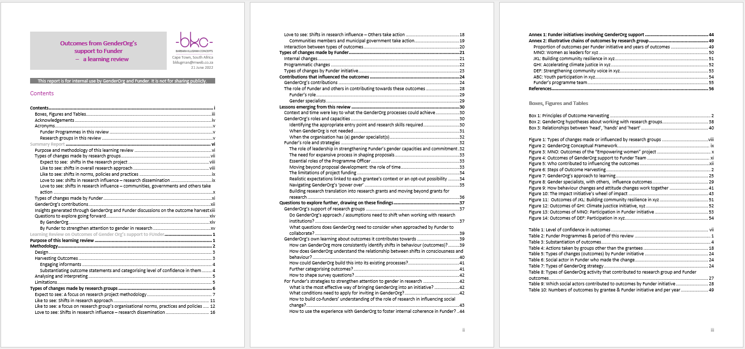
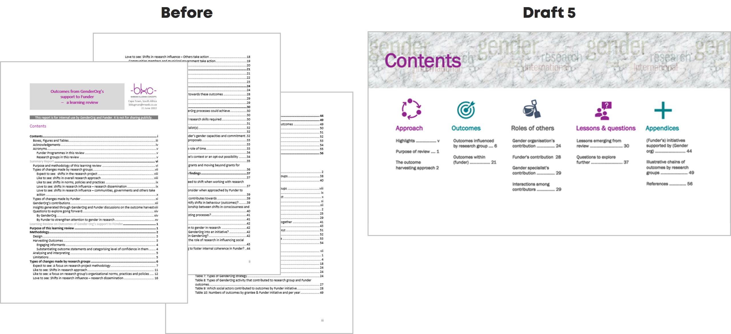
    The Original

    Here’s what the initial Table of Contents looked like:

    Draft 1

    I cut my multi-page contents page from three heading levels to only Heading 1s.
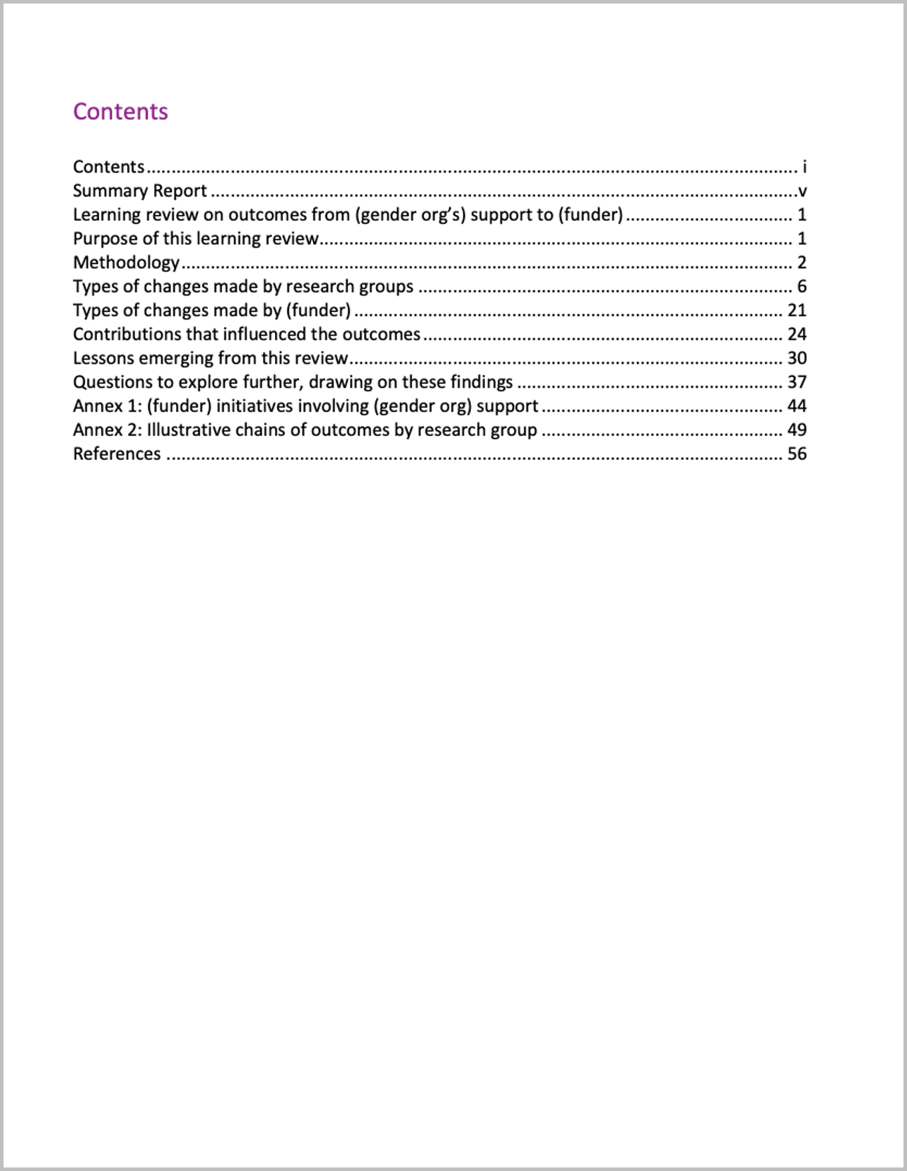
    Draft 2

    I changed some headings to be more meaningful.

    For example,

    • from ‘Summary Report’ to ‘Highlights’
    • from ‘Methodology’ to ‘The Outcome Harvesting Approach’; and
    • from ‘Contributions that influenced the outcomes’ to ‘The role of (gender org), gender specialists and (funder)’.
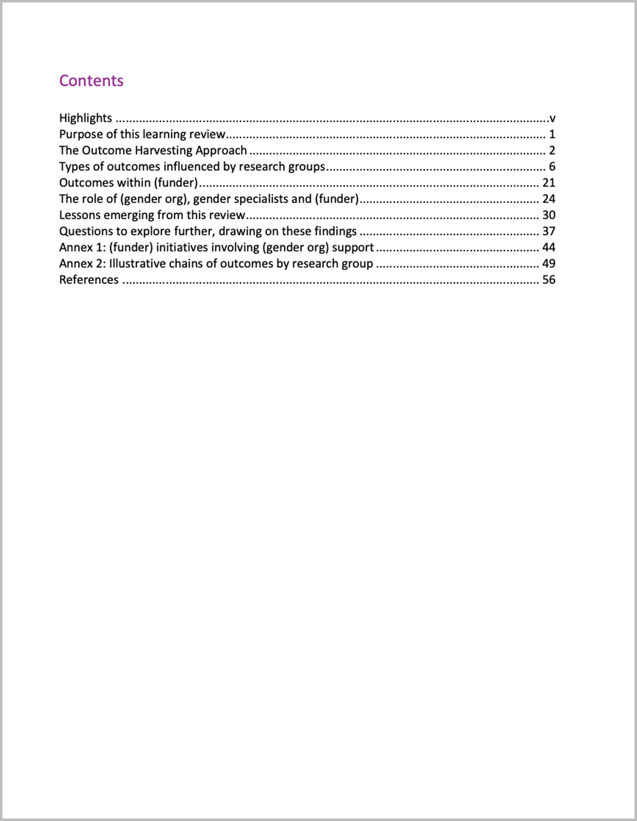
    Draft 3

    I grouped the headings, named the groups, and set it up in landscape.

    I also enlarged ‘Contents,’ in response to one of Ann’s ongoing exhortations to “double the size of the headings from what you currently use.”

    I moved from Word into PowerPoint.

    Draft 4

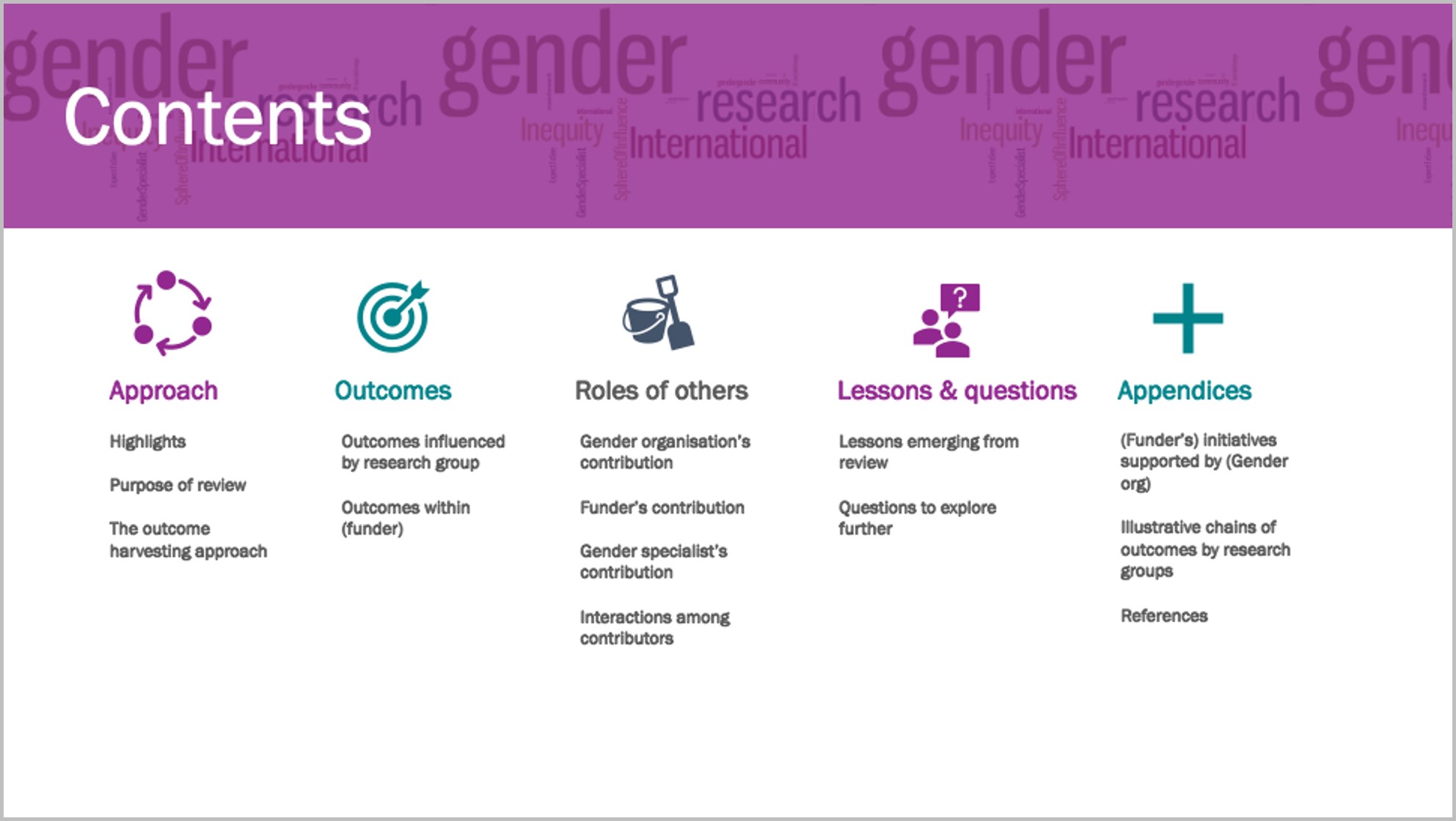
    I created a section divider in my brand colours and added icons.

    Ann proposes use of such dividers for short reports, with a different colour for each section – in long reports you’d use a whole page for each section.

    I used her ’20-minute page cover’ method by layering a cylinder shape in my brand colour, somewhat transparent, over a Word Cloud, and ‘Contents’ on top.

    I added an icon to each section and recoloured the sections to colours I will use for the divider page and headings of each section, taken from my brand colours.
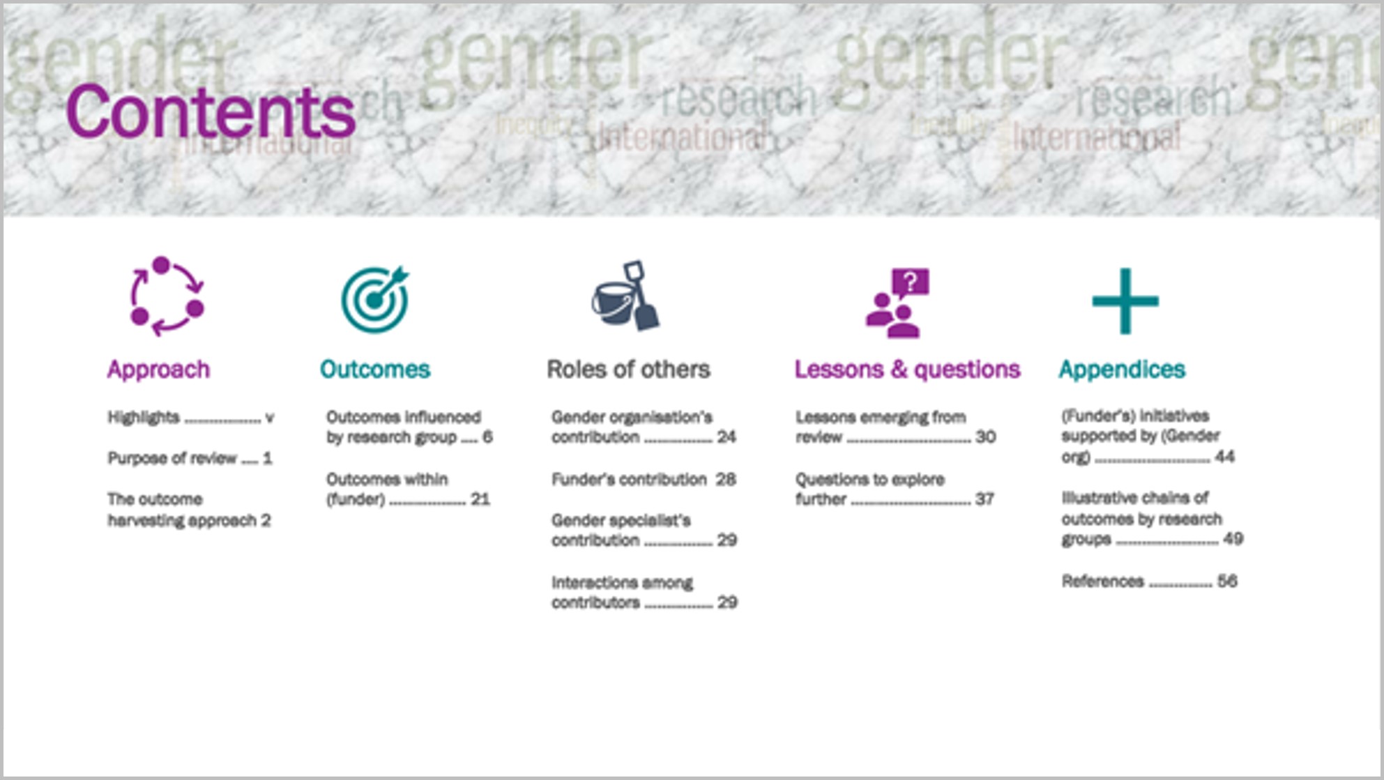
    Draft 5

    I re-coloured the section divider and put in page numbers.

    As ‘gender’ in the Word Cloud overwhelmed the heading, I used the ‘textures’ option in ‘format colours’ to create a grey textured layer over the Word Cloud, and changed the colour of ‘Contents.’

    To me this shift from a pro-forma contents page to this version invites the reader to find what they’re looking for in the report.

    Going forward, I would plan this out before writing the report, to help organise my own thinking about the contents and how to communicate it.

    Thanks to Ann.

    More about Barbara Klugman
    Barbara Klugman (PhD) provides freelance support to social justice NGOs, social movements and funders in strategy development and evaluation-for-learning. She also facilitates peer learning initiatives. She brings together, overlapping with each other, over 40 years of experience as a social justice and women’s rights activist and academic, 17 as a funder, 14 as an evaluator. She has published extensively on the theory and practice of conducting, training for, and evaluating policy advocacy, as well as on analysing and addressing gender and rights in health research, policy, activism and communications. In the 1980s she was an anti-apartheid and women’s rights activist lecturing in Social Anthropology at Wits University. In the 1990s she directed the Women’s Health Project at the School of Public Health, Wits University, which facilitated national consultation and mobilisation contributing towards women’s health policy changes in South Africa’s new democracy. From 2003-2009 she ran the Ford Foundation’s international sexual health and rights portfolio from New York after which she started her freelance practice from South Africa. In December 2017, she completed a six year tenure on the board of the Urgent Action Fund-Africa for Women’s Rights and in 2018 joined the board of the Global Fund for Community Foundations. Clients have included Comic Relief, the African Women’s Development Fund, the Global Greengrants Fund, WIEGO, Gender at Work, groundWork and Planet Tracker. She is a knitter and jewellery maker but only with this Report Redesign course has found a way to translate her love of colour and style into her work process.

    10 Comments

  • Laura Baxter says:

    Nice!!! So much better!

  • Sue Griffey says:

    Great revamping, Barbara. You’ve given me some ideas for the Coursebook revamp I am setting up a style guide for. Thanks!

  • Gesine Ziebarth says:

    Impressive work! I am curious, why did you decide to switch to landscape format?

    • Barbara Klugman says:

      Hi Gesine, thanks for your comment. I shifted to landscape when Ann pointed out how in most cases clients aren’t printing evaluation reports. They’re reading them on the computer, which is set up in landscape. I recently did a whole report on PowerPoint in landscape and found that the format itself pushed me to think more about presentation, and brevity! Barbara

  • Juan De Jesus says:

    great idea! thanks for sharing 🙏🙏

  • Beautiful work! Thanks for the inspiration.

  • Jennifer Brandt says:

    This is really awesome! Thanks for the inspiration as we are looking to update our TOC as well!

  • Marcia Stodalka says:

    Great interpretation and application of Ann’s recommendations. Thanks for sharing.

  • Melanie Hwalek says:

    Very nice! Thanks for sharing!!

  • Gerda Zonruiter says:

    That looks amazing. I glazed over on the original and on Draft 5, I wanted to read the report.

  • Leave a Reply

    Your email address will not be published. Required fields are marked *

    You Might Like

    Our complimentary mini course for beginners to dataviz. Takes 45 minutes to complete.

    Enroll

    Ready to transition out of academic-style reports? Tired of Text Walls? Learn how to design skimmable, accessible reports that our audience can quickly understand.

    Enroll

    Subscribe

    Not another fluffy newsletter. Get actionable tips, videos and strategies from Ann in your inbox.