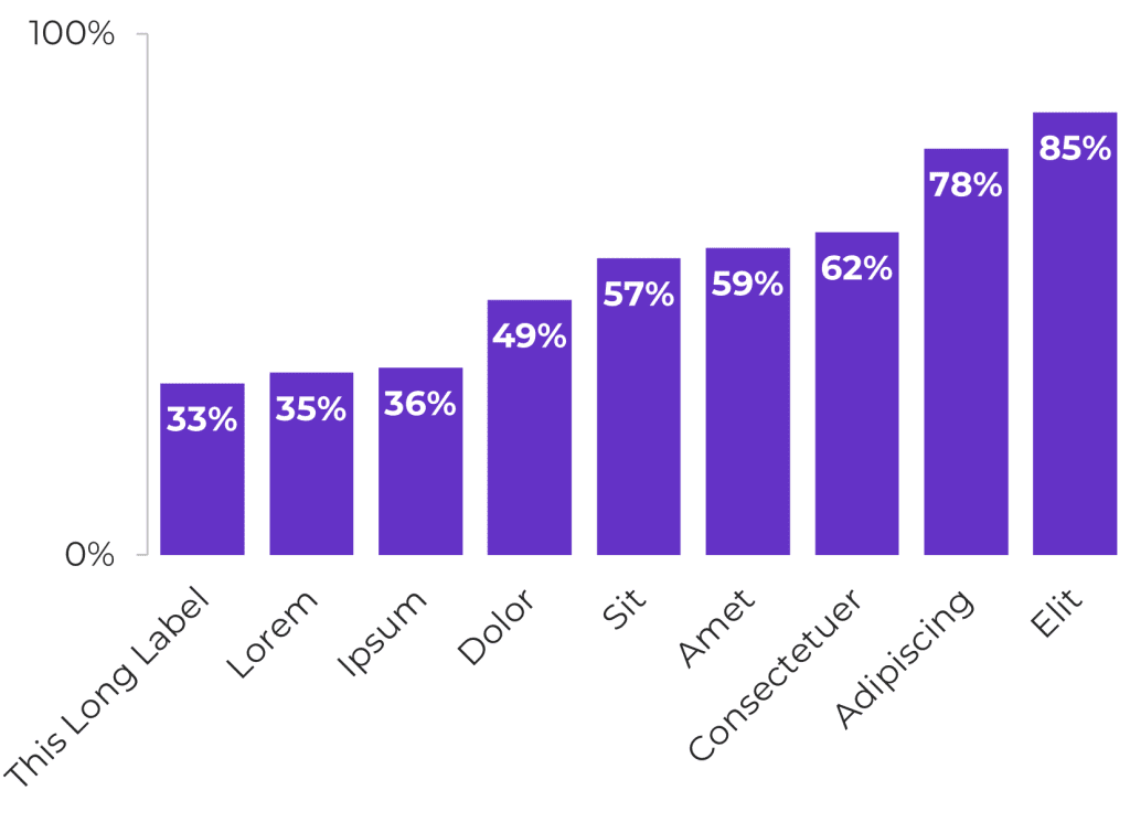
If you’ve got a column chart with lots of labels, chances are, the labels have gotten twisted diagonally, like this:

Diagonal text takes longer to read than plain ol’ horizontal text, so we want to avoid it.
In this lesson, you’ll learn 5 ways to fix those lonnng chart labels:
What’s Inside
- 0:00 Intro
- 0:58 Fix 1: Slow-to-Read Diagonal Text
- 1:18 Fix 2: Unreadable Tiny Text
- 1:38 Fix 3: Cartoonishly-Big Chart
- 2:38 Fix 4: Column Chart into Bar Chart (with Change Chart Type)
- 3:27 Fix 5: Forced Line Breaks in Chart Labels
- 3:56 What NOT To Do: Clicking the Space Bar a Bajillion Times
- 4:10 What TO Do: Alt + Enter
- 4:38 Mixing and Maxing these 5 Fixes for Your Dataset
- 4:58 Your Turn
Resources Mentioned
- Download the Excel file shown in the lesson
- Related tutorial: Adjusting the Outside and Inside Chart Borders in Excel
Transcript
Ann K. Emery: [00:00:00] If your chart has really long labels, chances are, Excel did this.
It probably tilted the labels diagonally, which takes longer to read, obviously, or it might’ve done the thing where it gives you some of the words and then dot, dot, dot, and it cuts them off. And. We can’t keep that.
So in this video, I’m going to show you five fixes.
And your data set is going to be totally different from my super fake one that I have here.
So you’re going to have to try these different fixes and then please, please, please comment below the video and let me know which fix works for you. Um, I’m Ann Emery. You’re watching Dataviz on the Go, the series where you learn dataviz time savers inside everyday software like Excel and PowerPoint and Word. And speaking of dataviz being on the go, I am leading office hours for my online course students in three minutes.
So let’s go, let’s go through these fixes really quickly. All right.
Fix number one [00:01:00] is you could just leave it alone and say, I don’t care if diagonal text takes longer to read, screw the people looking at this graph. They’re just going to have to take longer to read it. I know you’re not thinking that. I just wanted to show you like what, what not to do.
Okay. So we’re not just going to leave it like that.
Fix number two, uh, you could just say. I don’t care if people wear contacts or glasses. I’m just going to shrink down the font size until everything is horizontal. But, uh, I know, I know you’re not that rude. Okay. You’re not doing unreadable font either.
So that brings us to fix three, which actually might work. Fix three is you take your chart and you make it bigger until the labels are horizontal and it might have to be really big. It might have to be like, how big does it like this big? And then you have to adjust the inside border so you don’t have this weird white space.
I’ve got [00:02:00] other videos about this that I’ll link to up above too. If you’re like inside border, outside border, what’s that? You can go watch that quick tutorial as well. Now, enlarging the chart to get horizontal, easy to read labels, it might just work. Like if, if this chart is going into a wide PowerPoint slide, you can have a wide chart.
But what if your chart has to fit in this little teeny tiny spot on your dashboard screen? Then, uh, Your chart can’t be this wide, right? So this one gets like a, what are we kind of scoring the solution? Like a, a maybe, like a meh kind of squiggle. All right, fix four. You could change your columns into bars.
People think, Oh, now I’m going to have to delete my chart and start over. False. You don’t have to do that. You’re just going to take your chart and click on it. You’re going to do a right click and you go to change chart type. Bars and columns are similar, but Excel does not [00:03:00] consider them to be identical charts.
So you go to change chart type, it opens up the menu and you’re going to pick the bar chart. Okay. And then you still, of course, have to resize it a little bit. You’re left with this weird white space, but then your labels have all the breathing room that they need on the side. I often pick this solution.
I often change columns into bars. I have to do this for many, many projects. So that one’s going to get like a hooray. Check that it works. And then fix number five, I had to do this recently on a chart that looked similar to this. These aren’t the real countries or the real like scores or whatever this pretend data set would be about.
But the chart did look more or less like this. And I had to do fix five, which is forced. I’m going to show you what not to do, and then what to do. A forced line break would be, you take something that has two words, like South Korea. Here’s what not to do. You do space, space, space. And if you do enough [00:04:00] spaces, it forces a line break.
And that works, but there’s a little bit of a fancier behind the scenes workaround. So a forced line break, I would suggest would be Alt Enter. You’re going to have to look at your keyboard to do this. You’re going to click in between the two words where you want the line break and you’re going to do Alt Enter.
Hold down alt and then do enter, and it makes a new line. You can see it in that cell. You can see it up here in the formula bar, and then you can see it in the chart. In real life, you might actually have to mix and match some of these fixes. You might have to do a forced line break. You might have to enlarge the font size or shrink it just ever so slightly.
You might have to make the chart wider. Or not. Okay. So hopefully these five fixes have given you like some ideas, right? For your own troubleshooting. Okay. It is time for office [00:05:00] hours. I’ve got to go. I am a little bit late. Unfortunately, it’s your turn. Give this a try and comment below the video and let me know, did this work?
Did this not, did you run into some other challenge that you need help with? Let me know. And I’ll probably make a video just for you. Thank you.


Leave a Reply