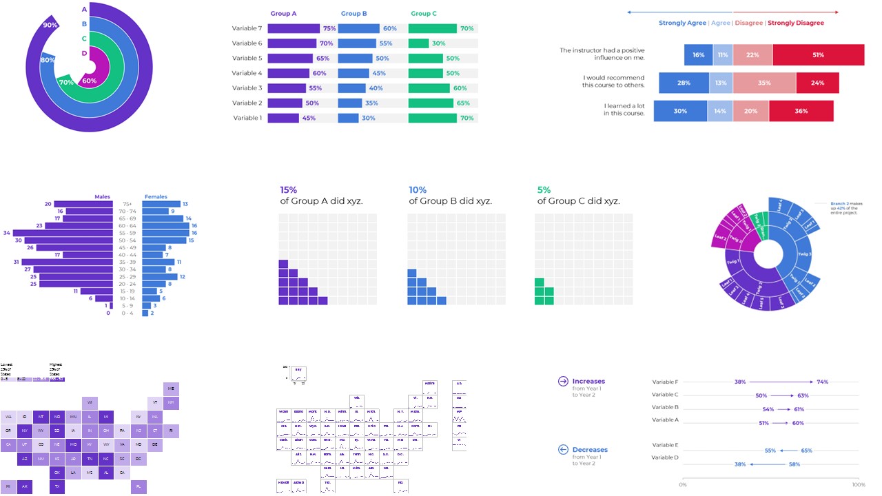
Bored of the basics?
Want to take your graphs to the next level?
Wondering what’s possible in Microsoft Excel?
From A to Z, here are some of the amazing data visualizations that you can make inside of good ol’ Excel.
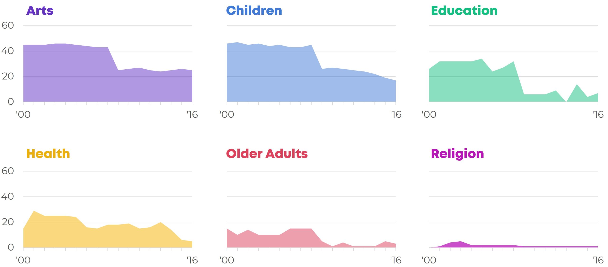
Area
You shade the area underneath the line for extra oomph.
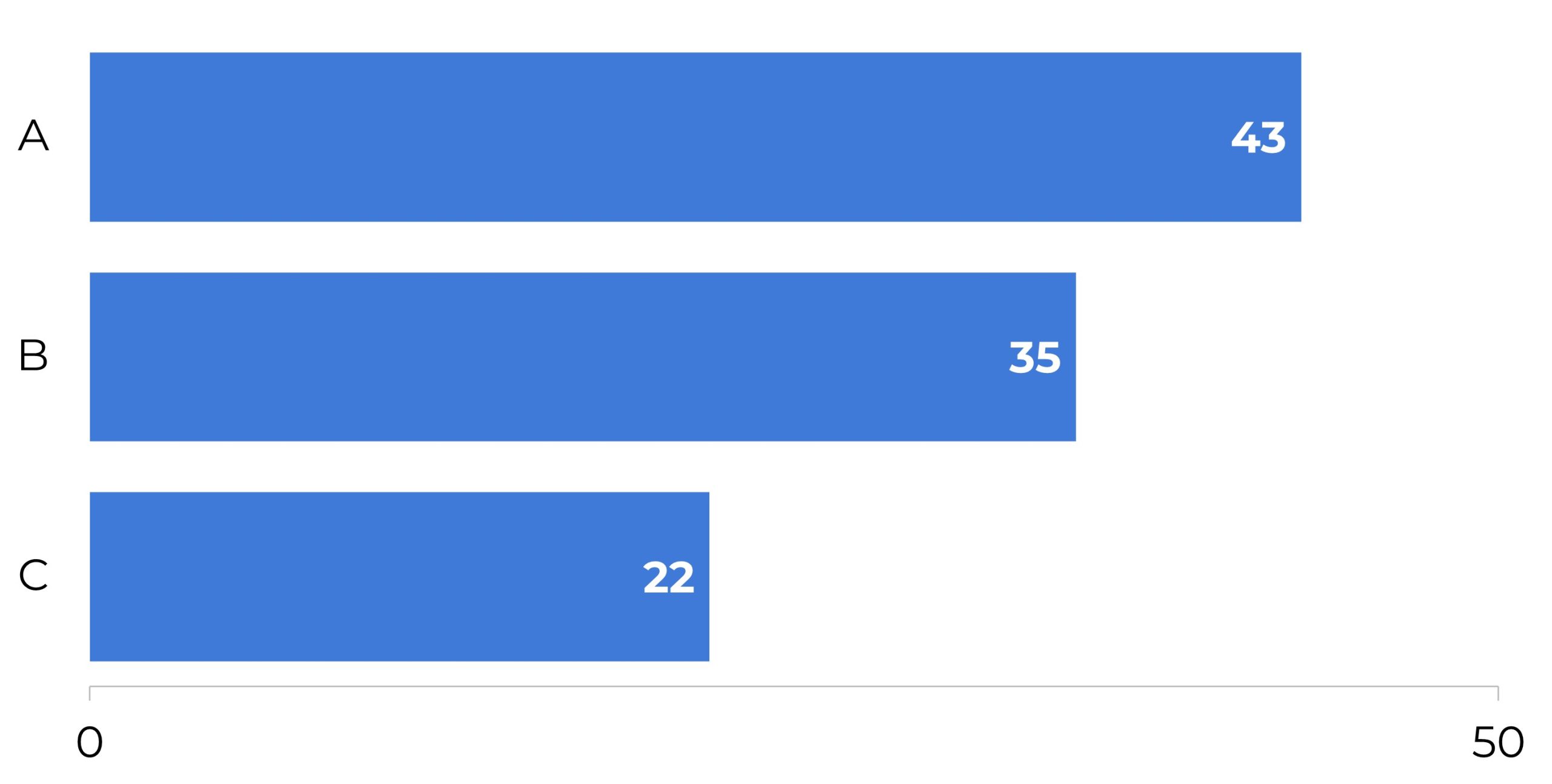
Bars
To compare the averages or totals of several categories at once.
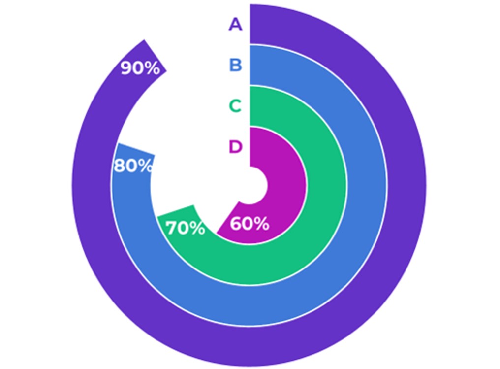
Bar’c
A bar-arc chart, a.k.a. curved bar chart. Not as accurate as a straight bar chart, but more interesting.
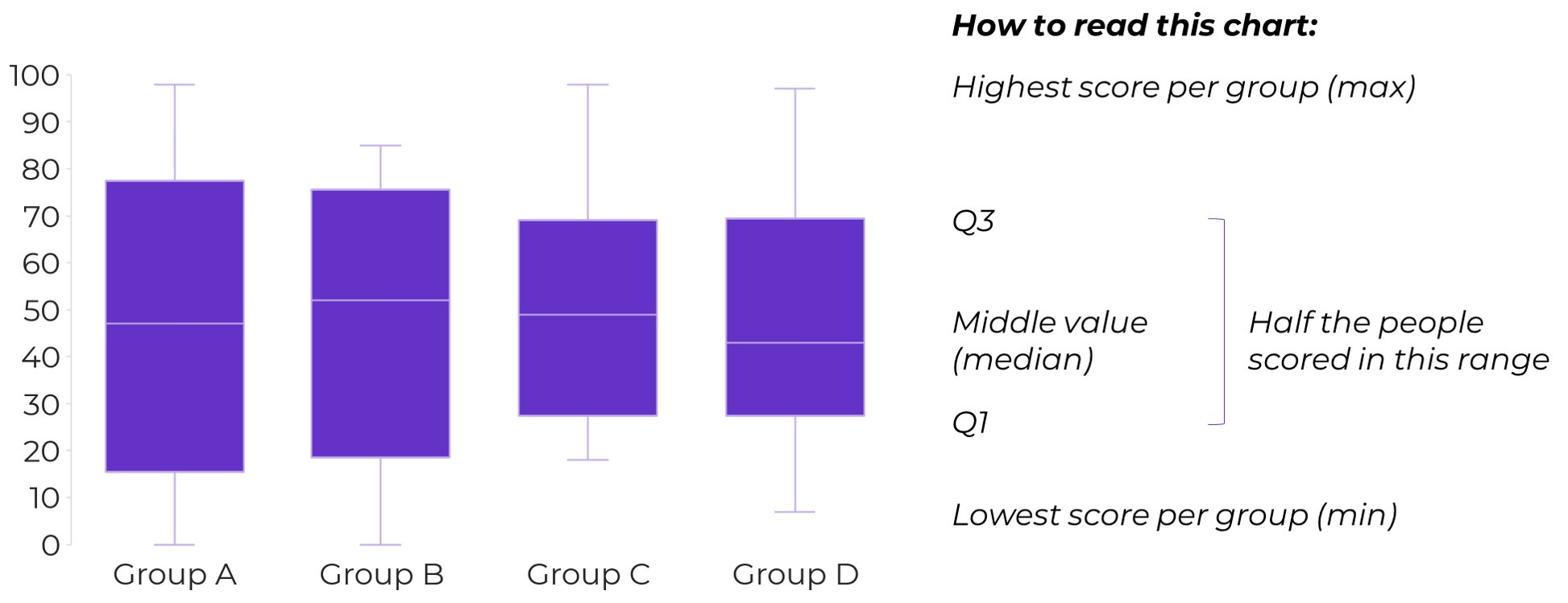
Box and Whisker
Mostly seen in academic settings.
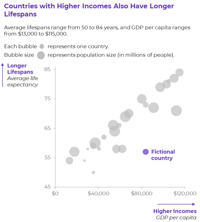
Bubble Charts
To compare three variables: x, y, and z. The z variable is the size of the bubble.
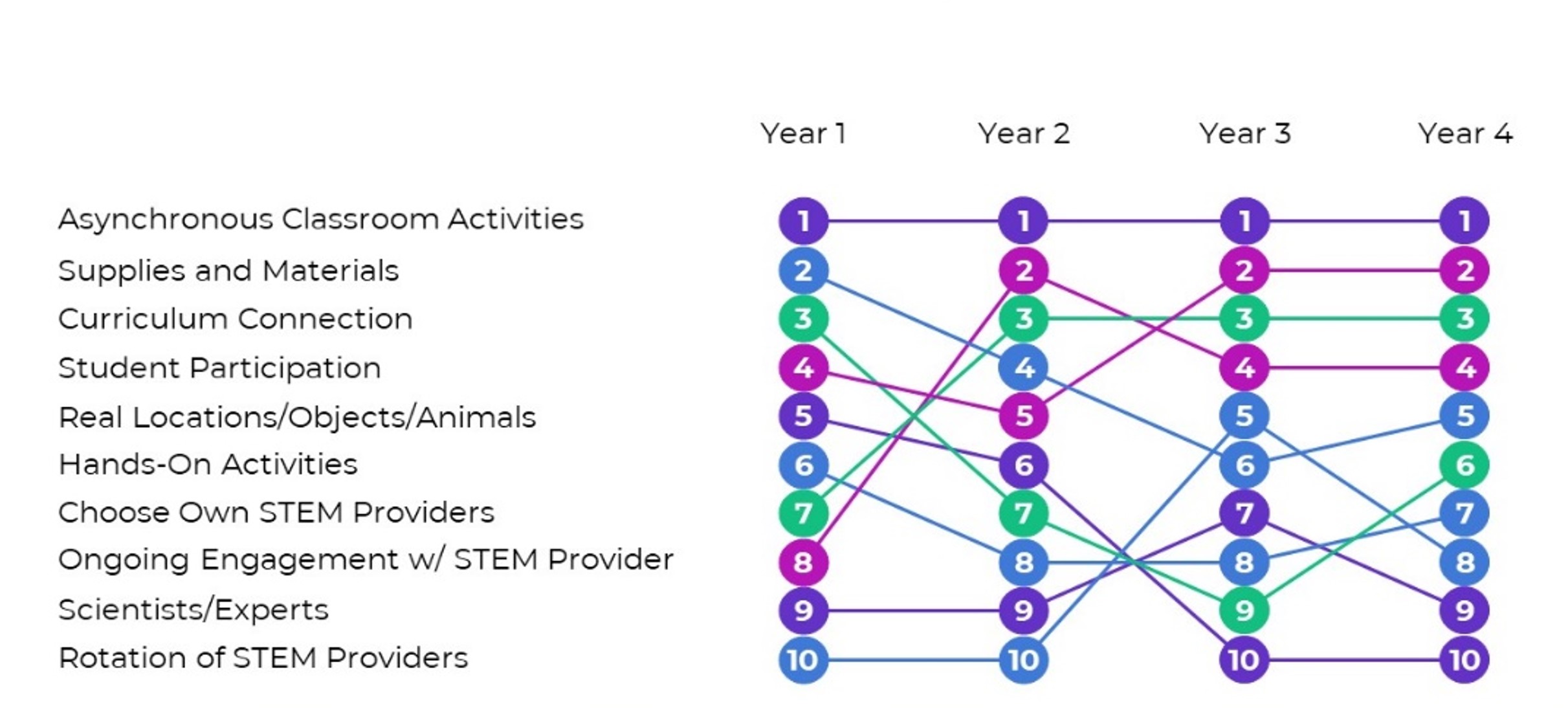
Bump
To visualize rankings over time.
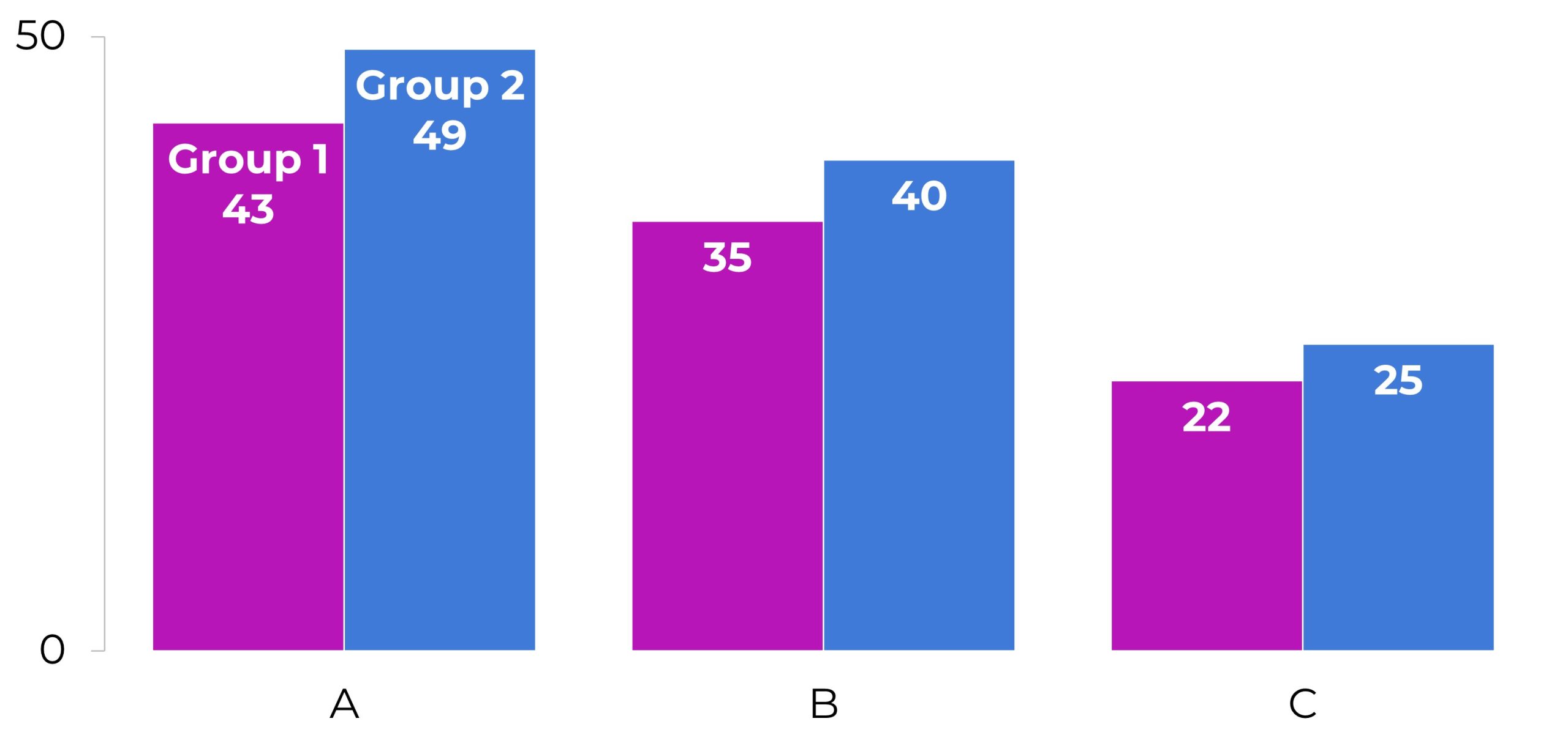
Clustered Bars
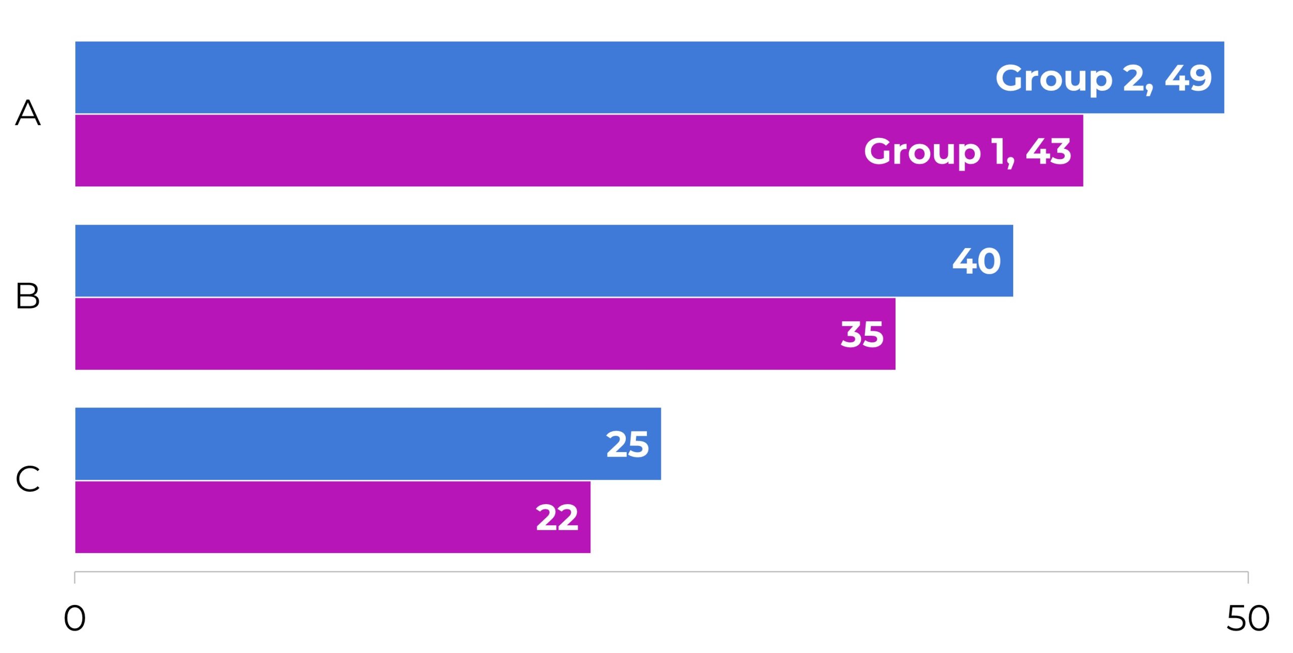
Clustered Columns
To compare a few subcategories at once.
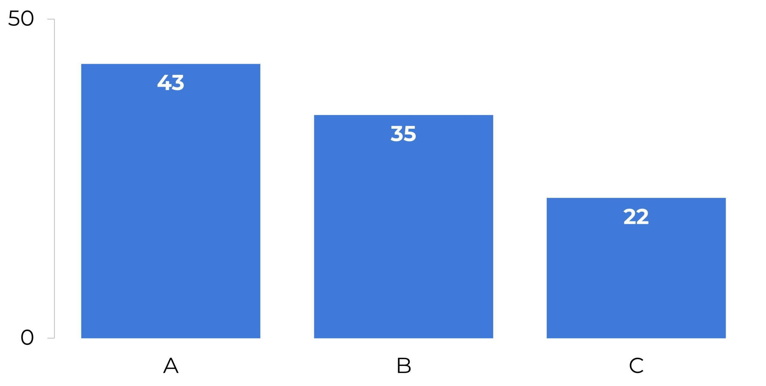
Columns
Combo Charts
Two chart types combined into one, like a column chart with a line.
Data Bars
Miniature at-a-glance horizontal bars to help us explore our dataset.
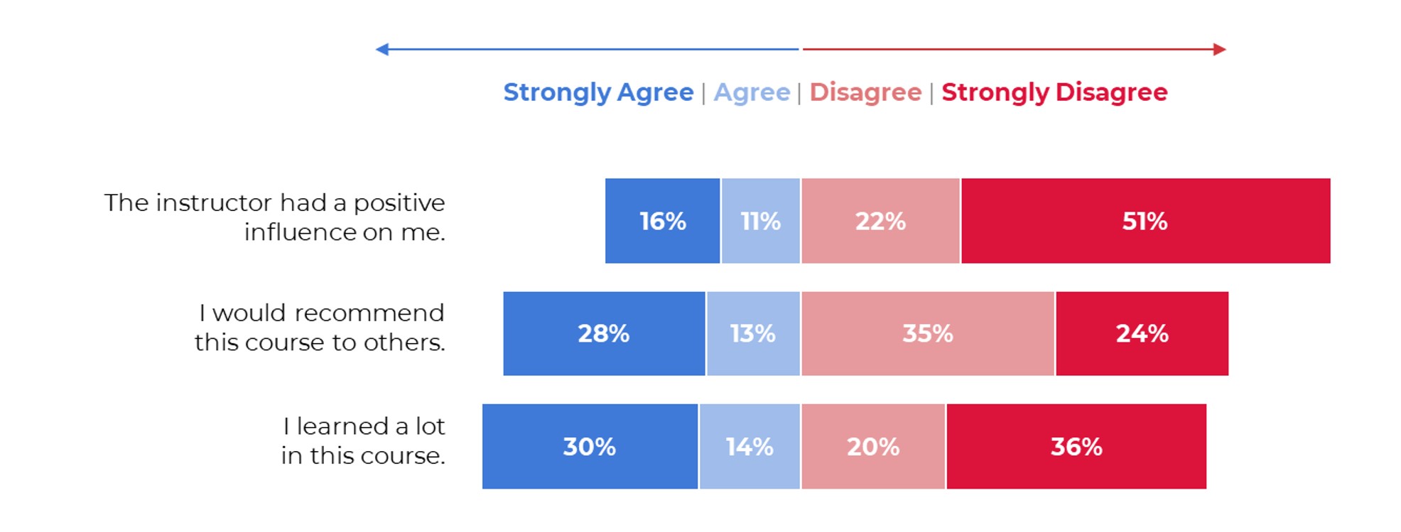
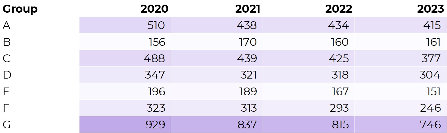
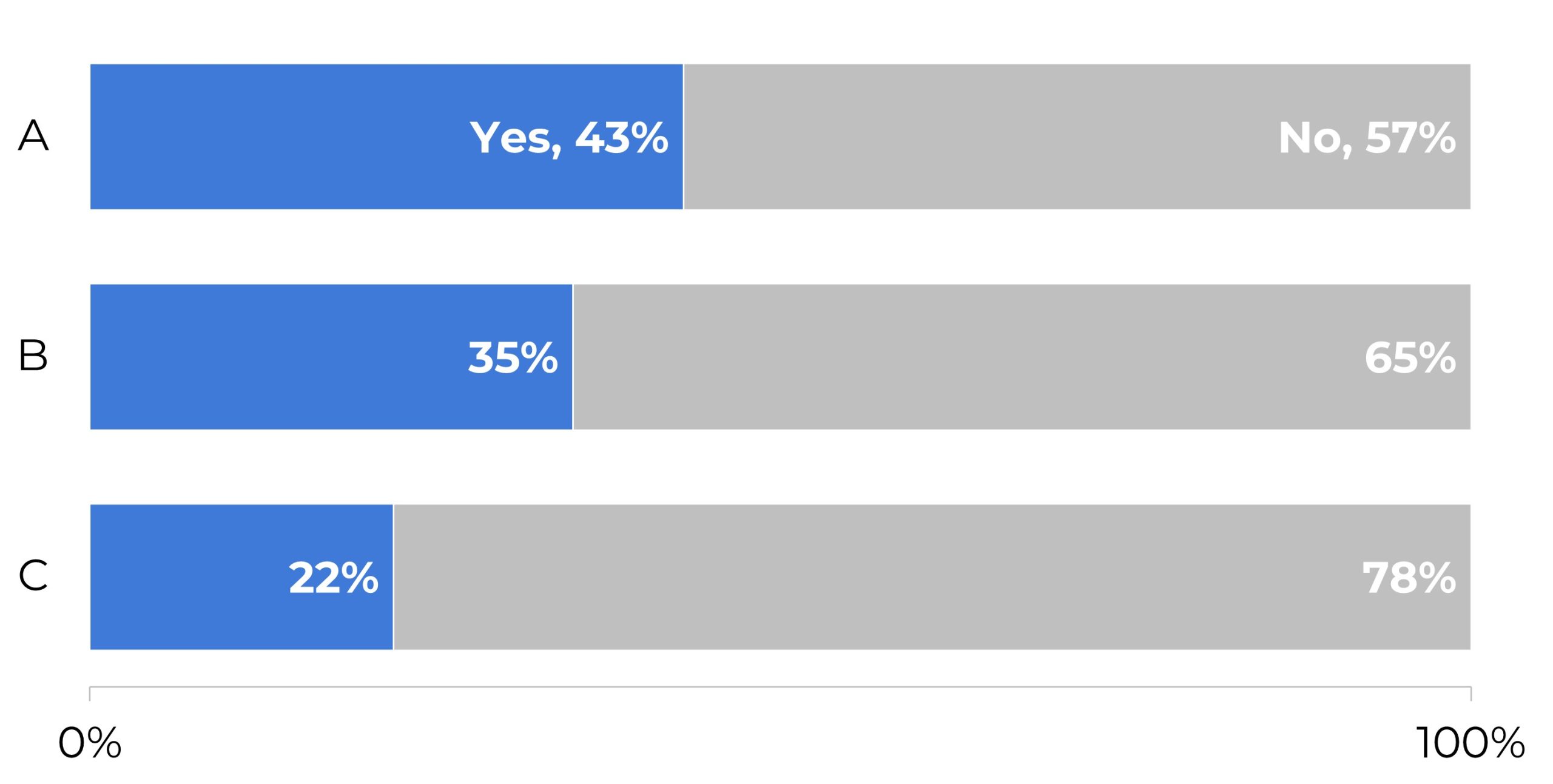
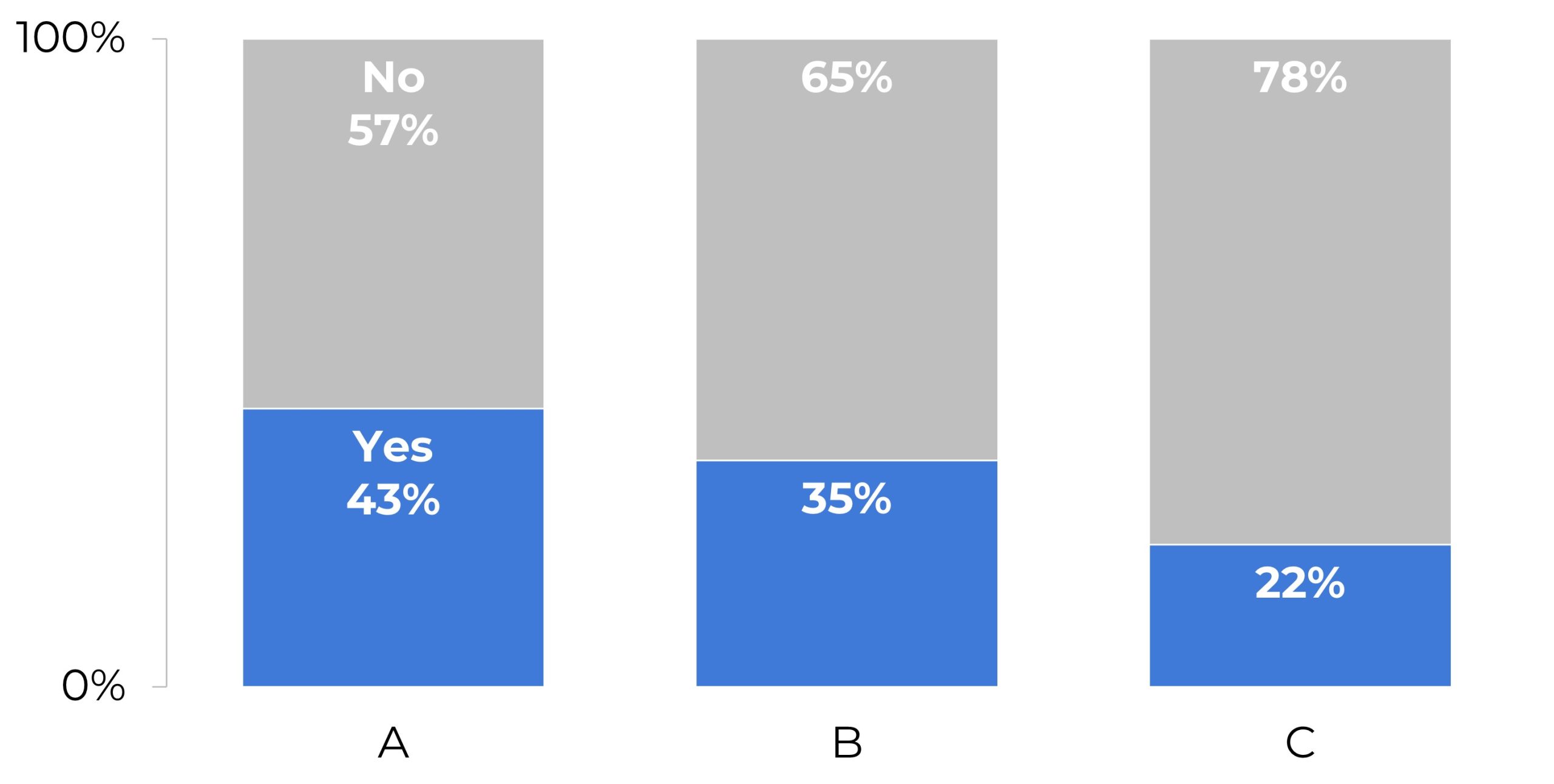
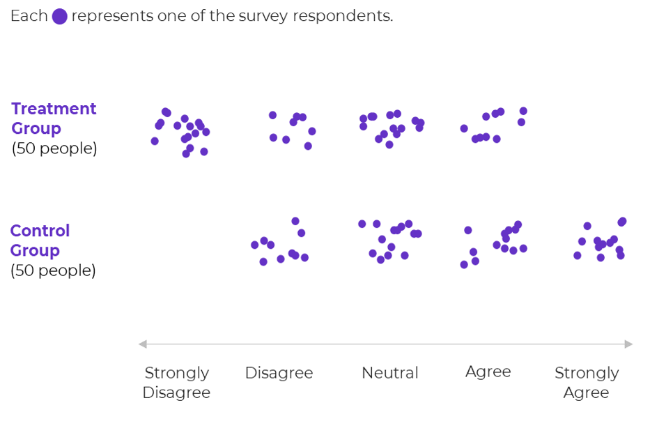
Diverging Stacked Bars
Most useful for diverging variables, like agree-disagree scales, to see how many people fall on each side of the fence. I only use these for even-numbered data (i.e., the 4 breakouts shown here).
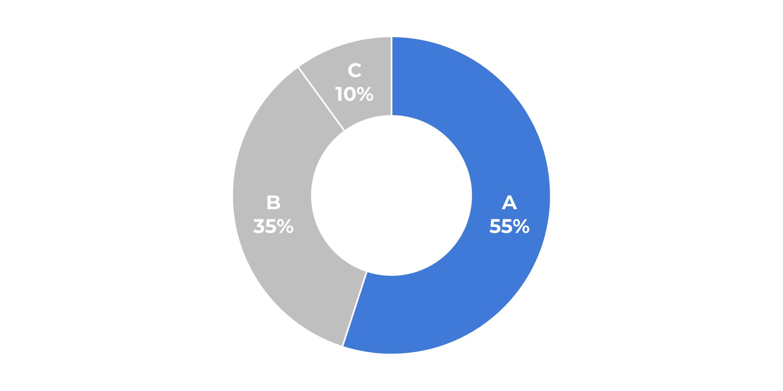
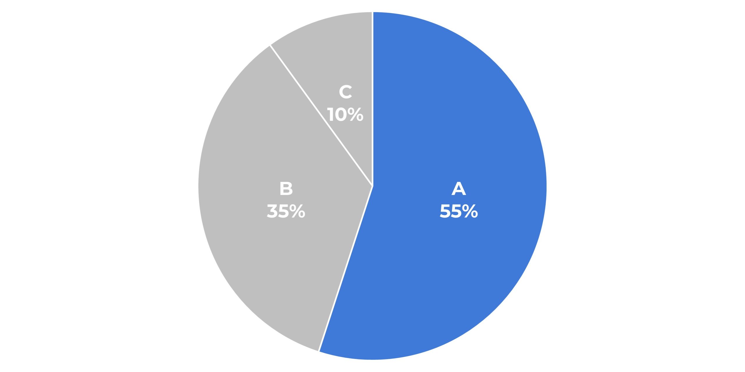
Donuts
A pie chart with a hole punched in the middle. Donuts follow the same rules as pies, e.g., limit them to 2-3 slices.
Dot Plots
A.k.a. the Cleveland dot plot, we get to compare two (or more) points along the same plane. Great alternative to clustered bars/columns.
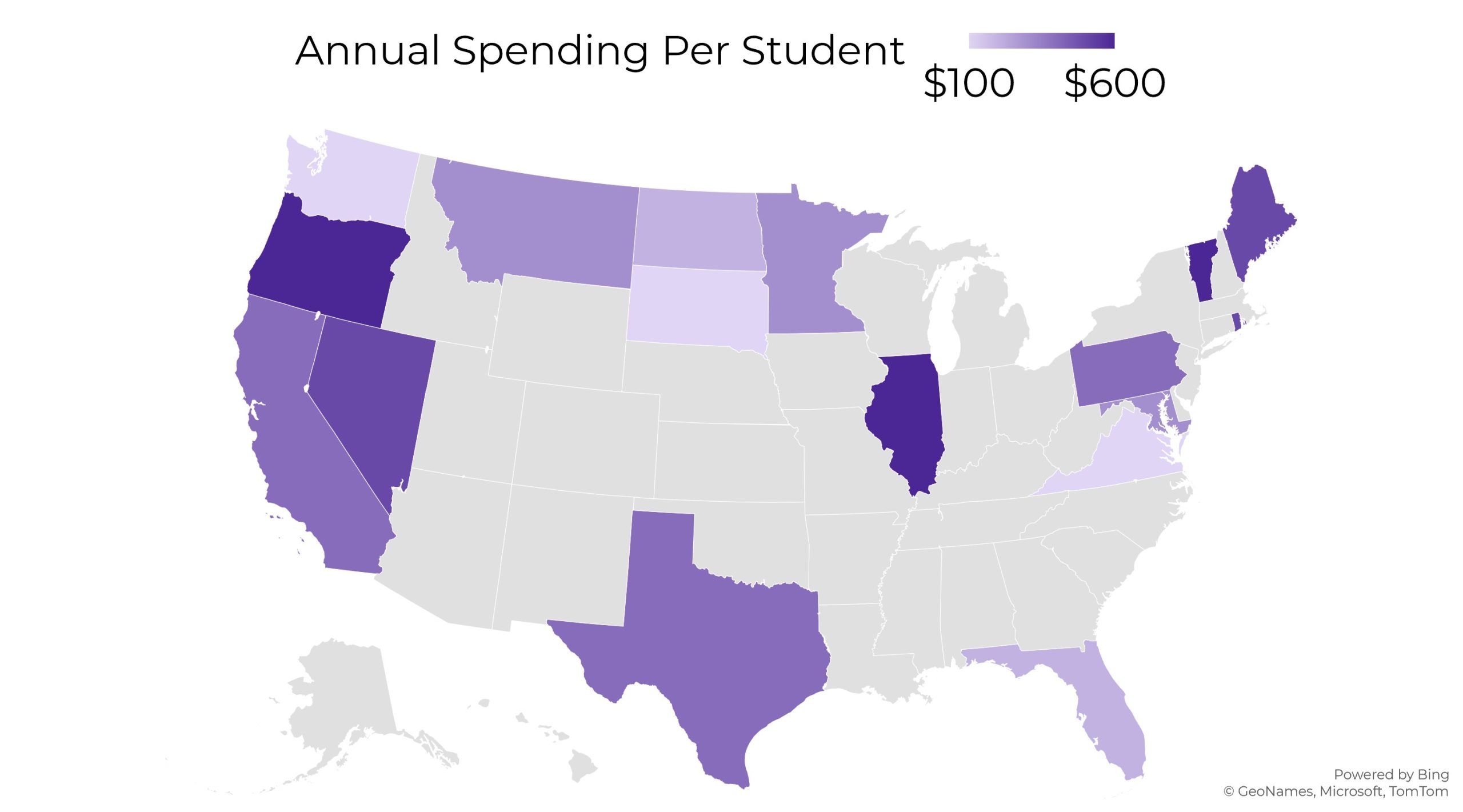
Heat Maps
We color-code each location.
Heat Tables
We color-code each cell.
Histograms
Similar to column charts, but for bins (ordinal categories).
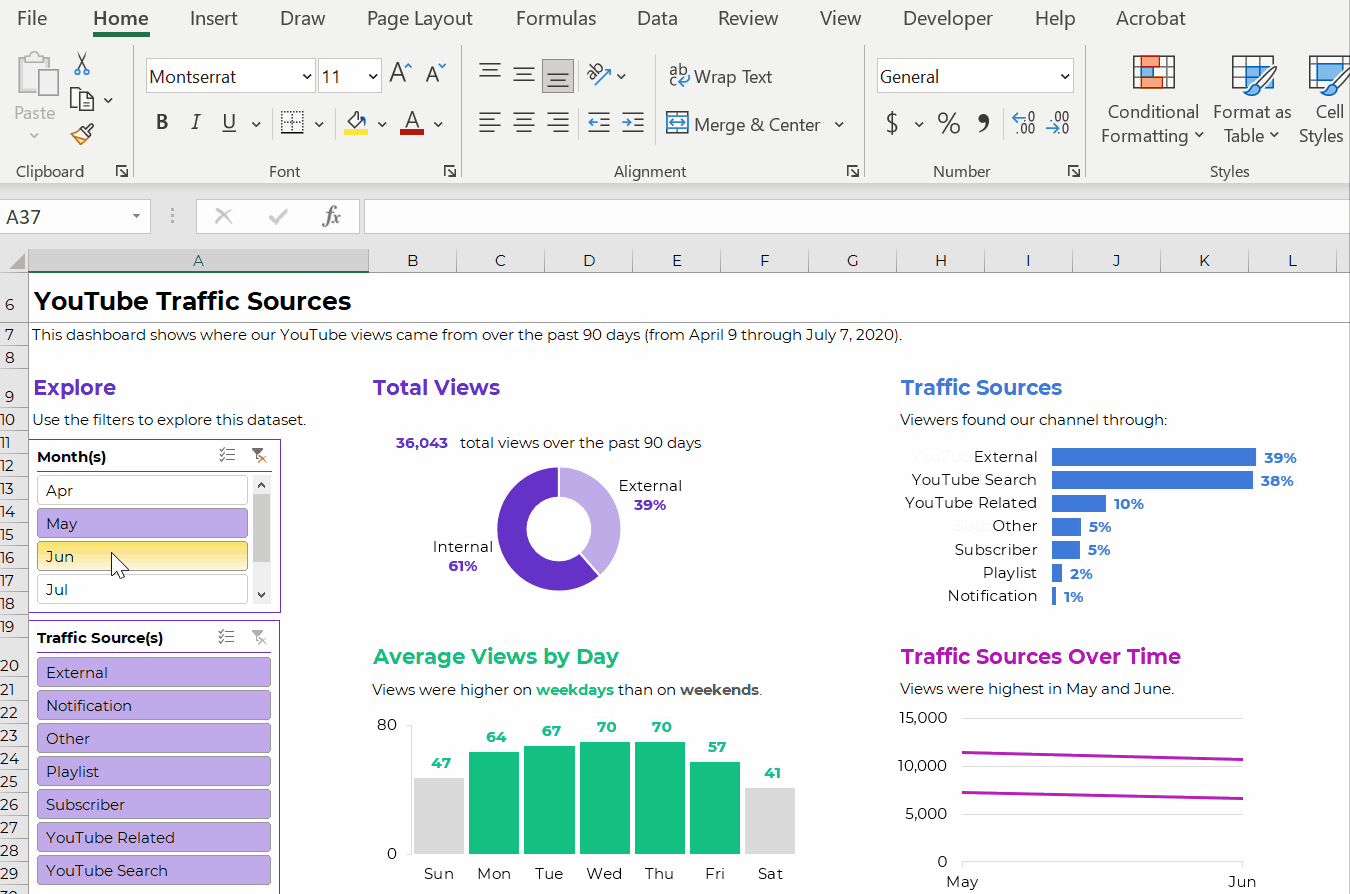
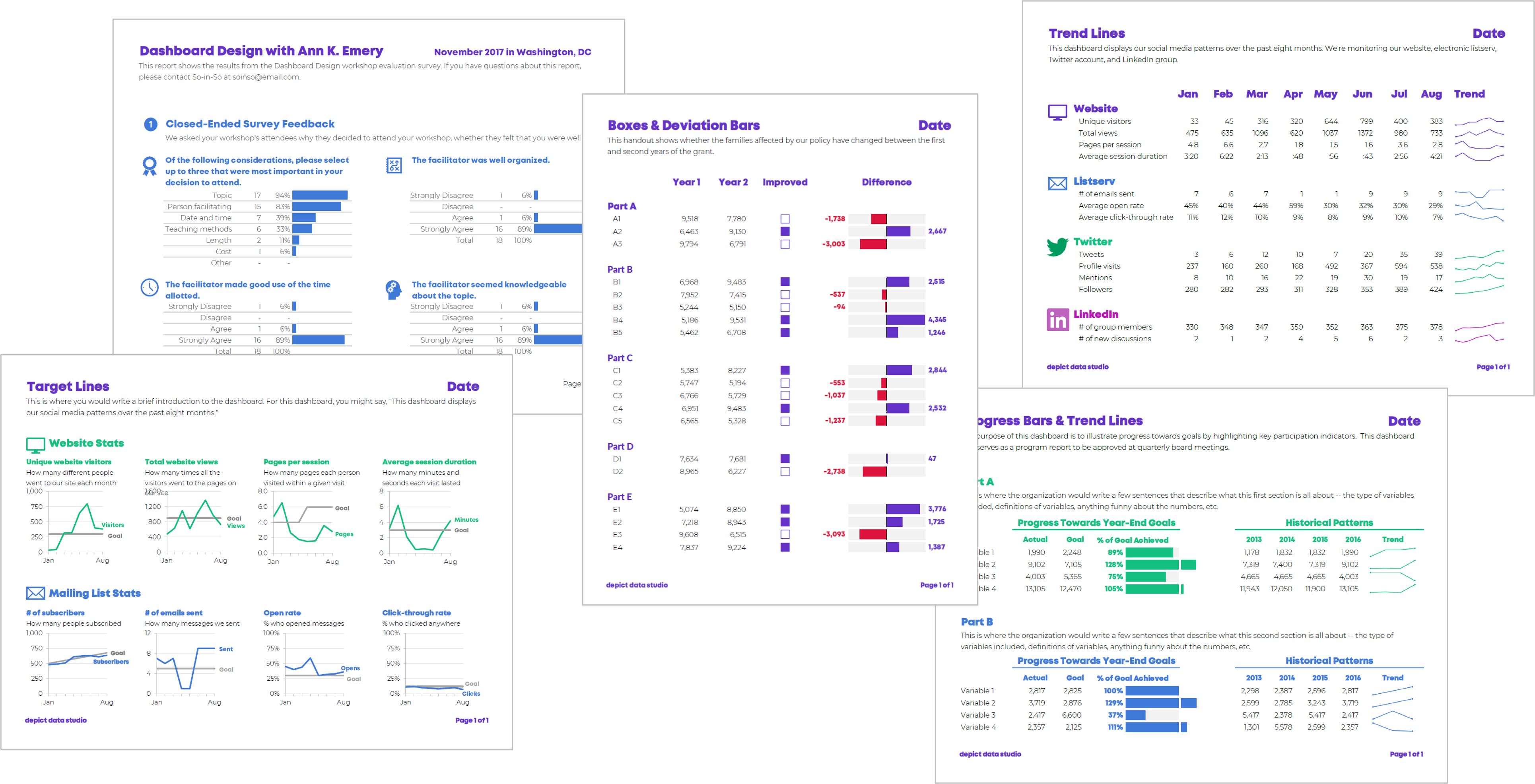
Interactive Dashboards
Available since Excel 2010, we link Excel Tables to pivot tables to pivot charts, and then use slicers to filter the data.
Lines
To visualize patterns over time.
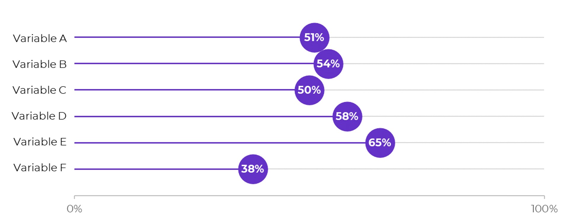
Lollipops
A skinny bar chart with a dot at the endpoint.
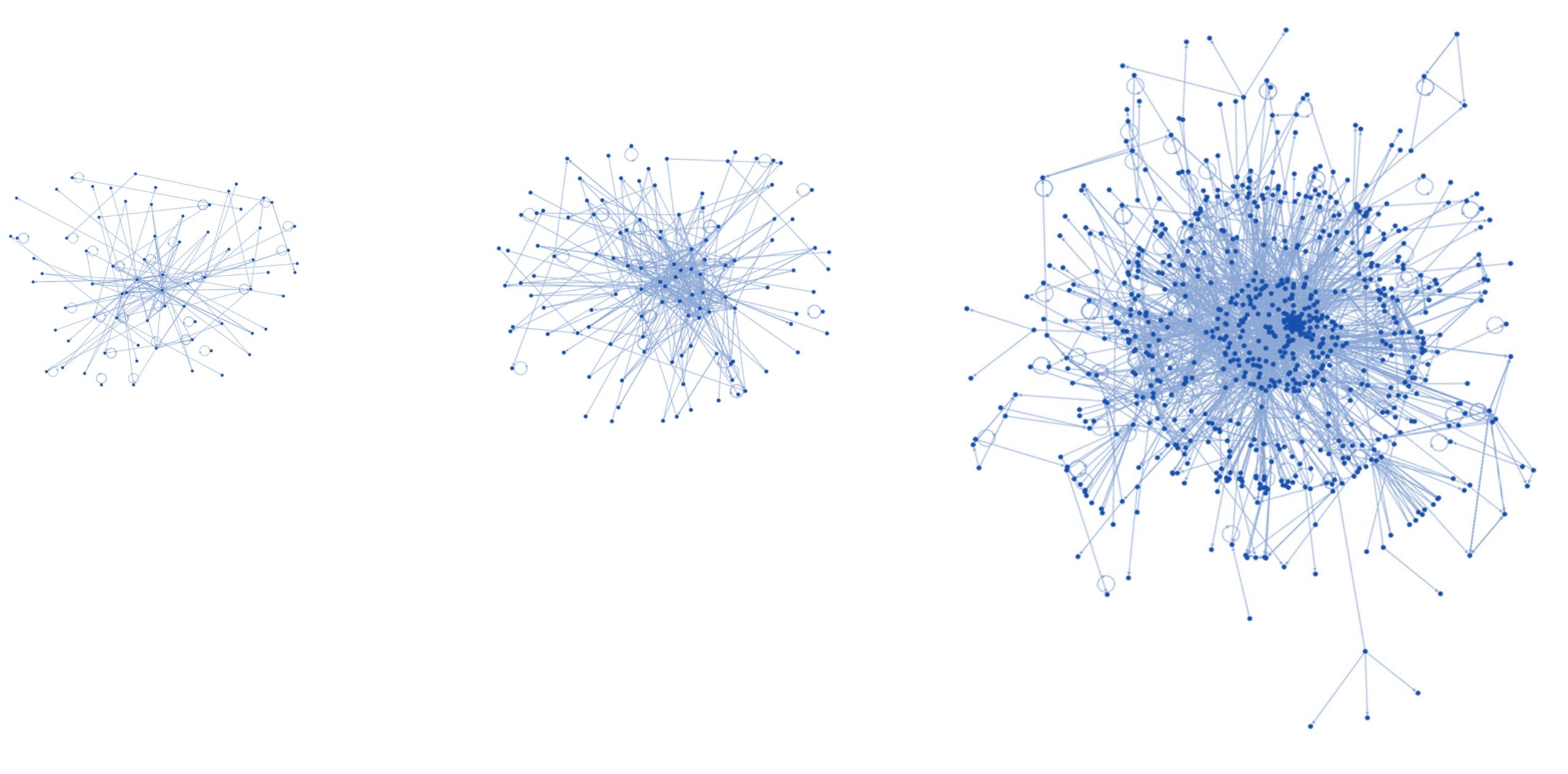
Network Maps
To compare how people, entities, etc. are connected as a network. Possible with a free plug-in, NodeXL.
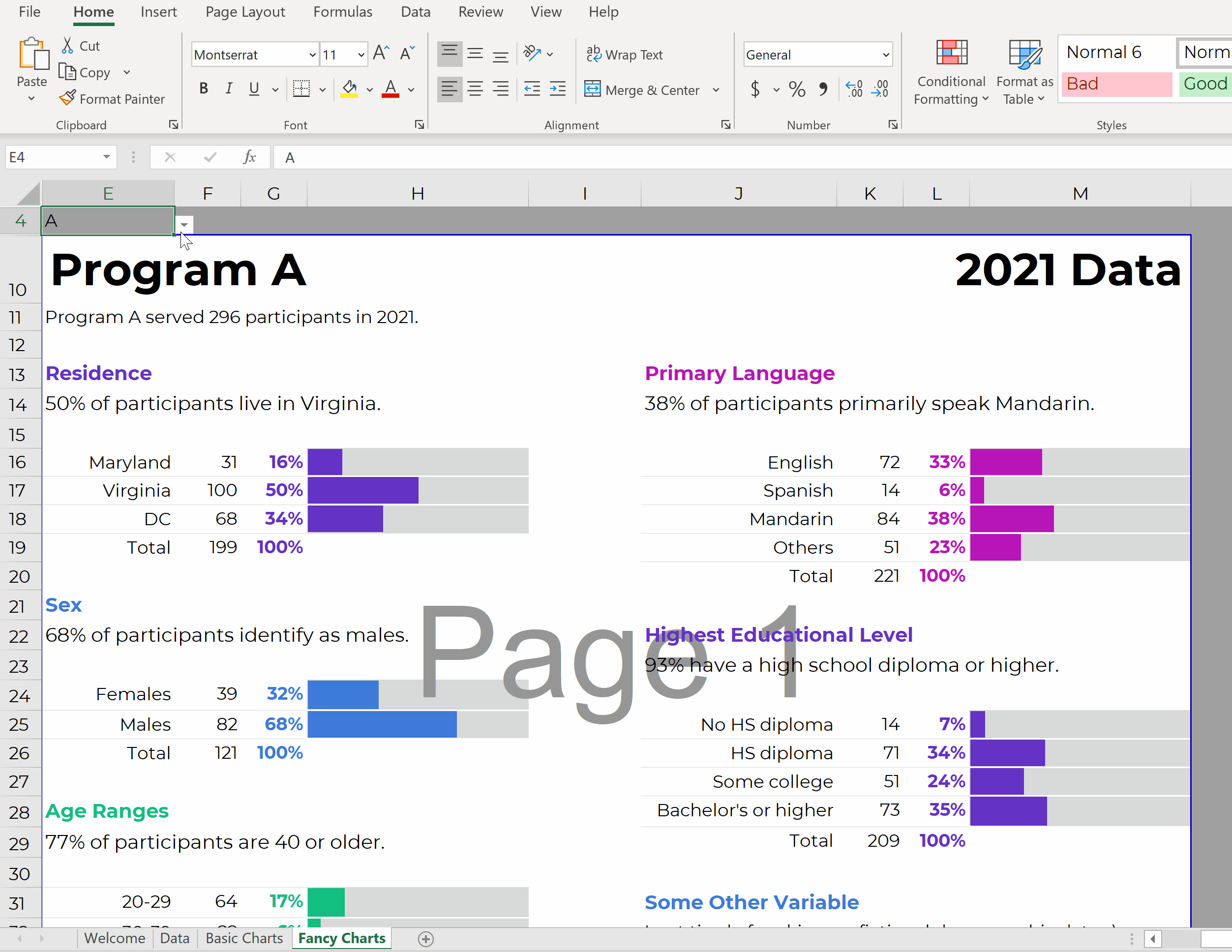
One-Pagers
Made entirely within Excel and saved as a PDF (not pasted into Word).
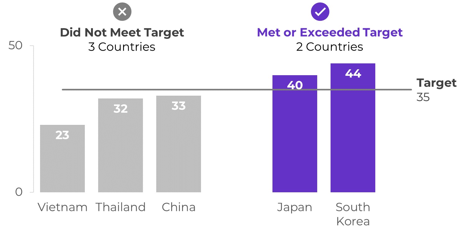
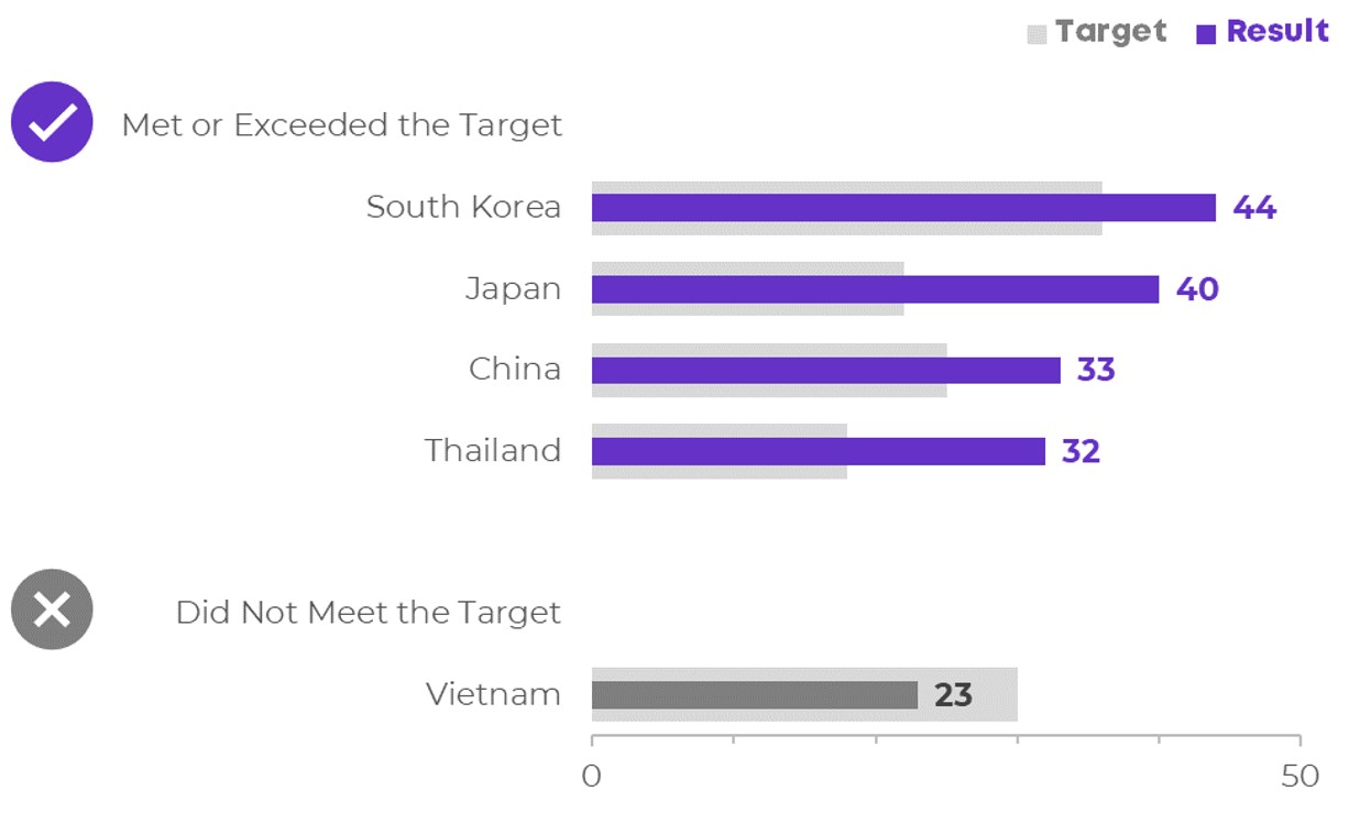
Overlapping Bars & Columns
When you’re comparing each bar/column to its own target.
Pie Charts
Make sure you follow these guidelines.
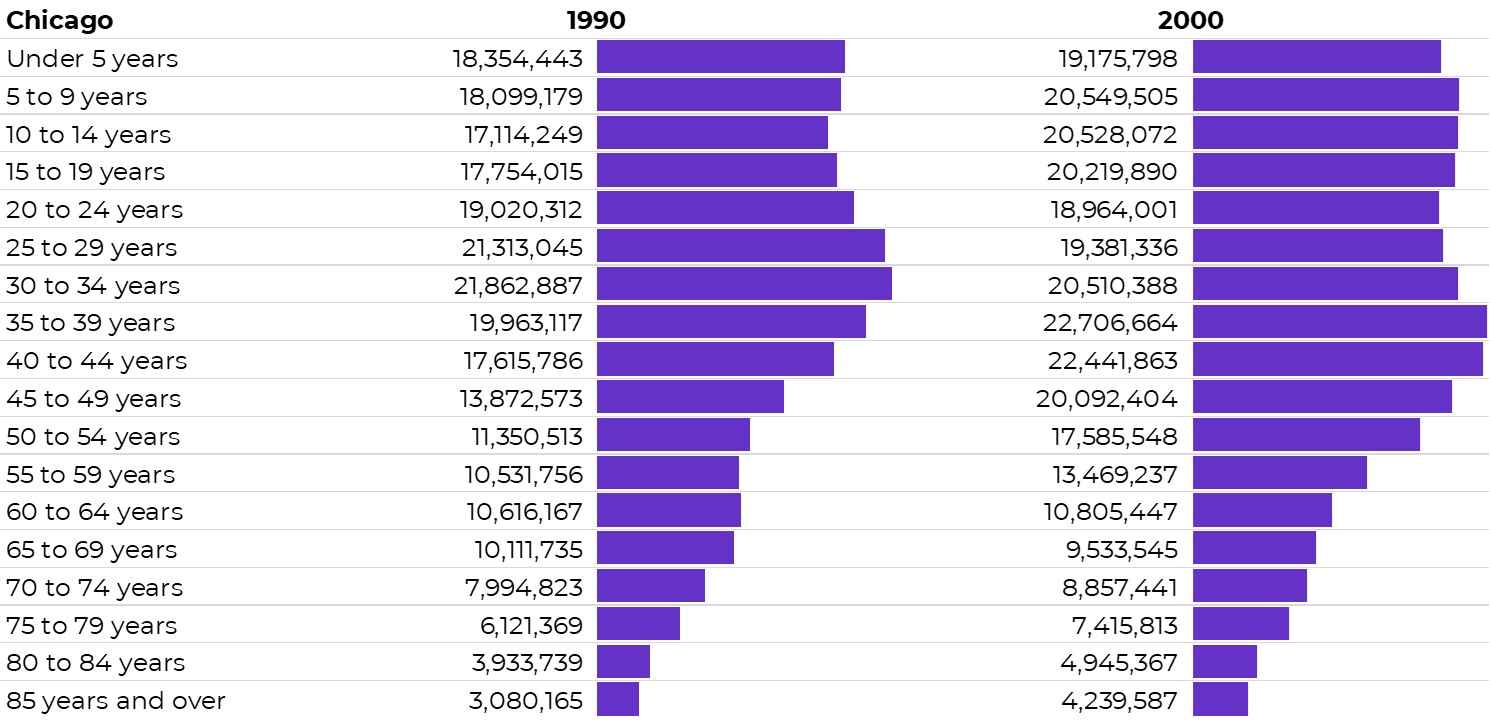
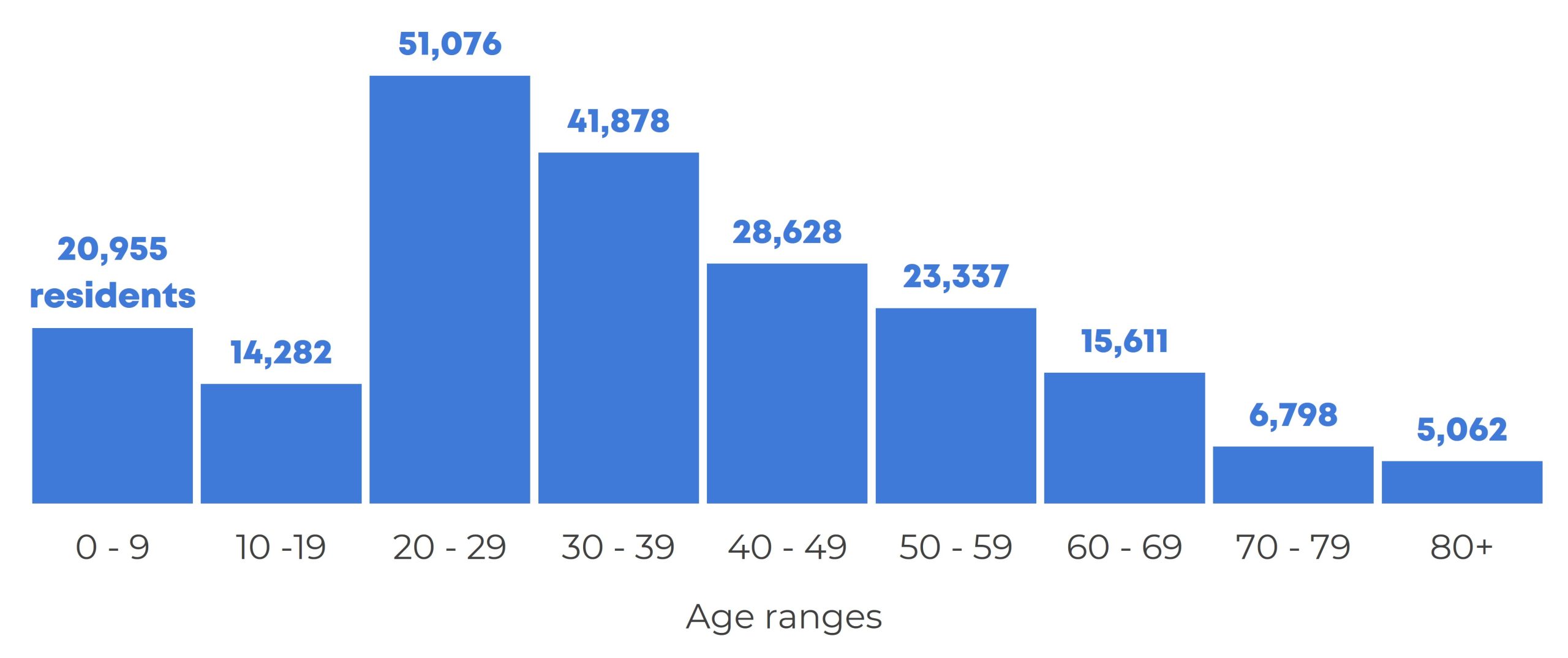
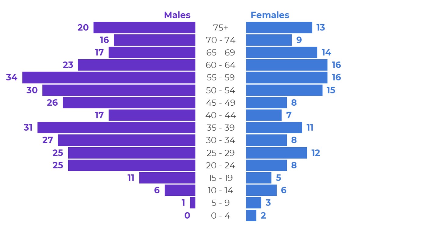
Population Pyramids
A back-to-back histogram. The traditional population pyramid visualizes age vs. sex, and is most common among demographers. We can make these for any ordinal variable (age ranges, income levels, highest educational level completed, etc.) x two categories (two locations, two groups, etc.).
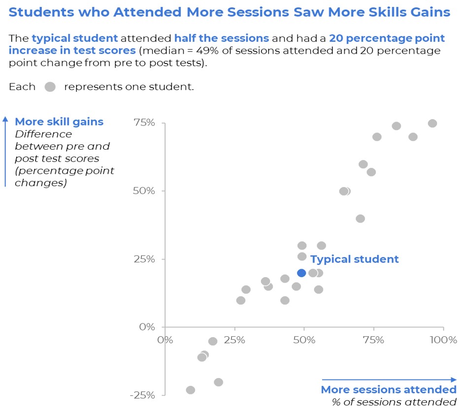
Scatter Plots
To visualize the correlation between two continuous variables (x and y).
Series of Matching Dashboards
One per student, per school, per state, etc. Create one template and let Excel handle the rest.
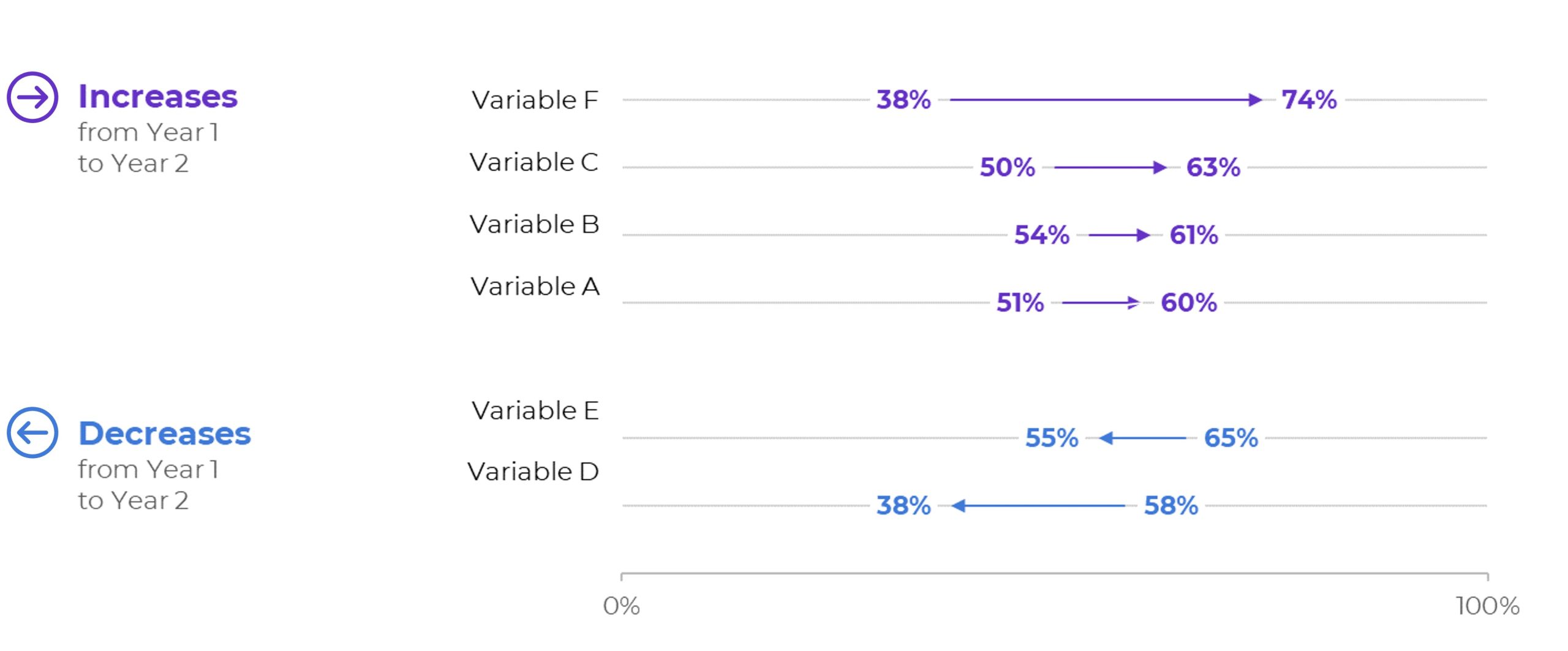
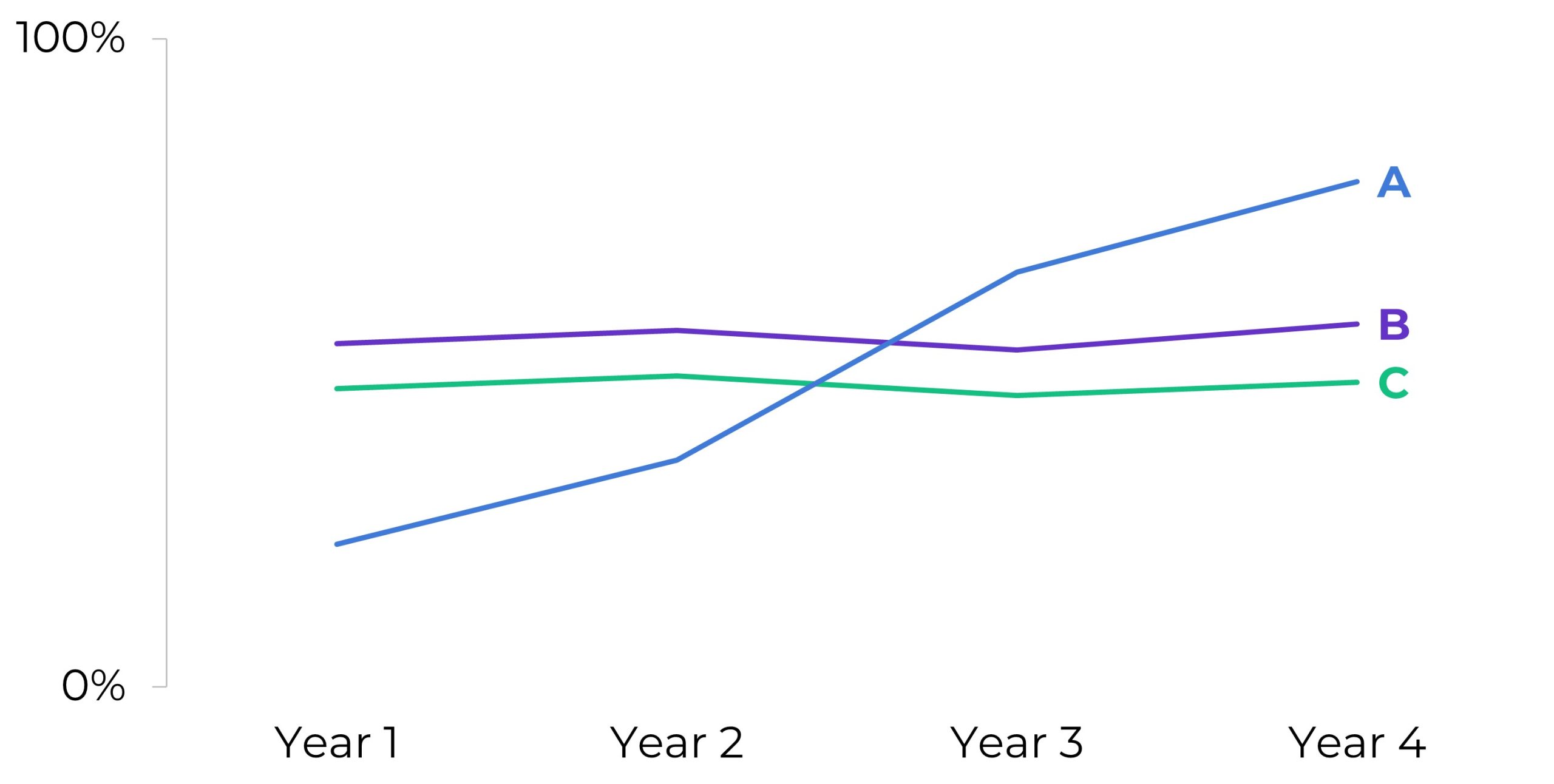
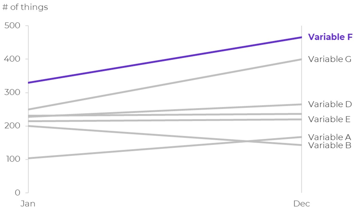
Slopes
A fancy name for a line chart that compares exact two points in time.
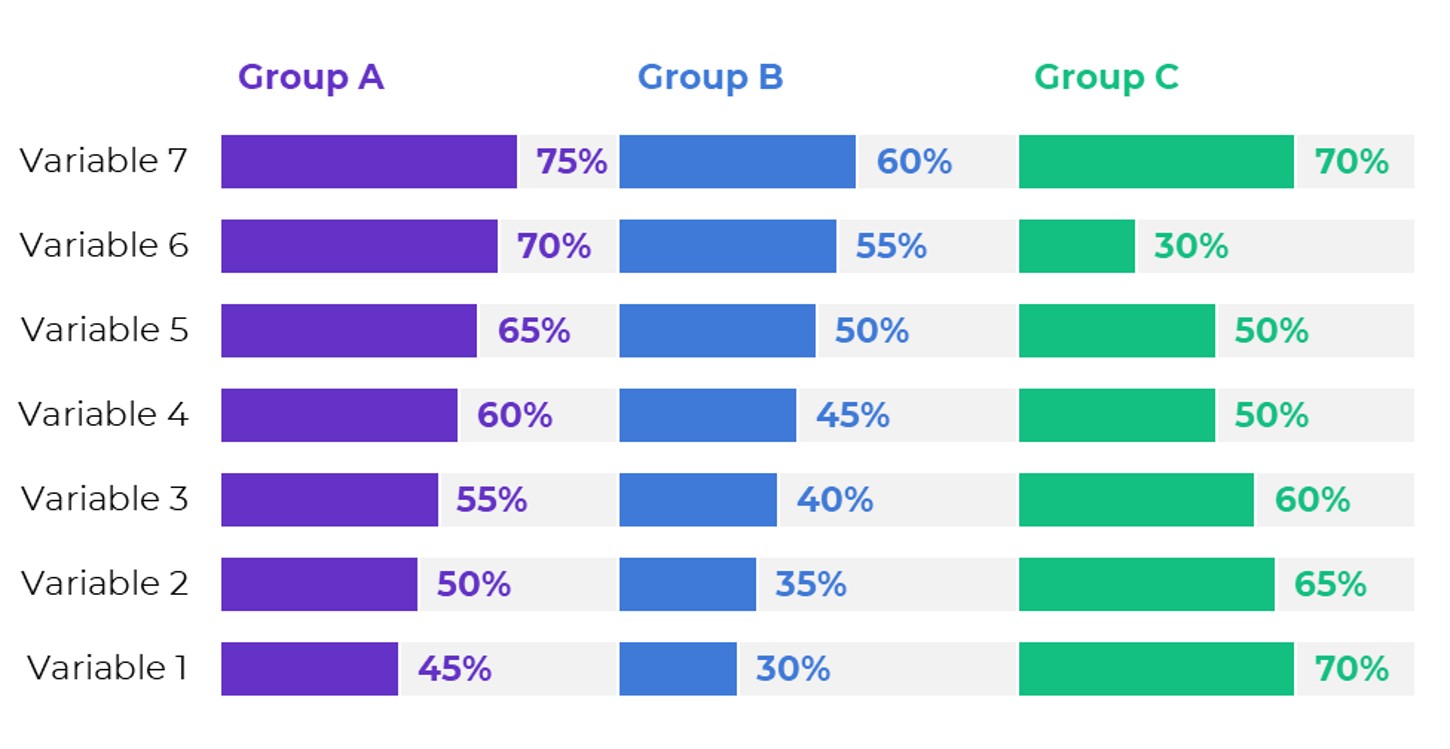
Small Multiples Bars
Several small charts. See another example here.
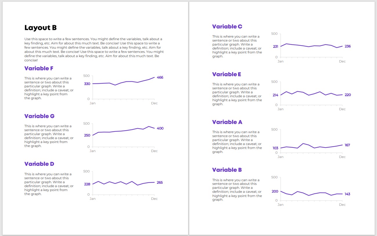
Small Multiples Lines
An alternative to the spaghetti line chart.
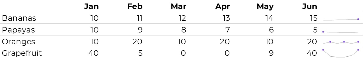
Sparklines
Miniature within-cell trendlines that help us explore the data.
Stacked Bars
An alternative to making comparisons across multiple pie charts.
Stacked Columns
Static Dashboards
Learn how to make them in this Dashboard Design course.
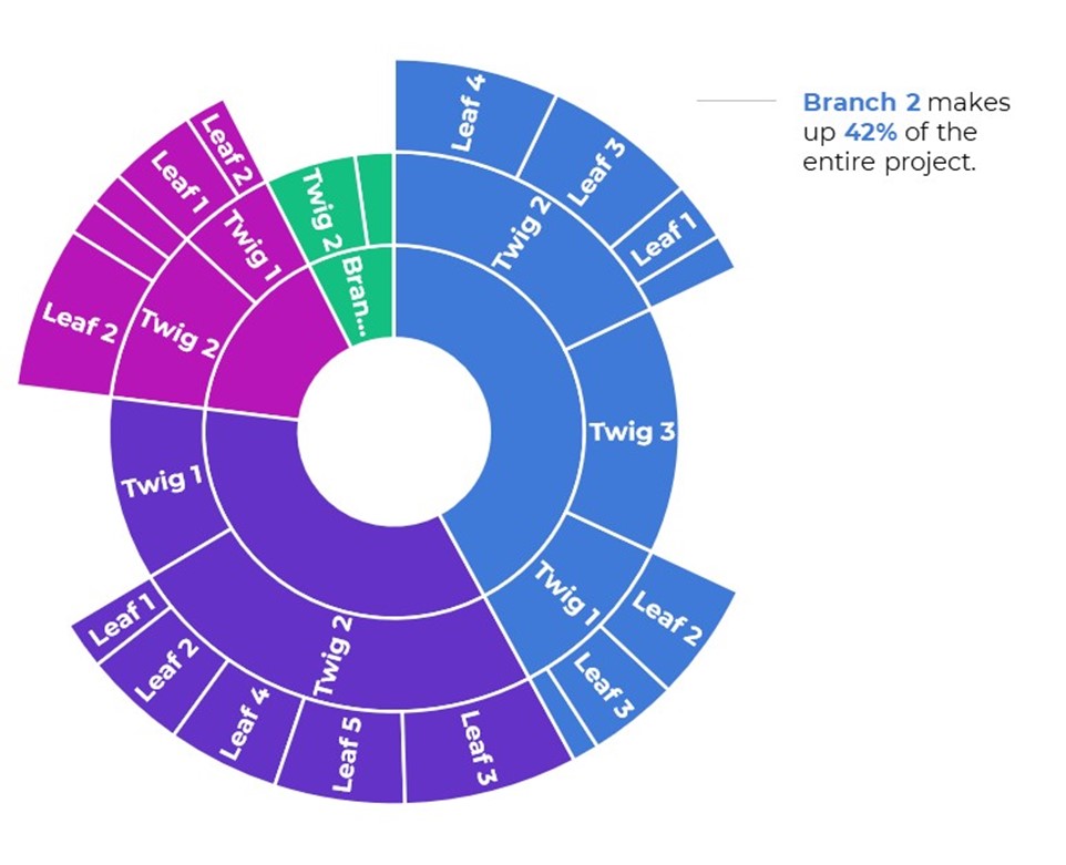
Sunburst Diagrams
Nested donut charts for comparing categories and their subcategories.
Swarm Plots
Also known as bee swarms and jittered dot plots. These plots show the individuality of each data point, not just averages.
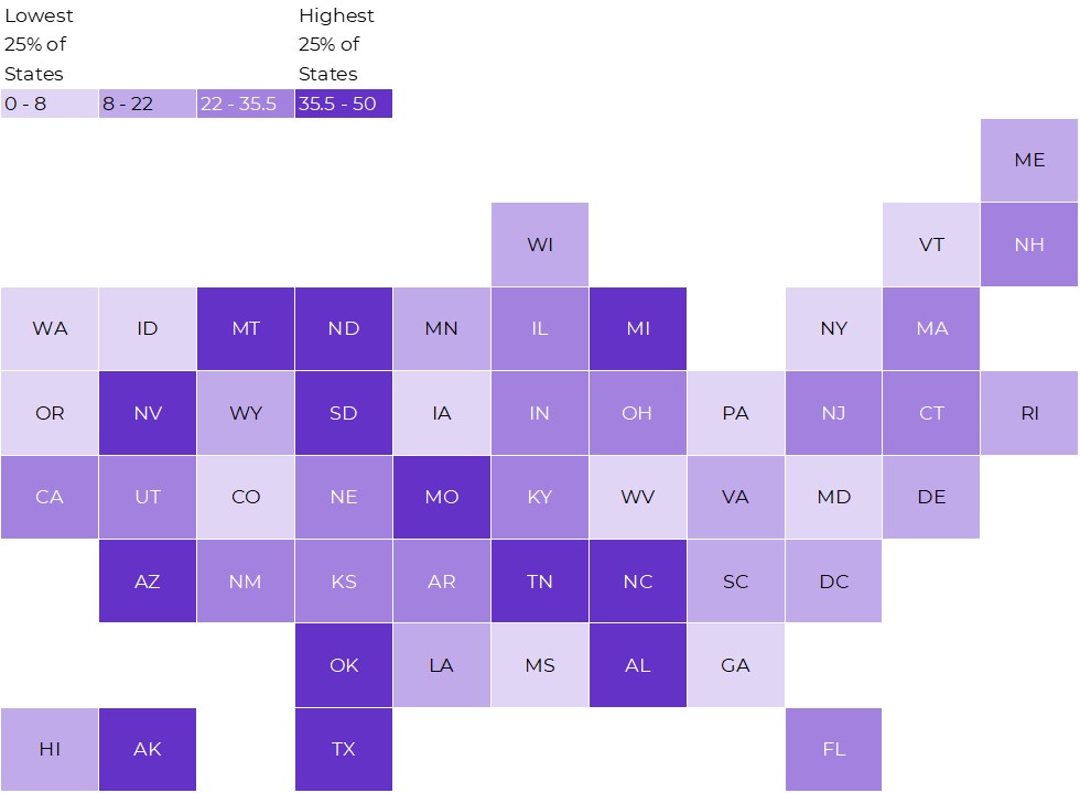
Tile Grid Heat Maps
An alternative to the regular ol’ geographic map. Helps us combat the Alaska Effect. Learn more about them here.
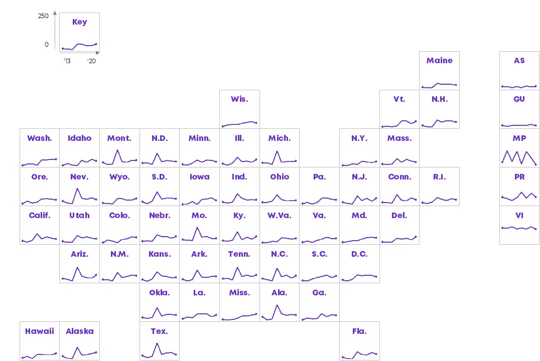
Tile Grid Trendline Maps
An alternative to the spaghetti line chart.
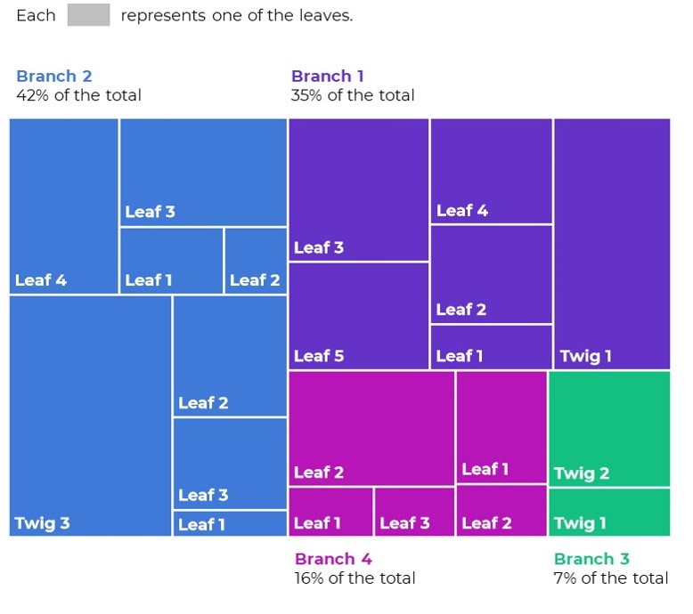
Tree Maps
For nested data: classrooms within schools within districts; branches within a government agency; etc.
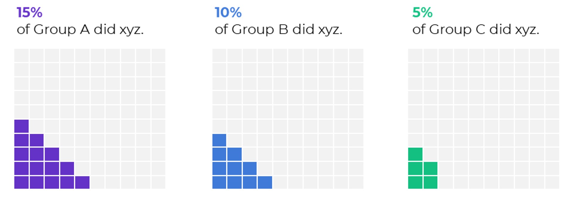
Waffles
A square version of the pie chart.
Your Turn
Which of these charts are you already using?
Which ones might you try in the future?
Comment below and let me know!
5 Comments
This is great!
Where can we get this Excel workbook?
It’s part of my Great Graphs in Excel course.
Are instructions on how to do them given in the ebook. Want to purchase it but can’t do the course (I am in a hurry)
No, sorry! The in-depth instructions are in the videos and templates inside the course, not as a PDF’d ebook. If you’re in a hurry, you can skim my “Dataviz On The Go” YouTube tutorials here: https://www.youtube.com/c/annkemery
Interactive dashboard