
Should you avoid pie charts? Within the past year, I’ve led 60+ in-person workshops and virtual webinars for 3,000+ participants. Most of these trainings have focused on data visualization best practices and how-to’s; other topics have included dashboard automation, research methods, and data analysis. I can always tell when someone has attended a data visualization training in the past because they tell me, “Ann! I know everything there is to know about data visualization! I know that I can never use pie charts!” That advice about never using pie charts is only half-true. Pie charts and donut charts are okay in some circumstances–when they meet all seven of my pie chart rules. In this post, I’ll also share before/after data visualization makeovers so you know exactly what to use instead of a pie chart.
Rules for Using Pie Charts and Donut Charts
Here are my guidelines for using pie and donut charts. Pie charts are okay when they:
- are well-formatted. No 3D, exploding slices, leader lines, or legends.
- display nominal variables. Ordinal variables don’t belong in a pie chart.
- add to 100%. I’ve seen pies that only add to 90% because the designer deleted the “other” category and forgot to recalculate the new percentages.
- contain positive numbers. I’ve seen designers place a mix of positive and negative numbers inside the same pie chart, which doesn’t make any sense.
- display a single point in time. Patterns over time belong in a time series graph, like a slope chart, line chart, or dot plot.
- only have two or three slices. Four slices is pushing it.
- are displayed individually. Only show one pie chart at a time. No small multiples pies. Comparisons across multiple pies are time-consuming.
Finally, while I don’t consider this to be a strict guideline, pie charts tend to be easiest to read with common fractions, like a one-fourth vs. three-fourths pie or a one-third vs. two-thirds pie.
Circumstances When Pie Charts Are Okay
Given these guidelines, I use pie charts to show:
- male/female/etc. gender categories;
- yes/no survey responses;
- students who graduated high school on time vs. didn’t graduate high school on time;
- adults who live in single-family homes vs. adults who live in other housing types; and/or
- other binary data.
Alternatives to Pie Charts
Let’s tackle these pie charts! It’s not sufficient to tell you to avoid pie charts. You need to know what to do instead. Here are some pie chart makeovers that are inspired by my real projects.
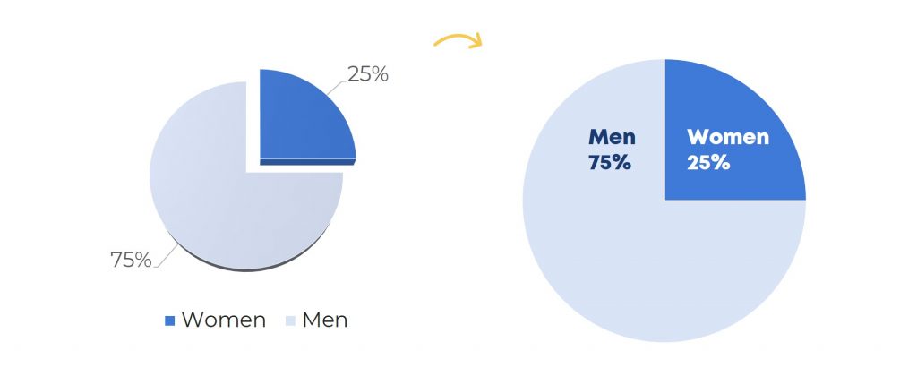
If Your Pie Chart is Poorly Formatted… Then Format It!
The chart on the lower left is poorly formatted. This one is 3D, so the slices look larger or smaller than they really are… and, it’s exploding, which is distracting for viewers… and instead of the percentages being right on top of the pie slices, now there’s a tiny legend down below the pie, which means our viewers would have to zig-zag their eyes around the slide to tell which slice is which.
The final sin in this poorly-formatted pie chart is that there are leader lines, those gray lines connecting the 25% and 75% to their corresponding slices. Plus, So much ink is on the page, yet so little is actually focused on the data.
The well-formatted pie chart on the lower right is fair game. Gender is nominal or categorical, so that works. We’re only showing a single point in time, so that works too. And we’ve only got two different slices.
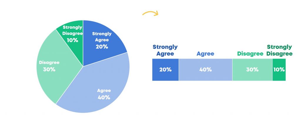
If You’ve Got Ordinal Data… Then Use a Stacked Bar Chart or a Column Chart
Ordinal or sequential variables have a natural order, like responses to a survey that go from strongly agree to agree to disagree to strongly disagree.
In this case, you’d swap out your pie chart and use a stacked bar chart instead, so that viewers can tell which category is at which end of the spectrum – the agrees on one side and the disagrees on the other side.
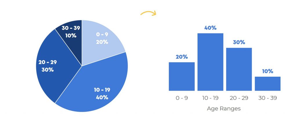
Another type of ordinal or sequential variable is age ranges. Histograms are a great alternative to pie charts when you’ve got ordinal or sequential groupings. Let your audience read across the screen from left to right (i.e., from lowest to highest).
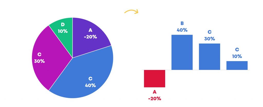
If You’ve Got Negative Numbers…Then Use a Deviation Chart
I mentioned that pie charts are only for positive numbers, not negative numbers. Sometimes we have negative numbers when we’re dealing with changes over time.
In this example, we’re looking at four products and whether they increased or decreased in sales compared to the previous quarter. For example, Product A’s sales decreased 20% compared to the prior quarter while Product B’s sales improved 40% compared to the prior quarter.
Instead of a pie chart, we’d use a column chart or bar chart. In your software program, the negative numbers will automatically flip in the opposite direction of your positive numbers. The axis line runs across the middle at 0% and we can see which products went down (like Product A) and which products went up (like Products B, C, and D).
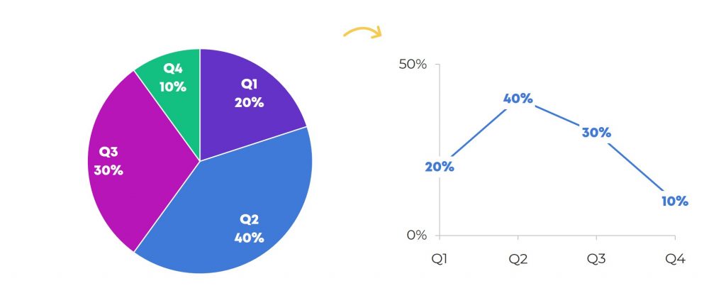
If You’ve Got Patterns Over Time… Then Use a Time Series Chart
What if you have time series data, that is, patterns over time? Maybe you’re trying to show data for each Quarter – Quarter 1, Quarter 2, Quarter 3, and Quarter 4 – or for each month, or for each year in the grant cycle.
Swap out your pie chart and use a line chart instead. You want viewers to see the beginning point – Quarter 1 – over to the end point – which is Quarter 4.
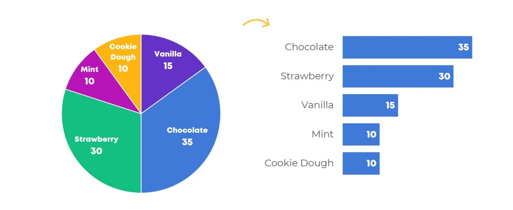
If You’ve Got More than Two or Three Categories… Then Use a Bar Chart
Pie charts are easiest to read with only two or three slices.
What if you have lots of different slices, like favorite ice cream flavors? This pie chart has too many slices – vanilla, chocolate, strawberry, mint, and cookie dough. It’s too hard for our brains to compare the slices to each other.
Swap out the pie chart for a bar chart and order the bars from greatest to least (or least to greatest). Chocolate would be listed first because it’s the most popular, and cookie dough would be listed last because it’s the least popular.
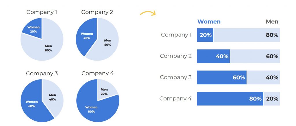
If You’re Tempted to Display More than One Pie at a Time… Then Use a Grouping of Stacked Bar Charts
What if you want to compare several companies, organizations, outcomes, etc. all at once? Pie charts are hard enough to read. Our brains don’t do well deciphering the angles, area, or circumference of circles. Two or three or four different pie charts can be understood, but with way too much mental energy.
In this example, we’re asking our viewers to look first at the 20% angle, and then at the 40% angle, and then their eyes have to zig-zag to the 60% angle, and then their eyes have to zig-zag over to the 80% angle. So. Much. Work.
In this case, you’d swap your small multiples pie chart for a small multiples stacked bar chart. The part-to-whole pattern is still there, but now our viewers’ eyes only have to make a single, diagonal swooping motion down the page to compare all four companies at once. Less energy required for reading, more energy reserved for making decisions based on that data.
Join the Conversation
Have you seen real-life pie charts or donut charts that are in desperate need of a makeover? Comment below and include a link to the example, and I may even include it in a future pie chart makeover blog post.
21 Comments
Nice article, agree with all of it. Only use it in some situation.
Very useful, but I’m curious how you recommend we get around the 101% rounding issues?
44.5% – 45%
55.5% – 56%
the decimals add to 100, the rounding is done properly. But rounded, it’s 101%
My suggestion to avoid the 101% rounding dilemma is to use scientific rounding instead of bookkeeping rounding. .1-.4 round down and .6-.9 round up.
If .5 always rounds up then you have more cases rounding. Up than down and leads to an invalid distribution, so look at the number following the .5. If it’s odd, then round down; if it’s even then round up.
[…] *Source: http://annkemery.com/pie-chart-guidelines/ […]
[…] in 2016 as more people write and argue about best practices. There will always be the debate about pie charts(2), zero-axis baselines(3), and memorability, but it seems the field has come a long way in the […]
[…] K. Emery offers good advice on the pie charts in her blog post, "When Pie Charts are Okay (Seriously)." The short answer: almost […]
[…] It’s social media filler content, so whatever. And yeah, the chart, if you want to call it that, isn’t any good. But let’s not lose sight of the big picture here, and that is that pie charts are okay sometimes. […]
[…] I found this great post which talks through use cases of when using a pie chart is […]
[…] It’s social media filler content, so whatever. And yeah, the chart, if you want to call it that, isn’t any good. But let’s not lose sight of the big picture here, and that is that pie charts are okay sometimes. […]
[…] quarter-by-quarter pies are off the table. According to my pie chart guidelines, gender breakdowns are one of the only times it’s okay to use a pie chart (nominal variable, […]
[…] not anti-pie but I do have a long list of pie chart guidelines. These numbers can’t stay in a pie chart because a) there are too many slices, b) you can […]
[…] was about gender–the proportion of wheelchairs distributed to men and women. According to my seven pie chart guidelines, gender can stay in a pie chart. Gender is a nominal/categorical variable and there are only a […]
[…] make the purists cringe, a pie chart. Don’t worry, I teach my workshop participants about alternatives to pie charts. I might use a pie chart when I want my fictional viewers to see the part-to-whole comparisons. […]
[…] least favorite charts of all time include clustered bar charts, 3D exploding pie charts, and line charts with two y axes. By now, hopefully you know my style. I’m not just going to […]
[…] When Pie Charts Are OK (Seriously) by Ann Emery […]
You can probably get away with 5 or 6 wedges in a pie chart. Other than this, I’m in agreement with this article.
To use ordinal data in pie charts is key, if you want to know which answer to a question is the majority!
Creating diagrams is not about feeling, or self defined rules, it is about knowing how visualization works.
The worst diagrams are stacked bar charts in sense of reception!
https://eagereyes.org/blog/2016/a-reanalysis-of-a-study-about-square-pie-charts-from-2009
https://eagereyes.org/techniques/stacked-bars-are-the-worst
exelente Artículo, estoy totalmente de acuerdo, aplicaré tus recomendaciones
I see that I chimed in three years ago, to say that 5 or 6 values in a pie chart is okay. I would even suggest that more is okay, if it is formatted well, and the point might be to show that one or two pies take up the vast majority of the total, and you’re left with a lot of little skinny pieces.
One rule you don’t include is that with more than 2 slices, the date should be sorted largest to smallest.
Is it a bad idea to sort data meant for analysis during the Data Cleaning exercise, perhaps to easily trace for duplicate entries or study patterns?
Sometimes, what appears to be a duplication may actually not be. I recently studied a dataset in which a field that should serve as its Key contained duplicate entries, whereas, other adjacent fields are distinct.
In that case, after trying to remove duplicate records but realizing there are none, you want to see if the Key field does not contain duplicate entries. That is why I suppose sorting the records in an order and running the eyes over it could reveal such.
My concern is just that I’ve never read a material nor seen a video that mentions sorting dataset during its preparation. So, I wonder if it is a MUST-NOT-DO.
You can definitely sort your dataset at any time.