
At a recent Board of Directors meeting: “I think I’ll design a one-page annual report for the Washington Evaluators!”
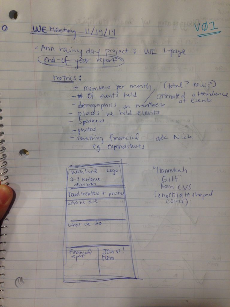
Draft 1
At the meeting: “Which metrics would we include? Maybe stats about the number of members, number of events held, brown bag topics….?”
Look closely, can you see the small multiples blog post peeking through on the other side of the page? Start with sketching and your life will be 1,000,000 times easier.
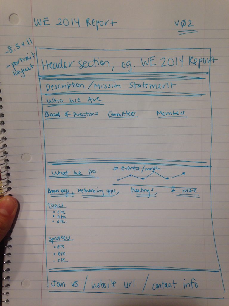
Draft 2
Revisiting the initial brainstorming, about a week later: “I’ll need a header section, and a 2-sentence description of the organization, and maybe a list of Board members, and some demographic charts on members, and something about our brown bags and happy hours. And of course we’ll need contact information at the bottom… Okay this seems easy… Is this too easy…? Sketching is always the easiest step, right…?”
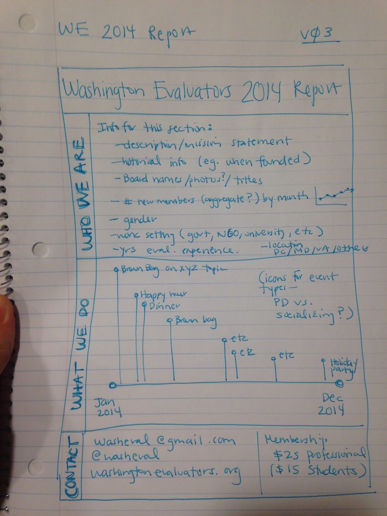
Draft 3
“The ‘Who We Are’ section is looking huge. Which topics do I even have data on? And how many charts can I realistically fit in that tiny space? I’d really love to keep this summary to just one page… And how would I actually visualize that stuff under ‘What We Do’ … hmm … maybe a graphic timeline? … okay I’ll go with that for now…”
Draft 4
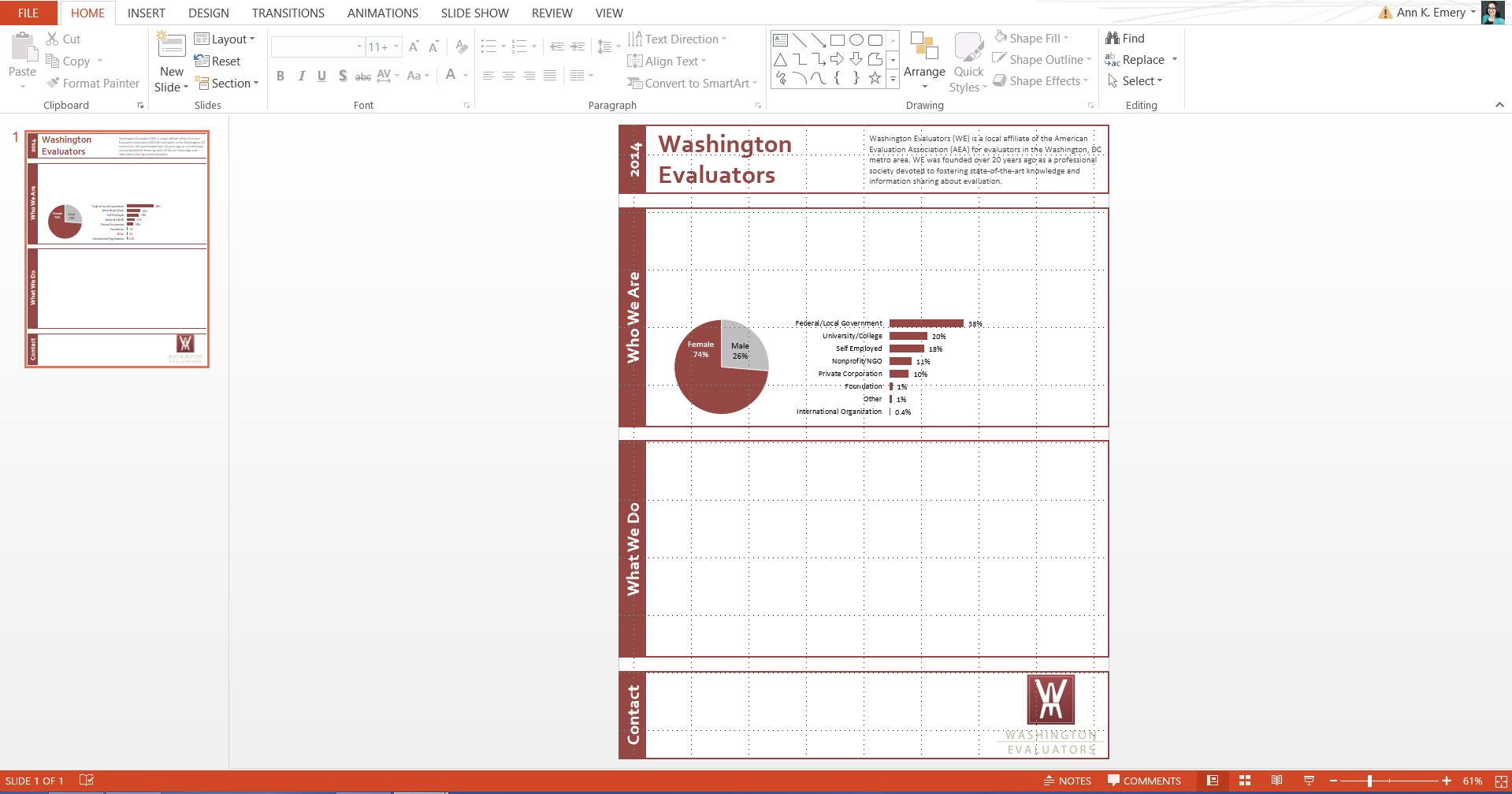
“This will be so easy, I’ll just stick these charts and text boxes into a PowerPoint slide so that I have plenty of control over moving the various objects around on the screen… I’ll just set my slide dimensions to a portrait layout… This’ll be printed in black and white and shared online in color PDFs, so I can use some color, but I better stick with a pretty simple color scheme – probably the burgundy from our logo and that’s it. There’s some yellow too, but there’s no way that yellow will show up good when this is photocopied in black and white… Darn copying and pasting charts from Excel into PowerPoint is such a drag, I wish there was some way around it…”
Draft 5
“Oh geez, oh course there’s a shortcut that helps me avoid copying and pasting charts back and forth from Excel into PowerPoint – I’ll just create the entire report inside Excel. Just like I often do… Why didn’t I think of that 20 minutes ago?! … C’mon Ann, maybe you shouldn’t be working on this ‘just for fun’ project at 2am…”
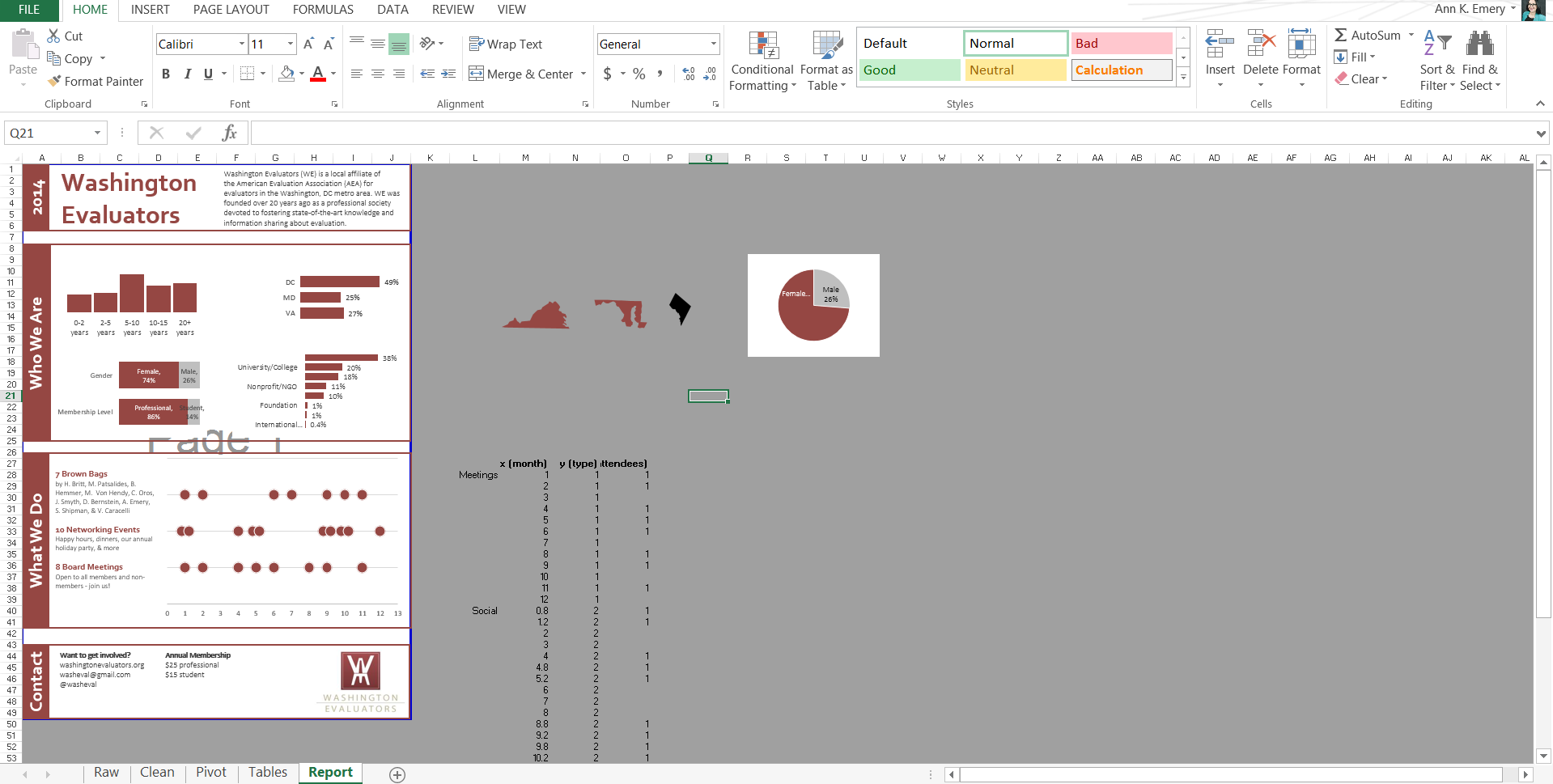
Final Report
Three weeks later, revisiting the Excel-based summary: “Vertical text boxes? What was I thinking?! … And those burgundy boxes around each section… They seemed fine earlier but now they seem way too dark… I want the headers to stick out, so let me increase the font a little and add light gray lines instead of burgundy boxes.”
Want to view the full report? Click below to download the PDF.
4 Comments
The report is simple and beautiful, but the post about the creative process washing even better. Always inspiring to read how creatives we admire think! 🙂
Happy new year and a lot of great results to report. Isn’t it great when data decides to colaborate?
Love the process documentation!
Very good example. I always like to try to map out processes in a cross-functional capacity. When I am writing a report I try to put together an outline. The example shows some great ways to show the process documentation
Awesome post. Please keep sharing!