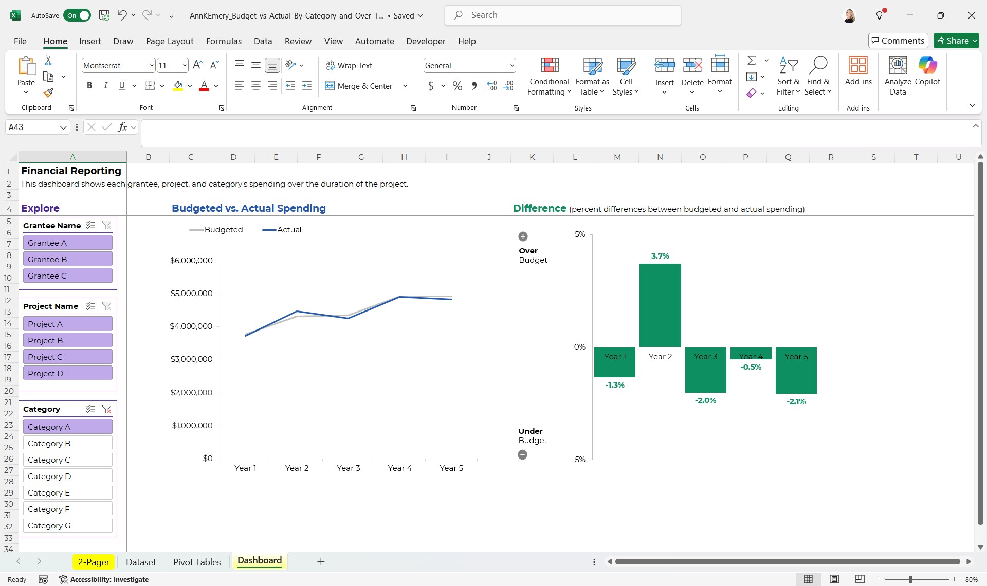
Leave a Reply

Your email address will not be published. Required fields are marked *

Graphing Budgeted vs. Actual Spending in Excel (Dynamic Charts w/ Slicers & a 2-Page Summary)

Last updated

Aug 12th, 2025

Related resources:

, , ,

What’s Inside

  • 0:00 How companies usually visualize budgeted vs. actual spending (in boring tables)
  • 1:11 2-Page PDF
  • 2:56 Dynamic Dashboard

More about Ann K. Emery
Ann K. Emery is a sought-after speaker who is determined to get your data out of spreadsheets and into stakeholders’ hands. Each year, she leads more than 100 workshops, webinars, and keynotes for thousands of people around the globe. Her design consultancy also overhauls graphs, publications, and slideshows with the goal of making technical information easier to understand for non-technical audiences.

Leave a Reply

Your email address will not be published. Required fields are marked *

You Might Like

Our complimentary mini course for beginners to dataviz. Takes 45 minutes to complete.

Enroll

Make a Drop-Down List in Excel

Are you typing data directly into Excel? (Rather than exporting it from a database?) If so, drop-down lists can save time and reduce typos. Here’s how to make them in Excel with a feature called Data Validation.

More »

Want to wow your boss with a dynamic dashboard? Or, how about a one-pager of key findings? Our 4-course bundle provides all the how-to’s.

Enroll

Weekly Newsletter

Data visualization time-savers in everyday software, like Excel. 

Our weekly newsletter is shared with a community of 8,000 professionals.