Just because I’m pro-graph, I’m not anti-table.
Technical tables have so much value, especially as visual appendices for reports.
In this blog post, you’ll get ideas for bringing your technical tables to life.
Before
Here’s what the “before” version of some technical tables looked like.
These are made-up numbers, but you get the idea.
The public health staff wanted to look at quarterly numbers, the total annual number, and the rate (the number of cases per 100,000 live births).
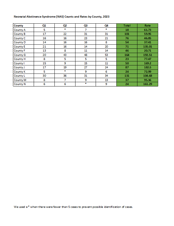
Even if you’re not measuring neonatal abstinence syndrome, I bet there are numbers that you track each quarter. You might even want to look at the total annual number, too. Get some inspiration from this blog post, and then adapt the ideas to your own workplace.
Re-Created in Excel
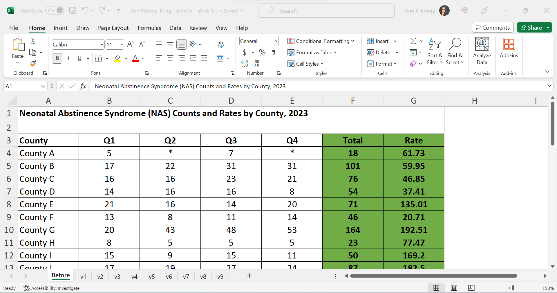
First, I re-made their table in good ol’ Excel.
The finished product will be a PDF, but the most efficient way to bring technical tables to life is to keep the numbers inside Excel the entire time. We’re not going to transfer anything to Word.
Declutter
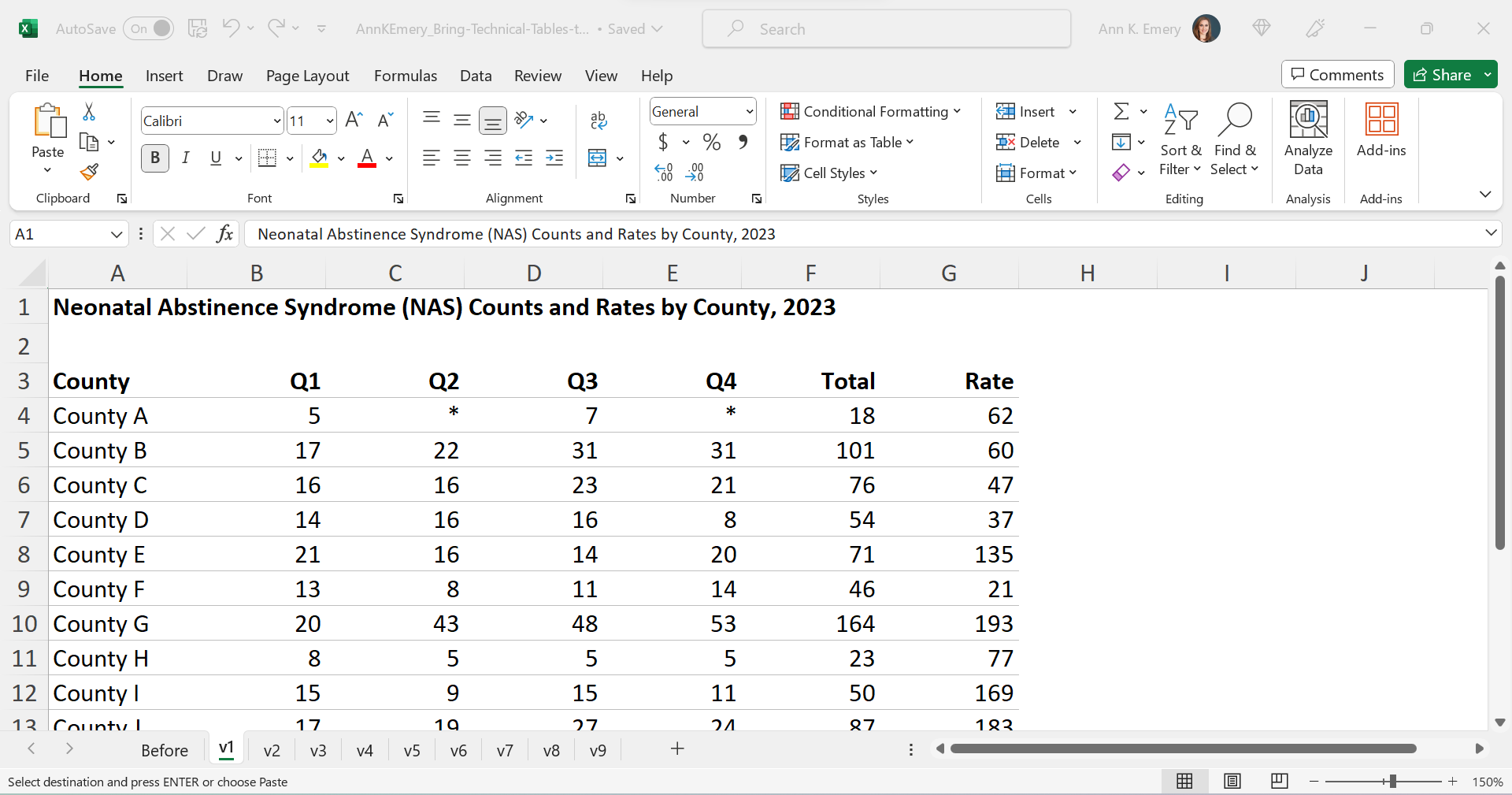
Let’s tackle the easy edits, such as:
- removing all the borders;
- adding back just the gray horizontal borders;
- removing the background fill; and
- left-aligning the text and right-aligning the numbers.
Add Trendlines
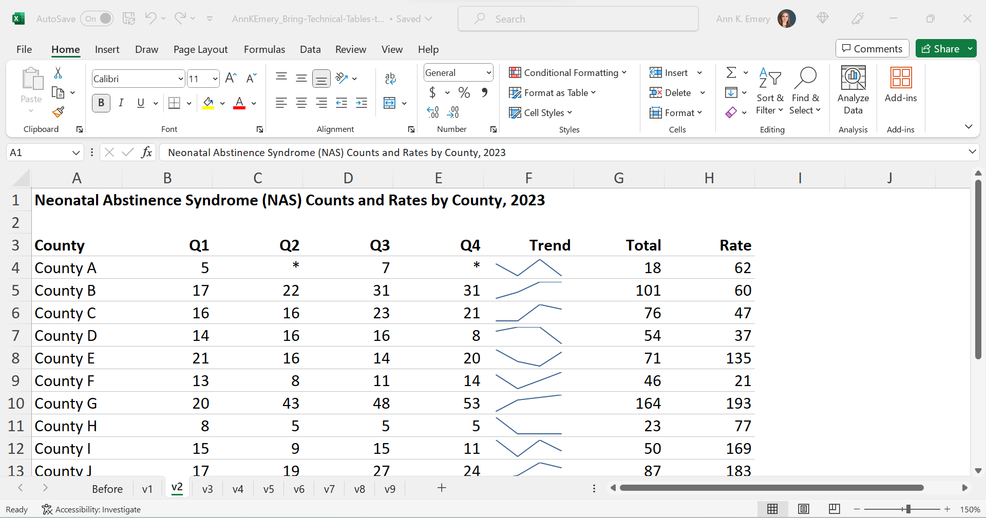
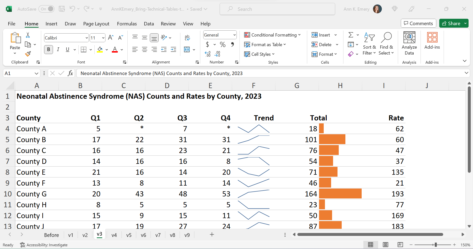
We’ll bring the quarterly trends to life with sparklines.
Add Bars
We’ll bring the annual totals to life with data bars:
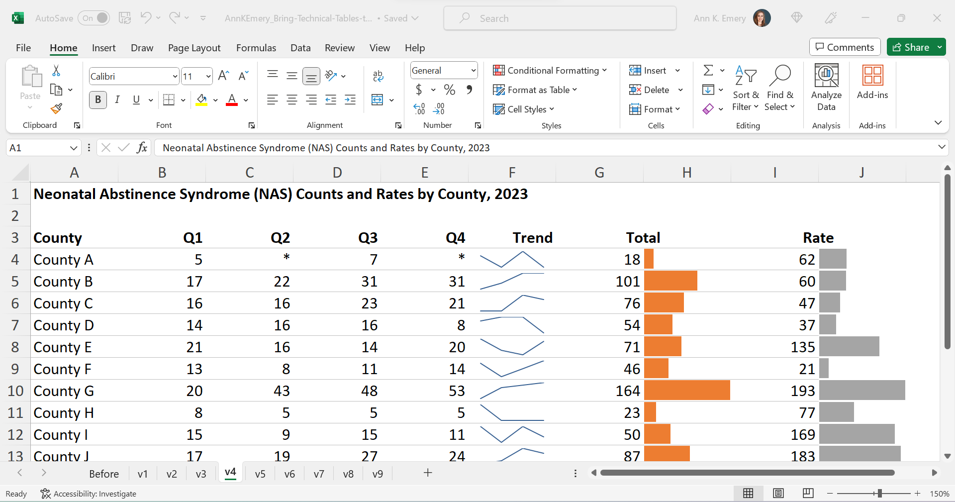
We’ll bring the rates to life with data bars, too:
Brand Colors & Brand Fonts
Time to format!
We’ll apply brand colors and brand fonts:
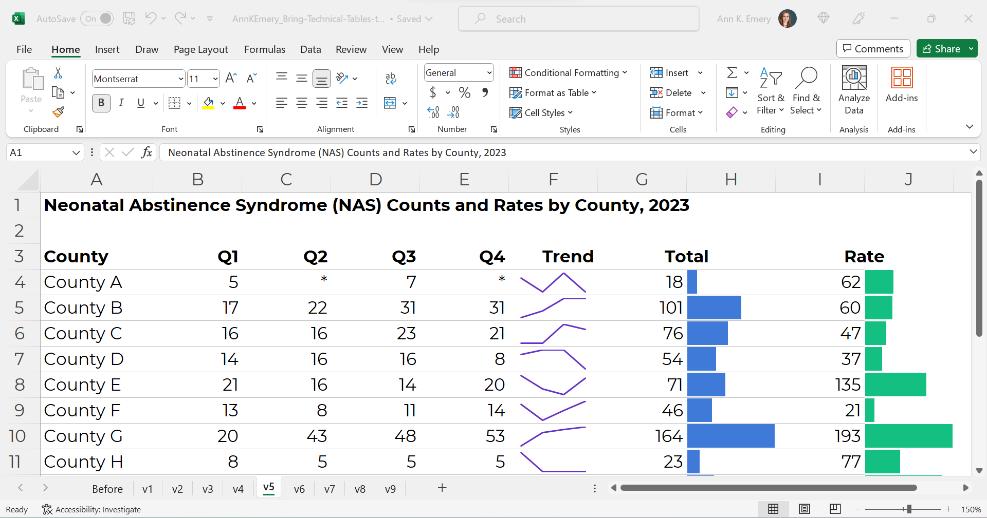
We’ll color-code the text to match the bars.
(Sometimes the table’s columns get so narrow that it’s tricky to tell which number corresponds to which bar. That’s where color-coding comes to the rescue.)
As a general rule of thumb, colored font should be bold so that it passes 508/ADA color contrast guidelines.

Text Hierarchy & Intro Sentences
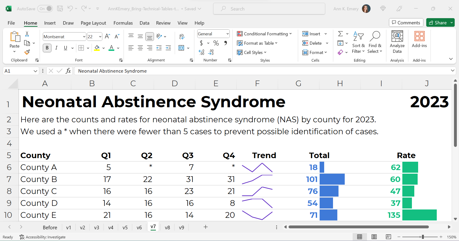
A text hierarchy means the title should be largest, boldest, and darkest so that it’s easiest to spot. (Followed by H1s and H2s if we had them.) We’re developing a hierarchy of information so our readers can stay organized.
As a general rule of thumb, I make sure headings are twice as big as body font. The body font is size 11, so this title is size 22 and bold.
We’ll also add intro sentences, and move that footnote info about the asterisks to the top. (People need to read that sentence before the table, not after.)
PDF- and Printer-Friendly
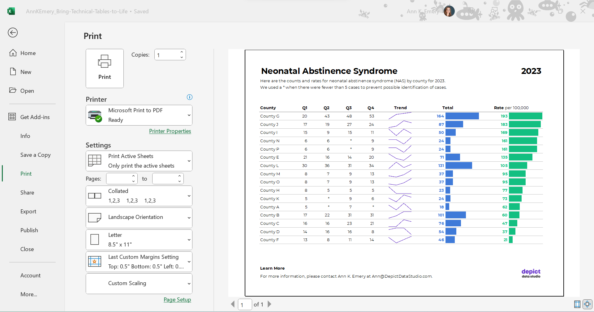
We’ve kept everything in Excel — that’s the only way to add the spark lines and data bars, and pasting tables into Word is a waste of time — but the final version will be shared with others as a PDF.
In the real version of this project, the PDF was about 15 pages long. There were various tabulations on various topics, not just neonatal abstinence syndrome.
We’ll need to:
- set the Print Area;
- adjust the Page Layout (portrait to landscape for easier on-screen reading);
- adjust the margins (0.5 to 1 inches is sufficient);
- add contact info and a logo so people can get in touch with questions; and
- adjust the column widths and row heights so everything fits juuust right.
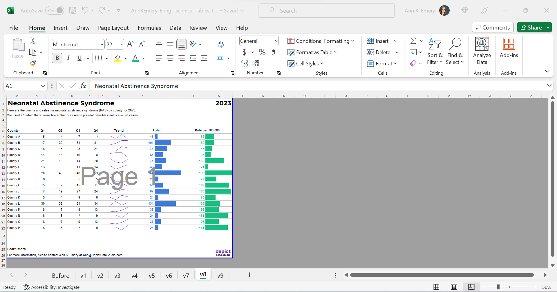
Optional: Sort by Rates, Not Alphabetically
Finally, we might choose to sort the table by the most important column (rates, in this example) instead of alphabetically by county name.
I’m usually a fan of sorting. But I’m on the fence here. I also see the value in the leaving the counties alphabetized so readers can search for their own county. Hmm.
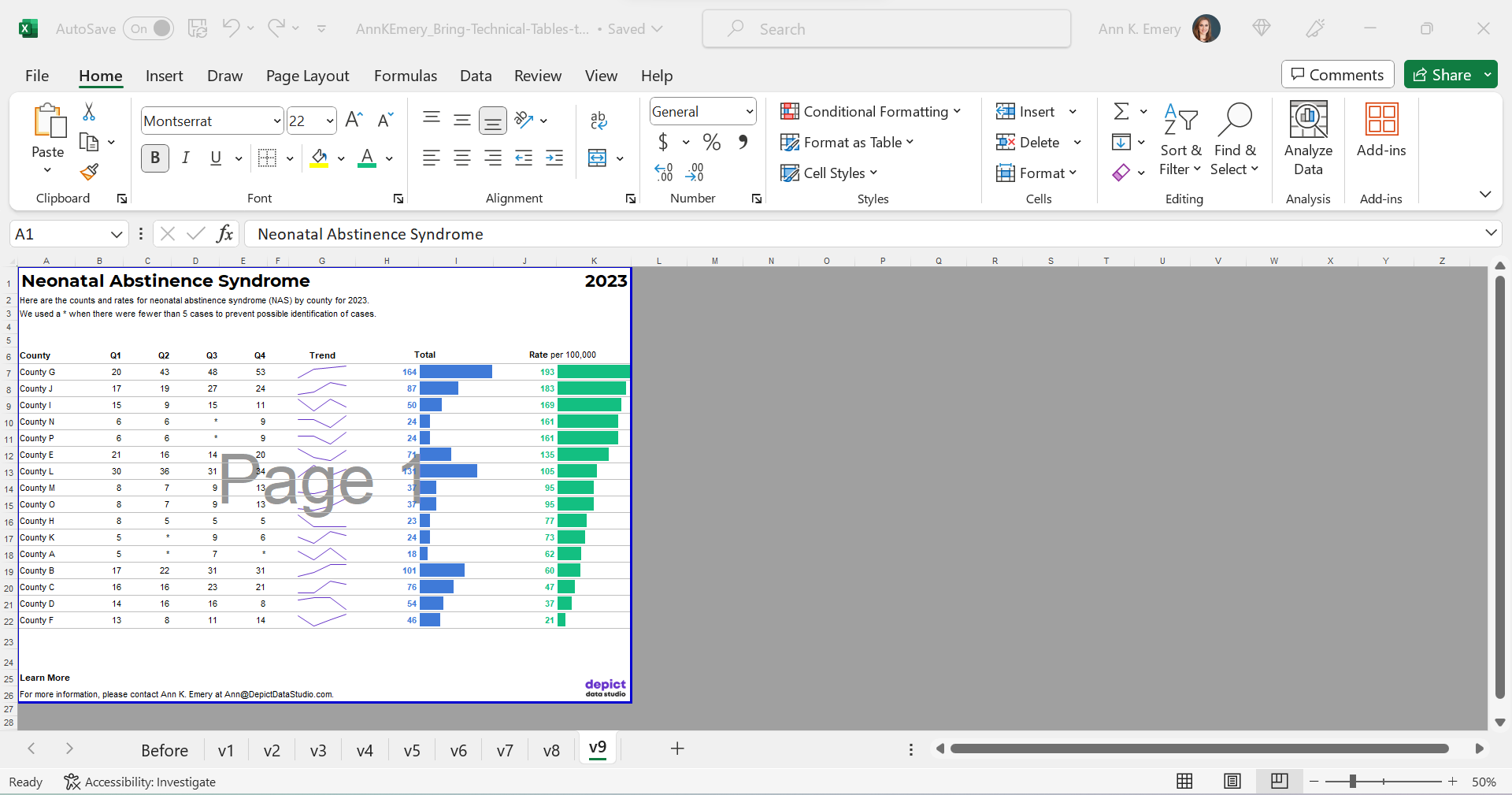
The Final Version
The visuals help us spot the patterns (thanks, Picture Superiority Effect).
The branding will help us look more professional to outside audiences (so we don’t look Frankensteined — when all our colleagues use different colors and fonts, and we put everything together in one doc, and it’s a hot mess).
The PDF’d appendices can be merged with the PDF’d report (thanks, Adobe Acrobat).
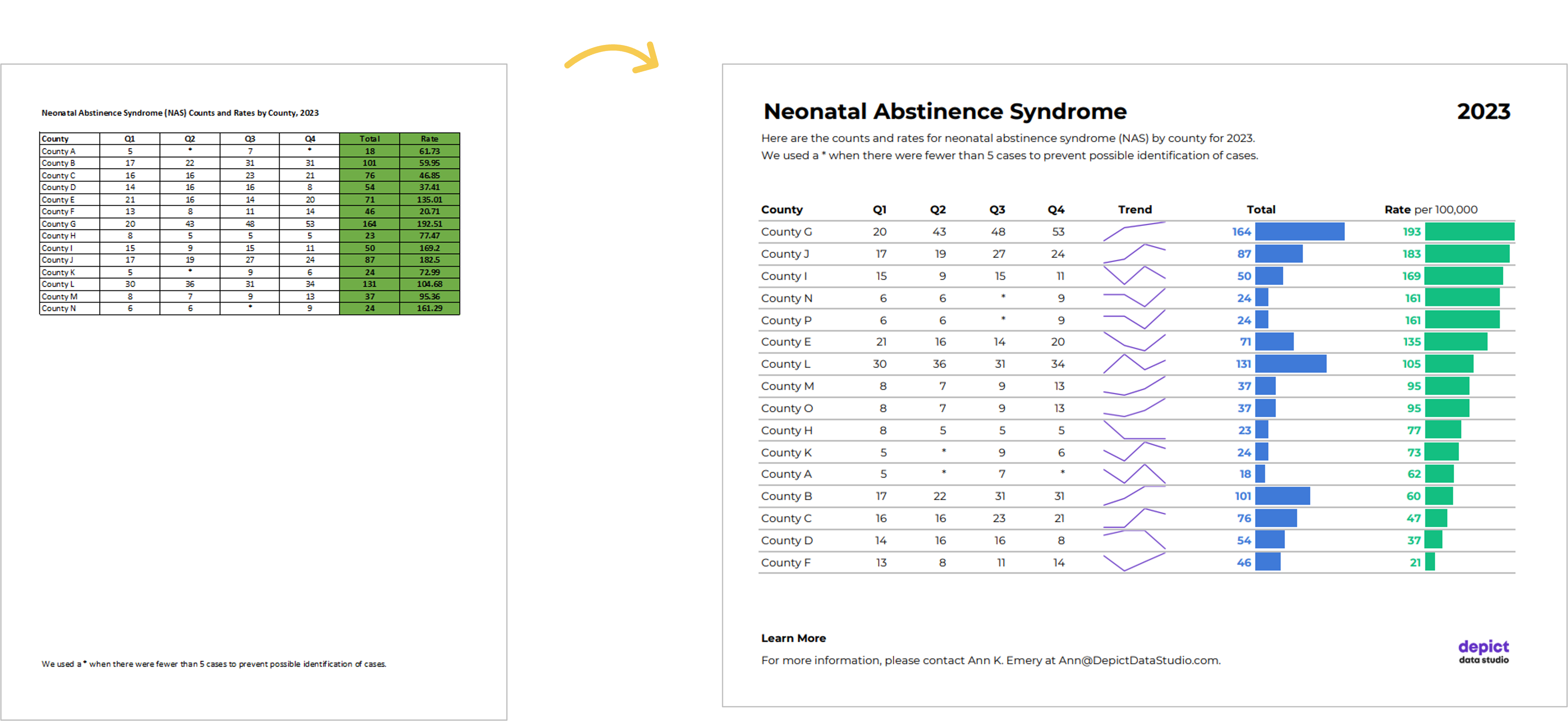
The Before-After Transformation
Once you’ve got intermediate/advanced Excel vizardry skills, the whole process will take less than an hour.
Really, this should take you less than 15 minutes!
If not, you’ll simply need to brush up on your Excel skills.
Dataviz is supposed to be fast and easy.
Bonus: Download the Materials
Want to explore my spreadsheet? Download my Excel file and adapt it for your own project.

Leave a Reply