Adding color to graphs is simultaneously the easiest and absolute hardest technique to nail.
Color is about much, much more than simply making your graphs look pretty.
When used well, color can enhance branding, guide viewers’ eyes to the most important pieces of the graph, and reinforce the underlying nature of the data, all while being legible when photocopied in black and white and for people with colorblindness.
I talk about these techniques in depth during our workshops, webinars, and courses.
Today, let’s focus on just one technique–matching your publication’s color palette to your brand and logo.
Avoid Default Color Palettes
First, the enemy we’re avoiding: the software program’s default color palette.
(And major bragging rights to anyone who can correctly identify these software programs in the comments section!)
Default color palettes scream I have no idea what I’m doing, or, worse!, I know I should be customizing my graph’s colors but I didn’t take 30 seconds to do it.
Use Branding Colors Instead of Default Colors
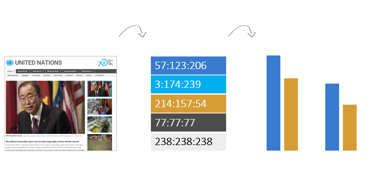
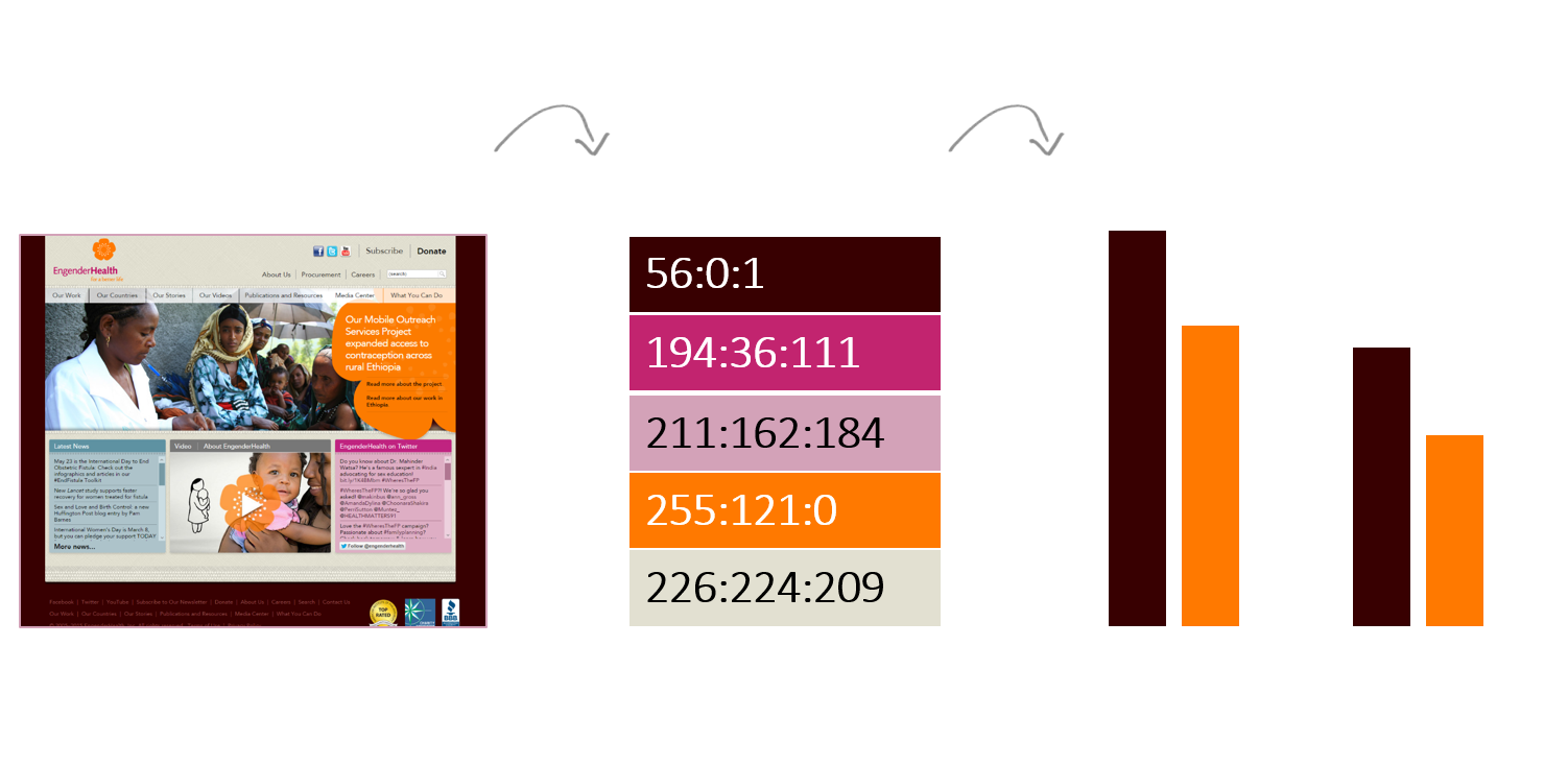
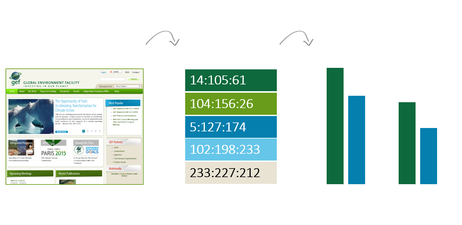
Here’s what we’re aiming for instead: selecting colors from an organization’s existing branding and identity.
Custom colors make our work look polished and professional.
Custom colors shout I care about my work and this graph was designed specifically for YOU with special thought and attention and data is central to our work and our stellar graphs reflect that commitment to data.
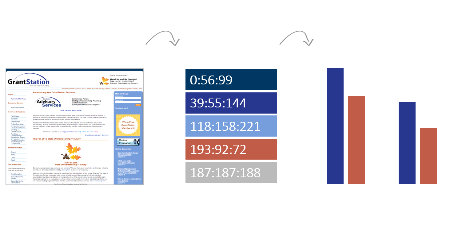
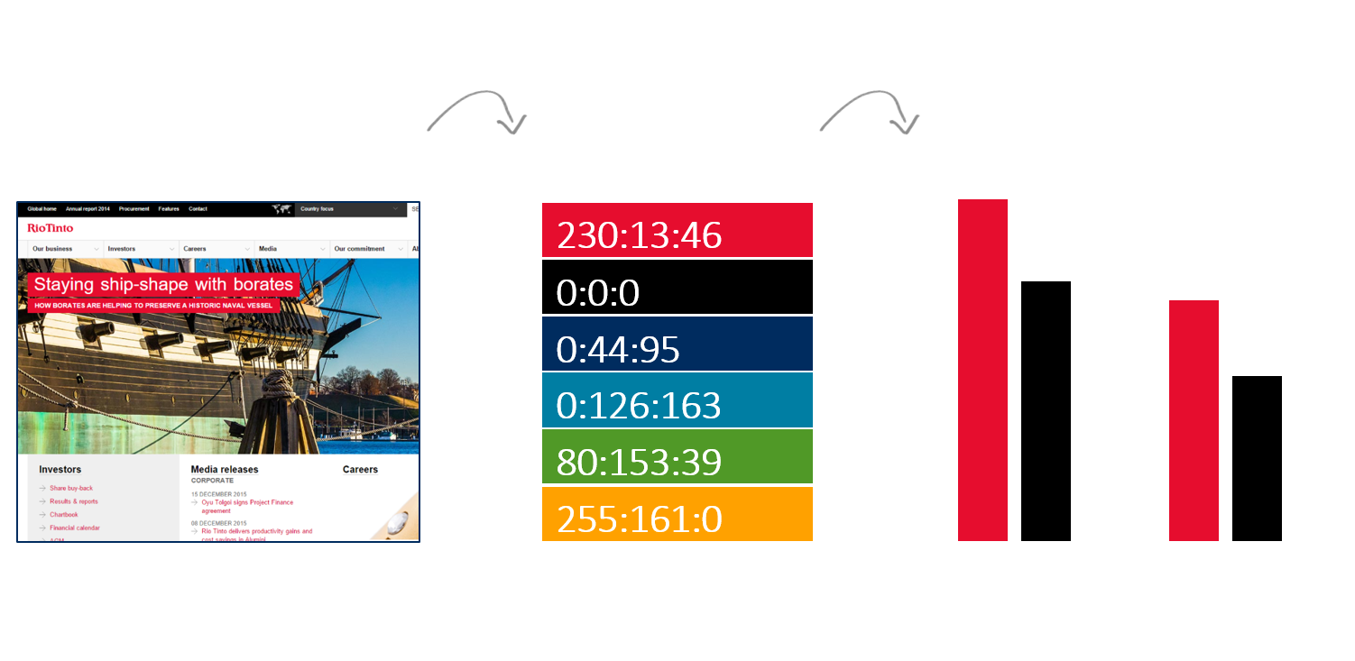
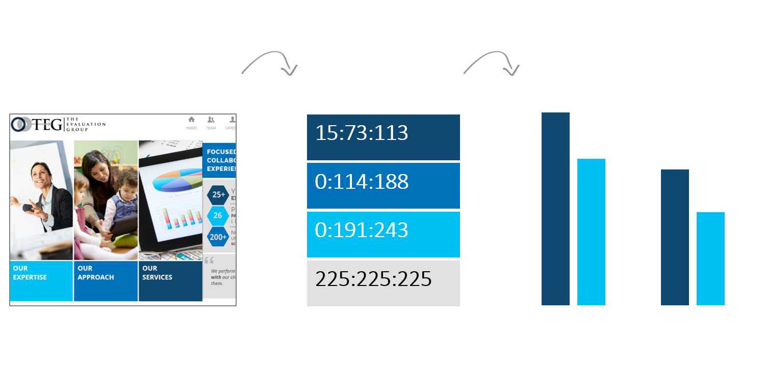
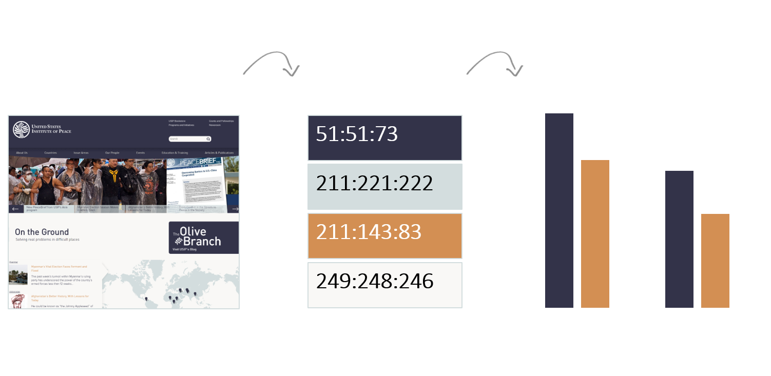
Here are the custom colors from a few groups we’ve recently worked with.

Whose Colors: Yours, or the Recipient’s?
Will you use your own organization’s colors or the viewers’ colors?
For example, a consulting firm might use their own color palette when writing the proposal for the work and switch to using their client’s colors for the deliverables.
A nonprofit might use their own color palette when publishing their annual report on their own website, but switch to their funder’s color palette when submitting quarterly reports on the outcomes they have achieved.
I don’t care whose color palette you use. I care that you’ve put conscious thought into this decision and can explain your reasoning to someone else.
Matching colors to branding is just one piece of the effective-use-of-color puzzle. But it’s the first and perhaps most important step.
Your Turn
But wait! Here’s where you come in.
Bonus points for helping me find organizations that are doing a good job of customizing the colors in their graphs.
Share a link to their reports, to their handouts, or to their slidedecks.
Celebrate the good work that’s being done!
14 Comments
I think I got them:
Virtually every modern Microsoft app
Tableau
Google charts
Wordle
Windows Paint
ggplot (R)
CartoDB? (haven’t used it in a while but visual memory says so)
Paint! Oh my goodness, I haven’t opened Paint in years, but should.
That one’s SankeyMATIC. You got the rest.
Congrats!
Hi Ann, here’s a different approach to assigning colors: https://zebra.bi/designing-financial-reports-dashboards-and-business-presentations/
Instead of forcing brand colors to all your charts no matter what content they represent, use standardized colors and shapes for meaning. Why should a color or a shape of e.g. sales or costs differ from company to company? Is the traffic sign for “stop” or “turn left” different in New York and Chicago just because the major of New York prefers a different color? Do the electrical outlet plugs differ from home to home or from company to company?
Did Mozart code his sheet music in magenta and Beethoven in deep blue with a 20% drop shadow and a nice little 3D effect? Not really. The beauty is in the music, not the coding. The beauty is in the data.
Are rivers on the map of Alabama red, Ohlahoma green or Tenesee orange? I don’t think so. Water is blue (even though most rivers I know are brown or grey or green, most people understand the concept of “water is blue”).
So how about we all switch to the semantic design of business information? You can align your corporate reporting/information design to your corporate colors in much more subtle and functional ways. Here are a few real-world examples with radically reduced, functional and standardized colors to emphasize the meaning: https://zebra.bi/gallery/
PS. To make the design safe for people with color deficiency, change the red/green to orange/blue, red/blue or black/yellow.
Your comment should read SPOILER ALERT across the top!
Like I wrote… Matching colors to branding is just one piece of the effective-use-of-color puzzle. But it’s the first and perhaps most important step. Yes! You guessed it! I’ll be discussing the rest of the equation in future posts.
It’s one of the best so far: Simple but not simpler
PewResearchCenter
http://www.pewresearch.org/fact-tank/2015/11/05/what-the-world-thinks-about-climate-change-in-7-charts/
[…] the default settings a little, especially those cruddy parts like borders or too-thick grid lines. You select colors from the viewers’ color palette. I’ve been doing a lot of design projects with USAID contractors lately; this blog post has […]
[…] each time you design another handout, report, or Powerpoint presentation (Ann K. Emery wrote a fantastic blog post about this.). PS: ColorPic is a great tool for matching colors to existing […]
[…] the mostly edited version: reduced clutter; custom color; labels directly beside the data; reduced gap […]
[…] “Ann, which colors should I use in my graphs?” You should start with your organization’s existing color palette. […]
[…] know you’re supposed to customize your color palette to match your organization’s branding. You know you can find your color codes in your existing style guide. But what if you don’t have […]
[…] at the very least, we need to apply color strategically. You should use your own organization’s colors so that your table (and the rest of your publica…. Throughout the report, we talked about the differences between the three countries, so we […]
[…] how about some custom colors? I really like matching my visualizations to my report, which is almost always based on the color scheme of the organization I’m working with. Let me tell you though, this can be a bit of a beast, so let’s get […]
[…] you want to look polished, then you have no other choice but to customize your visualization’s color palette. Don’t worry–customizing your colors is an easy low-hanging-fruit edit. Locate your […]
[…] Match the colors to the organization’s branding. Rather than using my navy and orange, I matched the organization’s style guide, which used these particular shades of green and orange. […]