
Did you see Sara DeLong’s post on Why You Need to Create a Data Visualization Style Guide to Tell Great Stories? You’ll love Part 2. –Ann
—
So you decided your organization needs a style guide to save lots your team lots of time when creating charts, enhance brand cohesion, and improve trust with your stakeholders.
In my previous post I described how to identify if your team needs a Data Visualization Style Guide, how to secure buy-in from leadership and your coworkers, and some great resources to review before you get started.
This post will outline the key components of your Data Visualization Style Guide and how to ask for feedback that will make this new resource actionable.
Every guide might be a little different depending on your field and your data.
Here are the key components of my Data Visualization Style Guide.
Note: The instructions in green type in the pictures below are for style guide users. These instructions help the user better understand the components of each chart type.
Chart Structure
This is a general overview of how charts should look for your team. This includes some of the basics of each chart, such as formatting for figure numbers, chart titles, chart subtitles, and axes.
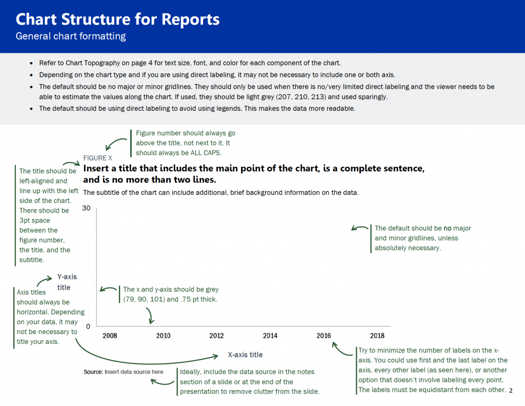
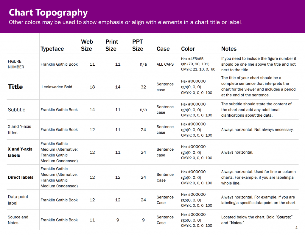
Chart Typography
I used Amy Cesal’s Sunlight Foundation Data Visualization Style Guide and Jon Schwabish’s Urban Institute Style Guide as my starting points for choosing font size for different components of our charts. I was redesigning our reports at the same time I was making my style guide, so through trial and error my team determined what font sizes worked for different kinds of materials, e.g., reports vs. PowerPoints.
Color Palette
If you have agency colors, you should use those as a starting point.
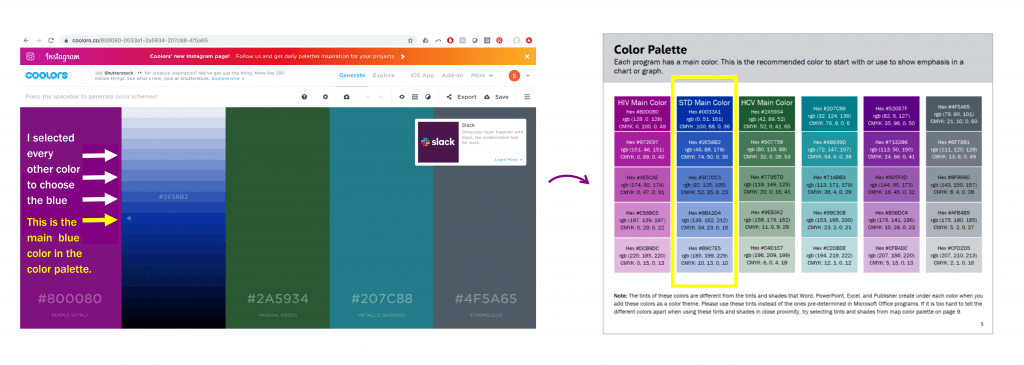
The picture of the color palette below shows the different colors assigned to my public health programs for HIV, STDs and HCV. Each program is encouraged to start with their main color and then use the other colors in the palette as needed.
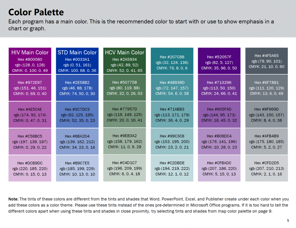
Your Data Visualization Style Guide should start with the same fonts and colors from your organization’s existing branding guidelines, if they exist.
If you need to create your own color palette or add colors to your agency’s color palette, here are some great tools:
- For inspiration on color combinations used by other businesses: https://brandcolors.net/
- To test out your color combinations, adjust your palette, and identify tints (lighter versions of your main color) and shades (darker versions of your main color): https://coolors.co/.
Identifying Tints and Shades
Here is how I identified the tints and shades for each color in my color palette.
Step 1: Once you have your color palette identified, select the symbol inside the yellow circle below:
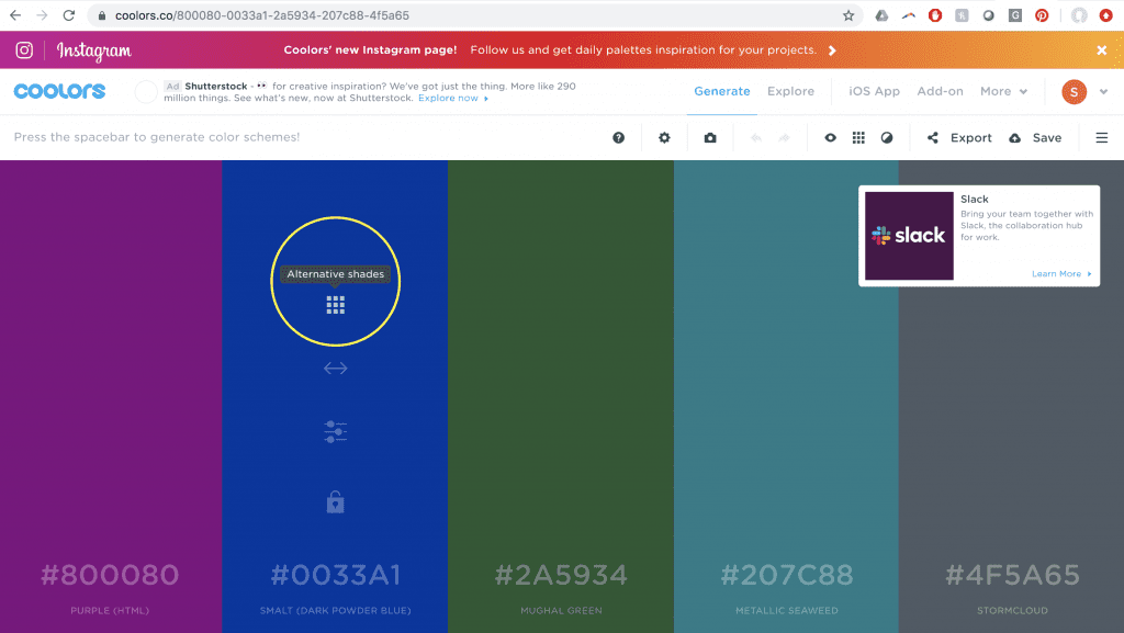
Step 2: Then use a system to select the additional tints and shades for your style guide. By system, I mean I selected every other color (see the arrows and instructions in the picture below) for my tints and shades. I repeat steps one and two with each color in my color palette.
Check for Sufficient Foreground/Background Color Contrast
To ensure your colors are contrast compliant based on the Americans with Disabilities Act, here is an accessibility checker: https://webaim.org/resources/contrastchecker/.
Including Lots of Color Codes
Ideally, a Data Visualization Style Guide should be user friendly with several different kinds of chart-making software.
By including all the different color codes, it minimizes the number of steps a person has to take to convert a color into the code they need (e.g. from RBG to HEX).
Also, maybe your whole team just uses RBG and CMYK color codes now, but by including all three, you are increasing the sustainability of this style guide if your team adds new software that uses a different color code in the future.

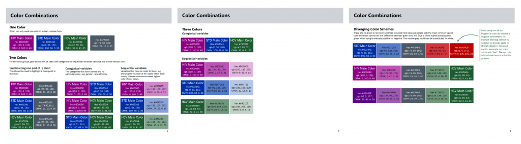
Recommended Color Combinations
This was really important to my team members. Some people don’t want to spend lots of time making decisions about colors. Providing color combination recommendations in the style guide saves my coworkers lots of time, but still allows room for creativity and autonomy.
Fewer decisions to make = timer saver.
Map Color Palette
We determined through trial and error that the overall color palette in the style guide could not be applied as is to maps because we needed colors with higher contrast between one another.
The viewer has to be able to tell the difference between the colors when they are in close proximity to one another.
I adjusted the colors slightly for my map color palette to ensure they would be distinguishable from one another when the colors are close together.
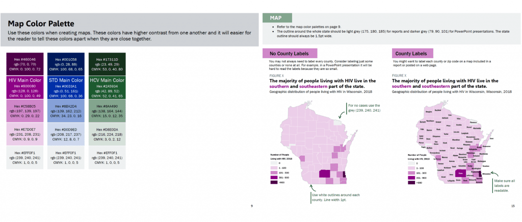
Map labeling is tricky. We ran into many different opinions about how maps should be labeled. It’s easy to over label a map, especially when you are dealing with small spaces, such as counties in a state. Also sometimes there are limitations with the mapping software when it comes to colors and labels. The maps above were made in GIS.
It’s important to ask yourself if the audience is really going to look for the label on each county, or do they just need to get a sense of the color scale.
Ask the question, what do I want my audience to understand from this map? How will the map be presented? Presentation? Report? Online? Interactive?
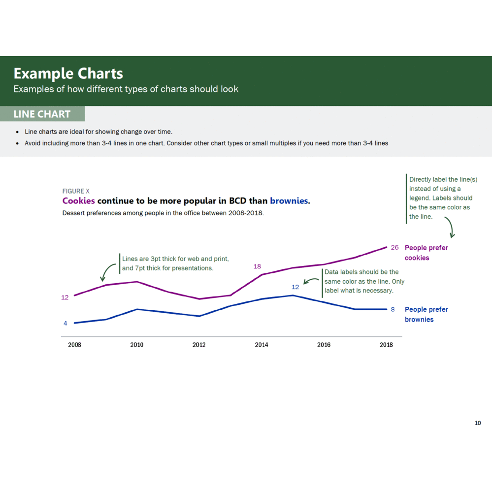
Example Charts
This is one of the most important sections!
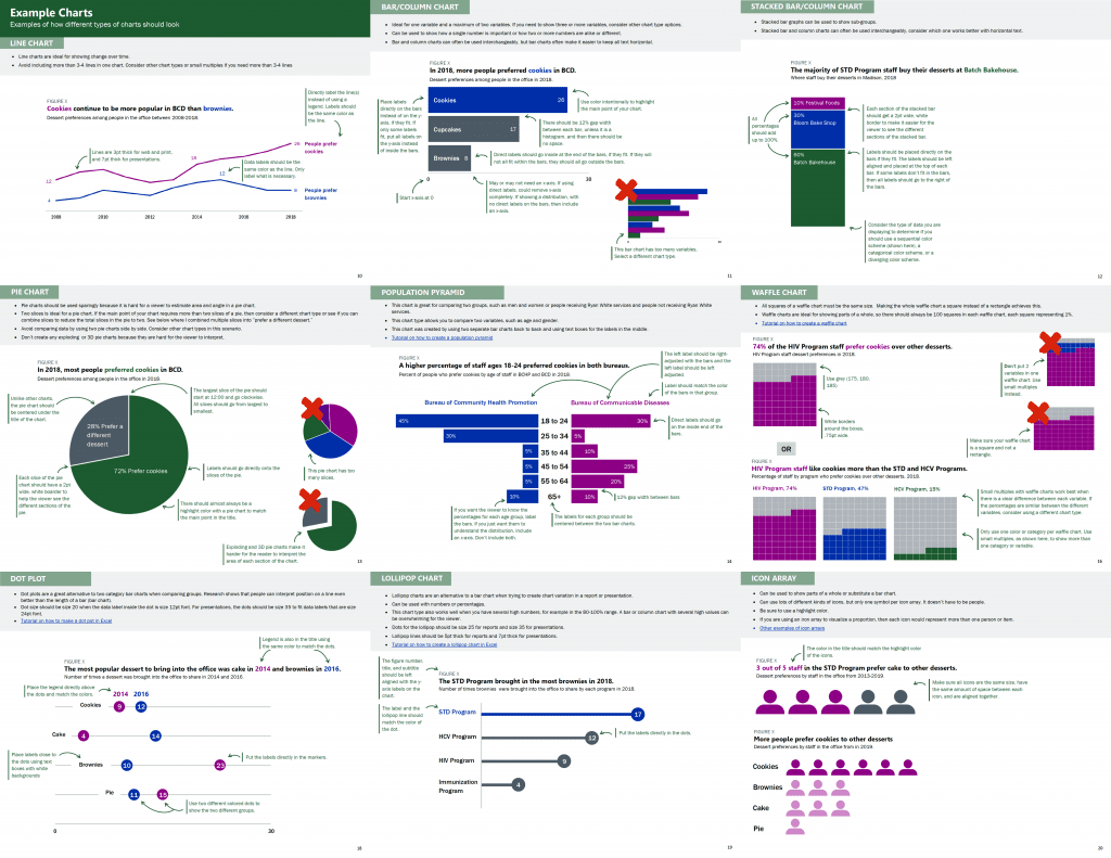
This section can feel like a big undertaking. Start by looking at your organization’s existing data documents. Identify the chart types that your colleagues use regularly and then consider adding a few other chart types to increase chart variation options for your staff. For example, include a lollipop chart in addition to a bar chart, and a waffle chart in addition to a pie chart. This section can include as many or as few charts as you see fit for your organization.
This is another example where the trial and error process is so important. Because we created this style guide while redesigning large data reports, we were able to test different sample charts for the style guide. We adjusted line and dot thickness, label placement, chart sizes, and font size to figure out what worked best. Then we used the style guide to standardize our decisions for future data deliverables. Our decision process was a balance of data visualization best practices, the story we were telling with our data, and my colleagues’ input.
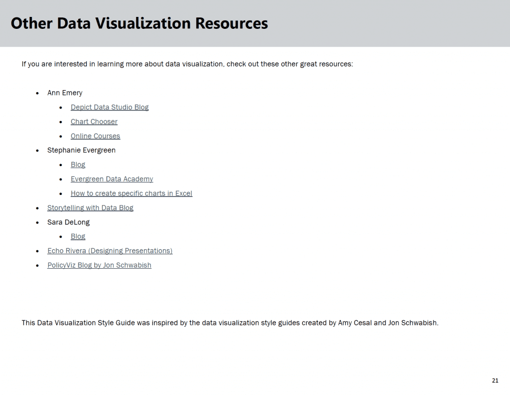
Other Data Visualization Resources
If you think your team is interested in other data visualization information, then you could include additional resources at the end of the document.
How to Ask for Feedback about Your Data Visualization Style Guide
**This is really important.**
About halfway through the development process of my Data Visualization Style Guide, I sent the guide around for feedback from coworkers I knew were going to use it. I asked for specific feedback on what is working and not working. Am I on the right track? Is this resource useful and clear?
Then I incorporated their feedback and created an almost final draft of the guide.
When I had an almost final draft I asked for even more feedback! What doesn’t make sense? What would make this resource more useful to you? What should be included to make this useful to a future new employee of our team?
In this final feedback stage, it was important to share our evolving style guide with team members who hadn’t seen earlier drafts and maybe were only going to make charts occasionally. These folks could provide feedback on what made sense and where guidance was missing. Ideally, a new employee could pick up our new Data Visualization Style Guide and use it to make charts that align with the program’s brand without needing additional guidance.
Reminder: Don’t ask for feedback unless you plan to use a good percentage of it. It wastes people’s time and sends a message that you don’t value their opinions. Not using their feedback at all could reduce the number of people who use your guide because your colleagues don’t feel invested in it.
How We’ve Used Our Data Visualization Style Guide
Here are some examples of data materials created using our Data Visualization Style Guide:
- Wisconsin HIV Annual Data Report
- Wisconsin HIV Data Two-Page Summary
- Wisconsin Hepatitis C Annual Data Report
- Wisconsin Hepatitis C Data Two-Page Summary
Key Takeaways for Creating Data Visualization Style Guides
Here are three lessons learned.
- Before you create a Data Visualization Style Guide it is crucial to secure buy-in from leadership and the majority of your colleagues who will be using the style guide. This buy-in will help ensure this document is relevant and will be used for future data-intensive materials.
- Before you start creating this resource, ask future Data Visualization Style Guide users: “What should be included in our style guide that would make this resource useful to you and increase the chances that you will use this tool to guide chart creation?” This is key because it ensures that you include what is important to your data team.
- Create a style guide as you are redesigning data documents. Don’t try to create a style guide and then apply it to lots of documents. Working on the style guide and data materials side by side will ensure you create a resource guide that actually works. This will set you and your new tool up for success.
The Benefits of Having a Data Visualization Style Guide
Designing a Data Visualization Style Guide may sound like a lot of work, but the benefits for your organization are enormous.
You will:
- Save your colleagues valuable time when designing data deliverables
- Enhance your organization’s brand, communications, and professionalism
- Increase the accessibility and communication of your data to key stakeholders because of your consistent use of data visualization best practices.
Bonus: Purchase Our Guide
The ideas and examples shared here and my previous post should give you all the tools you need to get started.
Or, save time and download our guide.
Buy the Guide
3 Comments
There is real gold in this discussion and information.
However I have a concern about red-green colour blindness. You can see simulations at https://www.color-blindness.com/coblis-color-blindness-simulator/
I took screenshots and uploaded it to the webpage, and under red-weak or red-blind, you’ll see that the purple and the blue don’t differentiate well.
There are some good options for colour palettes here: https://venngage.com/blog/color-blind-friendly-palette/
Yep, it’s really difficult to follow branding colors from existing logos and websites… AND use sufficient color contrast… AND choose colors that can be printed in grayscale… AND choose colors that are legible for people with color vision deficiencies.
Are you familiar with direct labeling? That’s the dataviz technique that helps you achieve accessibility, regardless of the brand colors that you need to follow.
Thanks for mentioning venngage! There are lots of great accessibility resources but I hadn’t seen that particular one before.
Ann – this is a very good resource and something every organization needs. Sending to my team!
It definitely takes the right type of employee to see this task through. I can appreciate tour agile approach to getting feedback from coworkers.
What decision criteria did you use when analyzing feedback from the team? Were you Just looking for a majority sign off? I find that conversations around colors and formatting never really end in 100% agreement.
-Brian