This is a brand new bonus module for current and past students in my data analysis course, Simple Spreadsheets: From Spreadsheet Stress to Superstardom with Microsoft Excel. The once-a-year registration period is open this week only! Register by Friday, February 28, 2020–or wait ’til next year.
—
“How can I get cleaner data???”
This is one of the most common questions I get.
Let’s pretend you’re entering “workplace setting.” And you’re supposed to type “hospital” as one of the categories. But you, or someone else, enters “hospitals.” Plural, argh!
Later on, you have to do all this data cleaning… and you have a mess of entries.
It’s impossible to enter perfectly clean data when you’re doing it by hand.
Common Data Sources
I realize you might not be hand-entering all your data. Your spreadsheets might come from…
- Email attachments
- Downloading a csv file from your agency’s database (where the data was already entered into a form)
- Downloading a file from a website (like a government website with public data)
- Manual data entry
Oftentimes, at least some spreadsheets are entered by hand.
Typos Are Not Inevitable!!!
You can get a virtually clean spreadsheet with a little but of upfront planning.
You work hard, a little bit, in the beginning.
And then your Future Self gets to sit back and enjoy the fruits of your labor.
What You’ll Learn
I’m going to teach you how to use:
- data validation
- drop-down menus
- pivot tables
- formulas
- pivot charts
- regular charts, and
- quickie charts
to set up foolproof data entry spreadsheets.
You set up your structure first. Then, someone else goes off and enters data for you. And then it’s automatically tallied—and visualized!
This might sound hard if you’ve never done it before, but it’s not! It’s easy. Let’s get started.
How to Enter Cleaner Data AND Automate the Entire Analysis and Visualization Process
With a little upfront planning, you can automate the rest of the analysis and visualization process. Here’s how.
(Current and past students in Simple Spreadsheets: Log in here >> https://depictdatastudio.teachable.com/p/simple-spreadsheets/ << and watch the video version of this lesson. You can also download two spreadsheets and practice alongside me. It’s 37 minutes of some of my favorite techniques I’ve ever taught. I promise that the 37-minute time investment will compound and save DAYS of your time.)
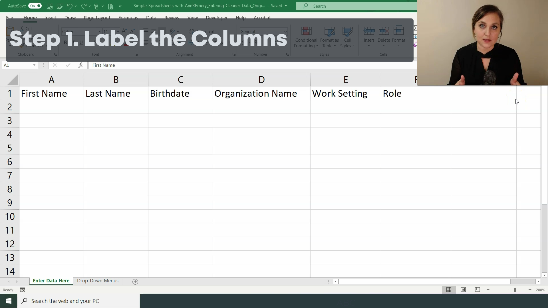
Step 1. Label the Columns
First, label the columns. This is a fictional spreadsheet, but we’re pretending we want someone to enter peoples’ first names, last names, birthdates, organization names, work settings, and roles.
Step 2. Enter Some Sample Data
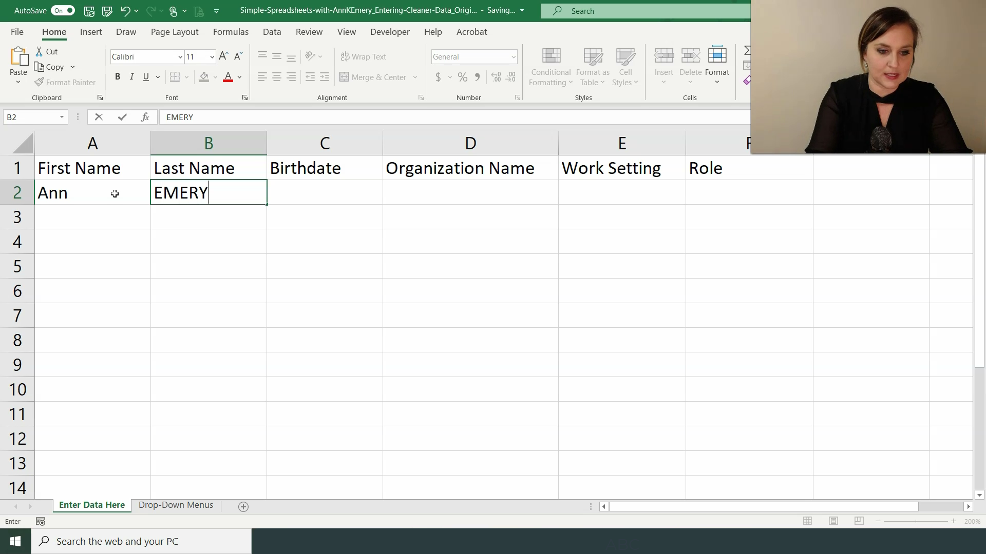
I like to add a few sample entries at the very beginning. It helps the data entry person later on.
For now, let’s just enter the person’s First Name, Last Name, and Organization Name. We’ll address the Work Setting and Role variables in a moment.
And because this happens in real life all the time, we’ll pretend our data entry person entered my last name in ALL CAPS, ha! I’ll show you how to clean that up in a moment.
Step 3. Apply an Excel Table
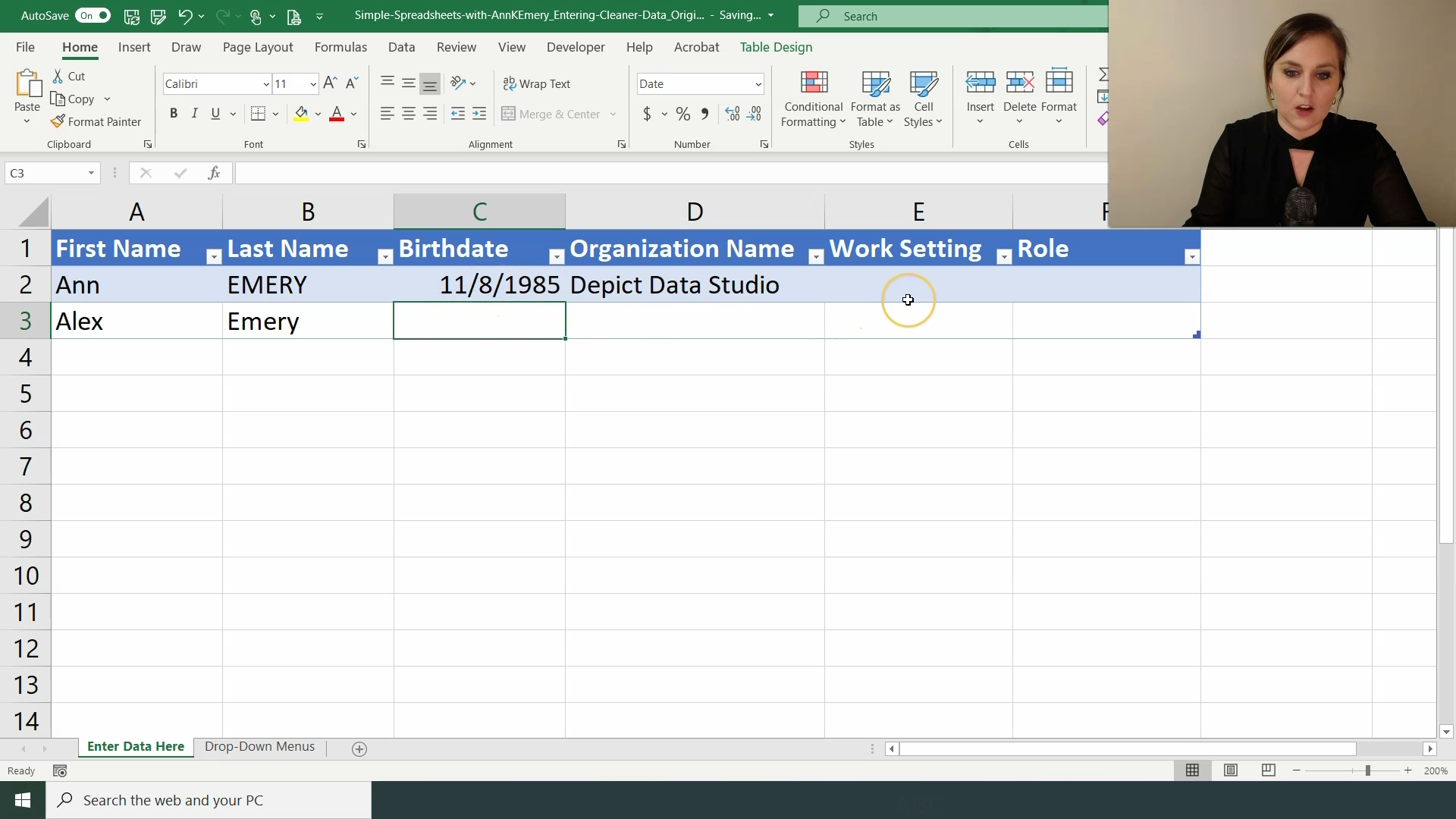
An Excel Table is not a regular table. An Excel Table is a certain type of formatting that is magical. I wish I would’ve learned these earlier!
To apply an Excel Table:
- Click on the upper left corner of your spreadsheet (usually cell A1, if you started typing your variable names into the first row of your spreadsheet).
- Go to the Insert tab.
- Click on Table.
Excel Tables can future-proof your datasets. They allow you to continue entering data later on and keep all your beautiful formulas and linkages.
Step 4. Add Data Validation
Data validation is one of your strongest weapons against typos.
How to add data validation:
- Click on the cell that you want to edit (“validate”).
- Go to the Data tab.
- Go to the Data Validation icon.
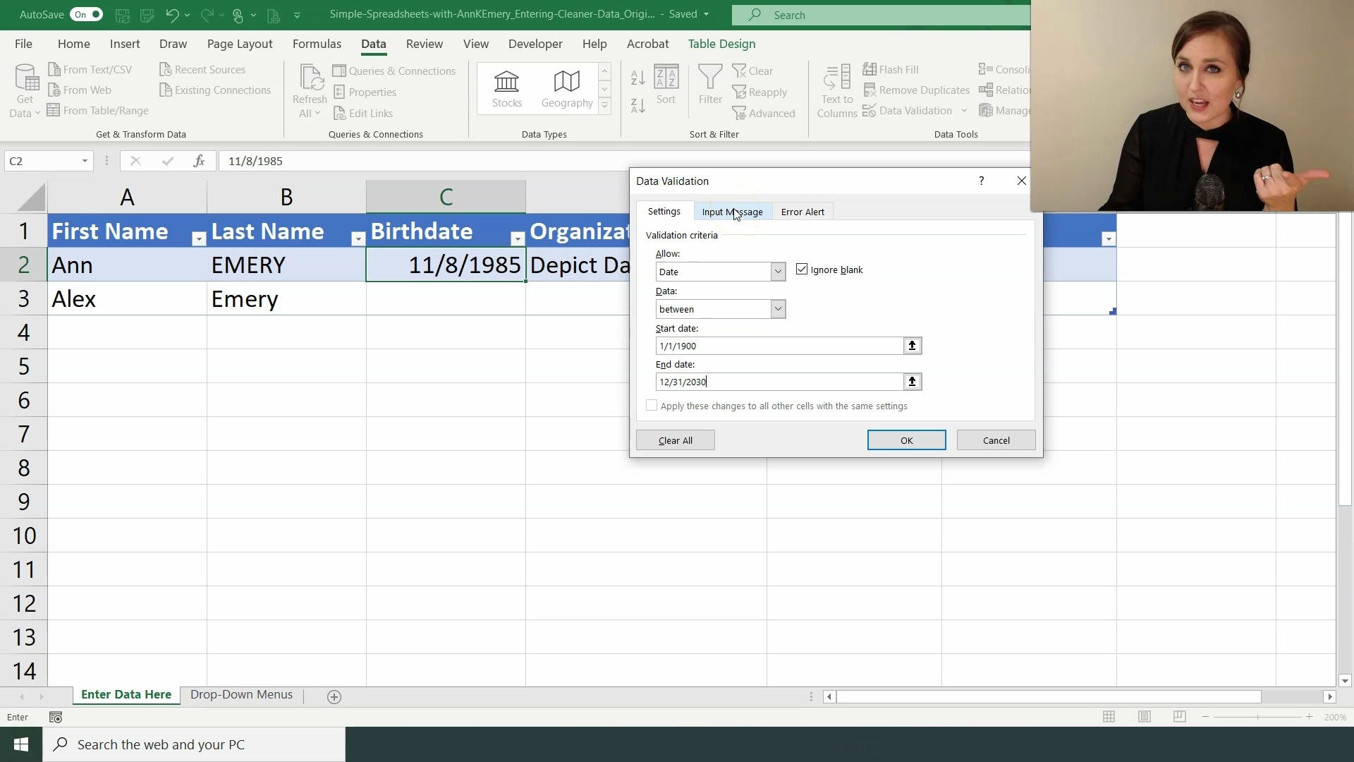
- Under Settings, you can Allow a Whole Number, Decimal, List, Date, Time, or Text Length. You can also set Minimum and Maximum values.
- Optional! Under Input Message, write instructions for the person who will be entering data. This is the message that the data entry person will see when they click on the cell.
- Optional! Under Error Alert, write custom error messages. This is the message that the data entry person will see if they make a mistake while typing.
In this example, I’m adding a data validation rule that prevents you from entering weird dates.
Step 5. Create Drop-Down Menus
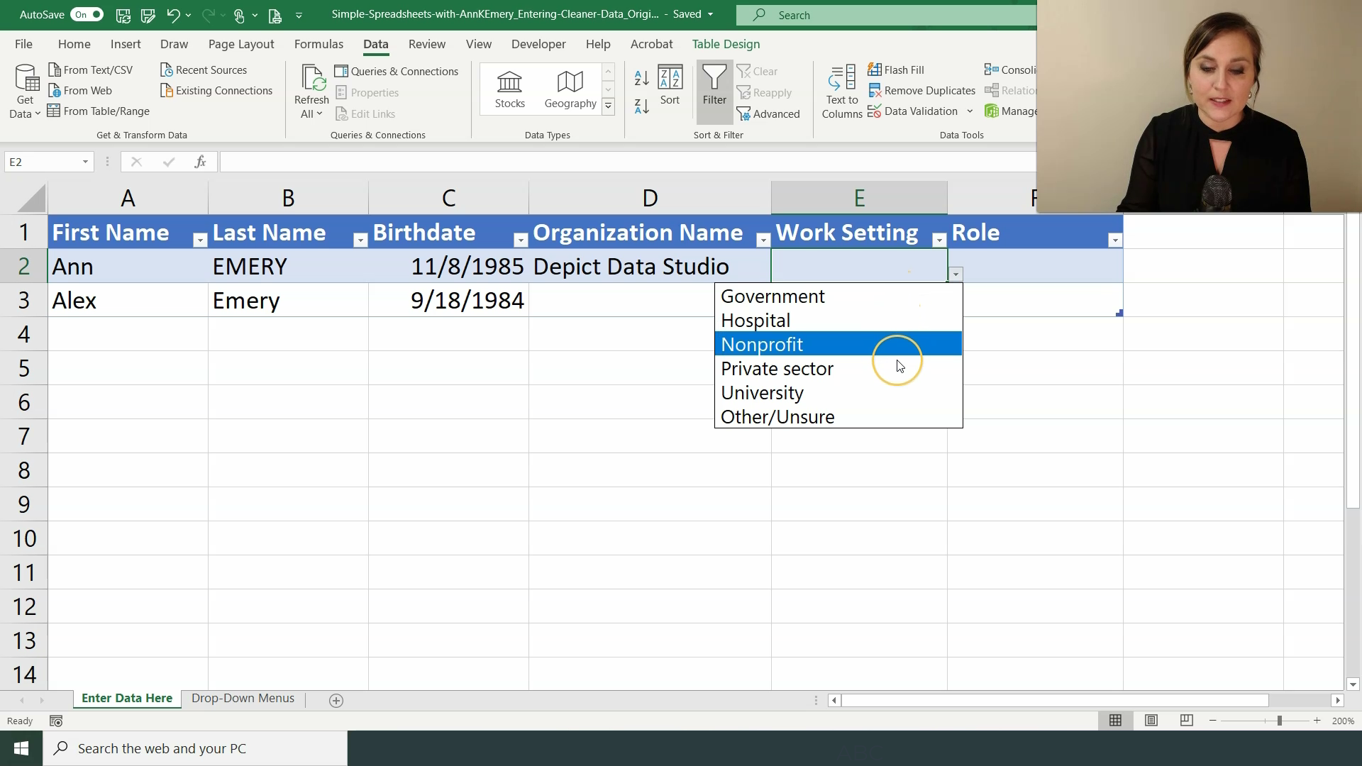
If there’s a set list of categories that someone should be entering, then that’s when you need a drop-down menu!
Here’s how you create drop-down menus:
- Insert a new sheet called Drop-Down Menus. Type a list of the response options.
- Go back to your original data entry spreadsheet. Click on the cell where you want to create a drop-down menu.
- Go to the Data tab.
- Go to the Data Validation icon.
- Allow a List.
- Tell your computer where the list is located.
- Hit OK. If needed, drag your new format downwards so that it fills the entire column.
- Hide the Drop-Down Menus sheet so it doesn’t distract the person who’s entering the data.
In this example, I’m adding a list of work settings.
Step 6. Add Formulas for Recoding Data
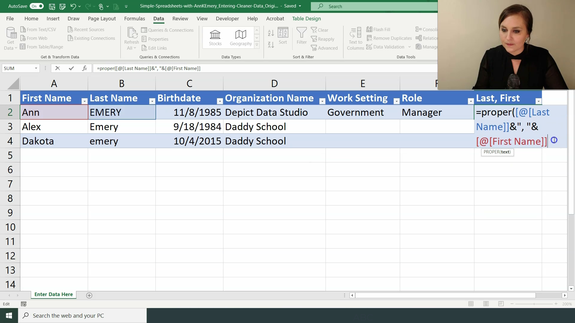
Try to anticipate what type of cleaning and recoding may be necessary. Then, enter those formulas off to the right.
For example, will you need the names in Last, First format? If so, write a formula that concatenates the first and last names together. Don’t forget to transform the messy uppercase and lowercase letters into proper case.
Will you need the birthdates to be transformed into ages? If so, write a formula that calculates how many years old the person is based on today’s date and their birthdate.
I realize your spreadsheet won’t look exactly like this. You might not be dealing with demographic data like names and ages at all. But the concept is the same: Your data entry person will enter data on the left, and then those variables will automatically get cleaned and recoded in new columns off to the right.
In my real life projects, I might have 10, 20, or 30 columns off to the right with all the data cleaning formulas I need.
Step 7. Pre-Summarize the Data with Pivot Tables and/or Formulas
You’ve got two choices:
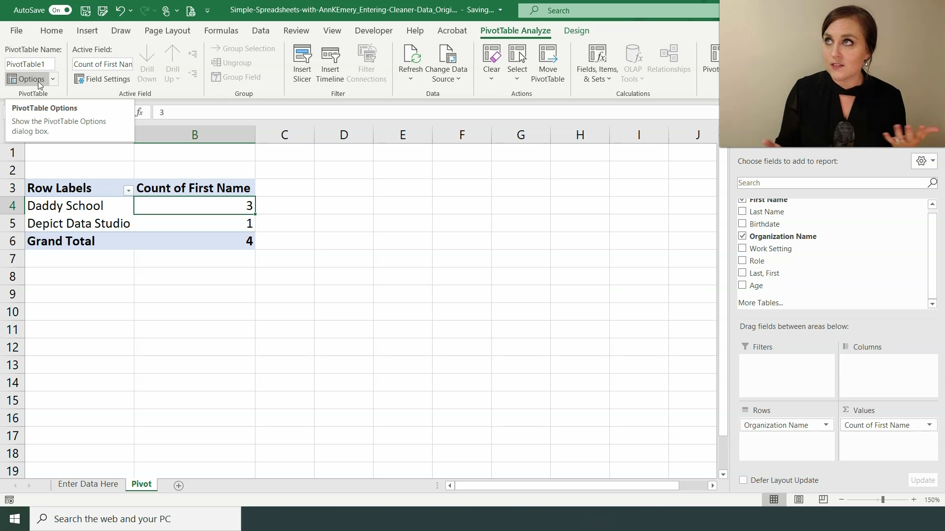
- Summarize the data with pivot tables
- Summarize the data with formulas
Pivot tables are often easier for novices because you don’t have to memorize any formulas.
I prefer formulas because they give me more control over formatting (and more control over the charts that I’ll create in the next step).
Step 8. Pre-Visualize the Data
Whoa! This is where it gets really fun.
We haven’t even entered the data yet.. but we’ve already got the analysis finished. And we’re about to get the visualization finished, too.
You’ve got three choices for visualizing data:
- Pivot charts
- Regular charts
- Quickie charts
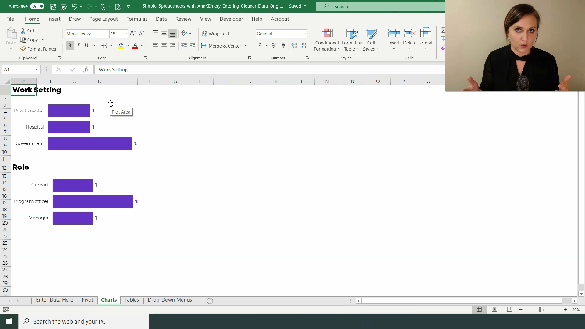
Pivot charts are linked directly to the pivot tables you already created in the previous step. Pivot charts are fine… but they’re not fancy. You can only make some chart types. And your formatting control is limited. They’re a good starting point but I never use them in practice.
I usually make regular ol’ charts, which are linked to the formulas I wrote in the previous step. Charts linked to formulas give me SO MUCH editing power. I can customize the chart exactly how I need it.
And I make quickie charts (data bars, heat tables, spark lines, etc.) whenever possible because they’re, well, quick! They’re often sufficient for my quick turnaround reporting needs as well.
Your Turn
Reply and let me know:
Are you already following this process for all your projects? Where you set up the skeleton of your spreadsheet beforehand, and then sit back and relax as the automatically-cleaned-analyzed-and-visualized data comes in? I love meeting fellow time-saving spreadsheet users! Reply and let me know what your workflow looks like.
Or, is this process brand new to you? I had to learn this automation process the long, hard way, so don’t feel bad if you haven’t been exposed to it yet.
Reply and let me know where you’re at. Our team reads every message.
Ann
P.S. Enrollment closes on Friday, February 28, 2020 for our data analysis course. If you can teach this process in your sleep, then the course isn’t for you, ha! But if some of these terms were new for you, or you have to do a lot of tedious data cleaning in your projects, then this is the course for you! Register: https://depictdatastudio.teachable.com/p/simple-spreadsheets/
P.P.S. Current Simple Spreadsheets students–what other bonus modules would you like to see? There are three case studies based on your requests. There are two bonus data analysis modules based on your requests. There’s a Getting Started with Dataviz module based on your requests. Keep the requests coming! You’re grandfathered-in to all future updates and additions.


Leave a Reply