9 Comments

  • Very cool tool, thanks for sharing!

  • Ann K. Emery says:

    Hi all,
    Here’s a visualization from Marc Smith (@marc_smith), which uses the post-conference week data: https://twitter.com/marc_smith/status/396303552596803584
    Once you click the link for his social network map, try clicking on “view an interactive version of this graph.” I like that version because it helps you see the strength of the relationships between players.
    Enjoy! Ann

  • Hi Johanna, I always have troubles showing the labels – I sometimes manage and sometimes I don’t – do you know the trick?

  • johannamorariu says:

    Hello Joitske, let’s see, for the version of NodeXL I’m using, the steps are:
    1. Working in the “Vertices” tab of the spreadsheet: In column C (“Visual Properties” section, column “Shape”), change the value for all cells to “Label”. You can do this by selecting all of the cells and clicking on the NodeXL tab, then on “Vertex Shape” and then on “Label.”
    2. In column H (“Labels” section, column “Label”), change the value for all cells to reflect the lable you want displayed—often a copy-paste from the name of the vertex itself.
    3. On the map, click “Show Graph” or “Lay Out Again.” Your map should now have labels. It might be messy, but they’re there! Now make it pretty:)
    Hopefully that works for you, too!

  • […] What do you see when you look at the #eval13 network? To do your own analysis of the dataset, access it here. […]

  • petrudumitru says:

    Hi, thank you for sharing. What about using Twitter data stored into an excel file? How to place them in Nodexl and get different visual outcomes?

  • […] to create your own? Check out Johanna Morariu’s tutorial on using NodeXL, a free Excel […]

  • […] a bar chart or line chart. Later on, once you’ve mastered the basics, try dot plots, slopegraphs, social network maps, tree maps, or waterfall […]

  • […] charts—try bubble charts, bullet charts, dot plots, heat maps, scatter plots, slope graphs, social network maps, tree maps, waterfall charts, and […]

  • Leave a Reply to Joitske Hulsebosch Cancel reply

    Your email address will not be published. Required fields are marked *

    How to Make a Social Network Map with NodeXL

    Updated on: Nov 1st, 2013
    Data Visualization in Excel
    , , , , ,
    A collage of laptops, clocks, calendars, and charts in Depict Data Studio's purple, blue, green, and fuchsia color palette.
    Art image of green, red, blue and purple circles connected by lines.

    Note from Ann: Today’s guest post is from Johanna Morariu, Director of Innovation Network, AEA DVRTIG Chair, and dataviz aficionado.

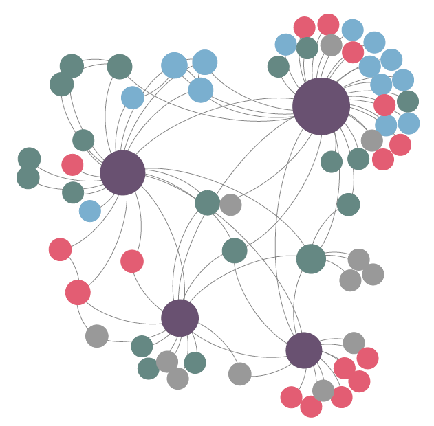
    Basic social network analysis is something EVERYONE can do. So let’s try out one social network analysis tool, NodeXL, and take a peek at the Twitter hashtag #eval13.

    Using NodeXL (a free Excel plug-in) I will demonstrate step-by-step how to do a basic social network analysis (SNA).

    What is Social Network Analysis?

    SNA is a dataviz approach for data collection, analysis, and reporting. Networks are made up of nodes (often people or organizations) and edges (the relationships or exchanges between nodes).

    The set of nodes and edges that make up a network form the dataset for SNA.

    Like other types of data, there are quantitative metrics about networks, for example, the overall size and density of the network.

    How to Create a Social Network Map in NodeXL

    There are four basic steps to creating a social network map in NodeXL:

    1. Get NodeXL.
    2. Open NodeXL.
    3. Import data.
    4. Visualize the data.

    View a Sample Dataset

    Do you want to explore the #eval13 social network data? Download it here.

    Why Social Network Analysis is Valuable

    Here’s where SNA gets fun– there is a lot of value in visually analyzing the network.

    Yes, your brain can provide incredible insight to the analysis process.

    In my evaluation consulting experience, the partners I have worked with have consistently benefited more from the exploratory, visual analysis than they have benefited from reviewing the quantitative metrics.

    Sure, it is important to know things like how many people are in the network, how dense the relationships are, and other key stats.

    But for real-world applications, it is often more important to examine how pivotal players relate to each other relative to the overall goals they are trying to achieve.

    Your Turn

    So here’s your challenge– what do you learn from analyzing the #eval13 social network data?

    Share your visualizations and your findings!

    More about Johanna Morariu
    Johanna is the Co-Director of Innovation Network and provides organizational leadership, project leadership, and evaluation expertise in her work with Innovation Network partners, staff, and other social sector organizations. She is a fierce believer in the power of the nonprofit sector to improve people’s lives, and the role of the nonprofit sector as innovator, experimenter, and advocate for effective approaches to societal challenges. In her work, she seeks to magnify the impact of her partners by providing timely, high-quality information to bolster decisionmaking.

    9 Comments

  • Very cool tool, thanks for sharing!

  • Ann K. Emery says:

    Hi all,
    Here’s a visualization from Marc Smith (@marc_smith), which uses the post-conference week data: https://twitter.com/marc_smith/status/396303552596803584
    Once you click the link for his social network map, try clicking on “view an interactive version of this graph.” I like that version because it helps you see the strength of the relationships between players.
    Enjoy! Ann

  • Hi Johanna, I always have troubles showing the labels – I sometimes manage and sometimes I don’t – do you know the trick?

  • johannamorariu says:

    Hello Joitske, let’s see, for the version of NodeXL I’m using, the steps are:
    1. Working in the “Vertices” tab of the spreadsheet: In column C (“Visual Properties” section, column “Shape”), change the value for all cells to “Label”. You can do this by selecting all of the cells and clicking on the NodeXL tab, then on “Vertex Shape” and then on “Label.”
    2. In column H (“Labels” section, column “Label”), change the value for all cells to reflect the lable you want displayed—often a copy-paste from the name of the vertex itself.
    3. On the map, click “Show Graph” or “Lay Out Again.” Your map should now have labels. It might be messy, but they’re there! Now make it pretty:)
    Hopefully that works for you, too!

  • […] What do you see when you look at the #eval13 network? To do your own analysis of the dataset, access it here. […]

  • petrudumitru says:

    Hi, thank you for sharing. What about using Twitter data stored into an excel file? How to place them in Nodexl and get different visual outcomes?

  • […] to create your own? Check out Johanna Morariu’s tutorial on using NodeXL, a free Excel […]

  • […] a bar chart or line chart. Later on, once you’ve mastered the basics, try dot plots, slopegraphs, social network maps, tree maps, or waterfall […]

  • […] charts—try bubble charts, bullet charts, dot plots, heat maps, scatter plots, slope graphs, social network maps, tree maps, waterfall charts, and […]

  • Leave a Reply to Joitske Hulsebosch Cancel reply

    Your email address will not be published. Required fields are marked *

    You Might Like

    Our complimentary mini course for beginners to dataviz. Takes 45 minutes to complete.

    Enroll

    How to Bring Your Technical Tables to Life

    Just because I’m pro-graph, I’m not anti-table. Technical tables have so much value, especially as visual appendices for reports. In this blog post, you’ll get ideas for bringing your technical tables to life.

    More »

    Need practical how-to tips? In this course, you’ll learn how to make great graphs inside software you already have. Includes beginner, intermediate, and advanced tutorials for making charts from start to finish.

    Enroll

    Subscribe

    Not another fluffy newsletter. Get actionable tips, videos and strategies from Ann in your inbox.