
Ten years ago, I had terrible insomnia.
I was working full-time and finishing graduate school at night.
My stress came out as insomnia.
I’d get tired of laying in bed… and go make YouTube videos. 😊
For me, being up in the middle of the night + making YouTube videos = intertwined.
I was up in the middle of the night again to speak at the Present to Succeed Conference (it’s mostly a European conference – different time zones).
I woke up at 3, presented at 4, and decided to make a YouTube video for you at 5.

I was up anyway, and I wanted to share some highlights from the conference session with you. Enjoy!
Watch a 16-Minute Segment
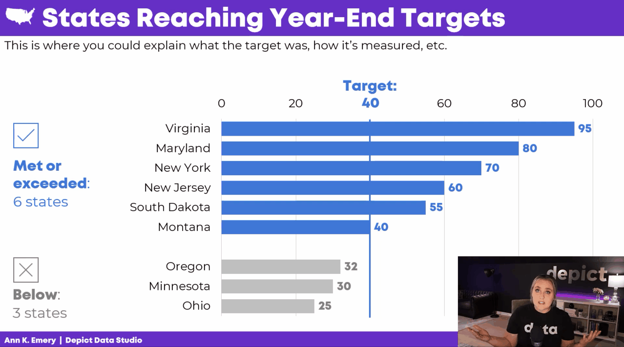
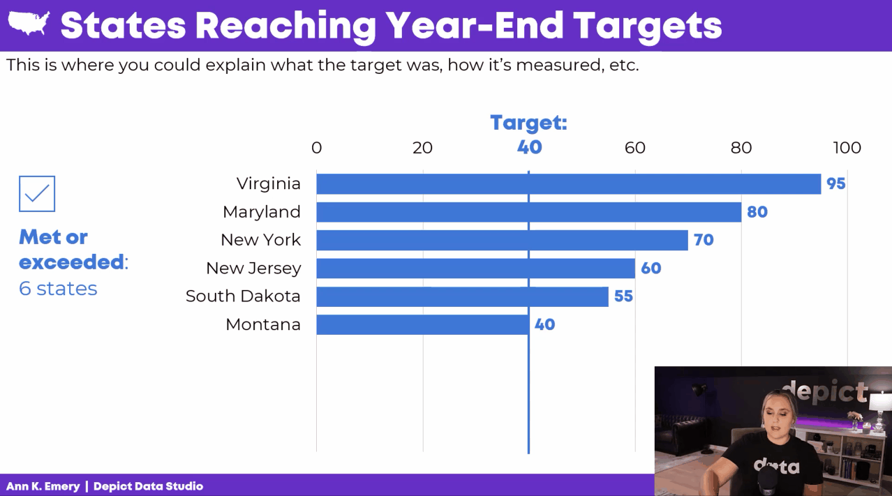
In the conference session, we learned about avoiding Death by PowerPoint by storyboarding.
Instead of presenting a single graph all at once, we’d explain the graph one piece at a time.
How to Edit the Existing Graph
In the video, you’ll learn about:
- adding target lines (if/when that applies to your project);
- grouping data with space (top vs. bottom categories);
- grouping data with color (blue vs. gray categories);
- adding words to explain our categories; and
- adding icons to increase memorability.
How to Storyboard the Graph
In the video, you’ll see me turn on my presentation voice and give a mini presentation.
I talk through the graph one piece at a time.
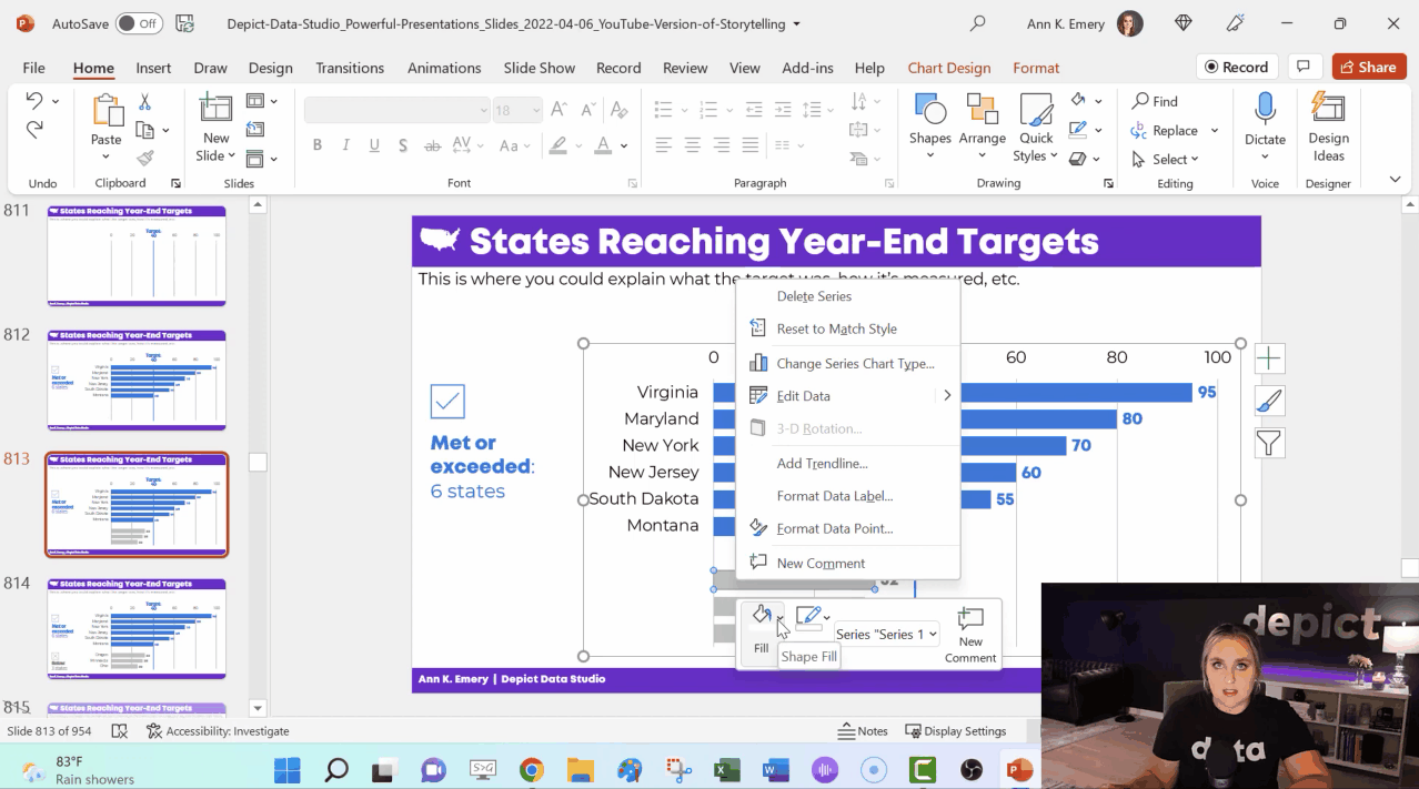
Behind the Scenes in My PowerPoint
In the video, you’ll see how I:
- make the finished graph;
- copy and paste that slide; and
- delete or hide one thing.
I’ve got all sorts of not-so-magical magic tricks: deleting icons and text boxes; adding white rectangles to cover words; changing the color of some bars to make them transparent; and deleting some of the numeric labels.
When It’s Worth Storyboarding Your Dense Graph
You don’t have to break up every graph across multiple slides.
I use storyboarding:
- at the beginning of a presentation (to start with a bang), and
- to explain dense, complex visualizations one piece at a time.
Bonus
Download my PowerPoint slides and explore them on your own.
Your Turn
If or when you apply this technique, get in touch! I’m cheering for you.
Leave a Reply