Here’s a common message I receive:
“Ann, I read your latest post, and I accidentally made a horizontal bar chart when it should’ve been a vertical bar chart! Am I going to have to delete my graph and start from scratch?”
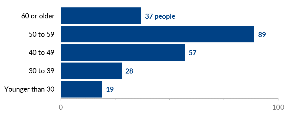
Maybe you’ve got something like this, where you want to display the number of people who fall into each age range.
What’s Better, Vertical Column Charts or Horizontal Bar Charts?
I suggest displaying ordinal data, like age ranges, from left to right across your viewer’s page or screen.
That means that this chart with horizontal bars would get rotated into a chart with vertical columns.
Do I Have to Delete the Chart and Start Over?
No way!
Don’t delete a thing!
That would be a huge waste of your time.
I’m here to save your time, not waste it.
How to Rotate Horizontal Bar Charts into Vertical Column Charts (and Vice Versa)
There are just a few steps involved.
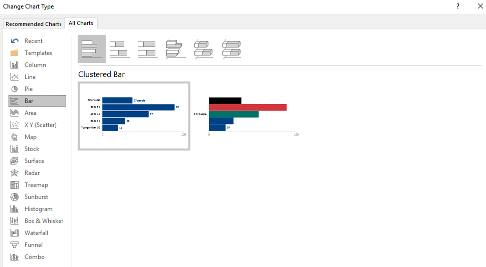
Step 1: Click on the Change Chart Type Button
In Microsoft Excel, click anywhere on your chart to activate it.
That’ll make the Design and Format tabs magically appear across the top of your file.
In the Design tab, look for the Change Chart Type icon.
(On Macs, you’ll see a range of mini chart icons with the words Change Chart Type down below, rather than a separate Change Chart Type icon. You also tend to see the Change Chart Type options on the left side of the screen instead of the right side of the screen. It’s the same thing, really.)

Step 2: Select Your Desired Chart Type from the Menu
The Change Chart Type button pulls up Excel’s menu of options.
We’ve currently got a horizontal bar chart selected.
Scan the listing on the left, select a vertical column chart, and hit OK.
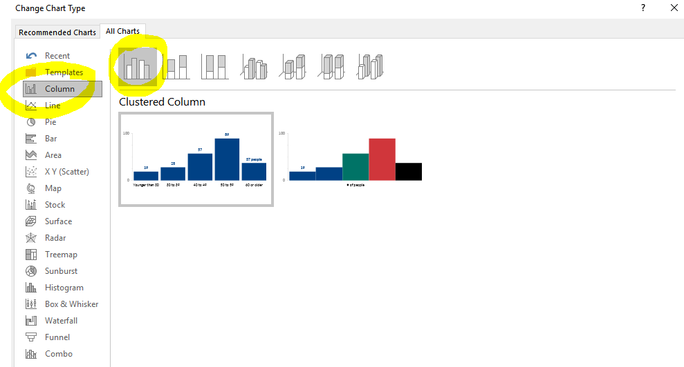
Your horizontal bar chart will transpose itself on its axis and turn into a vertical column chart, which is much more appropriate for an ordinal variable like age ranges.
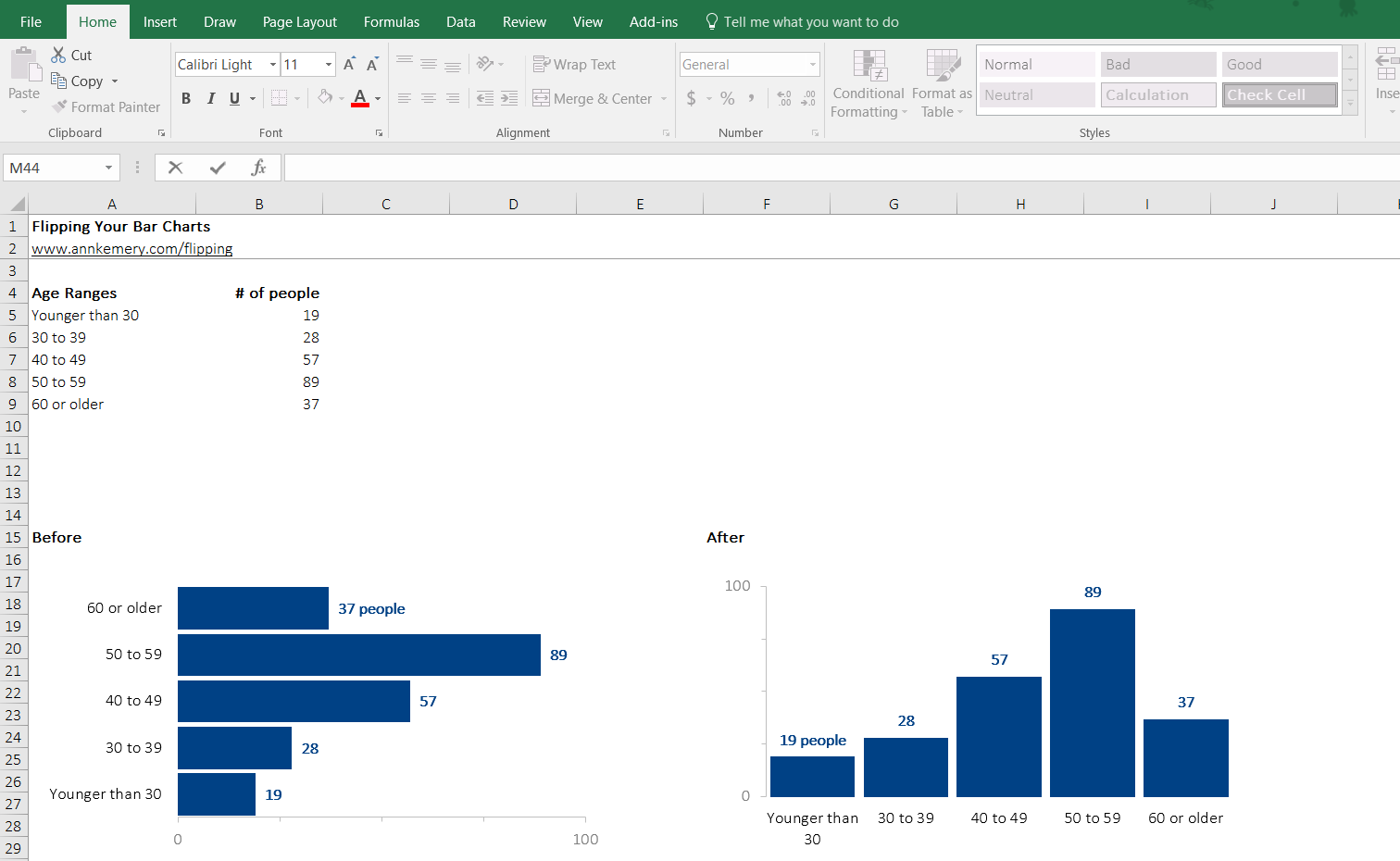
This Microsoft Excel trick is much faster than deleting your graph and starting from scratch, don’t you think?
Bonus: Download the Excel Template
Want to use these bar and column charts in your own projects?
Download the template and use the charts however you’d like.
2 Comments
Great tips as always Ann! Could you please disclose your trick on how to show only the 0 and max value on the X or Y axis (like in the above screenshot 0 and 100%)? I’ve been looking for this option for ages! thanks a lot
Just figured it out 🙂