Lauren Fox is a Depict Data Studio student and self-described “data viz nerd” who has over 10 years of experience helping organizations plan for, execute, and learn from research and evaluations.
She’s sharing examples of slider plots and step-by-step instructions for making them in Excel. Thanks for sharing, Lauren! –Ann
—
Hey everyone! Lauren Fox here from the Research & Evaluation Division (RED) of The University of Arkansas for Medical Sciences. Our group focuses on translating research into practice in fields like early childhood education, child nutrition, abuse prevention, and HIV education.
Much of my job involves working with faculty members and project leads to develop evaluation questions that lead to actionable data.
One of the biggest puzzles we face is how to translate those results (visually and verbally) so that everyone from expert audiences to laypeople can understand our findings and benefit from them.
The data viz world is full of options for visualizing basic data such as change over time, pre/post differences, and percentages/frequencies for a single point in time.
Sometimes however, your data (or your audience) demands a little more.
Case-in-point: When displaying margin of error is important.
The Challenge: Displaying Margin of Error Data
Back before the pandemic, one of our faculty asked for some help in visualizing her data for a conference on childhood nutrition.
I dressed it up the best I could, but it still fell far short of the best practices for data visualization. I figured there had to be a better way to display data with margins of error (a.k.a., the “95% confidence interval”), and set out to find it.
Spoiler alert: I didn’t find anything. So, a little bit at a time, over the course of several months, I built it myself. I call them “slider plots.”
Full disclosure: I didn’t know until after I developed these, but Stephanie Evergreen posted a rough sketch version of this idea using auto-calculated standard error bars back in 2017. Her title used “confidence intervals,” instead of “margin of error” so I missed it in my initial search.
While that means the basic idea behind my “slider plots” isn’t completely new, I’m still excited to build on her work and share this as a small step forward in chart design!
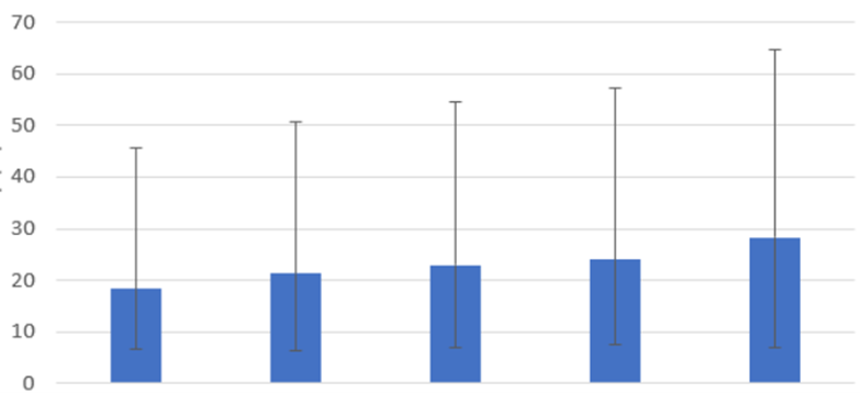
The Old Way
The “old way” involves using column charts with error bars.
The New Way: Slider Plots
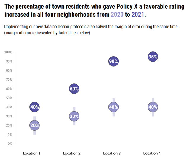
Slider plots can be vertical or horizontal. Here’s an example of a vertical slider plot that shows policy ratings from four different neighborhoods.

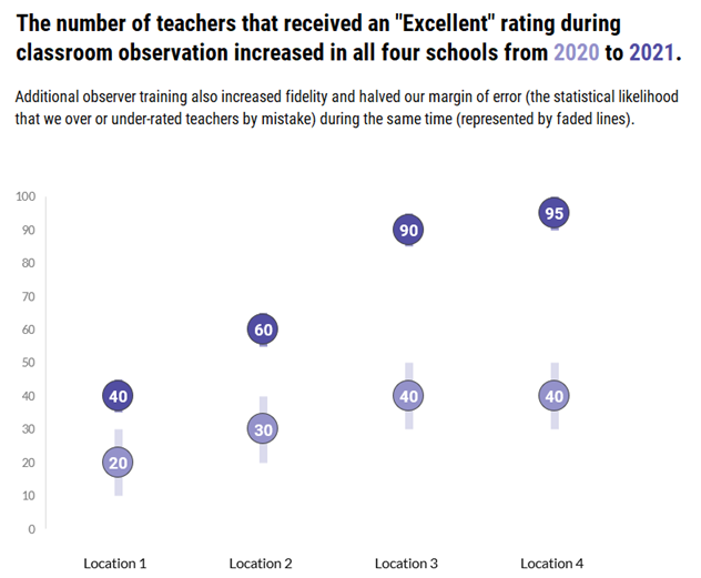
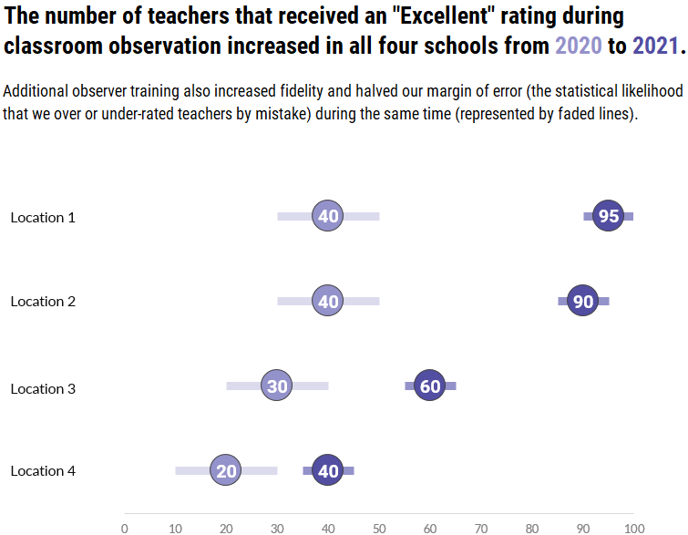
Here’s a second example of a vertical slider plot that shows teacher ratings in four different schools.
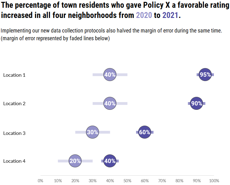
Here’s what a horizontal slider plot of those policy ratings would look like.
And finally, here’s the horizontal version of the teacher ratings.
Download the Excel File with Step-by-Step Instructions
The process to create slider plots follows many of the same steps as creating dot plots and adds a few more to create and customize your margin of error bars.
Start to finish (from creating a data table, to building your dot plot, through creating and customizing your error bars), there are 15 steps, plus a few optional sub-steps.
I’d like to list them all here, but this post would definitely get a TLDR citation from the blog police (Too Long, Didn’t Read).
While many of the steps are similar, vertical slider plots are easier to build so I recommend you start with those first.
The horizontal version may be harder to build, but it has the same readability advantages of classic dot plot we all know and love.
As a bonus, you can download a free Excel file with step-by-step instructions and screenshots, as well as an end-product template you can use to make the process much faster.
Winning Hearts & Minds with Slider Plots
While slider plots do take some time to set up, the payoff for your effort is helping to expand the reach of data viz.
Many in the evaluation community have begun to adopt better data visualization practices to help communicate their work over the last few years, but there are still many spaces (workplaces, conferences, etc.) where we find resistance.
Some of that is fear of judgement; that we won’t be taken seriously as scientists by our colleagues if we present data in non-traditional ways.
If there’s one thing I’ve learned from being an evaluator in the early education space, it’s that if you want to change people’s minds (and then their behavior), you have to meet them where they are.
I’m under no illusions this chart type will suddenly convert all the data viz detractors or revolutionize the field.
However, the changes are small enough and familiar enough that they might be a bridge to expert audiences; a way they can slowly grow more comfortable with the idea that presenting data differently doesn’t make you less scientific.
Know Your Audience
As cool as it is to do something new, it’s important that I leave you with this reminder:
Most of the time, margins of error will not be important enough to visualize unless you’re dealing with an expert audience.
It will most likely confuse or distract less-advanced audiences from the point you’re trying to make.
However, you can try adding a little more explanation in the graph subtitle to bridge the gap (see my slider plots above for examples) if it’s critical for your lay audience to see the margins of error as well.
Connect with Lauren
LinkedIn: https://www.linkedin.com/in/lbfox/
Leave a Reply