9 Comments

  • Kharaam Sharifpour says:

    I have so much respect for you I can’t even put it into words.

  • Sue Griffey says:

    I used this technique the day before your blog came out. I needed to contrast 2 different research findings in a short presentation I was doing. And I wanted (needed) to leave them in their large contexts (parts of paragraphs). And both needed to be on the same PPT slide. I used my SueMentors brand colors with blue as the paragraph text and the red for the emphasis text (and slightly larger). I also used bold and Italics on the red as it really helped the 2 findings contrast.

    I see now that gray instead of blue would have helped…

    So glad I can keep learning from you. 🙂

  • This is a small thing that makes so much difference. You are excellent Ann at showing the viewer why color-coding phrasing works vs. using other options. Thank you!

  • Angie says:

    love this post, Ann! question – to do the fill, do you use the Text Highlight Color tool, and make sure that the color you want to use appears as a Recent Colors option (unless for some reason it’s one of the 15 default color options)? or is there a more efficient way to do it so that you immediately have access to your Color Theme? i hope this question makes sense. basically i’m wondering if there’s a way to skip that step of getting the desired color to show up as a Recent Color since the text highlight tool uses its own special set of colors versus your color theme colors.

    • Ann K. Emery says:

      Are you familiar with setting up Theme Colors and Theme Fonts? If so, that’s a major time-saver. Theme Colors prevent us from having to choose from Recent Colors every time. I have video tutorials inside courses on how to do this, but no blog posts yet. You can simply google “How to set up Theme Colors in Excel” (or in Word, or PowerPoint) to learn how. It takes a few minutes to set up, and saves a lot of mouse-clicks in the long run. Let me know if that answers your question! Otherwise we can keep troubleshooting together.

      • Angie says:

        Yes, I am familiar with Theme Colors and have that set up, but that is not the color theme that shows up for my Text Highlight tool. My Text Highlight tool includes 15 default colors, one being that classic yellow highlighter color. Maybe there’s a way to customize the colors of the Text Highlight tool that I’m not aware of? Or maybe you’re using something other than the Text Highlight tool to highlight text? Thanks!

        • Ann K. Emery says:

          Ah, I understand now. I didn’t use the Text Highlight tool. I don’t think there’s any way to change those bright, neon colors.

          • Angie says:

            So silly, right? Do you add a colored box behind the text to create the highlight effect? Or is there some other obvious tool that I’m missing? Thanks again!

  • Leave a Reply

    Your email address will not be published. Required fields are marked *

    How to Visualize Qualitative Data with Colored Phrases

    Updated on: Apr 13th, 2021
    Data Visualization
    , , ,

    Wondering how to visualize your qualitative data? Maybe you’ve got open-ended survey responses, focus group notes, or speech transcripts. Qualitative data visualization can bring our words and phrases to life.

    My friend Jon Schwabish from PolicyViz asked me to partner on his One Chart at a Time project, in which we’re helping you get better-acquainted with common and not-so-common chart types.

    I created a tutorial on using colored phrases to visualize qualitative data. In this tutorial, you’ll learn:

    • The first time I ever used colored phrases to visualize qualitative data;
    • My favorite examples of colored phrases; and
    • Practical tips for using colored phrases in your project.

    Watch the Tutorial

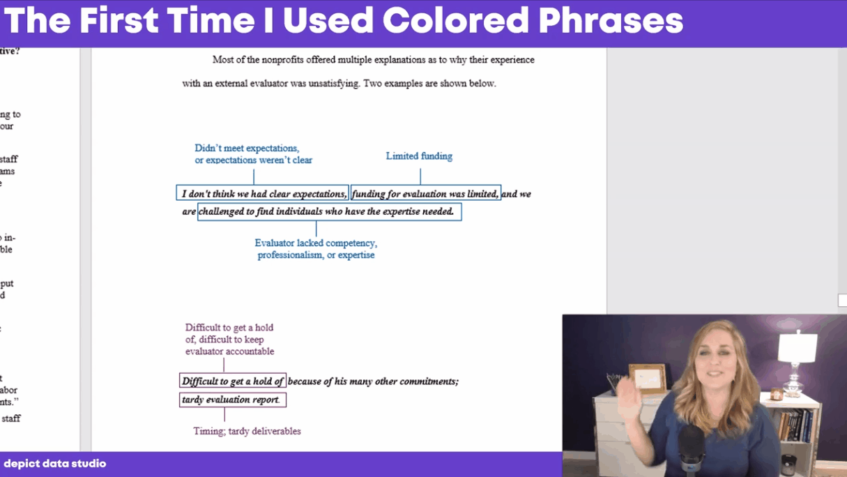
    The First Time I Used Colored Phrases in Data Visualization

    In the first part of the video, you’ll see the first time I used colored phrases.

    I was coding open-ended survey data during my Master’s thesis, and needed to visualize different themes that I was finding in the data.

    Inside good ol’ Word, I added colored rectangles around key phrases.

    The outcome wasn’t perfect, but it was better than regular text.

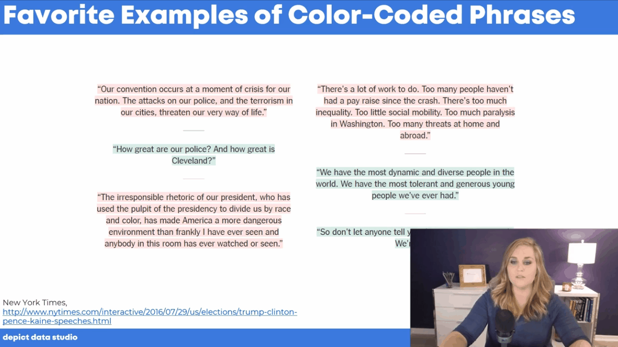
    My Favorite Examples of Colored Phrases

    In the second part of the video, you’ll see my favorite examples of colored phrases:

    In the second part of the video, you’ll see my favorite examples of colored phrases.

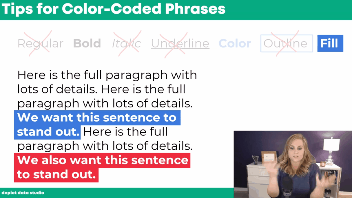
    Practical Tips for Using Colored Phrases

    In the final section of the video, you’ll learn practical tips for using colored phrases to visualize qualitative data.

    We’ll go through seven options:

    1. Regular text
    2. Bold
    3. Italic
    4. Underline
    5. Color
    6. Outline
    7. Fill

    You’ll learn the pros and cons of each approach, and see why I suggest using bold, colored, or filled text instead of the other options.

    In the final section of the video, you’ll learn practical tips for using colored phrases to visualize qualitative data. You’ll learn the pros and cons of each approach, and see why I suggest using bold, colored, or filled text instead of the other options.

    Your Turn

    Let me know when you’ve applied colored phrases to your own project!

    More about Ann K. Emery
    Ann K. Emery is a sought-after speaker who is determined to get your data out of spreadsheets and into stakeholders’ hands. Each year, she leads more than 100 workshops, webinars, and keynotes for thousands of people around the globe. Her design consultancy also overhauls graphs, publications, and slideshows with the goal of making technical information easier to understand for non-technical audiences.

    9 Comments

  • Kharaam Sharifpour says:

    I have so much respect for you I can’t even put it into words.

  • Sue Griffey says:

    I used this technique the day before your blog came out. I needed to contrast 2 different research findings in a short presentation I was doing. And I wanted (needed) to leave them in their large contexts (parts of paragraphs). And both needed to be on the same PPT slide. I used my SueMentors brand colors with blue as the paragraph text and the red for the emphasis text (and slightly larger). I also used bold and Italics on the red as it really helped the 2 findings contrast.

    I see now that gray instead of blue would have helped…

    So glad I can keep learning from you. 🙂

  • This is a small thing that makes so much difference. You are excellent Ann at showing the viewer why color-coding phrasing works vs. using other options. Thank you!

  • Angie says:

    love this post, Ann! question – to do the fill, do you use the Text Highlight Color tool, and make sure that the color you want to use appears as a Recent Colors option (unless for some reason it’s one of the 15 default color options)? or is there a more efficient way to do it so that you immediately have access to your Color Theme? i hope this question makes sense. basically i’m wondering if there’s a way to skip that step of getting the desired color to show up as a Recent Color since the text highlight tool uses its own special set of colors versus your color theme colors.

    • Ann K. Emery says:

      Are you familiar with setting up Theme Colors and Theme Fonts? If so, that’s a major time-saver. Theme Colors prevent us from having to choose from Recent Colors every time. I have video tutorials inside courses on how to do this, but no blog posts yet. You can simply google “How to set up Theme Colors in Excel” (or in Word, or PowerPoint) to learn how. It takes a few minutes to set up, and saves a lot of mouse-clicks in the long run. Let me know if that answers your question! Otherwise we can keep troubleshooting together.

      • Angie says:

        Yes, I am familiar with Theme Colors and have that set up, but that is not the color theme that shows up for my Text Highlight tool. My Text Highlight tool includes 15 default colors, one being that classic yellow highlighter color. Maybe there’s a way to customize the colors of the Text Highlight tool that I’m not aware of? Or maybe you’re using something other than the Text Highlight tool to highlight text? Thanks!

        • Ann K. Emery says:

          Ah, I understand now. I didn’t use the Text Highlight tool. I don’t think there’s any way to change those bright, neon colors.

          • Angie says:

            So silly, right? Do you add a colored box behind the text to create the highlight effect? Or is there some other obvious tool that I’m missing? Thanks again!

  • Leave a Reply

    Your email address will not be published. Required fields are marked *

    You Might Like

    Our complimentary mini course for beginners to dataviz. Takes 45 minutes to complete.

    Enroll

    The Data Visualization Design Process: A Step-by-Step Guide for Beginners

    Visualizing numbers in charts, graphs, dashboards, and infographics is one of the most powerful strategies for getting your numbers out of your spreadsheets and into real-world conversations. But it can be overwhelming to get started with data visualization. In this step-by-step data visualization guide for beginners, I’ll walk you through the data visualization design process so that you can transform your spreadsheets into stories.

    More »

    Inside our flagship dataviz course, you’ll learn software-agnostic skills that can (and should!) be applied to every software program. You’ll customize graphs for your audience, go beyond bar charts, and use accessible colors and text.

    Enroll

    Subscribe

    Not another fluffy newsletter. Get actionable tips, videos and strategies from Ann in your inbox.