When TechnoServe’s Kate Scaife Diaz reached out to see if I could consult on their 2016 Impact Report, I jumped at the opportunity. This report went through dozens of drafts, some of which you may see in future posts. There are several things to love about the final product.
Consistent Color-Coding and Icons by Category
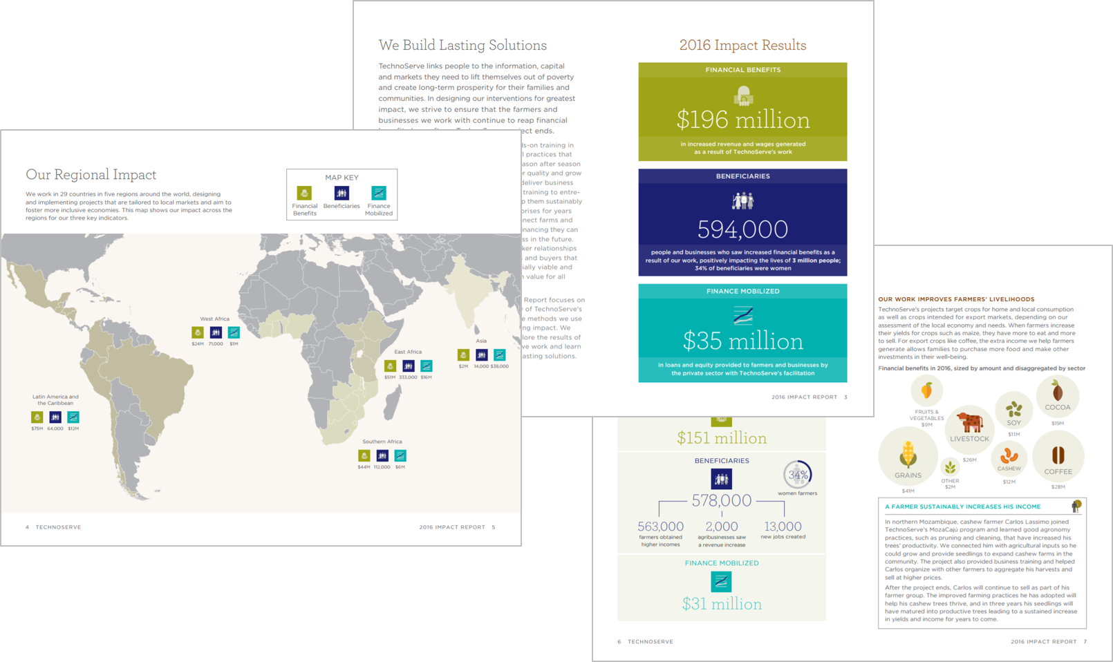
TechnoServe reported on three categories: financial benefits, beneficiaries, and finance mobilized. We introduced these terms, definitions, colors, and icons on the first spread. Then, the terms, colors, and icons are repeated consistently throughout the report. For example, you’ll never see financial benefits in purple or turquoise, or with any other icon.
These colors come from TechnoServe’s style guide, but they do more than just reinforce the organization’s branding. Colors are used intentionally to guide new readers through their terminology so that the content doesn’t feel overwhelming.

Graph-to-Paragraph Ratio
Not so long ago, the monitoring and evaluation field was plagued by hundred-page narrative reports. I’m a big fan of TechnoServe’s commitment to designing shorter reports that people can actually read.
Here’s the wordiest spread of the document, which isn’t even that wordy. On the left page, there’s an introduction (two short paragraphs) followed by a five-word diagram that explains Return on TechnoServe Investment calculations. Even the diagram contains icons. On the bottom of the left page, you’ll find a call-out box for the nerds (me!) who want to learn more. Since the call-out box has a light gray border, readers know that the content is different from the main narrative. It drills deeply into the topic, so readers can choose to read it or skip it.
On the right page, there’s an introduction followed by a dot plot. The introduction is just one sentence. You’re not aiming for zero words; you’re aiming for a sufficient number of words. In this section, one sentence was sufficient.
We strategically hid most of the text within semi-graphical elements, including the diagram, call-out box, and annotations. Graphical elements take up more than half of the spread.

A Variety of Graph Types
Throughout our discussions, we focused on including a variety of graph types. We knew that the only thing more boring than a hundred-page report was a hundred-bar-chart report. Within just 16 pages, we included:
- Photographs
- Icons
- Maps
- Diagrams
- Donuts
- Packed bubbles
- Column charts
- Stacked bar charts
- Call-out boxes
- Dot plots
- Line charts
For example, here’s a diagram about TechnoServe’s agricultural work. A donut within the diagram shows that 34 percent of the farmers were women. On the right page, packed bubbles show the relative size of financial benefits across grains, livestock, coffee, cocoa, and other sectors.
We didn’t include variety for variety’s sake. We included graphs that showcased patterns that we wanted to showcase.

Titles That Tell a Story
One of the hardest leaps for me in my data design journey was transitioning from generic, jargon-filled titles to titles that tell a story. I spent every semester and summer break during college working in research centers within schools of law, public policy, psychology, and education. We churned out peer-reviewed journal articles. After graduation, I worked in three more research centers before transitioning into a government contracting position. I was steeped in journal jargon for years. It took years to un-learn those habits.
Check out these exemplar storytelling titles. The spread’s storytelling title, We Create Lasting Impact in People’s Lives, provides more information than a traditional title like Chapter 4: Impact in Participants’ Lives Over Time.
Both graphs have storytelling titles, too. Our Impact is Sustained Year After Year and Beneficiaries See Lasting Effects interpret the data in layperson language. And they’re short; we only needed four to seven words each.

Have you seen exemplary reports that use consistent color-coding and icons, strong graph-to-paragraph ratios, a variety of graph types, or titles that tell a story?
2 Comments
[…] we were wrapping TechnoServe’s 2016 Impact Report, I also began consulting on TechnoServe’s Results Portal. The Results Portal is an interactive, […]
Like!! Really appreciate you sharing this blog post.Really thank you! Keep writing.