If viewers can’t read your graph, why bother making it? Accessibility is at the top of my priority list. A lot of things go into a data visualization’s readability, including:
- the graph type you select (3D exploding pie charts with 999 slices are inherently hard to read);
- font size (I suggest a minimum of 11-point font in reports and 18-point font on slides);
- text direction (we read horizontal text faster than diagonal or vertical text);
- colorblindness considerations (no red/green combos);
- grayscale printing considerations (test it beforehand); and
- the reading level of your titles, subtitles, and annotations.
Last time, I showed you this makeover:

In that before/after transformation, our goal was to make the years along the horizontal x-axis legible. Before, the labels were too small (size 9) and they were diagonal (which is slower to read than plain old horizontal text). We freed up space by abbreviating the years (1985 to ’85). We also opted to label just four points along the line to emphasize key milestones.
We also re-wrote the slide’s title. For slides, I aim for short titles (a couple key words). When the presenter is physically present, the presenter’s voice can elaborate on the cool parts of the graph.
The fewer words, the better. You don’t want to lose your audience’s attention, i.e., you don’t want them to be reading full sentences on your slides while you’re speaking. For other types of materials (like reports, handouts, and infographics), I use storytelling titles. Storytelling titles might be 6 to 12 words long. Storytelling titles give you room to elaborate on the cool parts of the graph, like the takeaway finding or “so what?”
Measure Your Text’s Reading Grade Level
While redesigning this graph, it took me a while to understand the slide’s title. There were a lot of technical terms that I wasn’t familiar with. I was also concerned about the title’s length.
I wanted to test my gut instinct. There are several free and low-cost tools for objectively measuring text readability.
I’ve used https://readable.io/ for years and love it. You’ll need to enter your email address. Then, you can access the free portion of the tool. You get 15 minutes of free usage each day. Or, you can pay $4/month for the pro version. I don’t get paid to promote Readable, but I probably should! I love sharing this tool with others.
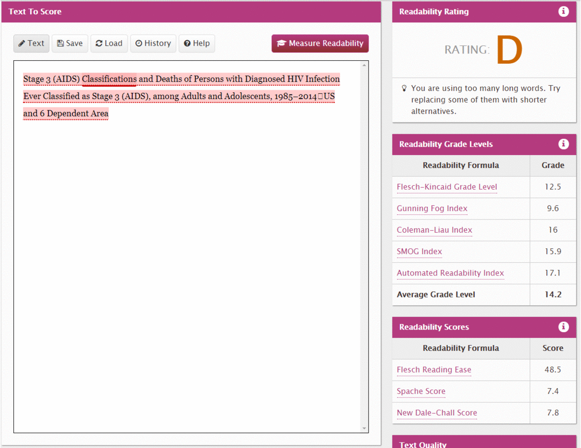
I pasted the before title into Readable’s website: “Stage 3 (AIDS) Classifications and Deaths of Persons with Diagnosed HIV Infection Ever Classified as Stage 3 (AIDS), among Adults and Adolescents, 1985-2014 US and 6 Dependent Areas.”
The before title scored a D, yikes! The before title was a 14.2 grade level, which is equivalent to a high school diploma and two years of college.
Yes, this graph was designed for people who had college degrees. Just because your viewers can read at a 14.2 grade level doesn’t mean they want to read at a 14.2 grade level. Reading at or above your level would feel like homework. Do you want your graph to feel like homework??

(P.S. Readable’s website got a makeover since I wrote this blog post, so your view will look a little different.)
Measure Your Text’s Reading and Speaking Times
Readable also measures reading and speaking times. Our title took 6 seconds to read and 11 seconds to speak! The epidemiologist could lose her audience for an entire 6 seconds.

On another recent project, I measured a company’s entire draft report with Readable’s website. The report was around 100 pages long, and Readable told us it would take someone 16 hours to read! The report was designed for state-level policymakers. Are we really expecting a busy policymaker to set aside two full working days to read a report? We’re all inundated with information.
Cut down your document’s length by focusing on essential content. Push non-essentials to an appendix. Then, make the remaining text faster and easier to read.
Edit Your Writing and Try Again
I read the title again. And again. And again. And I finally realized that it was just talking about AIDS diagnoses and deaths.
I tried that new title—AIDS Diagnoses and Deaths. It scored an average grade level of 6.5. Hooray!
The average American adult has an 8th grade reading level. This isn’t the time to laugh at people with 8th grade reading levels. I could talk about the systemic problems with our educational system for hours.
Your audience may not be the general public, of course. Your audience might be your boss, or your Board of Directors, or state-level policymakers. Their reading levels may be much higher. Your audience doesn’t want to read at their peak ability for hours. Don’t make your graph feel like homework!

This shortened title will only take the audience a second to read—six times faster than the original.

Still Not Convinced? Here’s When It’s Time to Care About Reading Levels…
Look for these clues from your readers:
“Well.. I can tell that really smart people worked on this project.” The first few times I heard this feedback, I mistook it for a compliment. I thought, “YES!!!! I used all the terms from my grad school stats classes correctly!” Now, if I hear that feedback, I cringe. This “compliment” is a sign that your documents are too technical. It’s time to revamp your graphs and your writing style.
“The report was really… comprehensive.” Ouch! This “praise” is a sign that your documents are too dense.
“Thanks for sending the report to us. We’ll let you know if we have any questions.” Ouch! This “engagement” is a sign that readers aren’t connecting with your documents.
Lowering your document’s reading grade level won’t solve all your reporting problems, but it’s a first step.
7 Practical Tips for Improving Your Text’s Reading Level
Sold??? Ready to improve your readability???
I love Readable because it gives you practical suggestions for improving your writing. For example, in our before title, the website highlighted the word classifications in a darker color. It also told me I was using too many long words and that the sentence was too long.
Here are practical tips for lowering your text’s reading level:
- Find synonyms for technical terms. In this project, we changed classifications to diagnoses. In another project, we changed the counterfactual to comparison group and described the nitty gritty details of the counterfactual analyses in the appendix. In another project, we changed at baseline to when people enrolled in the program.
- Avoid acronyms. I don’t care if you define the acronym the first time you use it. I shouldn’t have to flip back to page 1 while I’m trying to understand page 10. I shouldn’t have to memorize acronyms in addition to understanding your content and visualizations. When in doubt, spell it out.
- Use shorter words. Look for words with lots of letters and lots of synonyms, and then find replacements.
- Write shorter sentences. One of my personal weaknesses is writing run-on sentences. As I edit my own writing, I break long sentences into several short sentences. Search for your commas and semi-colons. Replace them with periods.
- Write shorter paragraphs. Several short paragraphs > one long paragraph.
- Write narrower paragraphs. I was That Nerd who took a speed-reading course during high school. I learned about how our eyes scan a page from left to right to read a line of text. I was surprised to learn that we don’t actually look alllllll the way to the left or allllll the way to the right. Instead, our eyes stay towards the center and we take advantage of our peripheral vision to scan the words on the far left and far right. Accordingly, there are studies about how long we should make each line of text (i.e., how wide or narrow our paragraphs should be). Results are somewhat mixed; readers have personal preferences about exactly how many inches wide they prefer. Nobody can speed-read a super long line of text, though. In portrait layouts, I use one or two columns of text. In landscape layouts, I use two or three columns of text.
- Remove redundancies. Say what you need to say—once! Avoid repetition across your sentences, graphs, and tables. I’ve got an upcoming before/after makeover blog post where I’ll show you how to remove redundancies.
I also have a personal preference for active voice and first-person writing. I can’t connect with reports that sound like they were written by robots.
Lowering your graph’s reading level is not the same as dumbing-down your graph. Lowering your graph’s reading level shows that you respect your audience. You recognize that these are busy, important people. Busy, important people have lots of busy, important priorities. Your graph is one of many, many pieces of information to come across their desk each day. Give your audience the information they want in a format that doesn’t take all day to decipher. Then, your audience can make informed decisions and move on.
Have you used other readability tools? Share them here!
3 Comments
It is still not entirely clear what the takeaway message of this graph should be. Is the point to show that the huge spike that happened in the early 90s has now dropped down almost to baseline levels due to some unspecified reason? I thought the data viz checklist you and Stephanie Evergreen created encourages the use of a headline in sentence format which tells viewers the point of the visualization.
Hi Robin,
Good question.
I don’t suggest using headlines in live presentations. Your audience would be reading the headline at the same time that you’re speaking. So you’d lose your audience–for up to 6 seconds with the original long title.
I definitely use headlines in written documents, like reports, executive summaries, policy briefs, dashboards, and infographics (basically, for everything except slideshows). In those situations, you’re not physically present to talk about the message–yes, that there was a spike and now it’s dropped down–so your text does the “talking” for you.
Hope this helps!
Ann
Update: Readable’s website is getting a facelift, so you might run into some wonky issues. In the meantime, I’ve been using https://datayze.com/readability-analyzer.php to measure reading levels. It’s not as pretty or comprehensive as Readable, but it gets the job done! As usual, I’m personally focusing on transforming my long sentences into several shorter sentences. I just transformed a draft from a grade level 9 into a grade level 6 by shortening my sentences. Enjoy this additional tool!