I offer full-day workshops on 6 different topics. All of these classes fall under the broad data communications umbrella.
You can choose from these 6 classes:
- Simple Spreadsheets
- Great Graphs
- Great Graphs in Excel
- Report Redesign
- Dashboard Design
- Powerful Presentations
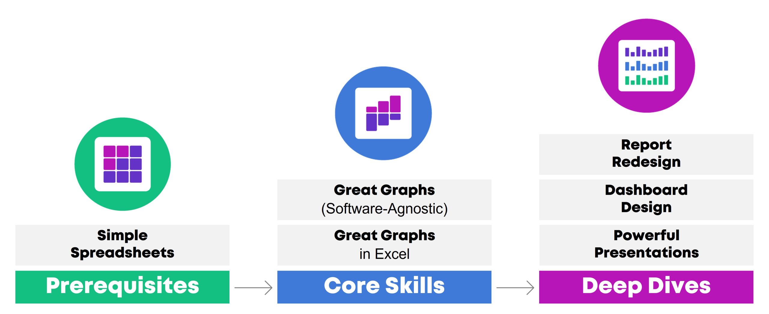
One class focuses on data analysis (cleaning and tabulating our raw datasets to get them ready for graphs).
Two classes focus on core data visualization skills (translating technical information for non-technical audiences; making sure we don’t just have bar charts; and using colors and fonts that are branded, accessible, and intuitive).
Three classes are advanced, sort of. I call them deep dives because they focus just on reports, or dashboards, or presentations. You’ll need to have your graphs created and edited first (skills taught in previous classes) so they can feed into those reports, dashboards, and presentations.
In this article, you’ll learn more about each of the classes.
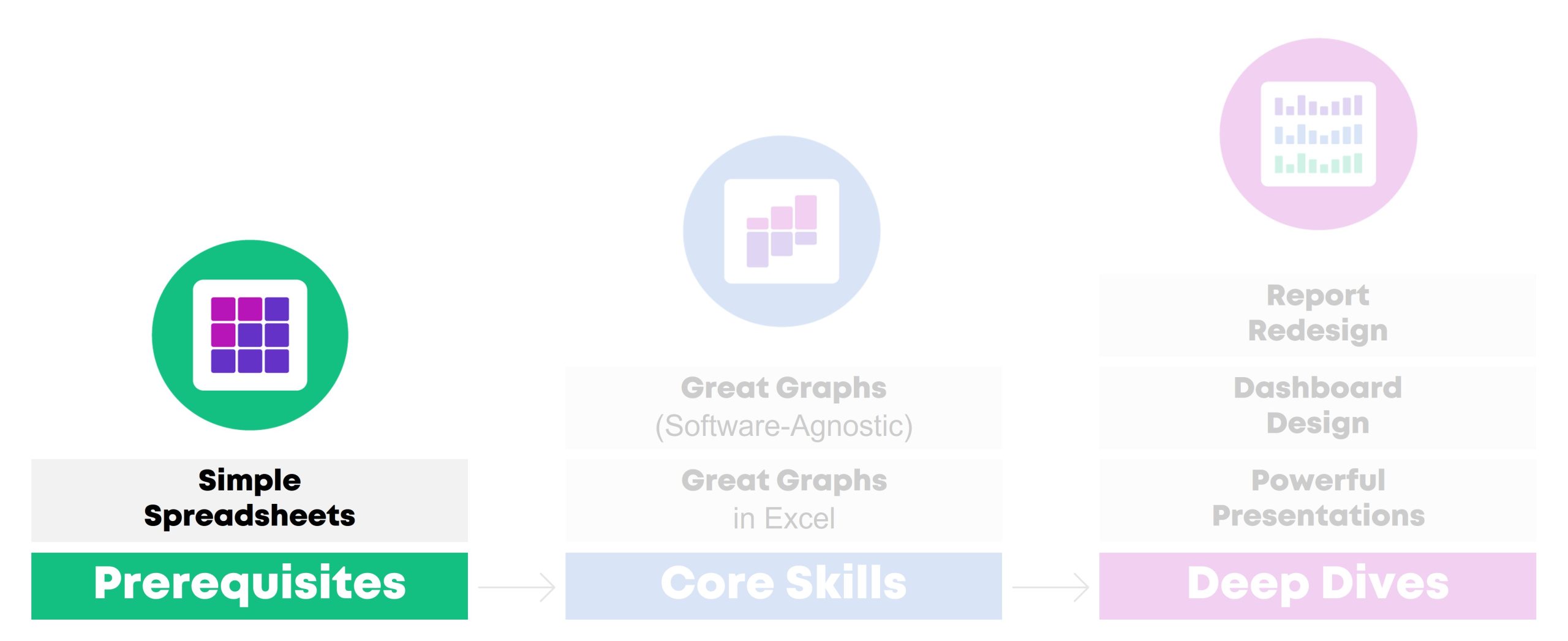
Simple Spreadsheets
How to Analyze Data from Start to Finish in Excel
Need to make sense of spreadsheets? Not sure where to start? Chances are, there’s a faster and easier way to get it done.
In this class, you’ll practice a step-by-step process for exploring, cleaning, analyzing, and tabulating your dataset. These spreadsheet skills will save your time, energy, and sanity.
You’ll learn how to:
- organize your brand new datasets by adding filters, freezing panes, and keeping raw data separate from clean data;
- merge disparate spreadsheets together with lookup formulas;
- clean and recode messy data (by checking for missing data and duplicates, and by transforming variables);
- run descriptive statistics and frequencies; and
- explore data more fully through pivot tables.
This workshop is highly interactive. Each section begins with a demonstration followed by a break for hands-on practice. For example, in the Analyze Data with Pivot Tables module, the instructor will show how to insert a pivot table and drag-and-drop variables. Then, you’ll practice right away, and you’ll be expected to ask questions whenever you get stuck.
Learn More
Learning Objectives
After the one-day workshop, participants will be able to:
- merge data from multiple sheets into a single master dataset;
- organize spreadsheets by adding filters and freezing panes;
- check for duplicates and missing data;
- clean and recode messy data to get it ready for analysis;
- run basic descriptive statistics and frequencies; and
- explore data more fully through pivot tables.
Target Audience
Researchers, evaluators, scientists, graphic designers/communications staff, and admin staff who need to use Excel spreadsheets as part of their job–and it’s not your favorite part of your job.
If you already teach Excel at conferences or in seminars, you don’t need this class. It’s for those of us who didn’t take graduate courses specifically on Excel formulas.
If formulas and pivot tables have always been easy for you, you don’t need this course. It’s for those of us who feel like we’re missing something; that “I don’t know what I don’t know” feeling.
If you’re looking for a dataviz course, this isn’t it. Simple Spreadsheets is about: You’re opening a brand new dataset for the first time. Now what?! You’ll tabulate nominal, ordinal, interval, and ratio variables with the right formulas (you’ll need different formulas based on the type of variable/dataset). You’ll learn the in’s and out’s of pivot tables — and when to use formulas vs. pivot tables. These are the skills that precede graphs, dashboards, reports, and slideshows.
Level
Beginner/intermediate.
Prerequisites
None.
(But this course is a suggested prerequisite for all the other classes.)
Equipment Needed
A desktop or laptop computer (not a tablet or phone).
PCs preferred over Macs.
Webcams suggested for virtual classes so that staff can fully participate.
Software Programs Used
Excel is required.
Newest version preferred (called “Microsoft 365”).
Materials Included
- 1 day of live instruction (9-4 on-site, or 9-12 two days in a row virtually)
- Excel files with step-by-step instructions and hands-on activities
What Participants Are Saying
“As a 20+ year Excel user I can not BELIEVE the things I didn’t know, and that I learned to master in moments from Ann’s brilliant and engaging teaching. This course is by far the most well prepared and executed online course I have ever taken… The course materials are actual Excel files embedded with the skills, tricks and formulas… As far as who this course is best suited to, I think it could help Excel users of all levels, from beginners to advanced (which is what I would have called myself before taking this course and realizing my knowledge gaps!). For beginners it would be a one-stop shop of all you need to know to excel at Excel. For long-time users it will provide short-cuts, helpful formulas and other tricks you might not have known were hiding in this program. I truly can’t say enough about it, and have already recommended it to research colleagues, data/social indicator experts and policy folks.” – Lynn Davey, Ph.D, Davey Strategies
“I am a university researcher and have a lot of familiarity with data collection and statistical analysis programs/platforms (e.g. SPSS, SAS, etc.), but needed a low-cost, widely-used data collection and analysis tool I could recommend and teach to the community partners with whom I conduct research. I have known for a long time that Excel was likely the solution to my problem, but could never find time to learn to use it, except in the most basic ways (sort, sum). Last summer, I took Ann Emery’s Simple Spreadsheets course and dramatically improved my Excel acuity. *Plus* the course was fun, straightforward, and immediately useful… This course was more than worth the time and money I put into it, and I continue to learn and benefit from it (almost a year later). I highly recommend this course!” – Sarah V. Suiter, Vanderbilt University
Case Studies from Past Participants
You can view participants’ before-after transformations here:
- 6 Data Cleaning Steps to Save You Millions by Hudson Kelley, HOPE International
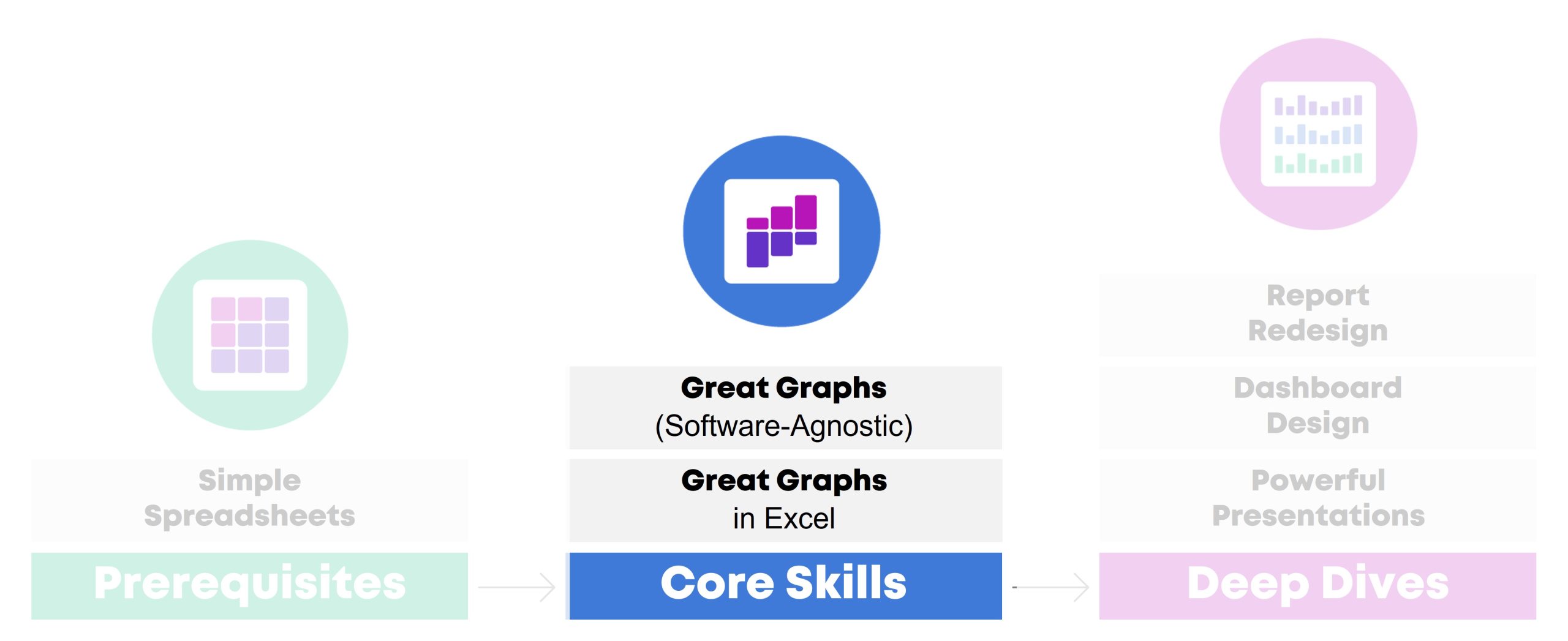
Great Graphs
A Software-Agnostic Introduction to Accessible Data Visualization
Are your takeaway findings getting lost? Busy graphs can slow down the viewer’s comprehension, increase cognitive load, and fail to inform decision-making processes. With intentional editing, we can design graphs that inform and inspire.
During this class, you’ll walk through a step-by-step process that you can apply to your own projects.
You’ll learn how to:
- customize your visualizations for each of your audiences (technical vs. non-technical, internal vs. external, etc.);
- choose the right chart type for your dataset (hex maps vs. choropleth maps, donuts vs. waffles, spaghetti lines vs. small multiples, etc.);
- select an appropriate software program for your needs;
- declutter your visuals so that viewers’ attention is focused on the data; and
- use colors and fonts that are branded, accessible, and intuitive.
Learn More
Sample Agenda
In-person workshops typically last a full day (e.g., 9 – 4, with a 1-hour lunch break). Virtual workshops can be a single full day (9-4) or two half days (e.g., 9-12, two days in a row).
Here’s a sample agenda:
- 9 – 9:50: Welcome & Logistics; Understand Our Audiences
- 9:50 – 10: Break
- 10 – 10:40: Choose the Right Chart
- 10:40 – 10:50: Select a Software Program
- 10:50 – 11: Break
- 11 – 11:15: Declutter
- 11:15 – 12: Color
- 12 – 1: Lunch
- 1 – 1:30: Text
- 1:30 – 1:50: Case Studies
- 1:50 – 2: Break
- 2 – 2:50: Case Studies
- 2:50 – 3: Break
- 3 – 3:30: Case Studies
- 3:30 – 4: Satisfaction Surveys; Next Steps
Sample Activities
We might:
- Use the Audience Analysis Crosswalk to map out your various audiences’ needs and preferences (to make sure your visualizations are customized perfectly for them);
- Talk through discussion-starter questions in a small group (for example, to decide which audiences prefer data storytelling approaches, or not);
- Set up branding presets (“Theme Colors” and “Theme Fonts”) inside Excel (to look professional and save time);
- Test our graphs for accessibility features, like color contrast, colorblindness, and grayscale printing, using government-approved websites;
- Sketch out 3-5 chart options for a given dataset (to practice weighing the pros and cons of different graphics); and/or
- Discuss or sketch out before-after makeovers from your real workplace.
Learning Objectives
After the one-day workshop, participants will be able to:
- explain when they would use traditional graphs vs. storytelling graphs;
- weigh the pros and cons of presenting data through various chart types (e.g., clustered bar charts vs. dot plots, and choropleth maps vs. hex maps);
- explain how to declutter visuals to make sure the viewers’ attention is focused on the key patterns (e.g., by removing redundant text);
- select graph colors that are branded, accessible, and intuitive; and
- write graph text (titles, annotations, tooltips, etc.) that is branded, accessible, and intuitive).
Target Audience
Researchers, evaluators, scientists, graphic designers/communications staff, and admin staff who need to share data with others through accessible graphs.
Level
Beginner/intermediate.
Prerequisites
None.
(But this course is a suggested prerequisite for Great Graphs in Excel, Report Redesign, Dashboard Design, and Powerful Presentations.)
Equipment Needed
A desktop/laptop computer (not a tablet or phone).
PCs preferred over Macs.
Webcams suggested for virtual classes so that staff can fully participate.
Software Programs Used
The Microsoft suite (Excel, PowerPoint, Word).
This workshop focuses on software-agnostic best practices that can be applied to any software program. We’ll have a few hands-on activities using Microsoft programs because most of us are using Excel, PowerPoint, and Word for at least some part of our workflow.
Materials Included
- 1 day of live instruction (9-4 on-site, or 9-12 two days in a row virtually)
- Handout
- Ebook
- PDF’d slides
What Participants Are Saying
“I would often see charts, graphs, and other data visuals in journal articles, and think to myself, ‘Wow, this is horrible; I have no idea what I am supposed to learn from this!” But I had no idea how to make it better or offer constructive suggestions. After Great Graphs, I learned about how to select the best type of graph and how to make it visually appealing to the intended audience. My own publications and posters have also benefitted—no more hard-to-read charts filled with clutter!” – John R. Heberger, Epidemiologist, Centers for Disease Control and Prevention
Case Studies from Past Participants
You can view participants’ before-after transformations here:
- A Before-After One-Pager Makeover by Lillian Haley, Haley Evaluation & Research Services

Great Graphs in Excel
How to Make Beginner, Intermediate, and Advanced Graphs from Start to Finish
You’re familiar with all the research-based dataviz best practices. Now, let’s get down to business and make those graphs in Excel!
During this class, you’ll make beginner, intermediate, and advanced graphs in Excel.
You’ll walk through three levels of Excel vizardry:
- First, in Level 1, learn the in’s and out’s of overused native charts (bar charts, pie charts, line charts, and more).
- In Level 2, you’ll make underused native charts, like tree maps, sunburst diagrams, and geographic maps.
- Finally, in Level 3, you’ll make non-native charts–charts that require sophisticated workarounds to produce in Excel, like dot plots, b’arc charts, small multiples bar charts, population pyramids, waffle charts, and more.
Learn More
Learning Objectives
After the one-day workshop, participants will be able to:
- create and edit a few classic chart types (bars, lines, pies, etc.) to make sure they’re Big A Accessible (508-compliant) and little a accessible (intuitive);
- practice creating a few newer chart types that are now available in Excel, like geographic maps and tree maps; and
- transform a few Regular Tables into Magic Tables to fully harness Excel’s power and make dot plots, population pyramids, and more.
Target Audience
Researchers, evaluators, scientists, graphic designers/communications staff, and admin staff who need to share data with others through accessible graphs.
Level
Intermediate.
Prerequisites
You should complete a one-day data visualization best practices class first (like Great Graphs).
You should already have strong spreadsheet skills (being able to transform your raw data into clean, tabulated data (skills covered in Simple Spreadsheets).
Equipment Needed
A desktop/laptop computer (not a tablet or phone).
PCs preferred over Macs.
Webcams suggested for virtual classes so that staff can fully participate.
Software Programs Used
Excel is required.
Newest version preferred (called “Microsoft 365”).
Materials Included
- 1 day of live instruction (9-4 on-site, or 9-12 two days in a row virtually)
- 25+ Excel files with step-by-step instructions and templates for making beginner, intermediate, and advanced graphs
- 2-page Chart Chooser
- 1-page cheat sheet on Transferring Graphs from Excel into Word or PowerPoint
- Instructions for setting up Theme Colors & Theme Fonts
What Participants Are Saying
“Before the course, I presented numbers narrated by text…yawn. Now, I present numbers as a story with visuals, sometimes as simple as sparklines, which engages staff and invites their insights! The Great Graphs in Excel course helped me see and share what story our data is telling. This course is best for people who learn through interaction, not just watching videos and reading tutorials. Ann K Emery responds to students’ questions and specific data scenarios, has us try the solutions real-time, and engages and encourages her students (probably the most impactful part of the course…) I especially appreciate her walking us through her thought process as she demonstrates the procedures she’s developed. It’s like having an officemate who’s both a whiz and mentor, which helps make me a better analyst.” – Ellen Shepherd, Program analyst at a nonprofit
“This course helped me to see Excel as a flexible tool for a wide range of data management and analysis tasks… Much more than just tables and calculations!” – Bob Coulter, Missouri Botanical Garden
“My trend is definitely upward in this course. I’m learning EVERYTHING about graphs and #dataviz. Even the first couple lessons taught me so much useful formatting information about Excel that are already saving me so much time and ensuring my #professionalbranding consistency. And I’m looking forward to making graphs and charts that can convey complex information in an effective way!” – Sue Griffey, Founder, SueMentors
“Enrolling in courses at Depict Data Studio is one of the best professional developments I have ever made… After eight months with Ann, I was able to turn my blah capabilities statement into something I am happy to share! I could go on and on about the many design and data visualization lessons I’ve learned from Ann. Instead, I’ll end by saying that books and blogs are excellent resources. I have several books and subscribed to many blogs. However, they do not compare to live and on-demand instruction of Depict Data Studio.” – Lillian Haley Ph.D., MSW, ChFC®, President and Owner, Haley Evaluation & Research Services (HERS)
Case Studies from Past Participants
You can view participants’ before-after transformations here:
- 3 Simple Steps that Took My Graph from Good to Great by Maia Werner-Avidon, evaluator
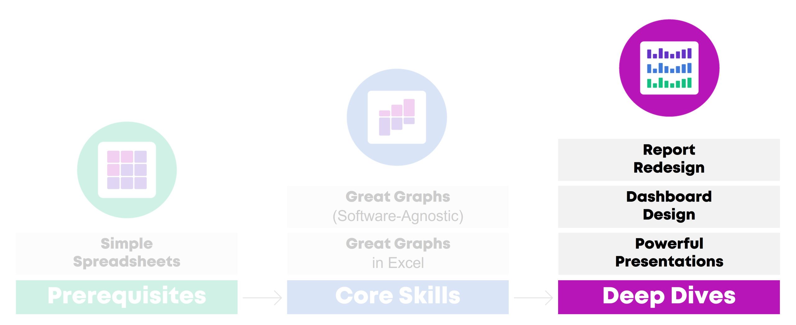
Report Redesign
How to Transform Text-Heavy Technical Reports into Visual, Skimmable Reports
Were you trained to write lengthy technical reports with methodological details? Technical reports are a great fit for technical audiences, like our peers working in public health. But what about our non-technical audiences, like policymakers or the general public?
In this class, you’ll learn how to translate technical data for non-technical audiences. You’ll walk through 3 layers of the Report Redesign pyramid.
Here’s what you’ll learn and practice:
- In Level 1: Go Beyond the Report, you’ll learn how to add a variety of dissemination formats to your project (not just reports) in order to meet a variety of audiences’ needs. You’ll also learn about the 30-3-1 Approach to Reporting, visual appendices, and the 8 ingredients for designing one-pagers.
- In Level 2: Structure Your Report, you’ll learn how to design a 20-minute cover. Then you’ll visually chunk your data with color-coded chapters. These are the big-picture, structural edits that make data-dense reports easier to skim and navigate.
- Finally, in Level 3: Design Each Page, you’ll fine-tune the graphs and paragraphs included on each page. You’ll see a checklist of 15 Ideas for Visuals, and then practice adding more visuals to each page. You’ll also edit your writing to ensure that it’s accessible and inclusive.
Learn More
Learning Objectives
After the one-day workshop, participants will be able to:
- transform one text-heavy page into a visual, skimmable page.
- name a few dissemination formats (beyond technical reports) that would be ideal for non-technical audiences;
- describe the 30-3-1 Approach to Reporting;
- name 8 ingredients that should be included in one-pagers;
- create a 20-minute report cover in Word;
- create color-coded divider pages in Word; and
- transform one text-heavy page into a visual, skimmable page.
Target Audience
Researchers, evaluators, and scientists who are preparing technical reports (peer-reviewed articles, etc.) and need to translate those scientific details for non-technical audiences.
Or, graphic designers/communications staff and admin staff who are helping scientists prepare those non-technical reports or infographics.
Level
Intermediate/advanced.
This training is ideal for staff who regularly work on reports of any type or length, and who might already be thinking about adding one-pagers or infographics to their project.
In other words, you’ll gain the most from this session if you can bring your own draft reports to work on. It’ll be harder to participate if you don’t have any documents to work on during the hands-on portions.
Suggested Prerequisites
This course is about designing reports and one-pagers for non-technical audiences. It’s not a data visualization course. We suggest that you complete a half-day or full-day data visualization class first. Then, those well-designed graphs and maps can go into the reports that you’ll fine-tune during this course.
Equipment Needed
A desktop/laptop computer (not a tablet or phone).
PCs preferred over Macs.
Webcams suggested for virtual classes so that staff can fully participate.
Software Programs Used
You’ll learn both reporting best practices and Word how-to’s.
Materials Included
- 1 day of live instruction (9-4 on-site, or 9-12 two days in a row virtually)
- Handout
- Ebook
- PDF’d slides
What Participants Are Saying
“Investing in the Report Redesign course from Depict Data Studio was one of the best decisions I have made in my career. Before the course, I was writing long, wordy reports that I thought were visually appealing because I included tables and bar charts; I had no idea the options I had within software I already had access to. Now, I create impactful one-pagers and reports that are visually appealing and even more importantly, get read by my colleagues. I know that there are more than 15 types of visuals to include in reports, how to utilize my company’s brand to my advantage, and more. I have been complimented on the new look of my reports by coworkers and external stakeholders, and continue to have “aha” moments of how I can continue to apply Ann’s advice as access to the course never expires. I cannot recommend this course enough. Thanks Ann and Depict Data Studio!” – Olivia Power, Data and Reporting Specialist, National FFA Organization
Case Studies from Past Participants
You can view participants’ before-after transformations here:
- Upping Your Reporting Game–with PowerPoint! by Ann Webb Price, Community Evaluation Services
- Three Ways Intentional Data Viz Has Elevated My Work by Kathy Dowell, The Evaluation Group

Dashboard Design
How to Design Static and Interactive Dashboards in Excel
Why wait until the end of the year to write a lengthy report when you can share data early and often with dashboards? Your organization’s leaders have more important things to do than read lengthy reports. Dashboards get to the point so that leaders can understand the numbers and take action.
During this class, you’ll make both static and interactive dashboards in Excel.
First, you’ll see sample dashboards from a dozen organizations like yours. You’ll hear share the story behind each dashboard so that you can learn about each dashboard’s audience and goals. For example, some of the dashboards were designed to track progress towards goals. Other dashboards were designed to help organizations compare their different program areas. You can decide which elements of each dashboard would be most applicable to your own work.
Then, you’ll design a few static dashboards in Excel. You’ll create sparklines and uncover some of Excel’s best kept secrets, like Conditional Formatting. These dashboards will live inside of Excel and get shared with stakeholders as PDFs through email or as printed handouts during meetings. Static dashboards are a great fit for non-technical audiences who only have time to skim a one-page email attachment.
Finally, you’ll design an interactive dashboard in Excel. You’ll turn your regular table into an Excel Table; you’ll tabulate your dataset with pivot tables; you’ll design pivot charts to showcase your key findings; and you’ll link everything together with slicers. Interactive dashboards are a great fit for technical audiences who have time to explore the data themselves.
Learning Objectives
After the one-day workshop, participants will be able to:
- describe when static vs. interactive dashboards are most useful (e.g., for technical vs. non-technical audiences);
- create sparklines, data bars, and heat tables;
- adjust their dashboard to be printer- and PDF-ready to create static dashboards; and
- insert Excel Tables, pivot tables, pivot charts, and slicers to create interactive dashboards.
Target Audience
Researchers, evaluators, and scientists who want to create monthly, quarterly, or annual dashboards inside no-code software you already have, like Excel.
Level
Intermediate/advanced.
Suggested Prerequisites
You’ll gain the most from this course if you’ve already taken two other courses from this instructor: (1) Simple Spreadsheets (to start practicing formulas and pivot tables) and (2) Great Graphs (to start practicing data visualization skills, like chart-choosing, branding, and accessibility).
Equipment Needed
A desktop/laptop computer (not a tablet or phone).
PCs preferred over Macs.
Webcams suggested for virtual classes so that staff can fully participate.
Software Programs Used
Excel is required.
Newest version preferred (called “Microsoft 365”).
Materials Included
- 1 day of live instruction (e.g., 9-4 on-site, or 9-12 two days in a row virtually)
- Access to recordings for 1 year so you can re-watch anything you’d like
- Ebook
- PDF’d slides
- ~10 templates with step-by-step instructions for making static and interactive dashboards in Excel
What Participants Are Saying
“This course helped me to design a visually engaging and easy to interpret surveillance report for our State Health Department. This course offers so many great Excel tips and techniques in such an organized way. The skills I learned from this course were extremely easy to apply to an actual project. Furthermore, the course examples provided me with so many ideas and inspiration for future projects.” – Melissa Lurie, MPH, Epidemiologist/Research Scientist, New York State Department of Health
“When I started my position, I was tasked with developing a better way to track performance data across multiple programs. With this course, I was able to transform the old system into a dashboard that is efficient, makes good use of a single page, and looks great. We now get lots of compliments on our dashboard, thanks to this course.” – Shawna Rohrman, Associate Director, Cuyahoga County Office of Early Childhood
Case Studies from Past Participants
You can view participants’ before-after transformations here:
- Creating Reports for Grant Deliverables Using Excel Dashboards by Josephine Engels, Mental Health America of Greater Houston
- Better Storytelling with the Same Data: Upgrade that Board Packet! by Kristen Summers, Saint Luke’s Foundation
Powerful Presentations
How to Design and Deliver Presentations for Maximum Impact
Do you need to give presentations, either in-person or online? You might need to design slides for public health conferences. Or, you might need to give updates at your staff meetings.
In this class, you’ll learn how to avoid Death by PowerPoint–those slides with Text Walls, grainy images, and run-on content. Our audiences are busier than ever, and they’re relying on us to communicate our data clearly and concisely.
You’ll gain presentation best practices and practical how-to’s in PowerPoint.
First, in the Slidedecks vs. Slidedocs module, you’ll learn the five graphic design features that make presentations stand out from reports. You’ll see examples of slidedecks and slidedocs from real CDC projects, and we’ll pause to make sure you know whether you need slidedecks and/or slidedocs for your own projects.
Second, in the Message module, you’ll design a Visual Framework to help organize your presentation into manageable chunks of information. You’ll also write the takeaway tweets for your presentation in advance to make sure it’s concise and actionable.
Third, in the Design module, you’ll swap out your bullet points and bar charts for a variety of visuals. You’ll receive our Chart Chooser and our checklist of 15 Ideas for Visuals, and we’ll practice adding visuals to some of your real slides.
Fourth, in the Delivery module, you’ll learn how to storyboard you slides, which is a technique for breaking up dense data over multiple slides and explaining it piecemeal to our non-technical audiences. You’ll also learn about public speaking skills, body language, and tech set-up for virtual presentations.
Learning Objectives
After the one-day workshop, participants will be able to:
- name five characteristics that should differentiate slidedocs (handouts made in PowerPoint) from slidedecks (presentation slides made in PowerPoint);
- narrow down a presentation’s content to just 3-5 “buckets” of information;
- draft a Visual Framework (a diagram) that shows how those 3-5 buckets are related (e.g., a venn diagram, step-by-step process, or repeating cycle);
- write a 1-2 sentence “takeaway tweet” that summarizes the main message from the presentation;
- re-design one text-heavy slide so that it includes accessible, skimmable visuals; and
- storyboard one graph (break up the graph over multiple slides to match your speaking points and keep the audience engaged).
Target Audience
Researchers, evaluators, and scientists who are preparing their own slides/handouts for upcoming presentations.
Or, graphic designers/communications staff and admin staff who are preparing slides/handouts that their supervisors will be presenting.
Level
Intermediate/advanced.
This class is designed for staff who are already giving presentations (informal staff meetings, or formal conference presentations) and want to take their slides and public speaking skills to the next level.
In other words, you’ll gain the most from this session if you can bring your own draft slides to work on. It’ll be harder to participate if you don’t have any slides or upcoming presentations to work on during the hands-on portions.
Suggested Prerequisites
This course is about presentations, slide design, and public speaking skills. It’s not a data visualization course.
We suggest that you complete a half-day or full-day data visualization class first (like Great Graphs). Then, those well-designed graphs and maps can go into the presentations you’ll design in this course.
Equipment Needed
A desktop/laptop computer (not a tablet or phone).
PCs preferred over Macs.
Webcams suggested for virtual classes so that staff can fully participate.
Software Programs Used
You’ll learn both presentation best practices and PowerPoint how-to’s.
Materials Included
- 1 day of live instruction (e.g., 9-4 on-site, or 9-12 two days in a row virtually)
- Access to recordings for 1 year so you can re-watch anything you’d like
- Ebook
- PDF’d slides
What Participants Are Saying
“Not only have my presentation skills and setup improved, but so have my slides. There are so many great tips and tricks I could highlight, but I will keep it to my three favorites: color coding, increasing readability, and storyboarding. The best part is, they don’t take that much extra time! These are simple changes that take your slidedecks to a new level and allow you to really impress your audience.” – Kelsey Waterson, Evaluator, Centerstone Research Institute
“A client asked me to report the results at their meeting and I used so many of your suggestions in the slidedeck, it was the most impressive PowerPoint I have ever made. But as the meeting progressed, they were running out of time, [but] luckily, I had also created a slidedoc and was able to share that document. I have never been so grateful that I had signed up for your class!” – Kristin Wright
Case Studies from Past Participants
You can view participants’ before-after transformations here:
- A Tip, a Trick, and a Thing to Try in Your Next Presentation by Elizabeth Dove, University of Montana
- Creating a Powerful Presentation: 3 Easy Changes to Revamp Your PowerPoint by Kelsey Watterson, Centerstone Research Institute
Learn More
If you’d like to explore private training options, you can learn more here.
Smaller teams may prefer group rates for online courses.
2 Comments
Hello Ann – I’m Anna!
I’ve been following your blog at the suggestion of some of my other non-profit friends. I work at an organization that is struggling with some of our data design/ presentation. While we do not have a great deal of large quantitative datasets to sort through, we could use some internal skills to make sense of the dashboards, projects, and engagement data that we do have (via GoogleSuite, Salesforce, etc.).
I am in our innovation department so, to be clear, my full time responsibility is not data cleaning/ analysis. (We have a person who will be starting later this year in that capacity). I do have a goal for myself to develop some of my skills in data presentation/ data viz. Given what I have seen of your classes, the Data Dashboards is most in line with what my org could benefit from.
I have a working knowledge of Excel/ Google sheets but am always happy to learn more. Given the outline of your course descriptions, I think the best pathway for myself would be Great Graphs and Dashboard Design.
My question for you is about cost and timeline. I wonder if you have a non-profit discount? I also wonder if the class cohort are scheduled ahead of time, or if they are conducted asynchronously? I would like to see if I could accomplish these two courses this year, with the support of my organization.
Cheers!
Hi Anna,
Great questions!!
I’m going to email you directly. I’ll also include a link to chat for ~20 minutes over Zoom and find the right course(s) for you.
To be continued. 🙂
Ann