Thank you, Ann Emery and thanks especially to the visitors of DepictDataStudio.com. It meant a lot to be asked to do a guest blogpost because Ann’s approach is practical, focused on real-world experience, and her dedication to empowerment of others is a key theme at my own site, DataScopic.net.
I’ve been working with Excel and data for 15 years and developed a skill for scrubbing data. So, data quality is always on my mind. This year, I’m teaching more workshops so that others are empowered to manage their own data quality and develop sound spreadsheets.
Hopefully, you’ll find this blogpost useful. Please comment, ask questions and be in touch.
– Oz du Soleil
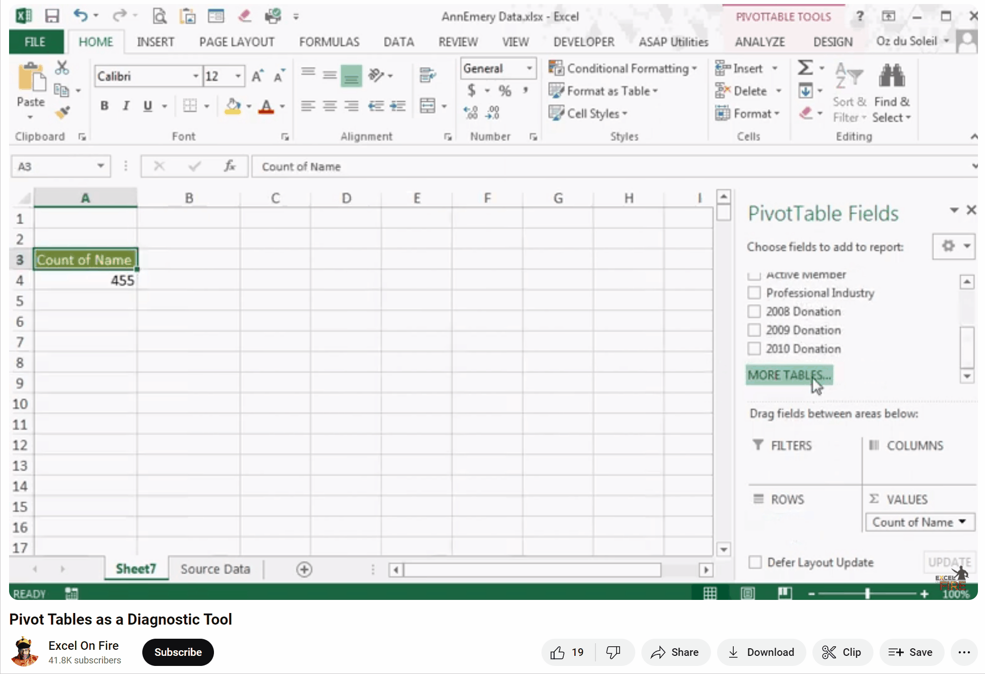
Today, we’re going to discuss data quality, messy data, or, as I’ve described in several blogposts, crap data. As a complement to this post, there is a dataset of 455 rows for us to work. Click here to download the sample dataset.
We Have Our Data: What Do We Want To Know?
We want to dig in and find out things like:
- Of the members we had in 2009, how many are still active members?
- What were the 2010 donation amounts of the currently active vs. inactive members?
- What were the 2008-2010 donations for the states where we plan to close offices: IN, MA and SC?
- What were the 2008 donation totals of the Gold, Platinum and Lifetime members?
- Are our Lifetime members clustered in a region, in a few states or, is there no correlation between residence and Lifetime membership?
This is so easy with pivot tables. You don’t need subtotals or SUMIFS formulae. But… stop!
Question: Can We Trust This Data?
A clever use of pivot tables is to throw your information into a pivot table as soon as it arrives at your desk.
There are two things that we want to know before we start our analysis:
- What are we dealing with?
- We have states in the dataset. Do we have 50 states and Washington, DC? How about Puerto Rico, Guam and US Virgin Islands?
- For Marital Status, do we have Married, Single, Widowed, Divorced and Domestic Partnership? Or, just Married or Single?
- Is this clean?
- Are there empty fields? Where are they and are they critical? We can live with a missing fax number, we can’t live without a missing membership level.
- Are there any duplicates that need to be merged into single entries?
- Is there anything just plain bizarre? Are there complete addresses in the State field or, “NOV” in a field that should only have YES or NO?)
Don’t make a single bar chart or summary table until we know the answers to those two questions.
Answer: Use a Pivot Table to Assess Data Quality
The old way of checking our data quality would be to scroll through, eyeballing for obvious duplicates; we would sort by the State field and eyeball through for blanks and nonsensical entries.
That is painful, tedious, and time-consuming. Eyeballing datasets is also prone to errors and must end. TODAY. Rest your eyes. A pivot table can save hours or even days, depending on the size and complexity of the dataset.
In this video, I generate a pivot table and focus only on the data quality. We see that there are duplicates and bizarre information that render the dataset untrustworthy until we get it cleaned up. As you watch the video, don’t focus too much on the results or the “how to.” Instead, listen to the thought process and questions I ask about the dataset.
Now we know:
- What are we dealing with?
- There are 25 states represented in our dataset, including Puerto Rico. Eight people aren’t assigned to a state.
- There are 5 membership levels: Rookie, Silver, Gold, Platinum, and Lifetime.
- There are 422 members.
- In terms of marital status, we only have Married and Single options represented in the dataset.
- We also know our donation levels between 2008 and 2010.
- Is this clean? NO!
- Kenneth is in the dataset 5 times. Adara is represented 3 times.
- There are 422 members and 455 rows of data. That’s 33 rows too many. They need to be investigated and merged into single entries.
- “17” is not a state. The people who live in “17” need to be researched and corrected. Also, review the data-entry process to see how that was allowed.
- There are 56 people whose active/inactive status is unknown.
Now What? Conclusions
The dataset has to be scrubbed. More importantly, Ann said it best in one of our conversations: “The main skill in working with data is developing your personal computer program: your brain.”
One goal of the video is to show how to think through the ways we might expose crap data. Using pivot tables eliminates the need to eyeball for errant data. This minimizes the filtering, sorting and scrolling that we’d otherwise use. Pivot tables save time and yield more accurate insight than our old ways.
For many years this wasn’t something I even thought of, and I was pretty darned lucky that nothing went wrong. Eventually I just got embarrassed when my boss kept noticing things that didn’t add up.
The problem wasn’t my math. It was naive trust of the data that had been handed to me.
I’m curious. How do you go about investigating data quality? How much time do you spend on it? What happens when you expose miscreant information?
12 Comments
What a fabulous post! I would never have thought of a pivot table as a data cleaning tool. I’ve only used pivot tables after cleaning the data! Thanks for a great tutorial!
Sheila, thanks for the comment and glad the tutorial added something to your arsenal.
Question: what had you used to examine your data?
It is a great post-data processing is often an overlooked step in the data analysis process.
Kevin, thanks for commenting. I really appreciate it.
How do you go about checking your data quality?
Great tutorial. We use conditional formatting within the dataset to identify and color code duplicates, outliers, missing data etc. to foster clean up.
Jessica, it’d be great to see the conditional formatting implemented. Do you blog?
(Hmmm … you give me ideas about how to use the conditional formatting.)
Hi Oz. Ann has some great examples that are similar to many of the things we do here: emeryevaluation.com/excel/exploring/. I do not have a blog (I keep meaning to, but projects get in the way). We can chat by email (jessica [at] viaevaluation.com], too.
[…] did a guest blogpost for Ann Emery at EmeryEvaluation.com called Pivot Table: Your Tool for Exposing Miscreant Data. This is a small glimpse into the reconnaissance before the actual kidnapping of […]
[…] starting and what you’re starting with. I detail that as Ann Emery’s guest blogger at Pivot Tables: Your Tool for Exposing Miscreant Data. Pivot tables are known for their ease of presenting data multiples way. However, there […]
[…] Pivot Tables […]
[…] a whole lot of data and you aren’t sure of the quality? Throw it into an Excel pivot table, use some conditional formatting, write a few formulas and uncover what’s […]
[…] Knowing when a pivot table is useful (Here’s an example of a pivot table used for checking data quality.) […]