
I recently had the chance to talk with my friend Jon Schwabish of PolicyViz. You might recognize Jon from our earlier interview about tips for doing and teaching data visualization in cultures other than your own.
Our latest conversation was part of the Urban Institute’s Data@Urban Digital Discussions series. The intention of these talks are to connect with each other while we’re all social distancing. Check out the full line.
You can also watch our full discussion below Jon asked me some specific questions as well as opened up to the attendees for their questions and I’ll go over those below.
Want to skim the highlights from our discussion? Keep reading!
Which Data Visualization Trends Are Here to Stay?
Jon asked, what is one technique or trend that you’ve seen that you think is going to continue? What’s a challenge that you’ve seen that keeps popping up for the folks you’re working with?
Being a good writer is important, but being a great speaker just became more important than ever.
We have to connect with other people (over phone calls and video calls) while quarantined.
We have to stay in touch with fellow humans.
But we also have to get people to know, like, and trust us… so that they trust and use our data.
We can’t just write reports and make pretty slides. Reports and slides aren’t enough anymore… and have never been enough. Speaking skills matter more than ever.
What Do You Help Clients With?
When you’re working with clients, what are your main things that you’re trying to help them think about? How do you help them move past just creating the report?
Let me share an example from a recent client meeting.
A few weeks ago, I was in California to deliver a keynote speech at the U.C. Davis campus. After the keynote, I also met with a small group for a few hours to work on one of their data projects.
During that meeting, we focused on not putting all our eggs in one basket.
The group had put significant effort into developing a (really good) interactive dashboard for their website.
Dashboards are great for specific audiences. But they’re not enough on their own. Dashboards can reach some, but not all, of our intended audiences.
We pulled up the Urban Institute’s pyramid and talked about which dissemination formats are the best fit for certain audiences. As a group, we reached consensus that we needed more than just a report, or more than just a dashboard.
So while I do a lot of consulting on the specifics of reports, dashboards, presentations, and infographics, I also do a lot of consulting related to communication strategies more broadly. I want to make sure that organizations have selected the right mix or reports and/or dashboards and/or presentations and/or infographics before we spend our precious time, money, and mental bandwidth actually making or improving on those designs.
Tips for Presenting Data Over Video Calls
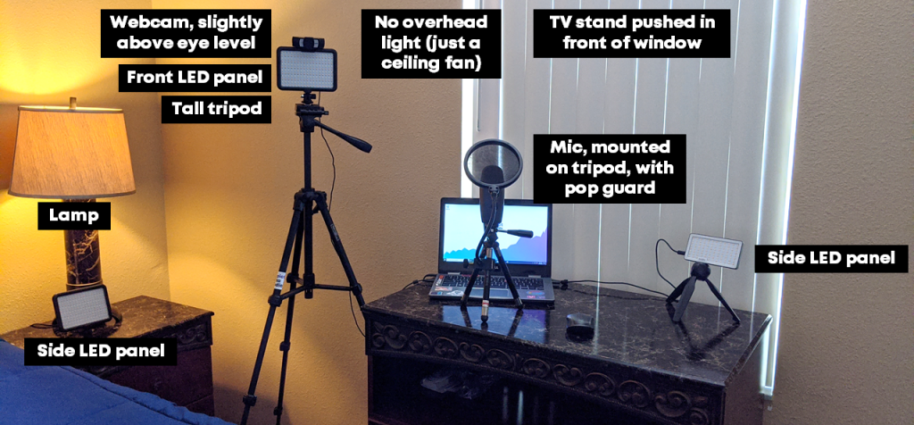
What are your top tips for setting up a good home office, especially for webinars and video calls?
I’ve been working from home for six years, and I’ve traveled full-time for the past year. I’ve got my “home” office set up really nicely! I can speak on podcasts, video calls, and record online courses from anywhere with minimal tech equipment.
Why Video Calls Matter
During this COVID-19 quarantine, we need quality human connection more than ever. We need to be able to see and hear each other on video calls (over Zoom, GoToMeeting Skype, etc.).
My public speaking coach taught me that only 40 percent of communication is the actual words that you use. The remaining 60 percent of communication is related to facial expressions, tone, pitch, using your hands to reiterate your main points, and so on.
You must look and sound professional during those video calls in order to get your point across. Sixty percent of your communication depends on it!
I suggest you focus on three areas:
- Audio
- Lighting
- Speaking skills
Audio Quality
Want to sound professional and be an effective communicator? We all need to invest in separate microphones.
You don’t need to spend a fortune. There are plenty of microphones in the USD $50 – $100 range.
I use this USB microphone and love it. It’s small so it even fits in my backpack while traveling for work, which means I can record online courses or speak on podcasts from anywhere in the world.
If you don’t have a separate microphone, then at the very least, you’ll need to use the ear buds that came with your cell phone. Those ear buds will have a built-in microphone. They won’t give you perfect audio quality, but they’ll be better for your audience than using your laptop’s built-in mic.
Lighting
Lighting is critical!
People can’t connect with you if they can’t see your face.
The number one thing to remember is: You don’t want to be backlit. Make sure your light source isn’t behind you.
The best option is to have a natural light source (i.e., your window) in front of you. But, you also have to consider what’s behind you. For example, my current background is a spare bedroom in the Airbnb rental we’re in. Not my top choice. But we’re all making-do right now.
I’m a huge fan of separate LED lights. It doesn’t matter how amazing and life changing our dashboard, graph or presentation is, if people don’t know, like, and trust you as the presenter of that dashboard. Trust is huge with data, and that’s why I use separate LED panels. So people can see my face! I’ve used these LED panels for years and love them.
When buying a LED light panel, you want to make sure that it has:
- Knobs that allow you to adjust low-high brightness level. If the light is too bright, you’ll look sweaty and shiny. You’ll need to adjust the brightness level and you’ll need to adjust your distance from the lights. I make sure to stand at least an arm’s length away from my lights.
- Knobs that allow you to adjust the cool-warmth balance. You need to be able to adjust it based on your skin tone and what suits you best.
Speaking into the Camera
You have to look into the camera!!! Not at yourself on your laptop screen!!!
If you can only see my eyelids, because I’m busy looking down at my own face on my laptop, then you can’t connect with me as a human being.
It’s much easier for your audience to connect with you when they can actually see your eyes:
Is it weird to look into your webcam? Of course. It takes practice. But it’s worth the effort. Small sacrifice for you. Big payoff for your audience.
My preferred setup is a tripod with this webcam and LED panel mounted onto it.
Prop Up Your Webcam
Your webcam should be slightly above eye level. Mine usually hits me in the forehead.
If you’re using your laptop’s built-in webcam, then your webcam will be waaaaay too low, and you’ll get the dreaded double chin.
You’ll need to prop up your laptop with cardboard boxes, a stack of textboxes, or even by standing in front of a makeshift “desk” like a tall dresser.
You need 100% of your mental bandwidth to be focused on discussing your data on camera. You can’t waste a moment by being self-conscious, and you’ll definitely be self-conscious on camera if you’ve got a double chin!
When you know that you look your best on camera, then you don’t have to worry about how you look.
Zoom Out & Show Your Hands
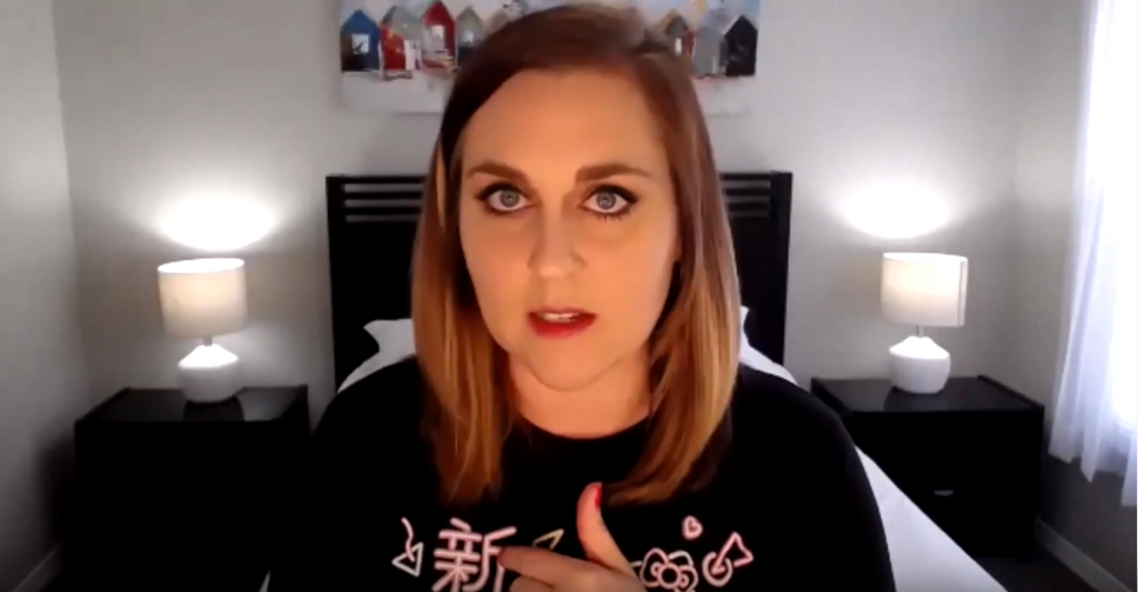
Zoom your camera out and include your hands in the shot.
Or, stand far enough away from your webcam so that your hands are included in the shot.
There’s lots of promising research about how your audience rates you as being more trustworthy when they can see your hands.
You don’t want to wave your hands around wildly, but you can use your hands to:
- Count things off (idea 1, idea 2, etc.)
- Indicate sizes (large, small, etc.)
- Use your hands near your heart to express empathy
- Show chronology (point down for ‘happening now’ or point behind you for ‘in the past’)
Pregnant? Show Your Beautiful Belly! (Or Not…)
If you look back at some of my older videos, they are purposefully only showing my head and shoulders. I was trying to block out my pregnant belly.
I didn’t want clients to know I was pregnant. Pregnancy discrimination in the workplace is real. I didn’t want to lose paying clients because they knew I was pregnant.
During both of my pregnancies, I got several emails from prospective clients along the lines of, “We were going to have you come speak but, heard your great news! We know you’re expecting, so we found another speaker instead.”
What a frustrating experience. To be fired before you even got the job.
If you choose to hide your belly while on camera, I get it. I’ve been there too.
My Makeshift Home Office
Here’s my latest set-up, from the Airbnb outside of Orlando that we’re calling home for a few weeks (or months?).
Lessons Learned from Teaching Online Courses
My question is about your lessons learned from your online training courses. There are lot of platforms out there, I’m curious about your experience and what’s worked for you.
This is a day-long conversation. 😊
I have learned so much about developing online data visualization training.
I’ve been speaking forever (well, since I started giving conference presentations about ten years ago). Then, I started working for myself six years ago. Two years ago, I finally listened to my friend Chris Lysy and started developing online courses.
Over the past two years, I’ve developed:
- Simple Spreadsheets, my data analysis course;
- Great Graphs: Design Principles, my software-agnostic course about data visualization best practices;
- Great Graphs: Excel How-Tos, my behind-the-scenes course about advanced Excel charting tricks;
- Dashboard Design, my course on making static one-pagers in spreadsheet programs like Excel;
- Powerful Presentations, my deep dive on presenting visualizations in slideshows, staff meetings, and webinars;
- Report Redesign, my deep dive on reporting best practices;
- Soar Beyond the Dusty Shelf Report, my complimentary mini course about getting started with dataviz; and
- Look Professional on Camera, our latest complimentary mini course, with behind-the-scenes tech tips for speaking on podcasts, recording online courses, and being interviewed on camera.
There are currently 540 lessons (!) inside these courses. So, it’s safe to say that I’ve learned a thing or two about what works—and what doesn’t—when it comes to teaching online.
Online Course Platform: Teachable
I use Teachable as my online course platform.
I use Teachable because I asked about 10 of my friends who make their living teaching online—meaning they make a full salary from their online course revenue alone, not just a couple hundred bucks her and there—and they all used Teachable.
That was a good enough endorsement for me!
I’m not an affiliate, just a very happy customer.
Their founder, Ankur Nagpal, also gives me a lot of confidence in their product. Ankur and his team are constantly improving. They interview instructors like me and they listen to our feedback. I love that. Sure, there are technical glitches once in a while, just like any software platform would have. But the Teachable team is constantly improving and iterating for their creators.
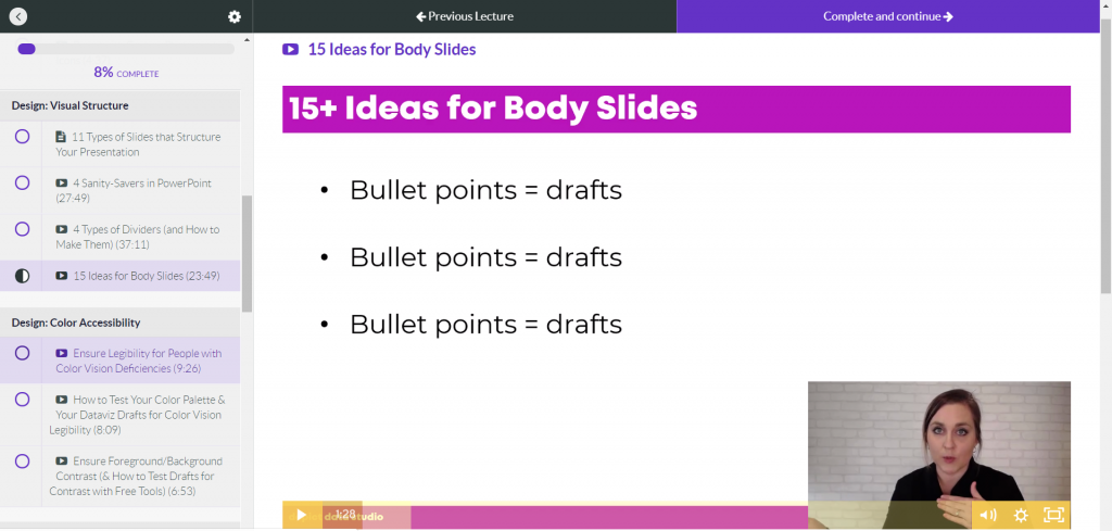
I also like Teachable because it’s user-friendly for students. Students log in, see the syllabus listed along the left, and see the video in the main screen. Underneath the video, you can add descriptions, images, quizzes, discussion boards, and attachments.
Video Player: Wistia
Teachable also uses a video player called Wistia, which is a bit cleaner than YouTube. It just has a play button and a couple of settings. I’m always aiming to make the students learning experience as easy and simple as possible.
Wistia also adjusts the resolution based on your internet speed for students and will play the best version for what your internet is like that day. I have students located in offices all over the world—I’m thinking of my international development and public health professionals in rural villages in Bangladesh—and I know they can participate even with slower internet speeds.
How to Create Content
Moving online was fairly seamless for me because I’d already been doing in-person trainings.
I see people creating courses from scratch and that’s really difficult.
But if you already have a 30- to 60-minute conference presentation that you’ve given, you can absolutely record that and turn it into a mini course.
Recording Tools: Screencast-O-Matic and Camtasia
For recording, I used to use Screencast-O-Matic . I liked it because you just hit record. It’s affordable and there’s only a little bit of minor editing to do.
A few months back I switched to using Camtasia to have more control over the editing. I’m not a master editor. I still mostly record my screen with my webcam in the corner. But now I can add text boxes, animations, and sounds.
Video Length: Varies on Purpose
Video length varies.
I used to think having a bunch of 2-minute videos was better than having a single 10-minute video. And honestly I’m still torn over this.
I’m monitoring the data behind the scenes to see what my students like the best. Right now, I purposely have a mix of anywhere from 2 minutes to 45 minutes.
Starting NOW with Online Training
I wish I started teaching online even earlier.
I started YouTubing way back in 2012, but it wasn’t until 2018 that I finally figured out that online courses were a “thing.”
Online learning doesn’t replace in-person learning. They’re apples and oranges; different formats with different strengths.
If you’re thinking about starting, then start today! You’re not behind. Now’s the time.
Using Icons Within Reports
I noticed one of the key features of your reports is to use icons to make things a little bit more intuitive. I used the nounproject.com to get icons to use in my reports. Are there any other resources you’d suggest for icons?
I’ll list out the options from worst to best:
Google Search
Don’t do a Google search for download free icons. This gets you in copyright jail. There are better options.
Microsoft Office
If you’re using Office365, then you’ve got free icons in PowerPoint, Word, and Excel. Just go to Insert àIcons. You can customize the color, the size, and so on.
The Noun Project
The Noun Project has both free and paid versions.
The free version…
- Gives you access to thousands of icons
- Only lets you download the icons in black
- Requires that you cite your icon source
The paid version—which is a whopping $40/year, what a steal!!—is such a great resource. The paid version…
- Gives you access to ALL their icons
- Lets you download the icons in the custom color (RGB, Hex, etc.) of your choosing to match your brand guidelines
- Doesn’t require that you cite your icon source (One less thing to remember; One less chance of going to Copyright Jail)
Custom Made Icons
The top tier is to hire a graphic designer to create custom icons for your organization.
I’m starting to see a lot more organizations do this and am always suggesting this to my clients.
A designer can come up with a couple dozen icons that your organization can use over and over again. The designer can also ensure that your icons match—that they all have the same edges (square vs. rounded), the same line thickness, and so on. These are small details that will make a report look as professional as possible.
A professional graphic designer might charge you anywhere from a few hundred to a few thousand dollars for this, depending on what you need.
Your Turn
How are you coping with presenting data while working remotely? Do you have your own audio, lighting, and speaking tips to share?
1 Comment
Like!! Really appreciate you sharing this blog post.Really thank you! Keep writing.