Leave a Reply

Your email address will not be published. Required fields are marked *

Quick Wins for Visualizing Financial Data in Excel

Last updated

Jul 21st, 2025

Related resources:

, , , , ,
Ann K. Emery, data storytelling, Microsoft Excel, data visualization

Inside this replay, you’ll learn about:

  • The visual superiority effect
  • Preattentive attributes
  • Decluttering first, then adding visuals
  • Quick dataviz wins inside everyday software like Excel

What’s Inside

  • 0:00 Welcome
  • 3:10 Visual Superiority Effect
  • 5:00 Preattentive Attributes
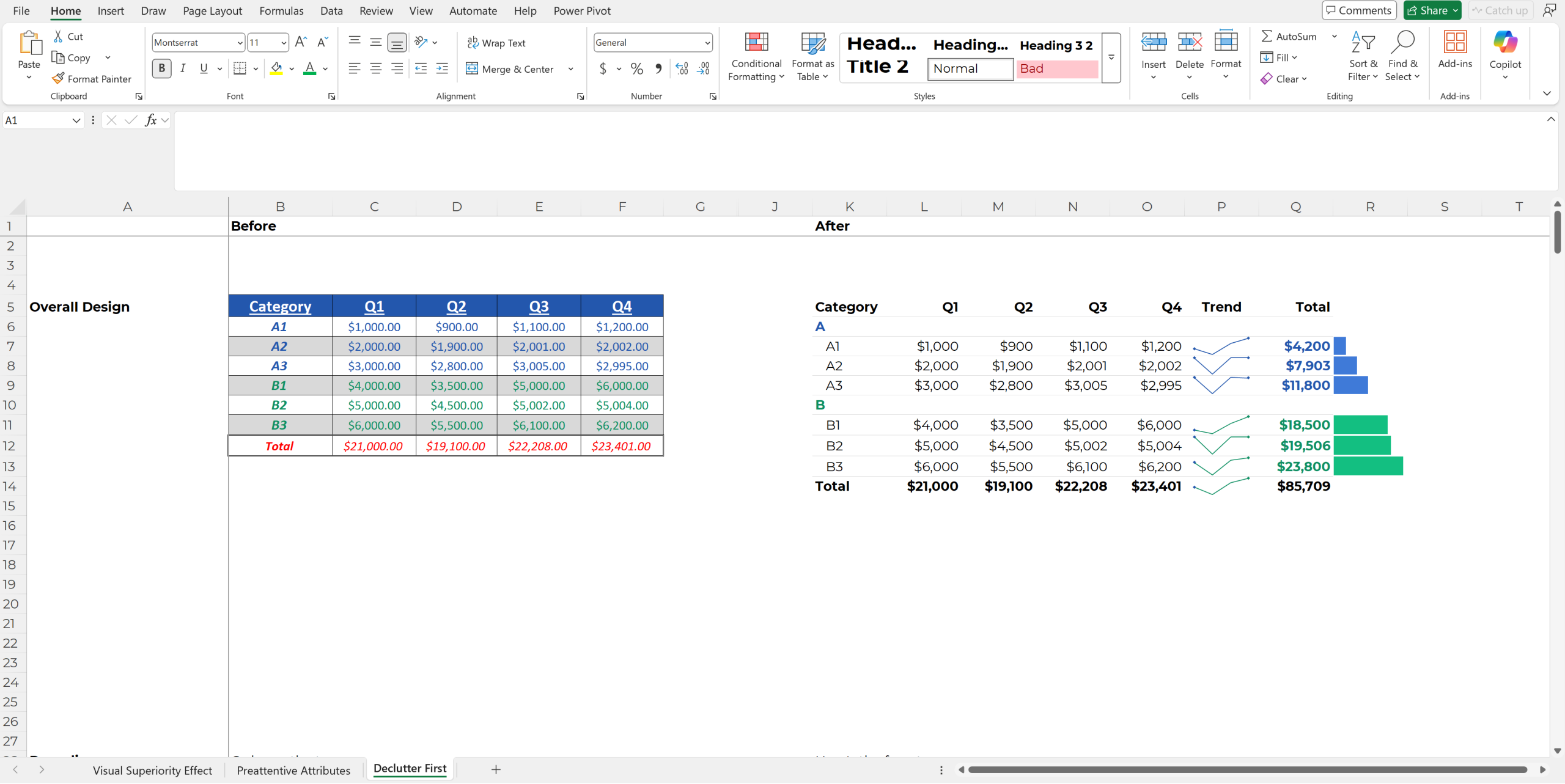
  • 23:00 20 Quick Wins (spark lines, data bars, etc.)
More about Ann K. Emery
Ann K. Emery is a sought-after speaker who is determined to get your data out of spreadsheets and into stakeholders’ hands. Each year, she leads more than 100 workshops, webinars, and keynotes for thousands of people around the globe. Her design consultancy also overhauls graphs, publications, and slideshows with the goal of making technical information easier to understand for non-technical audiences.

Leave a Reply

Your email address will not be published. Required fields are marked *

You Might Like

Our complimentary mini course for beginners to dataviz. Takes 45 minutes to complete.

Enroll

Adding Interactive Maps to Excel Dashboards

You’ll learn the workaround for connecting pivot tables and maps (with a dynamic array).

More »

Want to wow your boss with a dynamic dashboard? Or, how about a one-pager of key findings? Our 4-course bundle provides all the how-to’s.

Enroll

Spreadsheets to Stories
Weekly Newsletter

You’ll receive:
  • how-to tutorials about data management, analysis, visualization, and storytelling;
  • spreadsheets to download so you can try it yourself; and
  • the latest info about our online courses.

    Our weekly newsletter is shared with a community of 8,000 professionals.