Thanks to everyone who participated in the first and second dataviz challenges! I hope these challenges give you a chance to practice and build upon your Excel and visualization skills.
Last time, we made a streamlined version of the basic bar chart by adjusting Excel’s default settings. Basic bar charts are great when you’re just looking at simple patterns, like one series of data at a time.
However, sometimes we need to compare several series of data at one time. For example, the Innovation Network team and I recently compared the capacity of 12 different coalitions using our coalition assessment tool. We calculated coalition capacity in 7 different areas, such as Basic Functioning and Structure and the Ability to Cultivate and Develop Champions. To learn more about the tool, check out some materials from a recent presentation here.
The “before” chart: Here’s a clustered (aka cluttered) bar chart based on fictional data from the coalition assessment tool. The default Excel chart to compare Coalition A and Coalition B might look something like this:
Or, you could use the switch row/column feature to make a default chart like this:
These default clustered bar charts work… kind of. Well… not really. Actually, no, they really don’t work at all! My brain needs a couple minutes to read the default charts and really think about comparisons.
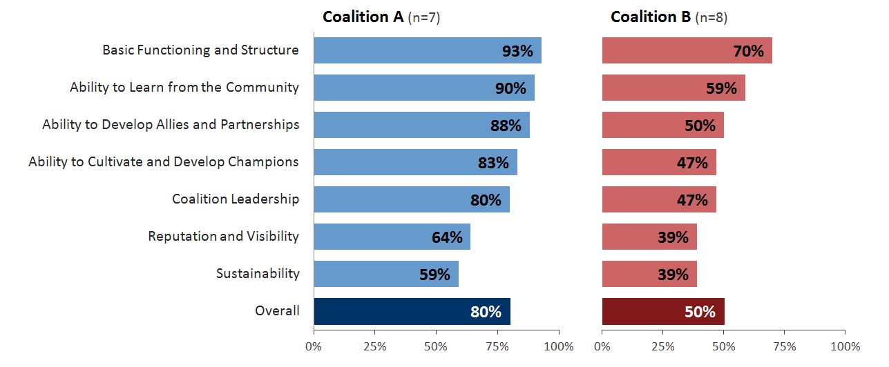
The “after” chart: Luckily, with a little Excel elbow grease, we can make the patterns pop out even faster. Here’s a side by side bar chart:

Now, my brain can see the patterns almost immediately: Both coalitions scored highest on Basic Functioning and Structure. Both coalitions scored lowest on Sustainability, with Reputation and Visibility scoring pretty low as well. Coalition A scored higher than Coalition B on every section of the assessment. The overall scores were 80% for Coalition A and 50% for Coalition B. Phew! This is much easier for my brain.
The dataviz challenge: Re-create the “after” version of the side by side bar chart in Excel, R, or some other free software program. When you’re finished, email me or tweet a screenshot to @annkemery.
Tips for beginner Excel users: First, learn how to make a basic bar chart. Then, check out this powerpoint for tips on making a side by side bar chart.
Bonus for advanced Excel users: Instead of copying this dataset exactly, think about how you might use a side by side bar chart in your own work. Can you re-create this chart using your own data or your own color scheme?
The prize for playing: Beer or coffee, my treat, the next time you’re in DC; a professional development opportunity; and bragging rights.
I’ll post the how-to guide in two weeks, on June 10, 2013. Happy charting!


10 Comments
Love this. Another advantage of the improved version is that it prints better in B/W than either of the two originals.
Interesting. This viewer needs know % of what (n=?) to make a smart comparison.
Eden,
Great point – can’t believe I forgot the n’s! I guess that’s what happens when you’re analyzing real data all day and then play around with fictional data at night, oops.
I re-uploaded the chart with n’s. Welcome to the world of Small Data! Sometimes coalitions only have a few members, so the numbers are typically small.
Hope this helps you make comparisons! Ann
Ann,
Other than not being able to figure out the tick marks, how did I do? Any hints or advise on the tick marks, as I tried “Format Axis / Axis Options / Axis Labels: High / Major Tick Mark: Outside” to no avail. It kept putting the tick marks at the top of the charts and not the bottom.
[cid:image003.jpg@01CE5BB3.EAF93FC0]
Thanks,
Regan Grandy, Ed.D.
Senior Research and Evaluation Associate
Spectrum | Research – Evaluation – Development
office: (435) 753-3963
cell: (435) 232-4096
fax: (435) 753-9444
Hi there,
Any thoughts on whether this would still work well if the two Coalitions differed entirely in their order of highest to lowest score?
Kerry,
Good question. I don’t see why it wouldn’t work.
You could help the reader see those differences in scores in a few ways. For example, you could intentionally order the categories (e.g., from the greatest percentage to the least percentage). Sometimes I make three side by side bar charts – the first would show Coalition A’s scores, the second would show Coalition B’s scores, and the third would show their differences. For example, on Basic Functioning and Structure, Coalition A scored a 93% and Coalition B scored a 70%, so the third bar chart would show 24% – because they differed by 24 percentage points. You might even order the categories from greatest to least based on these differences if you really wanted to emphasize how the coalitions differed.
Ann
[…] Two weeks ago, I challenged readers to re-create the “after” version of a side by side bar chart. You can read the full post here. […]
[…] excel to do complex work is easy; making the output look nice is a different matter. I took the challenge to recreate Ann’s graph because I’m always looking for better ways to display […]
[…] the third dataviz challenge, we started talking about making several comparisons at once. For example, when the Innovation […]
[…] Two weeks ago, I challenged readers to re-create the “after” version of a side by side bar chart. You can read the full post here. […]