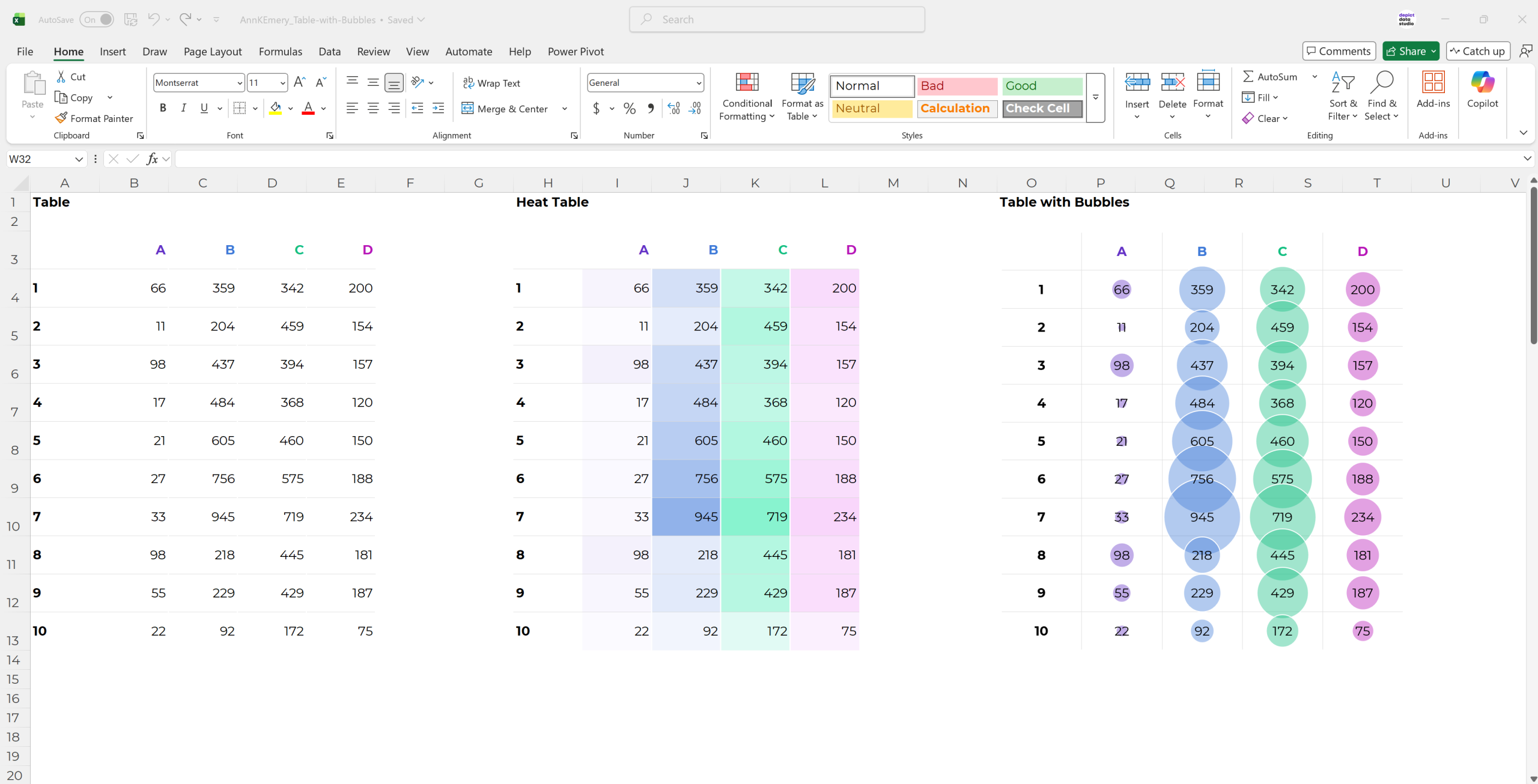
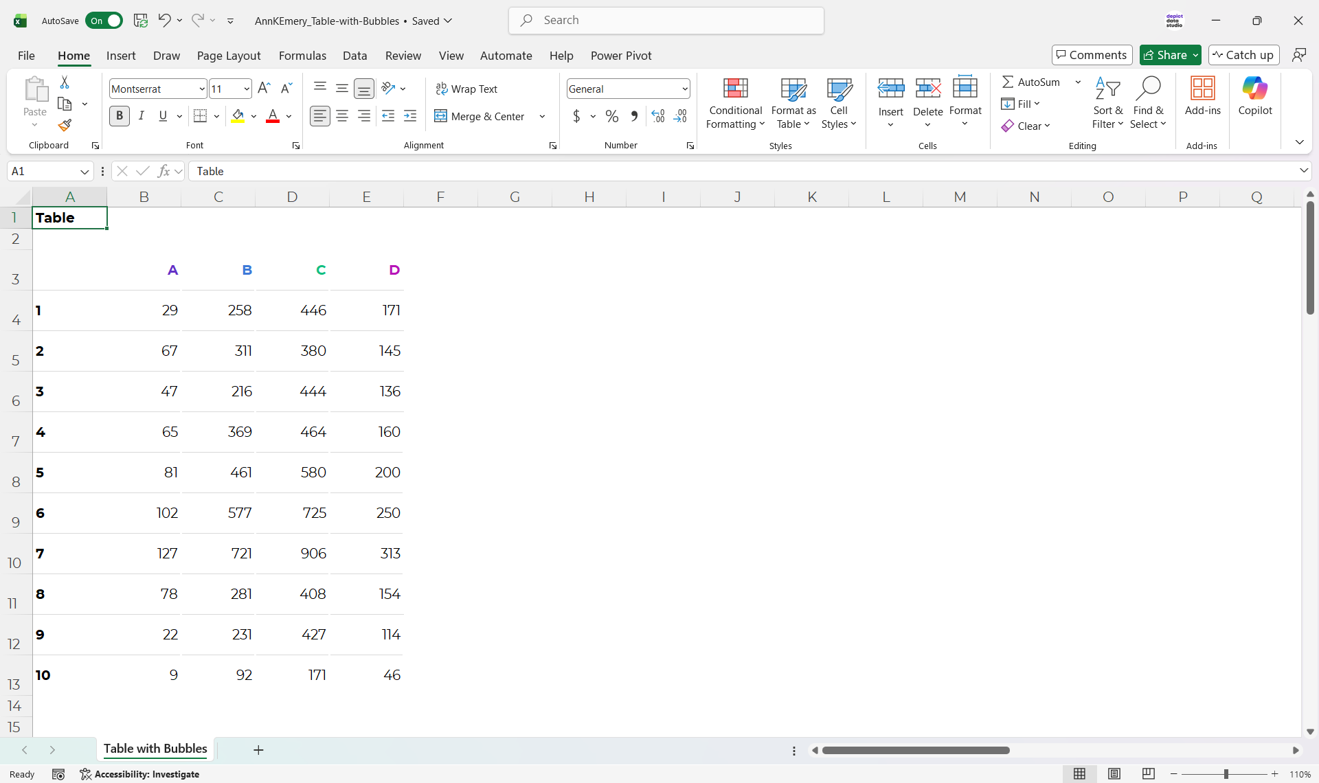
You’re familiar with regular tables…
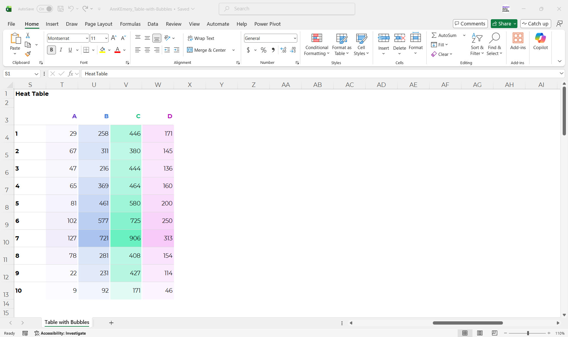
…and you’ve seen heat tables…
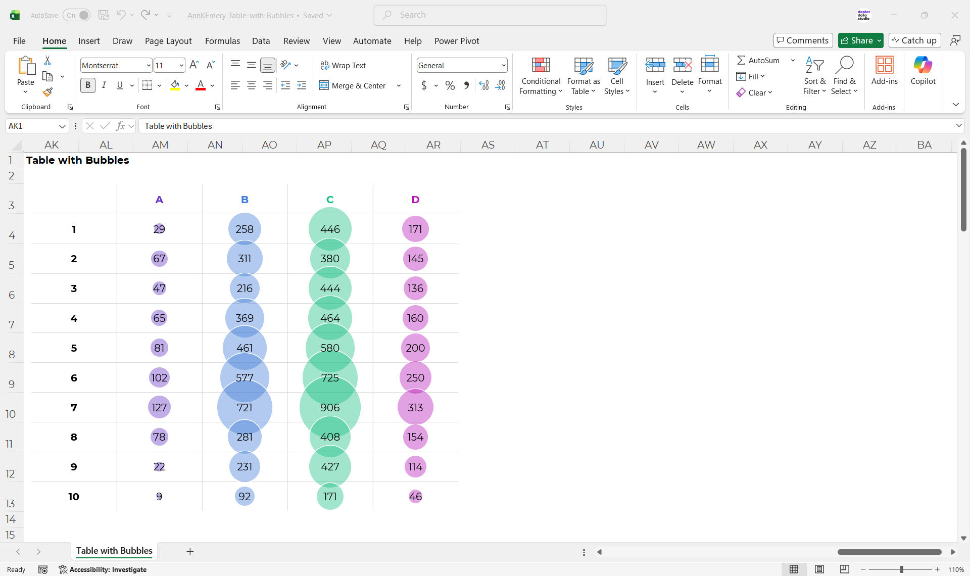
…but have you tried tables with bubbles?!
There are obviously pros and cons of each approach – like everything with data visualization.
Comment below with your own insights into the pros and cons.
How to Make Tables with Bubbles in Excel
You’ll set up a Helper Table with x, y, and z values.
Then, you’ll insert a bubble chart.
Finally, you’ll adjust the axes, grid lines, colors, and labels, just like you normally would.
Let me know if you’d like a more detailed tutorial.
Download the Excel File
Or, you can download my Excel file and explore it yourself.
This is just the file I used for this blog post (not step-by-step instructions).
Leave a Reply