Remember those “Excel for Dummies” books?
I’d go to the public library, grab a dog-eared book off the shelf, and flip through the grayscale images trying to match the author’s screenshots to my own computer.
They were always using a different version of Excel than me.
I couldn’t find the buttons from their blurry screenshots.
I had to zig-zag my eyes back and forth between the book and my screen.
That’s how I learned Excel. And it was terrible.
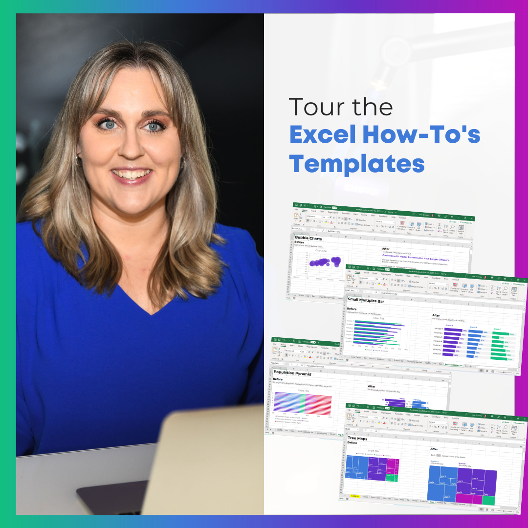
Introducing the Excel How-To’s Templates
That’s why I spent hours and days and weeks making the Excel How-To’s templates for you.
Rather than having a separate book open, you’ll learn directly from Excel.
All the instructions are typed directly into Excel for you – alongside the living, breathing graphs – so you can save precious time.
Or, if you’re not interested in learning all the how-to steps, you can use the completed templates for your own project. There are notes telling you exactly where to type your own numbers and percentages so that they’ll show up in the finalized charts. No need to reinvent the wheel.
What’s Inside: 31 Templates
There are 31 templates so far.
I make updates and additions a few times a year, and send the latest Zip folder to everyone to make sure they’ve always got the latest version.
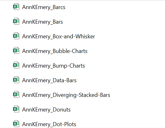
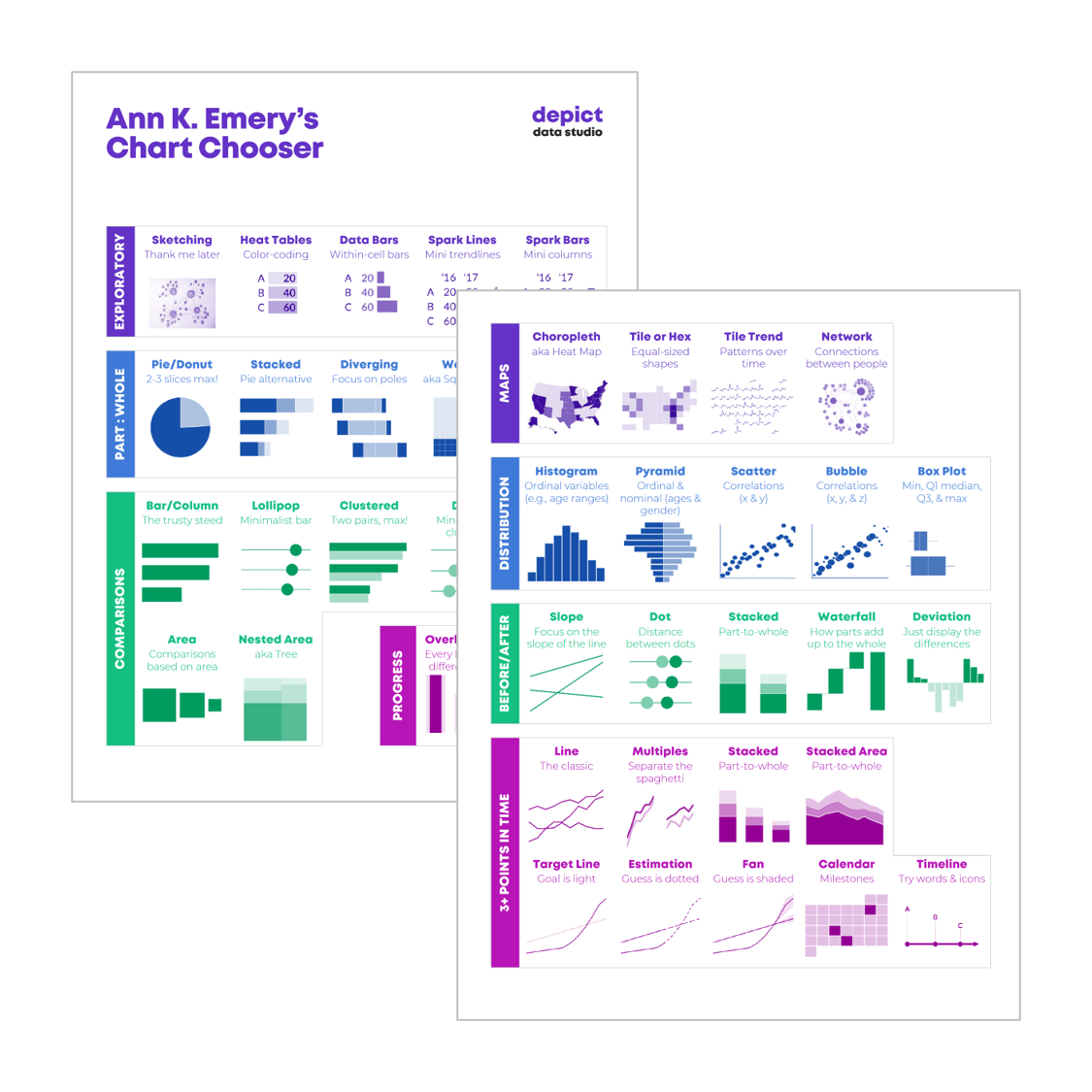
Chart Chooser
In addition to the graphing instructions, you’ll see my 2-page Chart Chooser, which’ll help you narrow down which chart to try.
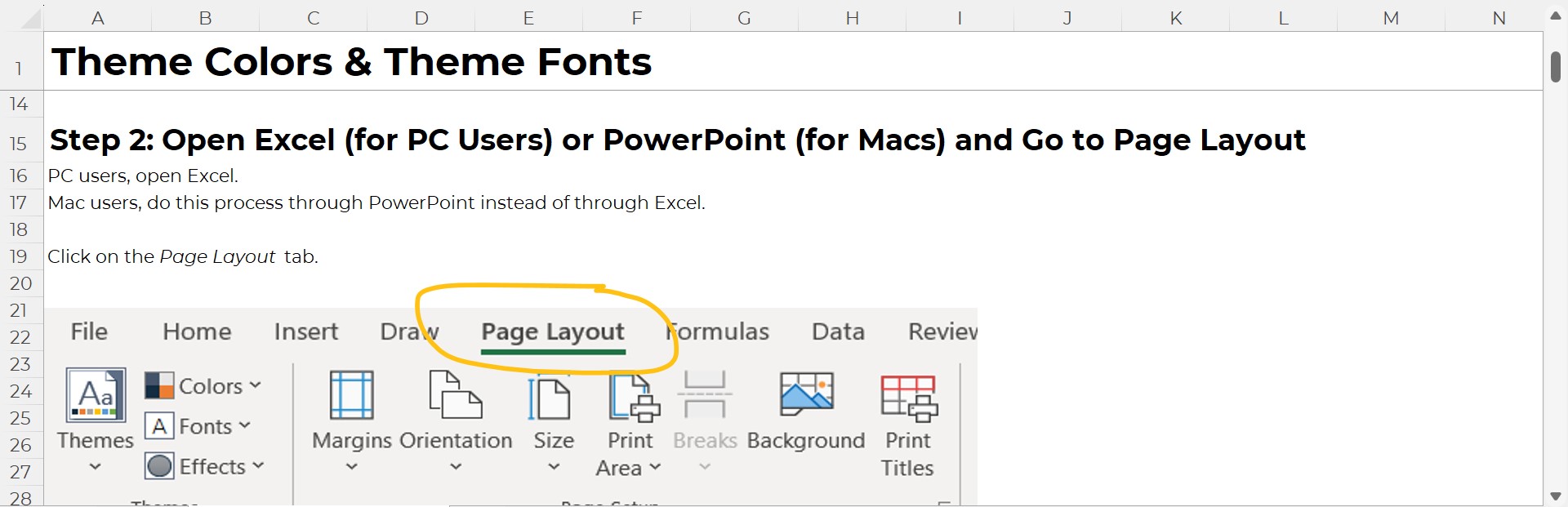
Theme Colors and Theme Fonts
You’ll also get step-by-step instructions for setting up your organization’s brand colors and brand fonts. Themes save time and help you look professional.
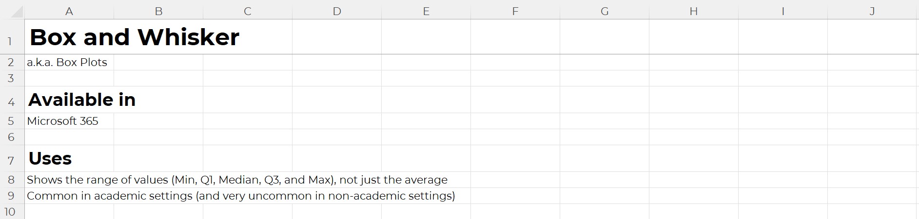
Available In
Inside each template, you’ll learn which version of Excel that chart’s available in.
Most charts can be made on most computers.
There are some exceptions here and there, which is why it’s explicitly spelled out for you.
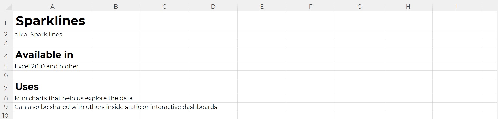
Uses
You’ll learn what that chart type’s best for.
And, I’ve added notes about where that chart is most or least common. In practice, we don’t see every chart in every workplace. Some charts are pretty much only seen in peer-reviewed journal articles. Other charts are pretty much only used by accountants. And so on.
Real-Life Examples
Inside each of the templates, you’ll see links real-life examples. Then, you can see how that chart has been used in reports, slideshows, dashboards, infographics, and websites by other agencies like yours.
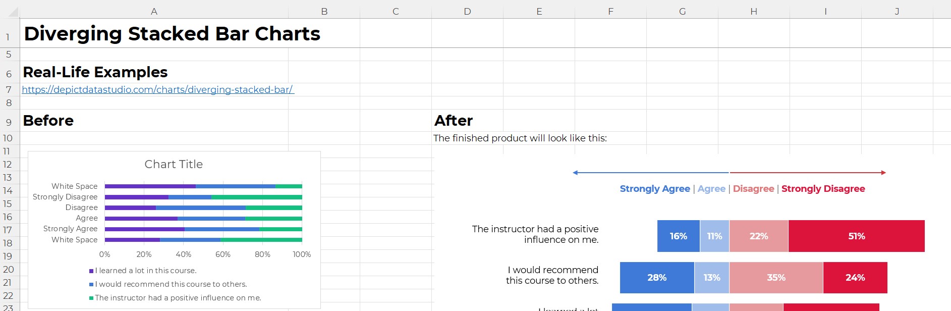
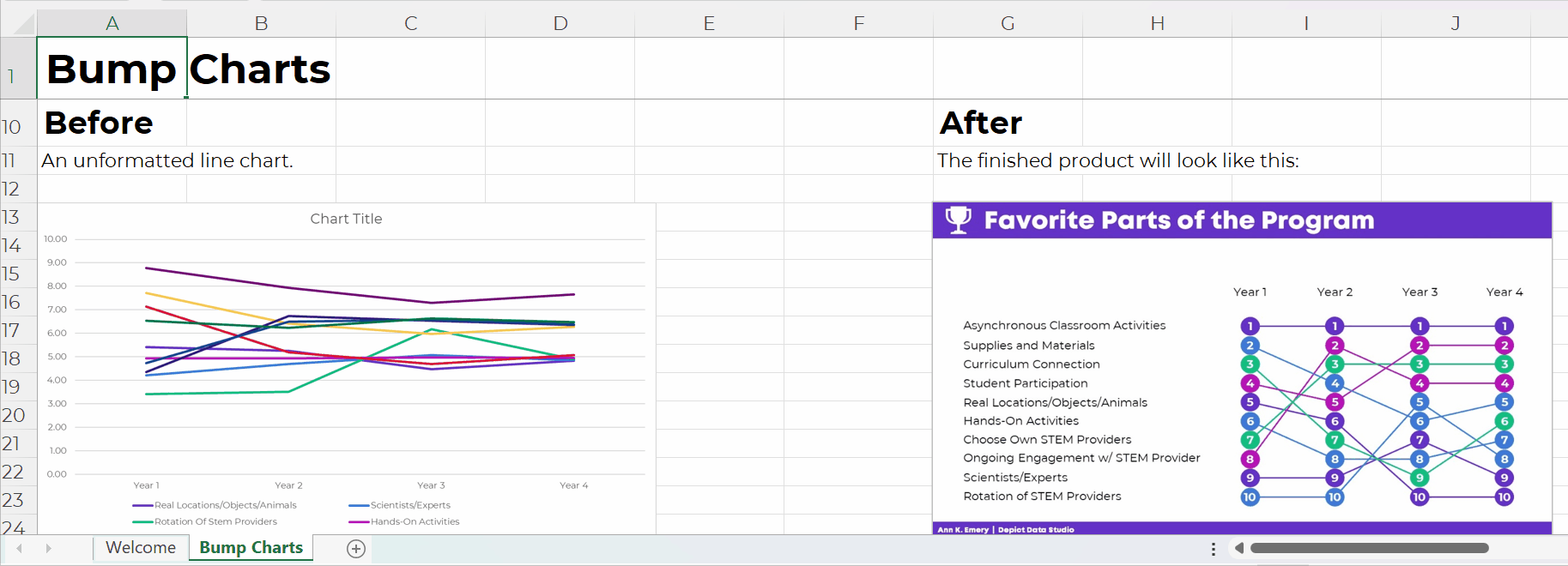
Before-After Editing Example
Then, you’ll get a preview of the before-after transformation that you’re about to create.
For example, in the bump chart tutorial, you’ll transform a regular ol’ line chart into a ranking chart.
Below, you’ll get ideas for how you’d adapt that busy bump chart for a presentation (by graying everything out and highlighting one category at a time).
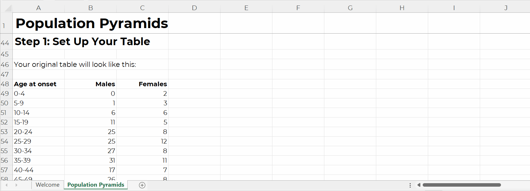
Step 1: Set Up the Table
You’ll walk through step-by-step instructions to make and edit all the 31 charts.
Step 1 is setting up your data table that’ll feed into the chart.
For native charts – bar charts, pie charts, line charts, etc. – the table set-up is extremely straightforward.
But for non-native charts, we have to get creative.
For example, in the population pyramid tutorial, you’ll see:
- the original table, and
- the magic table.
I’ve added notes to help you figure out what goes where.
The gray area gets pulled directly into the chart, so those are the values you’ll tweak when you’re making population pyramids for your own projects.
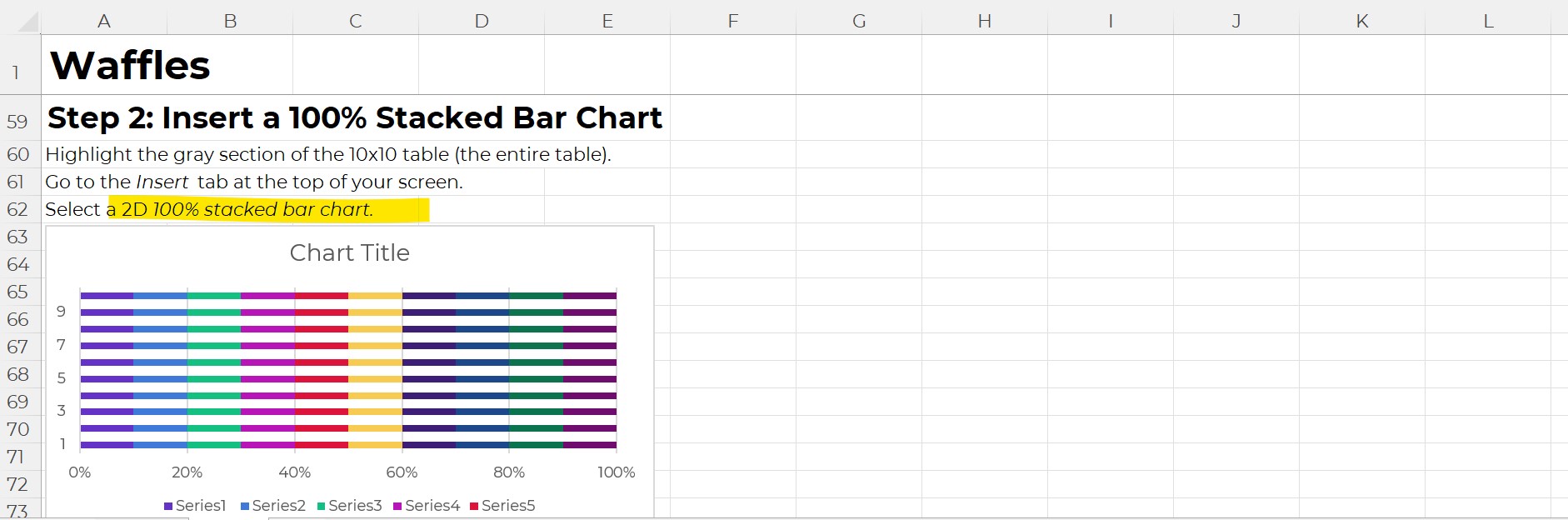
Step 2: Insert a ___ Chart
As we’re building non-native charts, we have to fool Excel.
We often insert one chart type… and disguise it to look like a different chart.
This took me nights and weekends, over several years, to figure out on my own. Let’s get you up to speed immediately! No need to waste your time fighting with Excel on your nights and weekends.
You’ll see explicit instructions about which chart type to add.
For example, to create a waffle chart (a.k.a. square pie), you’ll need to insert a 100% stacked bar chart first.
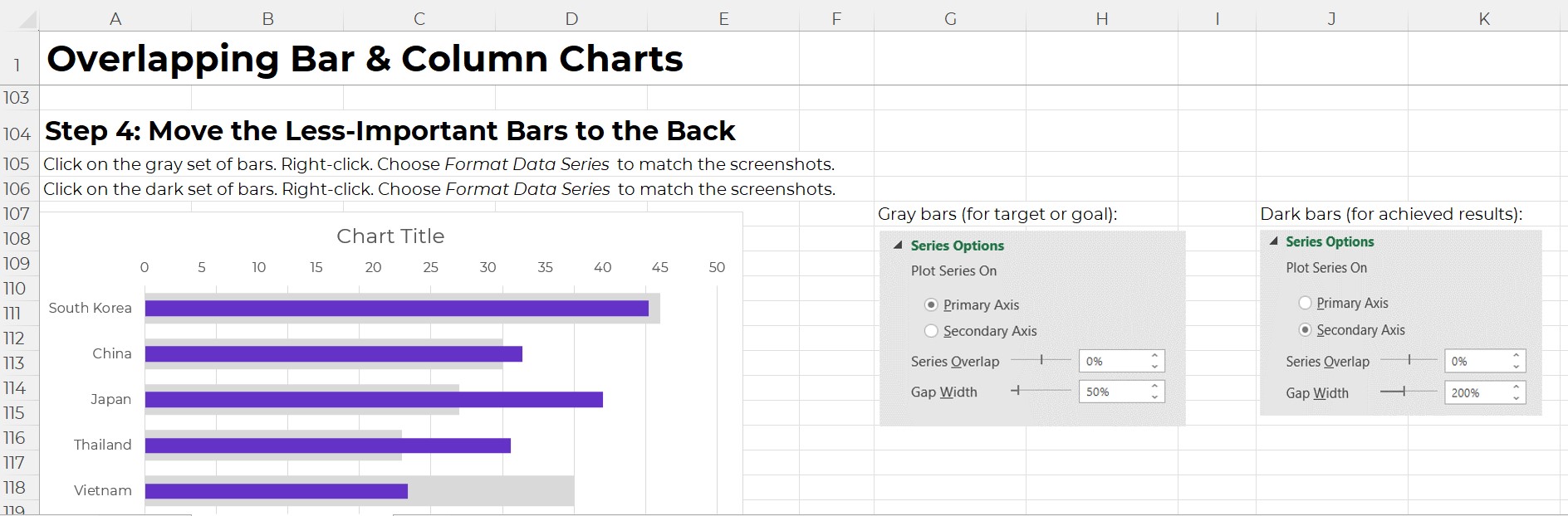
Step 3 (and onward): Format Format Format
This is where you’ll learn about Excel’s lesser-known features.
For example, you’ll learn how to adjust the primary and secondary axes’ Series Overlap and Gap Width, which makes our bars overlap.
I don’t find these edits to be intuitive at all. Quite the opposite! That’s why I’ve added screenshots for you – so you don’t have to memorize which buttons to click.
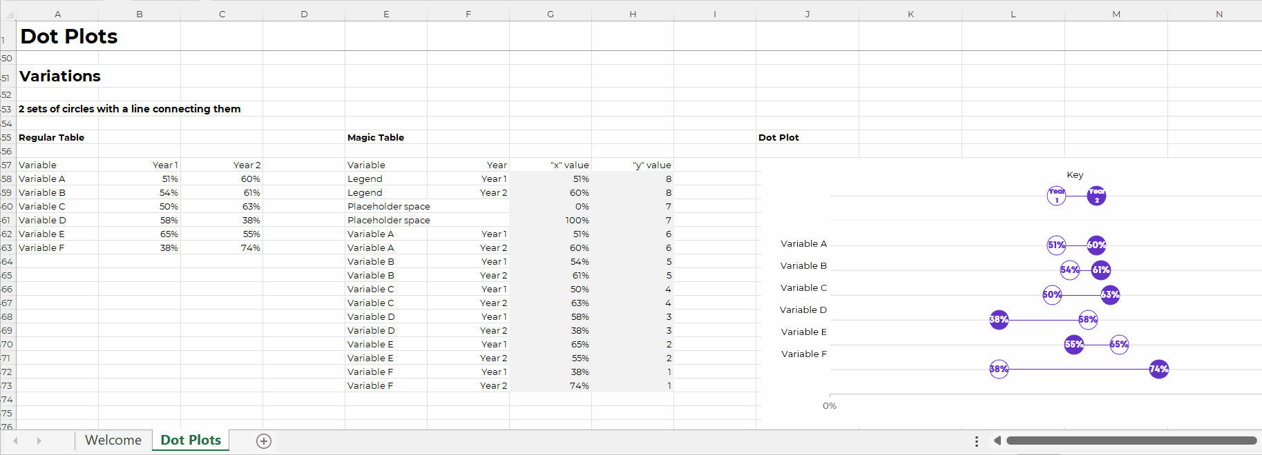
Variations
Finally, you’ll see variations of each chart.
For example, in the dot plot tutorial, you’ll see how to set up:
- 2 sets of circles with a line connecting them
- 2 sets of circles without a line connecting them
- 1 set of circles (a lollipop)
- Smaller dots with labels above or beside the dots
- Arrows
- Arrows, sorted (my personal fav)
Get the Excel How-To’s Templates
They’re included with your Data Storytelling in Excel tuition.
Leave a Reply