A few weeks ago, I showed you how to transform allllllllll of your presentation’s information into just a few main chunks. You can visually chunk information by creating divider slides and by using consistent colors and icons:

The previous post focused on divider slides. This post focuses on body slides. In particular, I’ll provide a few examples of how you can transform a list of bullet points into visuals.
Bad
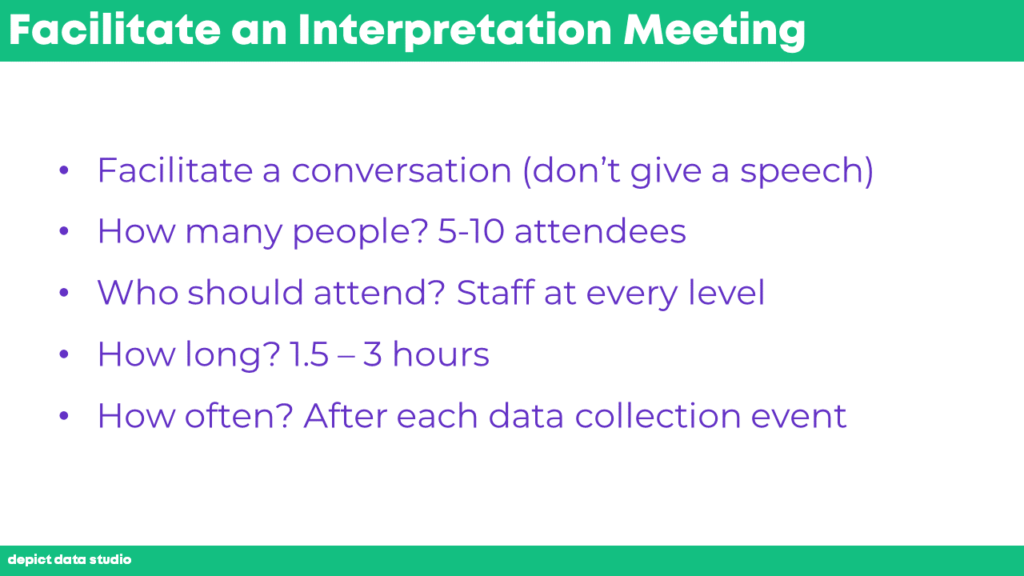
While I was creating content for the Facilitate an Interpretation Meeting section of a recent presentation, I wanted to include a few frequently asked questions.
Here’s what my first draft looked like. While drafting, I was just trying to get the main ideas down. Bullet points are fine for drafts but not for final products.

Better
At the very least, we can apply bold text to make key phrases stand out.

And even better, we can storyboard the slides so that one bullet points appears at a time as you click through your slides. Your goal is for your slides to match your speaking points.

You can achieve the storyboarding appearance with your slideshow’s built-in animation features. Just use the least distracting option, like Appear, rather than having bullet points fly in and do cartwheels across the screen.

Or, you can achieve the storyboarding appearance by creating separate slides for each bullet point. This is my personal preference. I give a lot of webinars, and some webinar platforms (like ReadyTalk, among others) will wipe out animations entirely when you upload your slides into the system.

The bare minimum is to apply bold text and make one bullet point appear at a time. But I’m not suggesting you keep the bullet points at all. There’s nothing worse than watching a presentation full of bullet points! Bullet points say I cared so little about you that I made these slides on the airplane last night.
Best
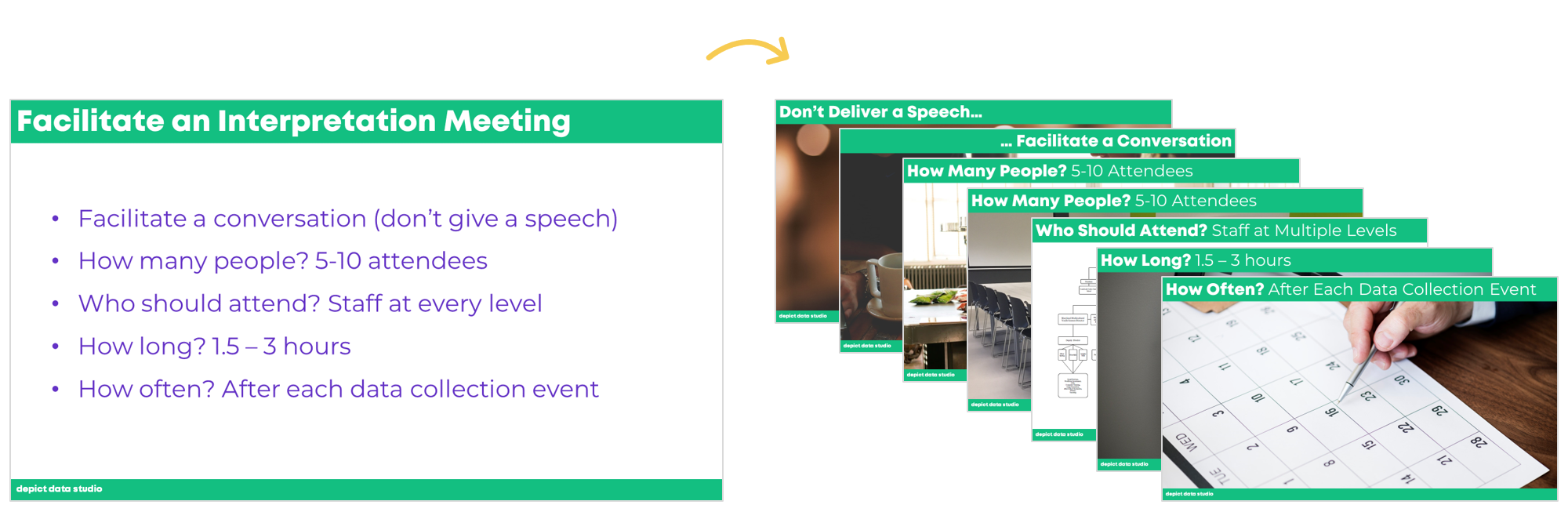
Your best bet is to break up the five bullet points altogether and give each bullet point its own slide(s).
The first bullet point was “Facilitate a conversation (don’t deliver a speech).” I devoted two slides to this concept, one of a microphone (representing a formal speech) and one of a casual meeting (representing the desired tone of the meetings that I was teaching my attendees about).
My speaking points would go something like this: “When you’re running these interpretation meetings, don’t deliver a speech. You’re not standing at a podium behind a fancy microphone. You’re not going to say, ‘Hey, welcome to the presentation. I already analyzed the data and want to share the key findings with you. I’ll take questions at the end.’ That’s too formal.”
Then, I would click to the next slide, and say, “Instead, you’re going to facilitate a conversation. You’re going to welcome everyone to the meeting and say, ‘I started analyzing the data, but I need your input. I need you to help me make sense of the numbers. Let’s talk about the data together.’ You’re going to ask open-ended questions and keep the meeting casual and conversational.”
I would spend approximately 20 seconds on each of these slides. The slideshow is informative yet fast-paced.

The second bullet point was “How many people? 5-10 attendees.” I devoted two more slides to this concept, one of a small two-person conversation and one of a larger room with lots of chairs.
My speaking points would go something like this: “How many people should attend the interpretation meeting? Two people is too few. You need more voices in the room.”
Then, I would click to the next slide, and say, “But on the other hand, this would be too many people. I suggest having 5 to 10 people at your meeting.”
I would spend approximately 10 seconds on each of these slides.

The third bullet point was “Who should attend? Staff at every level.” I selected a screenshot of an organizational chart, and added super-fancy text boxes and arrows to drive home the point that multiple voices and perspectives should be included.

The fourth bullet point was “How long? 1.5 – 3 hours.” Again, I got super fancy here, and selected a picture of a clock.

The final bullet point was “How often? After each data collection event.” Yet another super fancy approach: a picture of a calendar. Don’t think too hard. Even the simplest, most straightforward photographs will be more engaging and memorable than a bullet point.

I transformed a single slide into seven slides. My speaking points would be identical in both cases. My pace would be identical in both cases. I’m not talking any faster just because I have more slides. I don’t have to rush. Only the visuals would change. Adding more slides doesn’t make my presentation any longer. But adding more slides makes my presentation infinitely more engaging.

There are a million places to find good photos, but my favorite is Pexels.
Bonus: Download the Materials
Want to explore how I made the slides? Download my slides for free. I’m using custom colors and fonts, so when you open the file on your own computer, the colors and fonts will look a little different than mine.


Leave a Reply