
Lately I’ve been feeling let down by summary statistics: the min and max, mean and median, quartiles and standard deviation… They do their job well enough. Summary statistics tell a summary. An aggregate story, bringing all the messy scores together into some sort of cohesion. We grab the averages and stick them in bar charts.
But sometimes we don’t want to summarize, we want to highlight the variety in scores and remind readers that the chart is actually made up of individual people, not just the mean or median. Long live the messy data, the dispersion, the distribution, the spread!
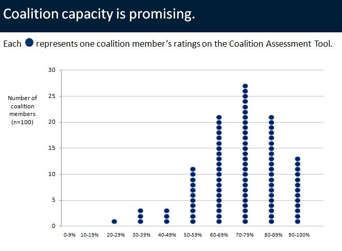
I could tell you a few descriptive statistics: min = 26%, max = 100%, Q1 = 64%, Q3 = 83%, median = 74%, mean = 73%, standard deviation = 15%. Or, I could show you the spread in this unit-chart-turned-histogram.
Unit charts are not your new go-to chart. They do not replace bar charts. They are not appropriate for all datasets. They’re best for those few moments when you choose to emphasize individual units of data. A unit could be 1 person, or 10 people, or 1 school, and so on. Units can be represented in circles or squares or triangles. Units can be stacked on top of each other to form a histogram, or they can be plotted along a line.
The dataviz challenge: Re-create the chart in in Excel, R, or some other free software program. Then, tweet a screenshot to @annkemery.
Bonus: Make a unit chart for your own data. Or, do you emphasize individual differences with other chart types? Share your ideas with the community!
The prize for playing: A professional development opportunity and bragging rights. I’ll post the how-to guide in a couple weeks.
Want to learn more? I’m presenting about charting techniques at the American Evaluation Association’s annual conference on Thursday, October 17, 2013 at 11am in Washington, DC. Hope to see you there!
2 Comments
Please reveal how to create this chart! I messed w/ scatterplot a bit; have an idea to mess more but am on a deadline and just want to do it! Thank you!
I figured it out! Using it to show ATOD use among high school students in the first quarter of this school year. Now I need to figure out how to use the drug symbol to represent the drug.
Thanks for your examples!